ADV @ UNDERCONSIDERATION Peek here for details
BROWSE
Dimensions (Width × Height × Depth)
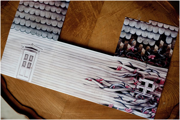
Folded: 4.25 in × 5 in × 0.25 in
Unfolded: 15 in × 8.5 in
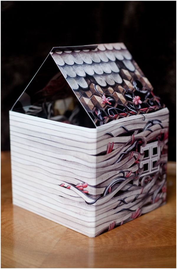
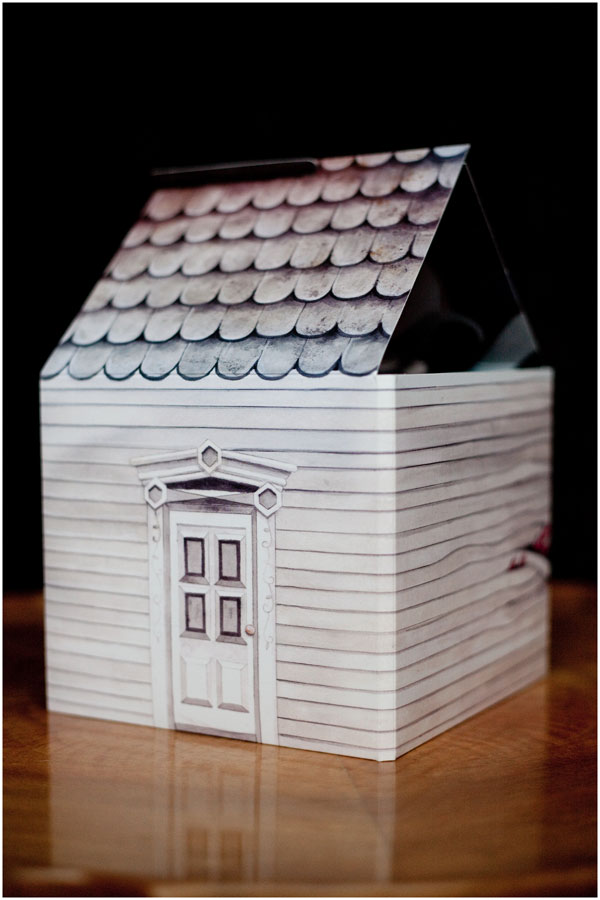
Assembled house: 5 in × 4.25 in × 8 in
Page Count
–
Paper Stock
Coated matte
Number of Colors
CMYK
Varnishes
–
Binding
–
Typography
Hand written type by Robyn Sereda
It is with packaging like this one that I remember why purchasing tangible music is an experience that downloading songs can never equal — no matter how snazzy the videos and graphics are.
?The primary challenge that we faced with this project was to create a unique experience for the consumer. One of the main goals for this project was to add continuous elements of surprise as the viewer opened the packaging — we wanted every fold and slide to reveal something new that the viewer would not expect. It is meant to be a progressive experience with an ultimate build-up. This idea was concocted after interpreting the music and conceptualizing how to represent it visually through concept, composition, color, pattern, etc.
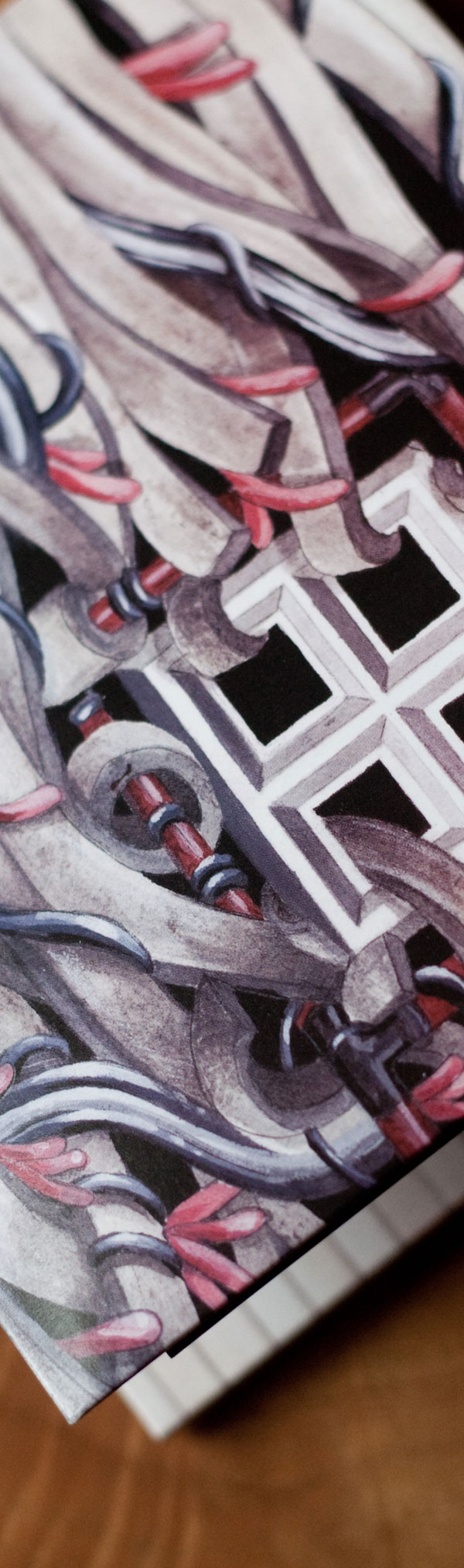
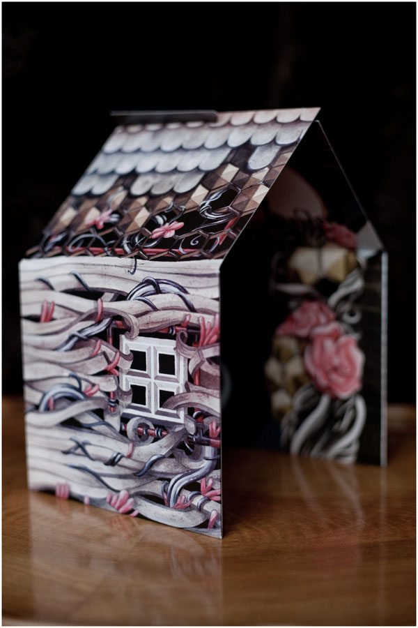
The inspiration that fueled this project was the music itself, and the visual aspect was determined by what emotions I felt listening to his music. Through the music we defined key words to focus on, such as: organic, metamorphosis, and harmony.
Jean-Paul de Roover wanted to reflect the title of the album Windows and Doors through the artwork, thus reflecting the idea that there are two paths you can take in life: the ideal and the realistic. Therefore, it was appropriate to present a dichotomy. Since one of our focus words was “metamorphosis,” we decided that a gradual change from one idea to the other would be interesting to depict visually.
All that is missing is a miniature Jean-Paul with which to play house while one is listening to his music.
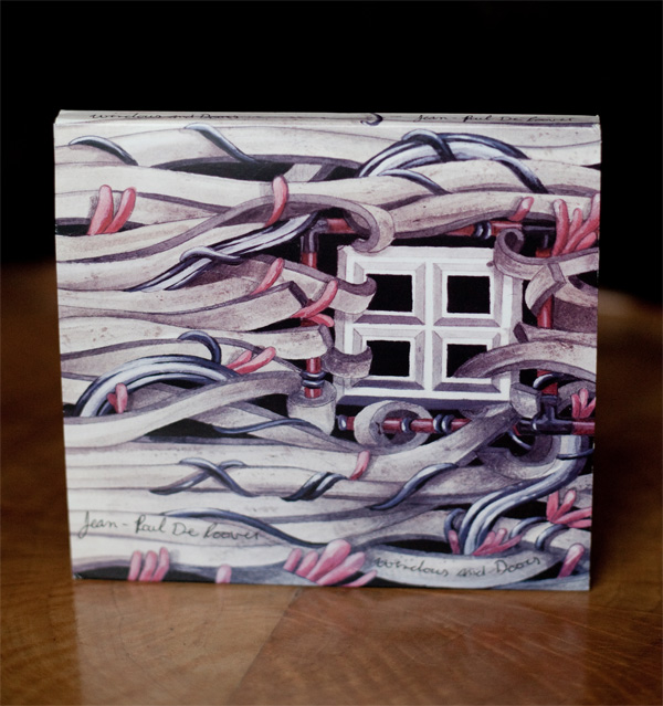

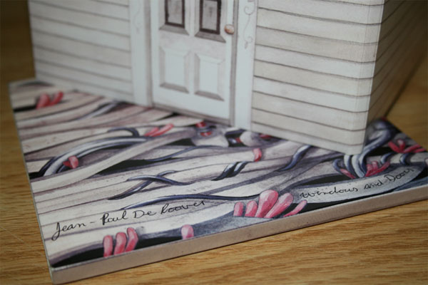
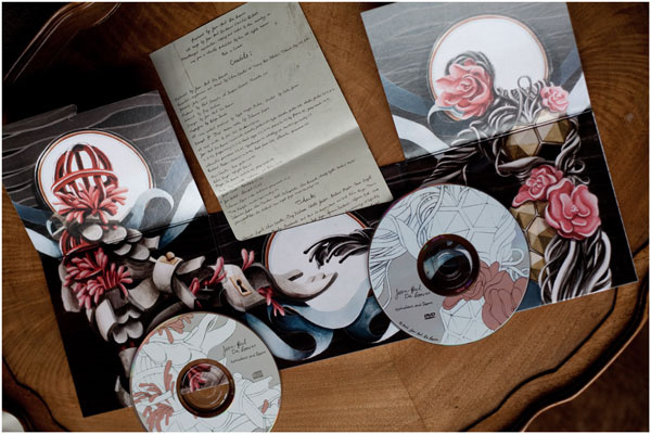
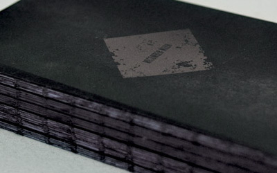
Jean-Paul De Roover CD/DVD Package
Production Method
Design
Art direction: Jean-Paul De Roover
Illustration and design: Greg Dubeau
Template: Polar Bear Productions
Printing
Polar Bear Productions
This post was published in the original layout of FPO so all images are smaller. Project descriptions as well as production lessons are quoted in the main content area.
Post Author
Bryony

Bryony Gomez-Palacio
Editor of FPO and co-founder of UnderConsideration LLC.
More: Online / On Twitter
Date Published
March 2, 2010
Filed Under
DVD Packaging
Tagged with
3D
CMYK
coated
die-cut grooves
offset
package


About
FPO (For Print Only), is a division of UnderConsideration, celebrating the reality that print is not dead by showcasing the most compelling printed projects.
FPO uses Fonts.com to render Siseriff and Avenir Next.
FPO is run with Six Apart’s MovableType
All comments, ideas and thoughts on FPO are property of their authors; reproduction without the author’s or FPO’s permission is strictly prohibited
Twitter @ucllc
Sign-up for Mailing List
Mailing list managed by MailChimp
Thanks to our advertisers
About UnderConsideration
UnderConsideration is a graphic design firm generating its own projects, initiatives, and content while taking on limited client work. Run by Bryony Gomez-Palacio and Armin Vit in Bloomington, IN. More…
blogs we publish
Brand New / Displaying opinions and focusing solely on corporate and brand identity work.
Art of the Menu / Cataloguing the underrated creativity of menus from around the world.
Quipsologies / Chronicling the most curious, creative, and notable projects, stories, and events of the graphic design industry on a daily basis.
products we sell
Flaunt: Designing effective, compelling and memorable portfolios of creative work.
Brand New Conference videos / Individual, downloadable videos of every presentation since 2010.
Prints / A variety of posters, the majority from our AIforGA series.
Other / Various one-off products.
events we organize
Brand New Conference / A two-day event on corporate and brand identity with some of today's most active and influential practitioners from around the world.
Brand Nieuwe Conference / Ditto but in Amsterdam.
Austin Initiative for Graphic Awesomeness / A speaker series in Austin, TX, featuring some of the graphic design industry's most awesome people.
also
Favorite Things we've Made / In our capacity as graphic designers.
Projects we've Concluded / Long- and short-lived efforts.
UCllc News / Updates on what's going at the corporate level of UnderConsideration.

Related entries
Animated Self-Portraits DVD Packaging/Poster
BÖIKZMÖIND DVD Package and Photo Book
Cuarto Creciente DVD Packaging
Mi2 DVD