ADV @ UNDERCONSIDERATION Peek here for details
BROWSE
Dimensions (Width × Height × Depth)
9 in × 13 in
Page Count
52 + cover
Paper Stock
Cover: Domtar Cougar Smooth, 80 lb Cover
Neenah Translucent Clearfold, 48 lb
Body: Domtar Cougar Smooth, 80 lb Text
Number of Colors
CMYK + 1 Spot on the book
3 Spot on the traslucent cover
Varnishes
Aquous for fast drying
Binding
Saddle-stitched
Typography
Modern 20
Century Expanded
Knockout
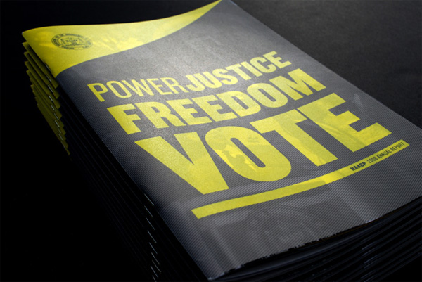
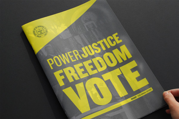
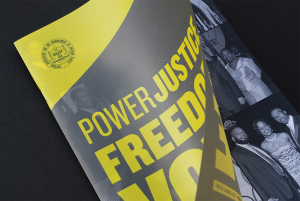
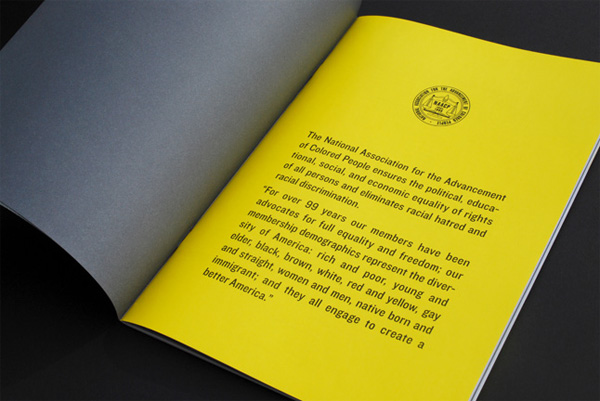
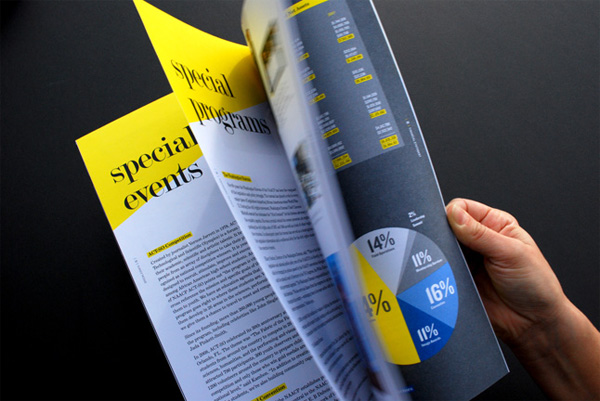
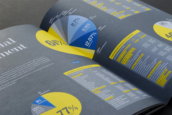
In this annual report for the National Association for the Advancement of Colored People (NAACP) — whose mission is “to ensure the political, educational, social, and economic equality of rights of all persons and to eliminate racial hatred and racial discrimination.” — the team at Hyperakt created a solid printed piece that looks like a million bucks but certainly didn’t cost that.
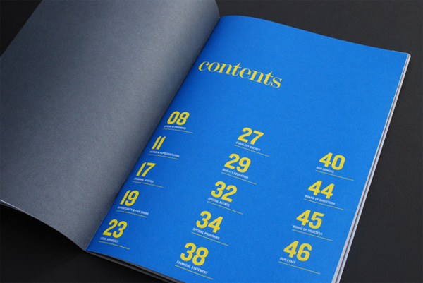
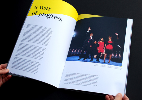
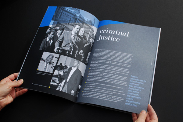
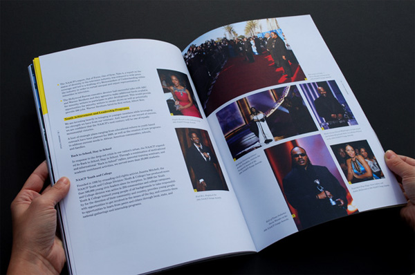
The cover comes with an additional translucent, well, cover that gives the report an immediate tactility and interactivity. And lest the idea seem simple, the production required a bit of keenness to make look so good, with a double hit of white prior to laying down the yellow ink to avoid an overly translucent effect. Inside, the report is strong typography and layout printed crisply in CMYK with the black and white images getting special treatment by being done as duo-tones (Process Black and Pantone Grey).
Overall, whether it’s the printing or the rallying cry on the cover, the report communicates “the potential of the vote,” as Hyperakt explains, “as both the ultimate expression and most fundamental engine of power, justice, and freedom.”

NAACP 2008 Annual Report
Production Method
Design
Hyperakt
Design: Jason Lynch
Art Direction: Julia Vakser, Deroy Peraza
Printing
Recycle Paper Printing
This post was published in the original layout of FPO so all images are smaller. Project descriptions as well as production lessons are quoted in the main content area.
Post Author
Armin

Armin Vit
Editor of FPO and co-founder of UnderConsideration LLC.
More: Online / On Twitter
Date Published
March 18, 2010
Filed Under
Annual Reports
Tagged with
annual report
CMYK
translucent


About
FPO (For Print Only), is a division of UnderConsideration, celebrating the reality that print is not dead by showcasing the most compelling printed projects.
FPO uses Fonts.com to render Siseriff and Avenir Next.
FPO is run with Six Apart’s MovableType
All comments, ideas and thoughts on FPO are property of their authors; reproduction without the author’s or FPO’s permission is strictly prohibited
Twitter @ucllc
Sign-up for Mailing List
Mailing list managed by MailChimp
Thanks to our advertisers
About UnderConsideration
UnderConsideration is a graphic design firm generating its own projects, initiatives, and content while taking on limited client work. Run by Bryony Gomez-Palacio and Armin Vit in Bloomington, IN. More…
blogs we publish
Brand New / Displaying opinions and focusing solely on corporate and brand identity work.
Art of the Menu / Cataloguing the underrated creativity of menus from around the world.
Quipsologies / Chronicling the most curious, creative, and notable projects, stories, and events of the graphic design industry on a daily basis.
products we sell
Flaunt: Designing effective, compelling and memorable portfolios of creative work.
Brand New Conference videos / Individual, downloadable videos of every presentation since 2010.
Prints / A variety of posters, the majority from our AIforGA series.
Other / Various one-off products.
events we organize
Brand New Conference / A two-day event on corporate and brand identity with some of today's most active and influential practitioners from around the world.
Brand Nieuwe Conference / Ditto but in Amsterdam.
Austin Initiative for Graphic Awesomeness / A speaker series in Austin, TX, featuring some of the graphic design industry's most awesome people.
also
Favorite Things we've Made / In our capacity as graphic designers.
Projects we've Concluded / Long- and short-lived efforts.
UCllc News / Updates on what's going at the corporate level of UnderConsideration.

Related entries
2016 RUFA Annual Report
True Grit: Concho 2016 Annual Report
National Arts Council Annual Report 2014
CREATIVE REGION Annual Report
Intertain Annual Report