ADV @ UNDERCONSIDERATION Peek here for details
BROWSE
Client
Northcoast Zeitgeist and Cranky Pressman
Quantity Produced
300 (50 with Northcoast Zeitgeist URL, 250 with the Cranky Pressman URL)
Production Cost
Approximately $800, including paper, the calendar pads and production time
Production Time
2 days
Dimensions (Width × Height × Depth)
5.56 in × 11 in
Page Count
–
Paper Stock
Cranky Pressman's Stocky Weights "Process Blanks", .056 board weight, 100% recycled
Number of Colors
3/1, Metallic silver, moss green and warm red
Varnishes
–
Binding
–
Typography
–
Developing cross-promotions between designers and printers is a great way to collaborate with people and obtain a quality piece at a reduced cost that both parties can benefit from. Joseph Hughes from Northcoast Zeitgeist met with Keith Berger from The Cranky Pressman via mutual friends and a new project was born:
I got in touch with Keith last fall and explained how I wanted to get closer to the craft of design and was interested in stopping down for a day or two to “get my hands dirty”. He graciously obliged and we got to work. The idea for the calendar came together pretty quickly, when Keith pointed out the shop’s impressive collection of type, old cuts and half-tones. I found one of a bruising, big-time wrestler pointing, I’m sure, at some barking, pip-squeak spectator and made him our 2010 mascot.
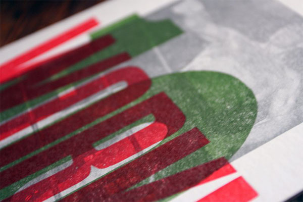
From there, we decided we’d proceed in a three-step process. The first “layer” would be our wrestler and the URLs of our respective outfits in metallic silver. The second layer featured a moss-green “10” set in large wood type, representing the year in which we all will all make our big comeback. The third layer called for the word “WORK!” — also set in wood type — and the great, little state seal, both printed in a warm red.
I learned quite a bit in these opening stages, especially how to assemble a tighter-than-a-fiddle-string lockup (still working on that one) and how to properly hand-set wood and metal type to hit exactly where you want it. We printed the calendars on the shop’s go-to behemoth, the Original Heidelberg automatic platen press, better known as the “The Windmill”. Seeing this baby in motion was a sight to behold, one part working closely with the next to ensure a smooth run. It was lovely, really.
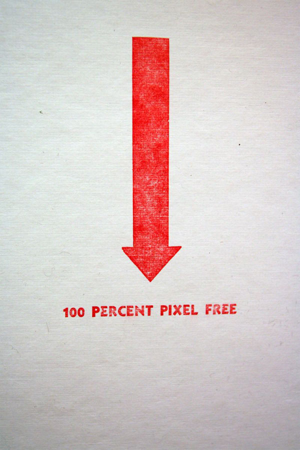
On the first day, we trimmed the stock to size, got the art together, and printed each of the three front layers in their entirety. On the second day, we drilled the hole for hanging and affixed the calendar pads, and printed the line 100 Percent Pixel Free, to testify to the certainty that no fancy computers were used during the design or production of this project.
Surely nothing bad with getting your hands dirty when a project with this depth, layering, and humor can be proudly displayed after a couple of days.
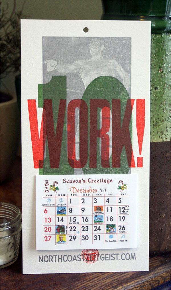

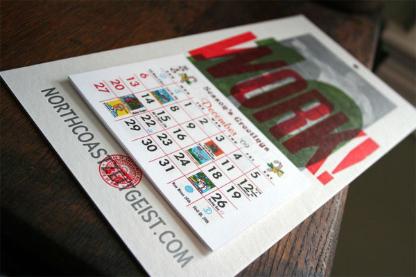
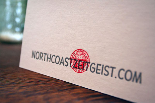
Northcoast Zeitgeist/Cranky Pressman 2010 Wall Calendar
Production Method
Design
Northcoast Zeitgeist: Joseph Hughes
Cranky Pressman: Keith Berger
Printing
Cranky Pressman: Keith Berger
This post was published in the original layout of FPO so all images are smaller. Project descriptions as well as production lessons are quoted in the main content area.
Post Author
Bryony

Bryony Gomez-Palacio
Editor of FPO and co-founder of UnderConsideration LLC.
More: Online / On Twitter
Date Published
March 4, 2010
Filed Under
Self promotion
Tagged with
calendar
learning experience
letterpress
metallic ink
overlay
self-promotion


About
FPO (For Print Only), is a division of UnderConsideration, celebrating the reality that print is not dead by showcasing the most compelling printed projects.
FPO uses Fonts.com to render Siseriff and Avenir Next.
FPO is run with Six Apart’s MovableType
All comments, ideas and thoughts on FPO are property of their authors; reproduction without the author’s or FPO’s permission is strictly prohibited
Twitter @ucllc
Sign-up for Mailing List
Mailing list managed by MailChimp
Thanks to our advertisers
About UnderConsideration
UnderConsideration is a graphic design firm generating its own projects, initiatives, and content while taking on limited client work. Run by Bryony Gomez-Palacio and Armin Vit in Bloomington, IN. More…
blogs we publish
Brand New / Displaying opinions and focusing solely on corporate and brand identity work.
Art of the Menu / Cataloguing the underrated creativity of menus from around the world.
Quipsologies / Chronicling the most curious, creative, and notable projects, stories, and events of the graphic design industry on a daily basis.
products we sell
Flaunt: Designing effective, compelling and memorable portfolios of creative work.
Brand New Conference videos / Individual, downloadable videos of every presentation since 2010.
Prints / A variety of posters, the majority from our AIforGA series.
Other / Various one-off products.
events we organize
Brand New Conference / A two-day event on corporate and brand identity with some of today's most active and influential practitioners from around the world.
Brand Nieuwe Conference / Ditto but in Amsterdam.
Austin Initiative for Graphic Awesomeness / A speaker series in Austin, TX, featuring some of the graphic design industry's most awesome people.
also
Favorite Things we've Made / In our capacity as graphic designers.
Projects we've Concluded / Long- and short-lived efforts.
UCllc News / Updates on what's going at the corporate level of UnderConsideration.

Related entries
E.A.S.E. Stationery Set
End of Work iPad and Notebook Cases
Cranky Bucks Promotion
Pizza Box Promo Mailer
Bryan Patrick Todd Mailer