ADV @ UNDERCONSIDERATION Peek here for details
BROWSE
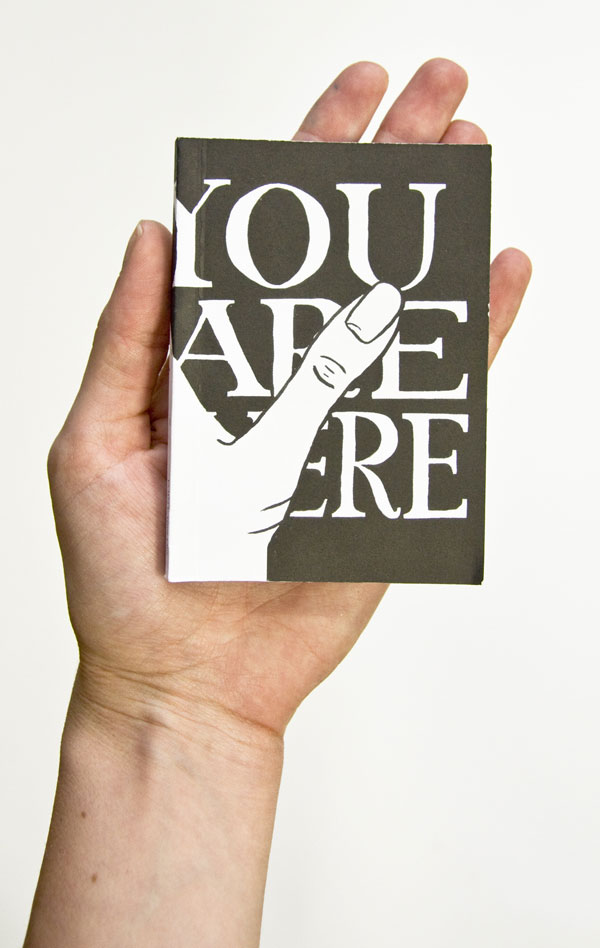
Dimensions (Width × Height × Depth)
74 mm × 105 mm (2.91 in × 4.13 in)
Page Count
120
Paper Stock
Pacesetter Uncoated
Number of Colors
1 spot ink, black
When you have been working with a client for more than ten years, a few things can happen. You develop a sort of formula that makes all the projects work, or the work gets stale without anyone realizing this is happening, or you manage to keep it fresh year after year. This final option seems to be the outcome of the work Boccalatte put forth for Performance Space this year.
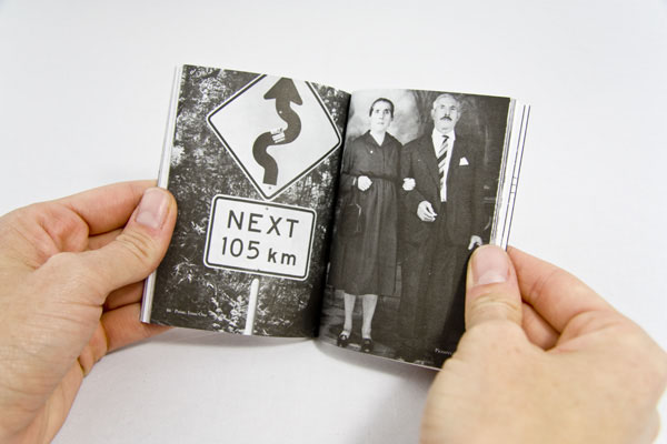
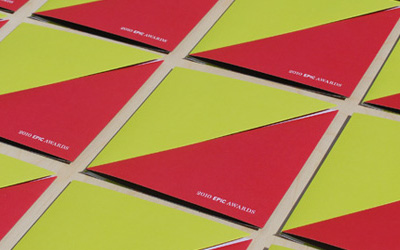
Our aim was to produce a program guide for Performance Space that would seduce people to pick up, take home, read and carry around. Rather than it being just a flyer/program, we suggested that it become a zine, a place where audience can speak back to Performance Space by submitting their writing and artwork to a blog we created. The idea was to involve/interact the audience not only with the end product, but also in the process of design. The A7 size saved the client money and really cut-through marketing clutter and has become a collectable. The use of a single ink was due to a limited budget, but also tied in with the ideals of Performance Space which are being lo-fi and experimental.
Of course, few projects come without challenges:
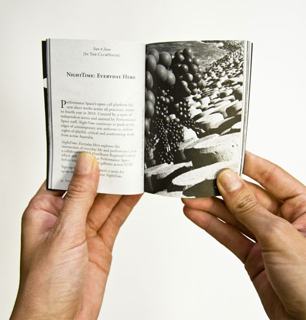
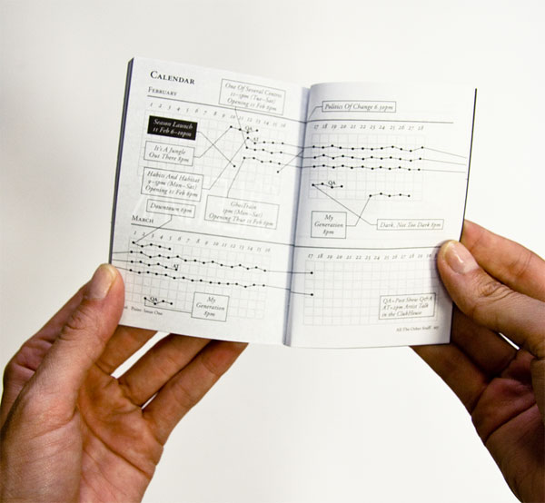
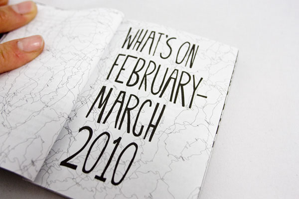
The main challenge was dealing with how type/information, would fit on small sized pages. It was important to limit word count and also deal with how information graphics would be designed to save space (see calendar image).

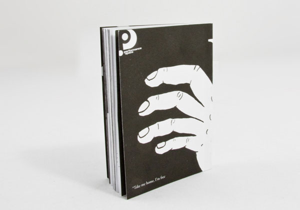
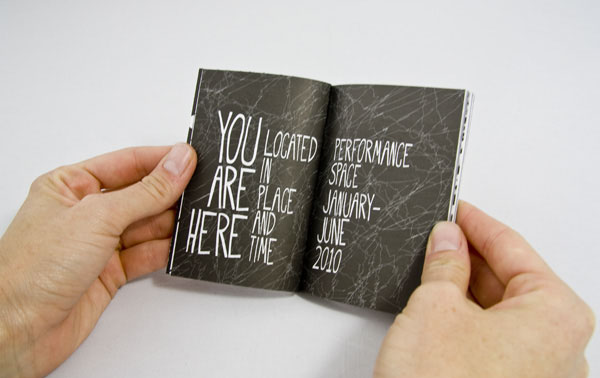

Performance Space Season Brochure
Production Method
Design
Boccalatte:
Arti direction: Suzanne Boccalatte
Design: Alexandra De Bonis
Cover design: Agatha Gothe-Snape
Printing
Southern Colour
This post was published in the original layout of FPO so all images are smaller. Project descriptions as well as production lessons are quoted in the main content area.
Post Author
Bryony

Bryony Gomez-Palacio
Editor of FPO and co-founder of UnderConsideration LLC.
More: Online / On Twitter
Date Published
March 29, 2010
Filed Under
Brochures
Tagged with
black
brochure
burst binding
one ink
pacesetter
uncoated


About
FPO (For Print Only), is a division of UnderConsideration, celebrating the reality that print is not dead by showcasing the most compelling printed projects.
FPO uses Fonts.com to render Siseriff and Avenir Next.
FPO is run with Six Apart’s MovableType
All comments, ideas and thoughts on FPO are property of their authors; reproduction without the author’s or FPO’s permission is strictly prohibited
Twitter @ucllc
Sign-up for Mailing List
Mailing list managed by MailChimp
Thanks to our advertisers
About UnderConsideration
UnderConsideration is a graphic design firm generating its own projects, initiatives, and content while taking on limited client work. Run by Bryony Gomez-Palacio and Armin Vit in Bloomington, IN. More…
blogs we publish
Brand New / Displaying opinions and focusing solely on corporate and brand identity work.
Art of the Menu / Cataloguing the underrated creativity of menus from around the world.
Quipsologies / Chronicling the most curious, creative, and notable projects, stories, and events of the graphic design industry on a daily basis.
products we sell
Flaunt: Designing effective, compelling and memorable portfolios of creative work.
Brand New Conference videos / Individual, downloadable videos of every presentation since 2010.
Prints / A variety of posters, the majority from our AIforGA series.
Other / Various one-off products.
events we organize
Brand New Conference / A two-day event on corporate and brand identity with some of today's most active and influential practitioners from around the world.
Brand Nieuwe Conference / Ditto but in Amsterdam.
Austin Initiative for Graphic Awesomeness / A speaker series in Austin, TX, featuring some of the graphic design industry's most awesome people.
also
Favorite Things we've Made / In our capacity as graphic designers.
Projects we've Concluded / Long- and short-lived efforts.
UCllc News / Updates on what's going at the corporate level of UnderConsideration.

Related entries
Carta de Exploración Brochure
Paperless Post Wedding 2017 Promotion
Karipidis Winery Brochure
Neenah “Fresh Takes on Classic Type on CLASSIC® Papers” Promo
Faculty of Architecture, Art & Design Brochure