ADV @ UNDERCONSIDERATION Peek here for details
BROWSE
Dimensions (Width × Height × Depth)
18 in × 24 in
Page Count
–
Paper Stock
French PaperConstruction 100#C Recycled White
Number of Colors
3 (custom blended) spot inks
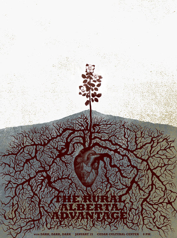
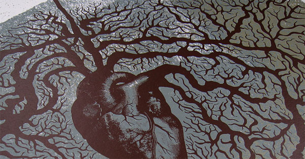
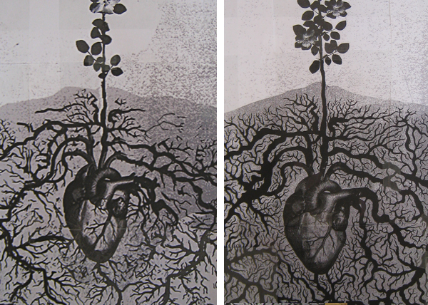
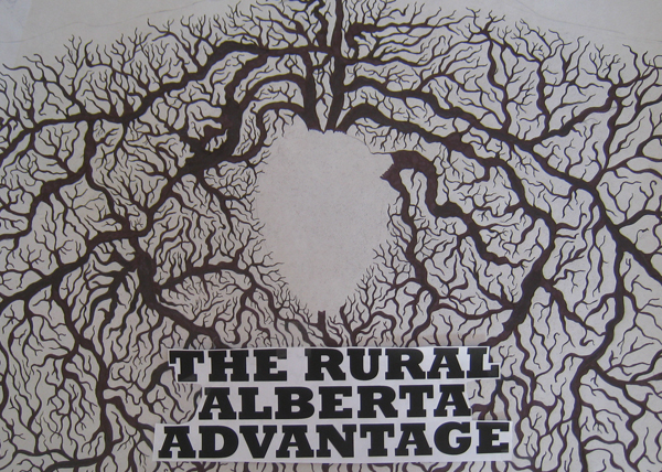
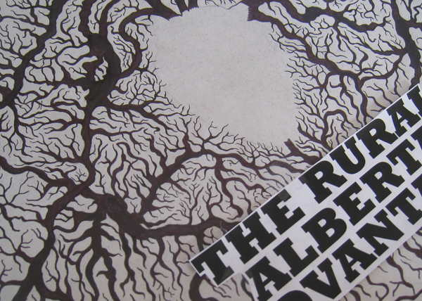
To promote a show by Canadian indie band The Rural Alberta Advantage at the Cedar Cultural Center in Minneapolis, local designer Brian Danaher went to the roots, literally and metaphorically, of the band and its debut album to create an intricate and saturated poster.
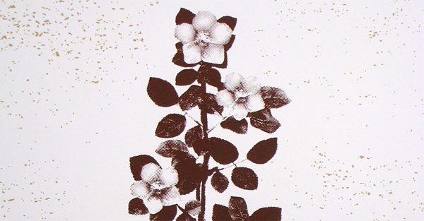
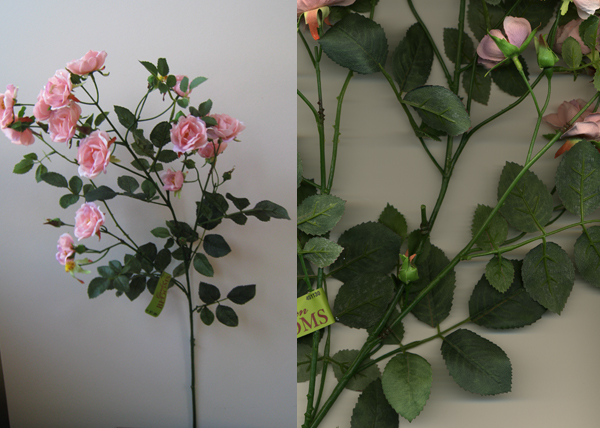
This poster was inspired by the band’s personal connection with Alberta as well as the content of the lyrics from songs their debut album “Hometowns” (many of which use the word “heart” as a metaphor). The flower depicted is the wild rose, the official flower of the Province of Alberta. I couldn’t get an actual wild rose (they are not available in Dec.) so I bought a similar looking silk rose flower at a local craft store and used photos, scans and photoshop to create one for the poster.
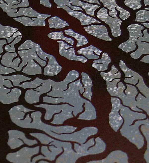
Silkscreened in three earthy tones, the poster reveals the hand-crafted approach that Brian took in creating this poster — part of this process can be seen in the images below.
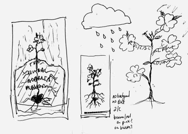
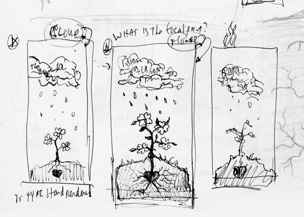
I built a rough composition for the roots/veins from scanned sketches and then piecing them together in Photoshop. When I got it to be roughly how I wanted it, I printed it out at full size (tiling on letter size paper) and used it as a template for the final rendering. I used the rough version created in Photoshop as a guide but after getting the basic shape of the root structure roughed in, I just freehanded the rest. It was drawn with ink pen and sharpie on translucent rag paper. I also set the type, printed it, cut it out and placed it where I wanted it within the roots drawing. Then I redrew parts of the roots around the type so it they both fit together seamlessly, scanned it and matched it up in Photoshop.
A hand drawn rose didn’t fit the design very well, so I had to create a more photorealistic one. I used scans and photos of a similar plant (a silk rose purchased from a local craft store) and pieced it together in Photoshop to create the final image. The left shot is a photo I took with my digital camera. The right photo is a scan. The rose bloom itself was created inPhotoshop.using flower textures.
Brian also offers some advice when doing overprinting and you are not able to attend the press check.
Since I couldn’t be a the press check (the printer is in a different state), I tried to be as specific as possible to keep surprises to a minimum. All three colors were custom mixed inks and I made sure to give the printer PMS #s and talk them through what I was hoping to achieve. In the end I was happy with the result, but the overprinting of the 3rd color (tan) came out more transparent than I was expecting. I knew that there would be some blending with the color below it but I thought it would have been more opaque. I talked to the printer afterward and he suggested in the future to request ink samples to see how the inks interact, especially when overprinting is involved. That way you can make adjustments before you get on press.


This post was published in the original layout of FPO so all images are smaller. Project descriptions as well as production lessons are quoted in the main content area.
Post Author
Bryony

Bryony Gomez-Palacio
Editor of FPO and co-founder of UnderConsideration LLC.
More: Online / On Twitter
Date Published
March 12, 2010
Filed Under
Posters
Tagged with
custom blended inks
french paper
poster
rockwell
silkscreen
uncoated


About
FPO (For Print Only), is a division of UnderConsideration, celebrating the reality that print is not dead by showcasing the most compelling printed projects.
FPO uses Fonts.com to render Siseriff and Avenir Next.
FPO is run with Six Apart’s MovableType
All comments, ideas and thoughts on FPO are property of their authors; reproduction without the author’s or FPO’s permission is strictly prohibited
Twitter @ucllc
Sign-up for Mailing List
Mailing list managed by MailChimp
Thanks to our advertisers
About UnderConsideration
UnderConsideration is a graphic design firm generating its own projects, initiatives, and content while taking on limited client work. Run by Bryony Gomez-Palacio and Armin Vit in Bloomington, IN. More…
blogs we publish
Brand New / Displaying opinions and focusing solely on corporate and brand identity work.
Art of the Menu / Cataloguing the underrated creativity of menus from around the world.
Quipsologies / Chronicling the most curious, creative, and notable projects, stories, and events of the graphic design industry on a daily basis.
products we sell
Flaunt: Designing effective, compelling and memorable portfolios of creative work.
Brand New Conference videos / Individual, downloadable videos of every presentation since 2010.
Prints / A variety of posters, the majority from our AIforGA series.
Other / Various one-off products.
events we organize
Brand New Conference / A two-day event on corporate and brand identity with some of today's most active and influential practitioners from around the world.
Brand Nieuwe Conference / Ditto but in Amsterdam.
Austin Initiative for Graphic Awesomeness / A speaker series in Austin, TX, featuring some of the graphic design industry's most awesome people.
also
Favorite Things we've Made / In our capacity as graphic designers.
Projects we've Concluded / Long- and short-lived efforts.
UCllc News / Updates on what's going at the corporate level of UnderConsideration.

Related entries
36 Days of Type Poster
Ministry of Environment in Colombia Poster
National Parks Map
eBoy Poster
“Love Your Mother” Print