ADV @ UNDERCONSIDERATION Peek here for details
BROWSE
Client
Kissimmee Utility Authority
Quantity Produced
2,000
Production Cost
–
Production Time
1 month
Dimensions (Width × Height × Depth)
12 in × 8 in × 0.25 in
Page Count
46 + cover
Paper Stock
Sappi 80lb. Cover & 100lb. Cover
Number of Colors
CMYK + 1 spot ink
Varnishes
Dull Aqueous
Spot Gloss UV on every page
Binding
Perfect binding
Typography
Helvetica Neue (LinoType)
Fette Egyptienne (Dieter Steffmann)
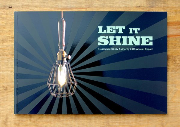
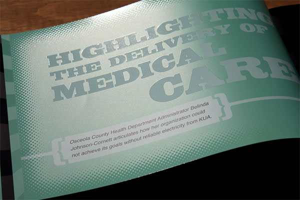
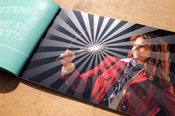
Kissimmee Utility Authority (KUA) a community owned utility—where all of its customers actually own the utility—publishes a traditional annual report each year. With a very different visual approach from last year’s annual, Primal Creative focused on telling the stories within the community.
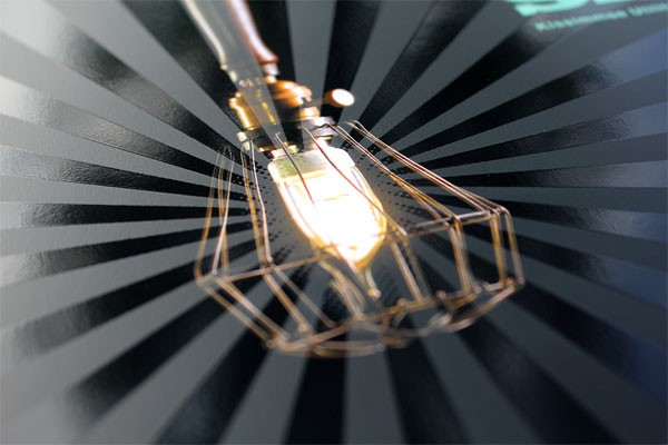
Since they are community owned all profits go back into the community in one way or another. The theme of “Let It Shine” was a great way to connect all of these stories of how KUA has benefited the community in the recent past. I knew from the beginning we were going to use spot UV. I’ve used spot UV in the past, but usually as minor accents—but this time we were going to “blow it up” with spot UV. We actually started back in January experimenting with using spot UV on some different sheets. Our first preference was actually to use French, Butcher paper, we looked around for samples (even asking French Paper), but no luck. So we did our own tests. We had the printer run tests on several weights and colors and in the end it had the perfect modeled affect that we expected. There were certain UV’s that worked better than others and it was great to go through that process before we even shot photos. The cost for the paper was obviously a bit more then a traditional coated sheet, but both the client and I thought it was worth the extra expense.
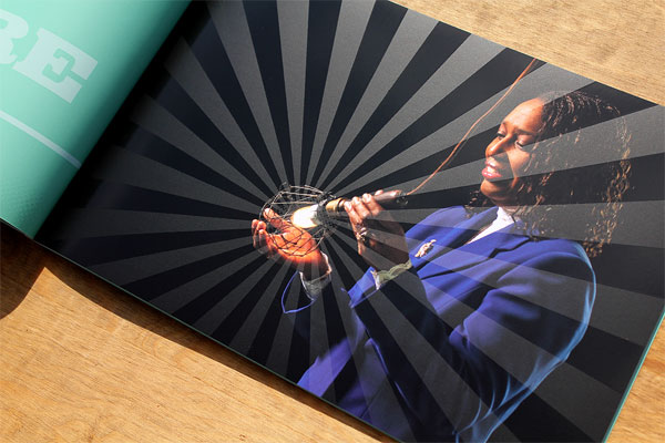
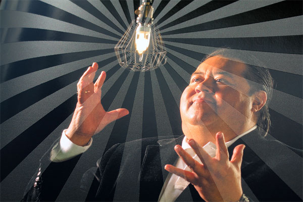
We shot the photos in a store room at the utility knowing we wanted rich blacks to help define the “light” that we were using to represent how KUA was helping all these individuals and community organizations shine. After the photography process was complete and the copy was written we finalized the layout and financials for the report. About two weeks before going to print we were informed by French Paper that they production issues with the particular paper we wanted to use. We decided to wait for it—but two week later, French Paper told us they were still having production issues and we should look at an alternative sheet. We were disappointed to say the least, but I have to give French Paper the proper recognition for doing the right thing. They knew we were under a deadline and instead of making false promises over and over they told us the truth. Being so late in the game we had to switch to a standard coated sheet (which honestly was always a backup if the Butcher Paper wasn’t going to work). We printed a standard 4 color process with a 5th color for the “minty green” and then coated the sheet with a dull aqueous.
Once the sheets were completed on the press they were sent out to be covered with UV. We utilized UV like crazy—every page has it on there somewhere. The reason for the UV was to emphasize the idea of “light”. The contrast between the dull aqueous and the gloss UV plays with the light and changes like crazy. It’s just amazing how with the tilt of a page it changes the look completely. In the end it’s rare for a piece to turn out as amazing as you expect—I mean usually there is something that you would change, but on this piece it met all of our expectations.
It is refreshing to see a spot varnish used to add a second dimension to an image, beyond highlighting a detail with it.


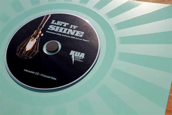
Kissimmee Utility Authority Annual Report 2010
Production Method
Design
Primal Creative
Design and Art Direction: Chris Jones
Photography: Ed McDonald
Copywriting: Chris Gent and Tina Haisman
Printing
Fidelity Press
This post was published in the original layout of FPO so all images are smaller. Project descriptions as well as production lessons are quoted in the main content area.
Post Author
Bryony

Bryony Gomez-Palacio
Editor of FPO and co-founder of UnderConsideration LLC.
More: Online / On Twitter
Date Published
August 4, 2010
Filed Under
Annual Reports
Tagged with
annual report
cd
dull aqueous
offset
sappi
spot gloss uv varnish
varnish


About
FPO (For Print Only), is a division of UnderConsideration, celebrating the reality that print is not dead by showcasing the most compelling printed projects.
FPO uses Fonts.com to render Siseriff and Avenir Next.
FPO is run with Six Apart’s MovableType
All comments, ideas and thoughts on FPO are property of their authors; reproduction without the author’s or FPO’s permission is strictly prohibited
Twitter @ucllc
Sign-up for Mailing List
Mailing list managed by MailChimp
Thanks to our advertisers
About UnderConsideration
UnderConsideration is a graphic design firm generating its own projects, initiatives, and content while taking on limited client work. Run by Bryony Gomez-Palacio and Armin Vit in Bloomington, IN. More…
blogs we publish
Brand New / Displaying opinions and focusing solely on corporate and brand identity work.
Art of the Menu / Cataloguing the underrated creativity of menus from around the world.
Quipsologies / Chronicling the most curious, creative, and notable projects, stories, and events of the graphic design industry on a daily basis.
products we sell
Flaunt: Designing effective, compelling and memorable portfolios of creative work.
Brand New Conference videos / Individual, downloadable videos of every presentation since 2010.
Prints / A variety of posters, the majority from our AIforGA series.
Other / Various one-off products.
events we organize
Brand New Conference / A two-day event on corporate and brand identity with some of today's most active and influential practitioners from around the world.
Brand Nieuwe Conference / Ditto but in Amsterdam.
Austin Initiative for Graphic Awesomeness / A speaker series in Austin, TX, featuring some of the graphic design industry's most awesome people.
also
Favorite Things we've Made / In our capacity as graphic designers.
Projects we've Concluded / Long- and short-lived efforts.
UCllc News / Updates on what's going at the corporate level of UnderConsideration.

Related entries
2016 RUFA Annual Report
True Grit: Concho 2016 Annual Report
National Arts Council Annual Report 2014
CREATIVE REGION Annual Report
Intertain Annual Report