ADV @ UNDERCONSIDERATION Peek here for details
BROWSE
Client
Messy Design
Quantity Produced
500
Production Cost
AUS$2,000.00 + ($1,826 +)
Production Time
2 weeks
Dimensions (Width × Height × Depth)
Flat: 297 mm × 420 mm (11.69 in × 16.53 in)
Folded: 210 mm × 148.5 mm (8.26 in × 5.84 in)
Page Count
–
Paper Stock
Uncoated Sovereign Offset, 160 gsm
Number of Colors
CMYK
Varnishes
–
Binding
–
Typography
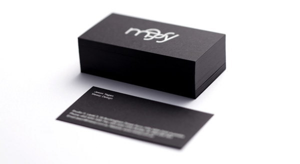
Chalet (House Industries)
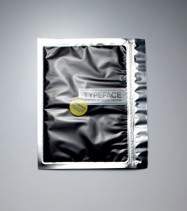
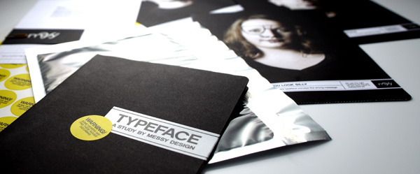
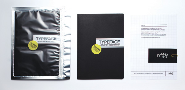
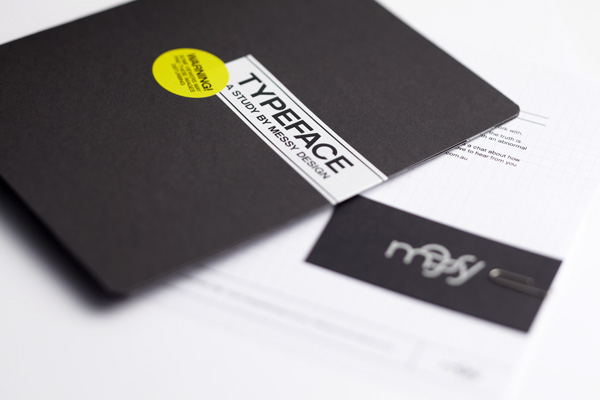
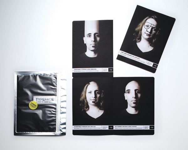
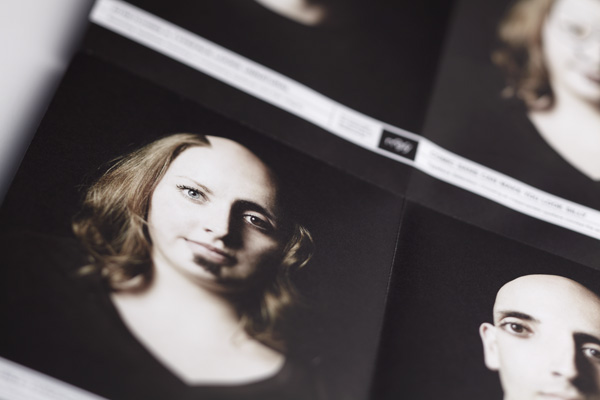
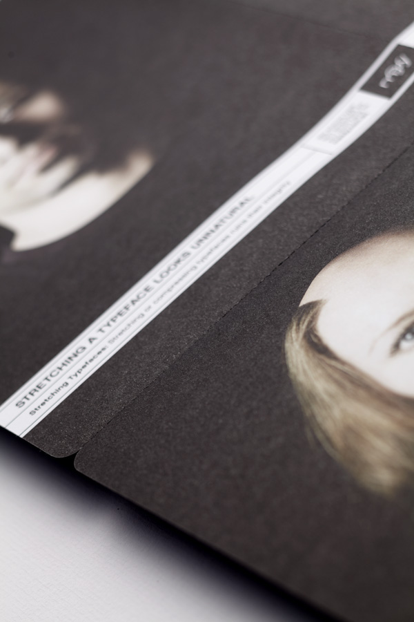
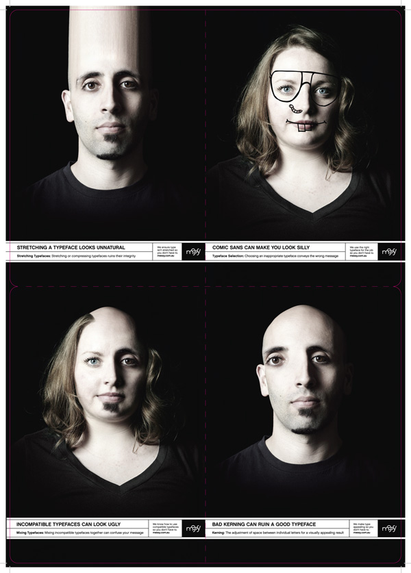
Messy Design produced a self-promotional piece with the goal of raising awareness about the importance of good typography, by means of a sealed booklet which folds out to reveal four altered images of (their own) faces, that demonstrate basic typography rules in a humorous and engaging way.
You wouldn’t do it to your face, so why would you do it to a typeface?
So how does one end up with a concept that may scare or attract clients, and the courage to go ahead with it?
Our goal was to create a self-promo piece that was clever and intriguing but also showed that we don’t take ourselves too seriously. We settled on the topic of typography as it is one aspect of design that clients are becoming less aware of with the advent of digital media.
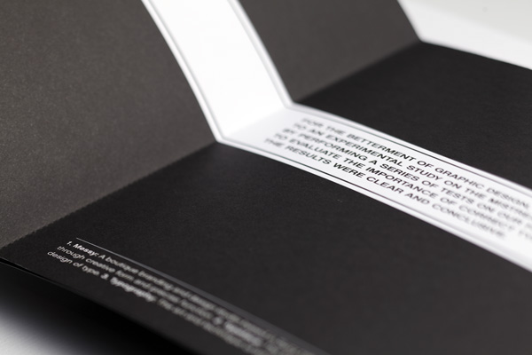
The design tells the story of an experiment on our (type) faces, hence the clinical design, zip sealed bag and warning sticker. We wanted people to be able to view the images as separate cards, to keep and re-visit for future reference.
Throughout the process we were constantly questioning if people would understand the concept. We knew that, to designers, the piece would make perfect sense, but would potential clients find it engaging enough and take the time to digest the information? From a functional standpoint, would people know to rip the sticker seal rather than tear the perforations and ruin the reveal? Would people be scared off by the warning labels or would it entice them to open the package?
At a quick glance, I can take and educated guess and see that the production of this piece needed some planning, perhaps some testing, and a good printer.
Our printers had a tough time executing our knifeline — the perforation, heavy black ink and the rounded corners made it difficult to fold flat and evenly. We wanted the perforation to be subtle enough that it didn’t fray and detract from the heavy black ink on the page so we tested applying the perf through both sides and decided on the option that produced the least frayed edges when folded. The printer did a great job of applying the knife accurately (to the millimeter) and in the end we were really pleased with the result.
The only other slight challenge we faced was the drying time on the business cards. The heavy application of the metallic pms smudges very easily and took over a week to dry properly.

Messy Design Self-Promo
Production Method
Design
Messy Design
Creative Direction: Jason Yagan
Design: Corrie Anderson
Printing
–
This post was published in the original layout of FPO so all images are smaller. Project descriptions as well as production lessons are quoted in the main content area.
Post Author
Bryony

Bryony Gomez-Palacio
Editor of FPO and co-founder of UnderConsideration LLC.
More: Online / On Twitter
Date Published
August 18, 2010
Filed Under
Promotional Cards
Tagged with
CMYK
double hit
offset
perforation
reflective ziplock
rounded corners
self-promotion
sovereign
sticker
uncoated


About
FPO (For Print Only), is a division of UnderConsideration, celebrating the reality that print is not dead by showcasing the most compelling printed projects.
FPO uses Fonts.com to render Siseriff and Avenir Next.
FPO is run with Six Apart’s MovableType
All comments, ideas and thoughts on FPO are property of their authors; reproduction without the author’s or FPO’s permission is strictly prohibited
Twitter @ucllc
Sign-up for Mailing List
Mailing list managed by MailChimp
Thanks to our advertisers
About UnderConsideration
UnderConsideration is a graphic design firm generating its own projects, initiatives, and content while taking on limited client work. Run by Bryony Gomez-Palacio and Armin Vit in Bloomington, IN. More…
blogs we publish
Brand New / Displaying opinions and focusing solely on corporate and brand identity work.
Art of the Menu / Cataloguing the underrated creativity of menus from around the world.
Quipsologies / Chronicling the most curious, creative, and notable projects, stories, and events of the graphic design industry on a daily basis.
products we sell
Flaunt: Designing effective, compelling and memorable portfolios of creative work.
Brand New Conference videos / Individual, downloadable videos of every presentation since 2010.
Prints / A variety of posters, the majority from our AIforGA series.
Other / Various one-off products.
events we organize
Brand New Conference / A two-day event on corporate and brand identity with some of today's most active and influential practitioners from around the world.
Brand Nieuwe Conference / Ditto but in Amsterdam.
Austin Initiative for Graphic Awesomeness / A speaker series in Austin, TX, featuring some of the graphic design industry's most awesome people.
also
Favorite Things we've Made / In our capacity as graphic designers.
Projects we've Concluded / Long- and short-lived efforts.
UCllc News / Updates on what's going at the corporate level of UnderConsideration.

Related entries
“Miniature Views” Promotion
Suspicion
Gap Semester Adventure Quest Folder
MONSTERBOX 150 Illustrated Monster Cards
I AM STERN Laser cut folding banner for NYU