ADV @ UNDERCONSIDERATION Peek here for details
BROWSE
Client
Table Nº1, Shanghai
Quantity Produced
Folders: 200
Business Cards: 1,000 of 5
Menu Sheets: 5,000
Production Cost
–
Production Time
3 Weeks
Dimensions (Width × Height × Depth)
Business Cards Flat: 120mm × 45mm (4.7 in × 1.7 in)
Business Cards Folded: 80mm × 45mm × 20mm (3.1 in × 1.7 in × 0.78 in)
Menu: 245mm × 325mm (9.6 in × 12.8 in)
Page Count
–
Paper Stock
Brown Kraft paper, 337 gsm
Newsprint paper
Number of Colors
1 (black)
Varnishes
–
Binding
–
Typography
Aachen
Trade Gothic Bold Condensed No.20
What sounds more inviting than tapas-style modern European cuisine served in long, rustic communal tables in Shanghai? Not much, really. Especially with an identity as simple and delicious as the one that Foreign Policy Design Group did for Table Nº1. Using only black, the designers have achieved a wonderful texture in an array of materials printed on kraft paper and newsprint through offset printing and a handy rubber stamp. The design team also explored new production techniques, like Paper Clip Distressing.
We kept the design fairly simple using just one color printing to keep the cost down. With cost in mind, we also used the same Kraft paper for the cards and the menu folder. Newsprint was used for menu sheets & the leftovers were made into booklets of order sheets, so nothing went to waste.
We also picked up some chemistry tips on distressing the metal clips along the way. By submerging in water with some salt and then leaving it to dry, after which the ferrous residue formed to be wiped across the clip; step and repeat several times to achieve that desired look. We had to make several trials and experiments before getting to where we wanted, basically our studio looked a little like a chemistry lab during those 2 weeks. Later on, we also learned that we should be spraying a clear protective coating to prevent farther corrosion, as we want to maintain that look for a more permanent period. So much for chemistry experiments.
But perhaps the most challenging experimentation came in the preparation of the files for the client using, gasp, Microsoft Word.
Designing on Microsoft Word is a big lesson to be learned by any designer! Yes, for that flexibility of the restaurant staff to update their own menu, this has to be set in a MS Word template with proper guidelines and instructions for them. The client has to also purchase the PC version of the typeface used in order to deploy this in a proper and accurate manner. I think because the layout and design was kept fairly simple, it has been really quite successful for them, and for us.
And just how cute is that business card table?!
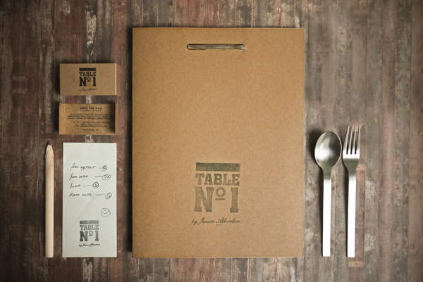

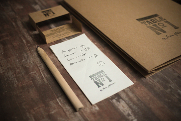
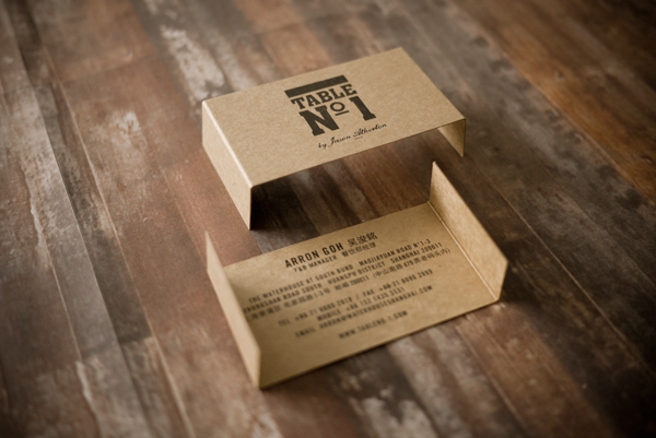
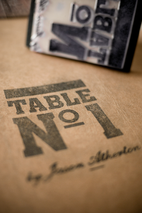
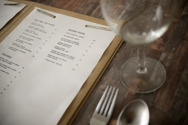
Table Nº1 Identity Materials
Production Method
Design
Foreign Policy Design Group
Creative Directors: Yah-Leng Yu & Arthur Chin
Art Director: Yah-Leng Yu
Designer: Tianyu Isaiah Zheng
Printing
pH Production
This post was published in the original layout of FPO so all images are smaller. Project descriptions as well as production lessons are quoted in the main content area.
Post Author
Armin

Armin Vit
Editor of FPO and co-founder of UnderConsideration LLC.
More: Online / On Twitter
Date Published
August 12, 2010
Filed Under
Identity Materials
Tagged with
kraft paper
newsprint
rubber stamp


About
FPO (For Print Only), is a division of UnderConsideration, celebrating the reality that print is not dead by showcasing the most compelling printed projects.
FPO uses Fonts.com to render Siseriff and Avenir Next.
FPO is run with Six Apart’s MovableType
All comments, ideas and thoughts on FPO are property of their authors; reproduction without the author’s or FPO’s permission is strictly prohibited
Twitter @ucllc
Sign-up for Mailing List
Mailing list managed by MailChimp
Thanks to our advertisers
About UnderConsideration
UnderConsideration is a graphic design firm generating its own projects, initiatives, and content while taking on limited client work. Run by Bryony Gomez-Palacio and Armin Vit in Bloomington, IN. More…
blogs we publish
Brand New / Displaying opinions and focusing solely on corporate and brand identity work.
Art of the Menu / Cataloguing the underrated creativity of menus from around the world.
Quipsologies / Chronicling the most curious, creative, and notable projects, stories, and events of the graphic design industry on a daily basis.
products we sell
Flaunt: Designing effective, compelling and memorable portfolios of creative work.
Brand New Conference videos / Individual, downloadable videos of every presentation since 2010.
Prints / A variety of posters, the majority from our AIforGA series.
Other / Various one-off products.
events we organize
Brand New Conference / A two-day event on corporate and brand identity with some of today's most active and influential practitioners from around the world.
Brand Nieuwe Conference / Ditto but in Amsterdam.
Austin Initiative for Graphic Awesomeness / A speaker series in Austin, TX, featuring some of the graphic design industry's most awesome people.
also
Favorite Things we've Made / In our capacity as graphic designers.
Projects we've Concluded / Long- and short-lived efforts.
UCllc News / Updates on what's going at the corporate level of UnderConsideration.

Related entries
Andy Stewart Design Identity Materials
Carolina Manresa Identity Materials
Bocanegra Studio Identity Materials
2016 Brand New Conference Badges
Molly Taylor & Co. Identity Materials