ADV @ UNDERCONSIDERATION Peek here for details
BROWSE
Dimensions (Width × Height × Depth)
21 in × 27 in
Page Count
–
Paper Stock
Rives BFK Printmaking Paper 280g 22 × 30-inch sheet Cream
Number of Colors
2 spot inks
Varnishes
–
Binding
–
Typography
–
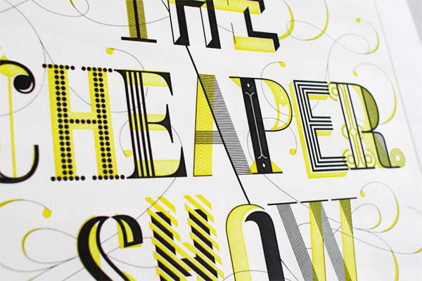
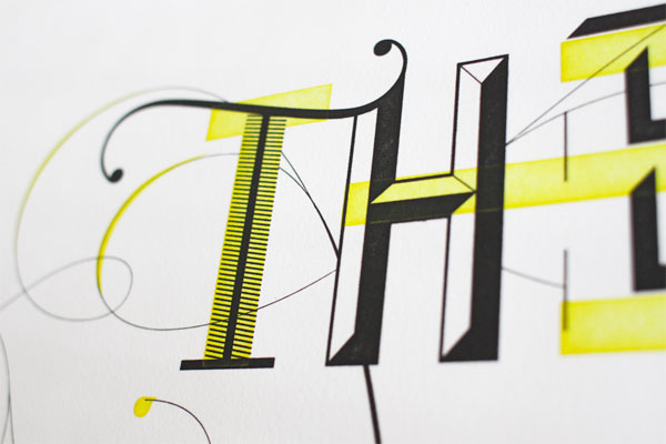
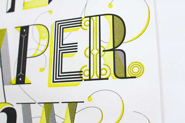
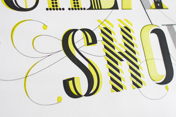
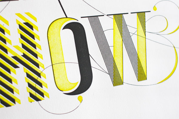
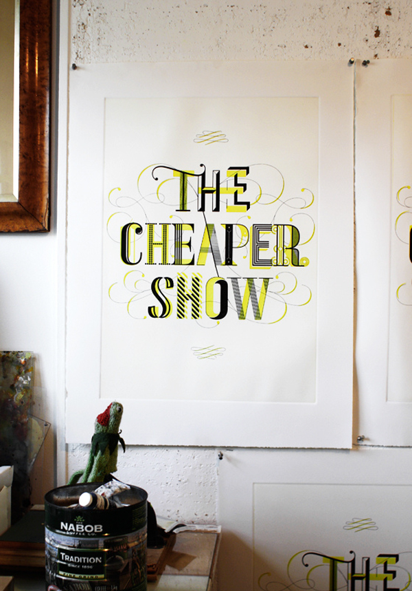
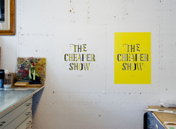
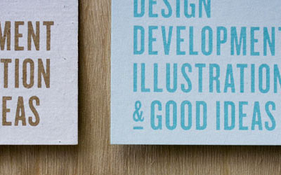
Small print runs are precious. And, this particular print, with its bold typography and energetic color palette feels anything but cheap as the big lettering indicates.
A limited edition print created to be sold at Cheaper Show No. 9. The lettering is based on the type used in the Cheaper Show identity while departing from the rigid sans-serif in order to create an amalgam of type styles that reflect the diversity of the event itself.
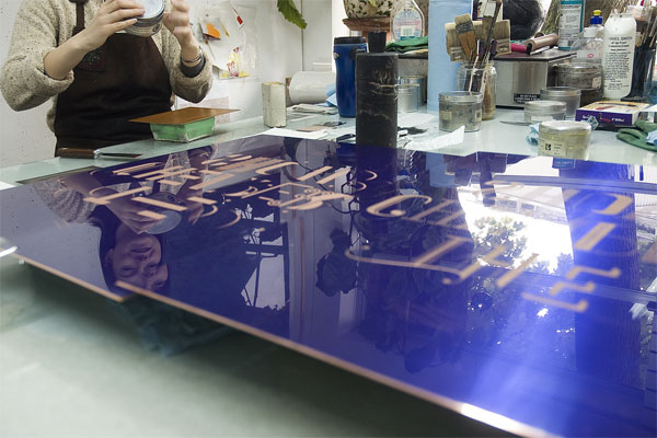
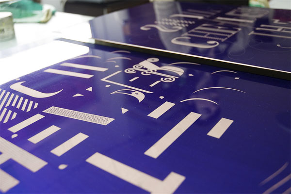
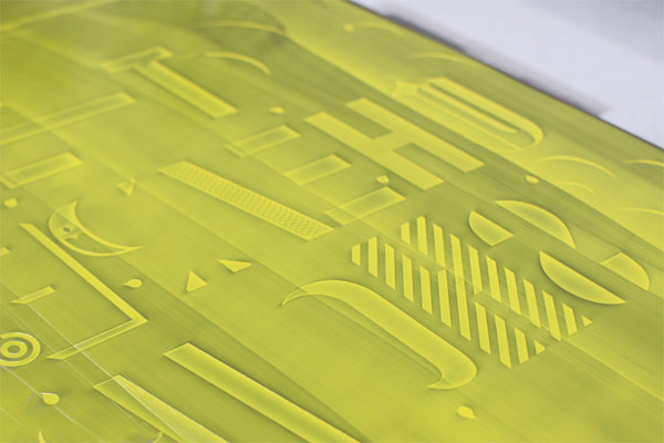
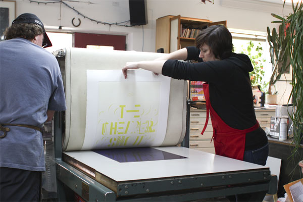
While the design is important, when you have the opportunity to produce a piece in a way you have never done before — in this case Intaglio printing, which is sort of a reverse letterpress, where the design is etched in a plate, ink is placed in the hollow spaces, paper then placed on top of the plate, and finally pressed to grab the ink — well that just sends shivers down a designer’s spine as the time to start approaches.
This project allowed us to work with a notable Vancouver based printmaking studio which specializes in producing artist prints. Working with a small printing house came the opportunity to lend a hand during the printing process, which gave us insight into intaglio printing.
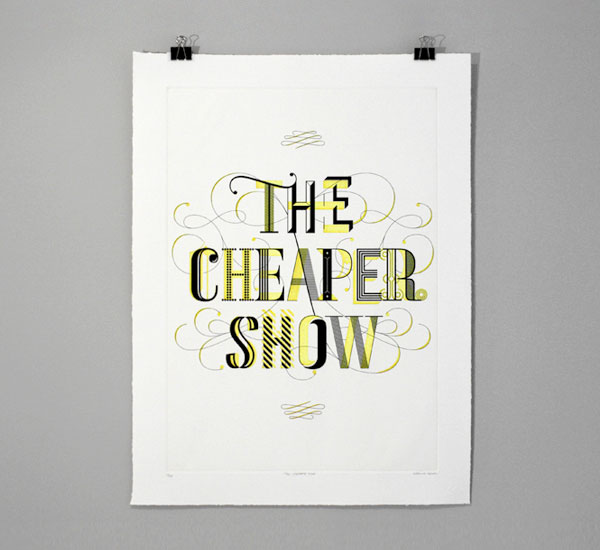


The Cheaper Show Print
Production Method
Design
Working Format
Printing
New Leaf Editions: Peter Braune
This post was published in the original layout of FPO so all images are smaller. Project descriptions as well as production lessons are quoted in the main content area.


About
FPO (For Print Only), is a division of UnderConsideration, celebrating the reality that print is not dead by showcasing the most compelling printed projects.
FPO uses Fonts.com to render Siseriff and Avenir Next.
FPO is run with Six Apart’s MovableType
All comments, ideas and thoughts on FPO are property of their authors; reproduction without the author’s or FPO’s permission is strictly prohibited
Twitter @ucllc
Sign-up for Mailing List
Mailing list managed by MailChimp
Thanks to our advertisers
About UnderConsideration
UnderConsideration is a graphic design firm generating its own projects, initiatives, and content while taking on limited client work. Run by Bryony Gomez-Palacio and Armin Vit in Bloomington, IN. More…
blogs we publish
Brand New / Displaying opinions and focusing solely on corporate and brand identity work.
Art of the Menu / Cataloguing the underrated creativity of menus from around the world.
Quipsologies / Chronicling the most curious, creative, and notable projects, stories, and events of the graphic design industry on a daily basis.
products we sell
Flaunt: Designing effective, compelling and memorable portfolios of creative work.
Brand New Conference videos / Individual, downloadable videos of every presentation since 2010.
Prints / A variety of posters, the majority from our AIforGA series.
Other / Various one-off products.
events we organize
Brand New Conference / A two-day event on corporate and brand identity with some of today's most active and influential practitioners from around the world.
Brand Nieuwe Conference / Ditto but in Amsterdam.
Austin Initiative for Graphic Awesomeness / A speaker series in Austin, TX, featuring some of the graphic design industry's most awesome people.
also
Favorite Things we've Made / In our capacity as graphic designers.
Projects we've Concluded / Long- and short-lived efforts.
UCllc News / Updates on what's going at the corporate level of UnderConsideration.

Related entries
36 Days of Type Poster
Ministry of Environment in Colombia Poster
National Parks Map
eBoy Poster
“Love Your Mother” Print