ADV @ UNDERCONSIDERATION Peek here for details
BROWSE
Dimensions (Width × Height × Depth)
4 in × 7 in
Page Count
–
Paper Stock
Crane Lettra, 300gsm
Number of Colors
3 spot inks
Varnishes
–
Binding
–
Typography
Ziggurat Black
Tungsten
Hoefler Titling
Futura
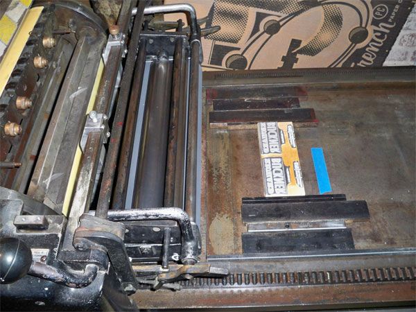
Some printing techniques (or tricks) can be combined into a single press, but when you are using letterpress and silkscreen in the same project you have to make sure you build in enough production time into your schedule to accommodate both processes.
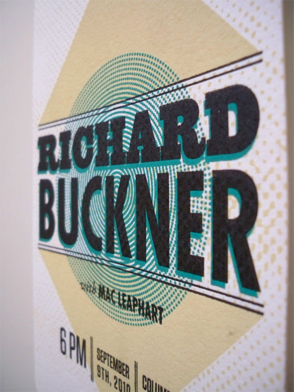
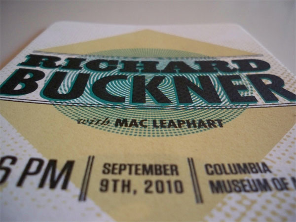
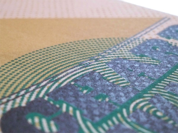
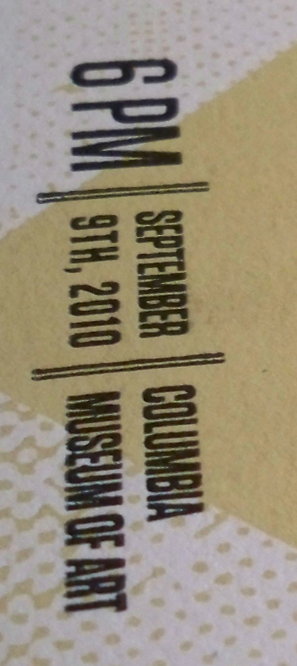
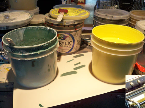
The Columbia Museum of Art is a bit of an nontraditional venue, and that was the theme that we ran with throughout this project. We knew that since we had the ability to silkscreen and letterpress in house, we wanted to combine the two processes and see what happened. Visually, we wanted to keep it simple, but elegant and convey the notion that the space this show would be held in was going to be a bit more formal than the usual music venue. We screenprinted the first two colours (tan and blue) and finished the final layer by letterpressing the black type.
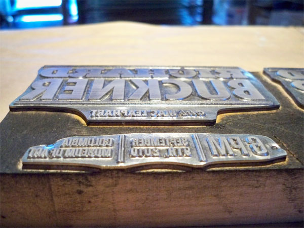
With silkscreening and letterpress, it is a layering process in which you have to run each colour separately. We ran the tan screen first on all of the prints then left them to dry for a bit. We wanted to run the blue screen second in hopes of creating a green overlay where it hit the tan. Once those were all printed, we went ahead and setup the letterpress plate. The only tricky part was the initial registration of the final key plate to the already existing screenprinted portion of the ticket. We ran a few tests on some extra sheets of paper so we could measure out exactly where the plate was making an impression on the paper and then lined up the already printed portion accordingly. Once we had that adjusted, we were able to complete the letterpress portion of the job in about 30 minutes.
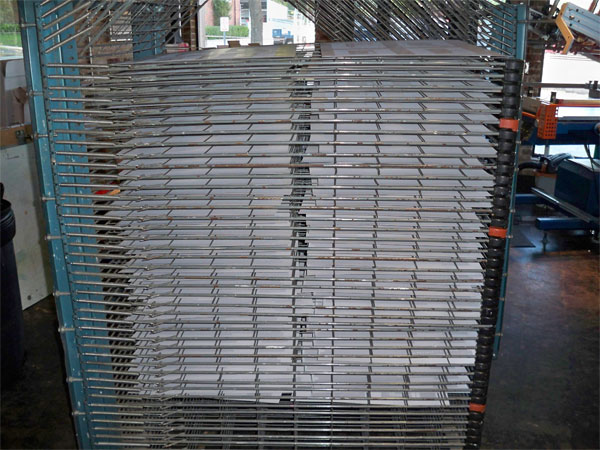
Lots of stacking the sheets of paper, allowing them to dry, re-prepping and doing it all over again for the next layer—surely a fine way to spend hour upon hour of the day.
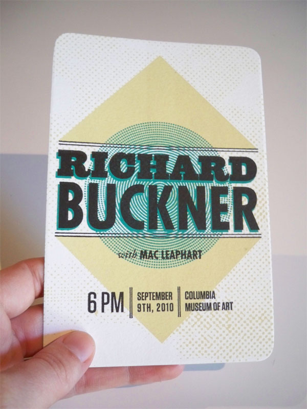

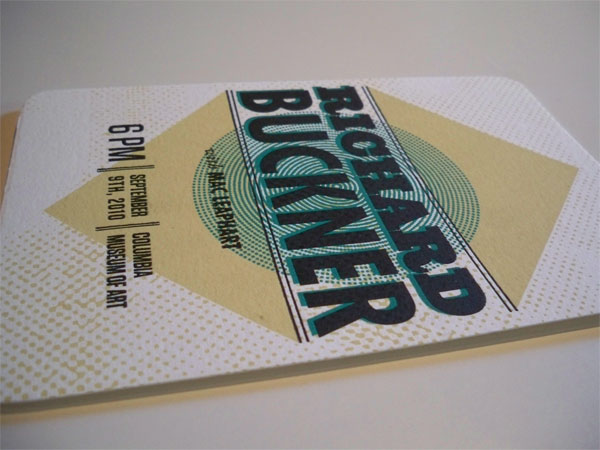
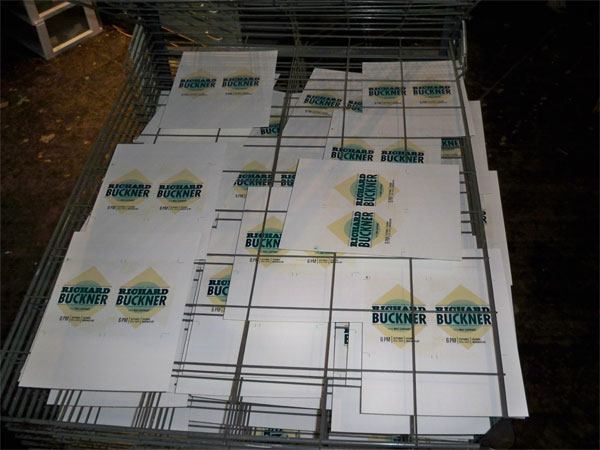
Richard Buckner Concert Ticket
Production Method
Design
The Half and Half
Printing
The Half and Half

This post was published in the original layout of FPO so all images are smaller. Project descriptions as well as production lessons are quoted in the main content area.
Post Author
Bryony

Bryony Gomez-Palacio
Editor of FPO and co-founder of UnderConsideration LLC.
More: Online / On Twitter
Date Published
September 28, 2010
Filed Under
Ticket
Tagged with
crane
crane lettra
letterpress
PMS
silkscreen
ticket


About
FPO (For Print Only), is a division of UnderConsideration, celebrating the reality that print is not dead by showcasing the most compelling printed projects.
FPO uses Fonts.com to render Siseriff and Avenir Next.
FPO is run with Six Apart’s MovableType
All comments, ideas and thoughts on FPO are property of their authors; reproduction without the author’s or FPO’s permission is strictly prohibited
Twitter @ucllc
Sign-up for Mailing List
Mailing list managed by MailChimp
Thanks to our advertisers
About UnderConsideration
UnderConsideration is a graphic design firm generating its own projects, initiatives, and content while taking on limited client work. Run by Bryony Gomez-Palacio and Armin Vit in Bloomington, IN. More…
blogs we publish
Brand New / Displaying opinions and focusing solely on corporate and brand identity work.
Art of the Menu / Cataloguing the underrated creativity of menus from around the world.
Quipsologies / Chronicling the most curious, creative, and notable projects, stories, and events of the graphic design industry on a daily basis.
products we sell
Flaunt: Designing effective, compelling and memorable portfolios of creative work.
Brand New Conference videos / Individual, downloadable videos of every presentation since 2010.
Prints / A variety of posters, the majority from our AIforGA series.
Other / Various one-off products.
events we organize
Brand New Conference / A two-day event on corporate and brand identity with some of today's most active and influential practitioners from around the world.
Brand Nieuwe Conference / Ditto but in Amsterdam.
Austin Initiative for Graphic Awesomeness / A speaker series in Austin, TX, featuring some of the graphic design industry's most awesome people.
also
Favorite Things we've Made / In our capacity as graphic designers.
Projects we've Concluded / Long- and short-lived efforts.
UCllc News / Updates on what's going at the corporate level of UnderConsideration.

Related entries
A Design Film Festival 2015 Tickets
UW Football Premium Ticketing
George Lois Event Materials