ADV @ UNDERCONSIDERATION Peek here for details
BROWSE
Client
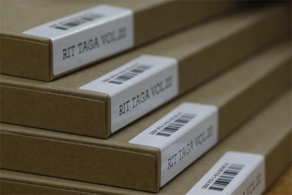
RIT TAGA, a Student Organization
Quantity Produced
360
Production Cost
$2,365 for binding and packaging substrates, printing donated
Production Time
1 Month
Dimensions (Width × Height × Depth)
6.5 in × 10 in
Page Count
160
Paper Stock
Mohawk Color Copy 98 Uncoated, 32 lb Bond and 110 lb Cover
Number of Colors
CMYK + Dimensional Clear
Varnishes
–
Binding
Smythe Sewn
Typography
Sabon, Jan Tschichold
Archer, Hoefler & Frere-Jones
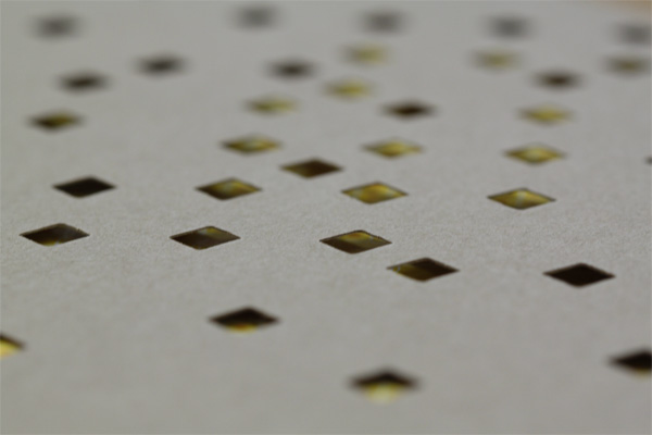
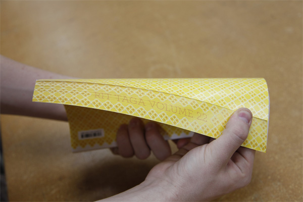
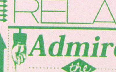
One of the designers involved in the project, Andrew Lakata, did a great job explaining the project, so I won’t try to introduce this too grandiosely. But I do want to point out how surprised I was to see that the book was printed digitally on a Kodak Nexpress, because the quality was near offset. Yet the most surprising was the dimensional printing that Nexpress is now doing, which is a kind of combination of spot varnish and gloss laminate, creating a raised plastiquey texture that is quite unique. I had heard about this recently but thought it was more gimmick than anything. Happy to report that the effect looks very convincing.
This journal is a technical research publication produced by the students of RIT TAGA (Technical Association for the Graphic Arts). From conception to creation, students are the driving force behind the project. Each year there is a new team, new design, and new research, so the design is always fresh. This year, for TAGA10, we wanted to show that print is more alive than ever (even on a tight budget).
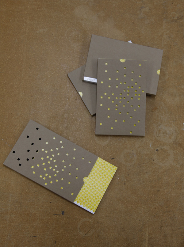
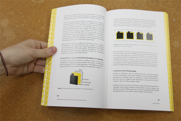
The concept of this journal was to provide various levels of interactivity though an innovative fusion of creativity and technology. To accomplish this, we designed interactive features to supplement the focus of the publication, which is the research content. Dimensional elements were thoughtfully chosen within the journal, and QR-codes link to additional multimedia content online.
Most importantly, we wanted the project to provide visual and tactile stimulus that could not be recreated digitally on-screen. The dimensional clear was used throughout the publication to create an adventure for the touch. When we see people unconsciously “feeling-up” the journal as they’re reading it, we know we’ve succeeded.
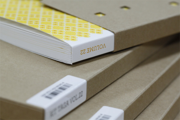
Other interesting elements include the visual interplay between the die-cut package and the cover pattern as well as the fore-edge design.
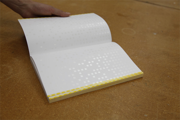
This was our first time using dimensional clear, and to create the most effective and noticeable designs we ran some printed test forms with varying line widths, patterns, and tint values.
Printing with dimensional clear presented a few problems down the line in production. The dimensional content added bulk to various areas on a sheet. Therefore, the signature stacks were difficult to balance and had to be cut in teeny-tiny piles. Also, as they ran through the folder, the signatures with dimensional elements built up so much static that they stuck together in an endless chain. We had to physically pull chunks of signatures apart, spread them on a metal table, and wait for the static to discharge, all while folding at full speed and getting shocked every five seconds.
In the end, shocks and all, it was worth it. We are really ecstatic about the overall feel of the journal and the tactile sensation of the dimensional elements.
Everything about this project is, for lack of a better term, smart. It looks smart, it feels smart. The contrast between the digital book and the brown die-cut package is very cool. No, sorry, very smart.

RIT TAGA 2010 Journal
Production Method
Design
Andrew Lakata
Vicki Julius
Complete list of RIT TAGA 2010 Members
Printing
Prepress and Production: Angelica Li, Nick Gawreluk, Scott Millward
Book printing: RIT Printing Applications Laboratory
Signature folding: RIT Print/Postal Hub
Binding: Hoster Bindery
Die-cutting: Diamond Packaging
This post was published in the original layout of FPO so all images are smaller. Project descriptions as well as production lessons are quoted in the main content area.


About
FPO (For Print Only), is a division of UnderConsideration, celebrating the reality that print is not dead by showcasing the most compelling printed projects.
FPO uses Fonts.com to render Siseriff and Avenir Next.
FPO is run with Six Apart’s MovableType
All comments, ideas and thoughts on FPO are property of their authors; reproduction without the author’s or FPO’s permission is strictly prohibited
Twitter @ucllc
Sign-up for Mailing List
Mailing list managed by MailChimp
Thanks to our advertisers
About UnderConsideration
UnderConsideration is a graphic design firm generating its own projects, initiatives, and content while taking on limited client work. Run by Bryony Gomez-Palacio and Armin Vit in Bloomington, IN. More…
blogs we publish
Brand New / Displaying opinions and focusing solely on corporate and brand identity work.
Art of the Menu / Cataloguing the underrated creativity of menus from around the world.
Quipsologies / Chronicling the most curious, creative, and notable projects, stories, and events of the graphic design industry on a daily basis.
products we sell
Flaunt: Designing effective, compelling and memorable portfolios of creative work.
Brand New Conference videos / Individual, downloadable videos of every presentation since 2010.
Prints / A variety of posters, the majority from our AIforGA series.
Other / Various one-off products.
events we organize
Brand New Conference / A two-day event on corporate and brand identity with some of today's most active and influential practitioners from around the world.
Brand Nieuwe Conference / Ditto but in Amsterdam.
Austin Initiative for Graphic Awesomeness / A speaker series in Austin, TX, featuring some of the graphic design industry's most awesome people.
also
Favorite Things we've Made / In our capacity as graphic designers.
Projects we've Concluded / Long- and short-lived efforts.
UCllc News / Updates on what's going at the corporate level of UnderConsideration.

Related entries
MANA Journal 2016
Self-Promotion Typographic Travel Journal
B|D Landscape Architects: Review Journal
“Cisma: Especial Haroldo de Campos” Journal
6400percent Journals