ADV @ UNDERCONSIDERATION Peek here for details
BROWSE
Client
Amy and Forrest
Quantity Produced
300
Production Cost
$800
Production Time
3 days
Dimensions (Width × Height × Depth)
Folded: 5 in × 7 in
Page Count
–
Paper Stock
Mohawk Via Vellum
Belly Band: French Paper Durotone Butcher Extra White
Number of Colors
CMYK
Varnishes
–
Binding
Belly Band
Typography
Handmade
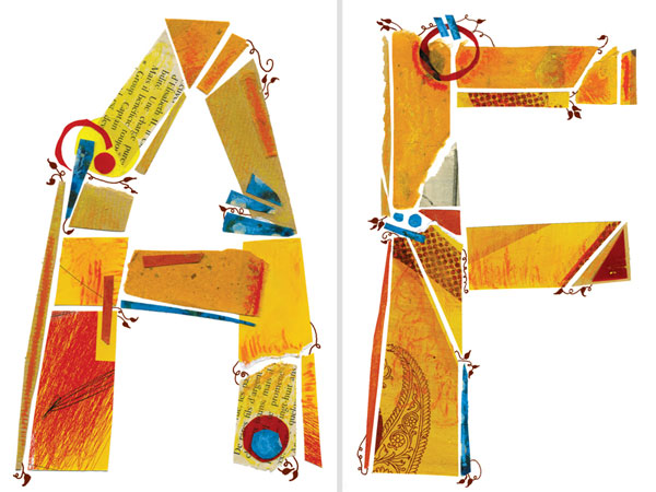
Cut paper typography
Delicato (Fountain Foundry)
Weddings are expensive, and as designers we wish we could spare no expense on the things that matter: the wedding materials that brand the event. But those of us who have been through the process know that we have to make our budgets work as best as we can—not unlike our client work.
Originally I was disappointed that letterpress was not an option (we were on a tight budget). However, using Mohawk Via Vellum on an HP Indigo 5500 Digital Press proved to be a good solution. The paper’s subtle and soft texture slightly “raised” the type and complimented the cut paper typography.
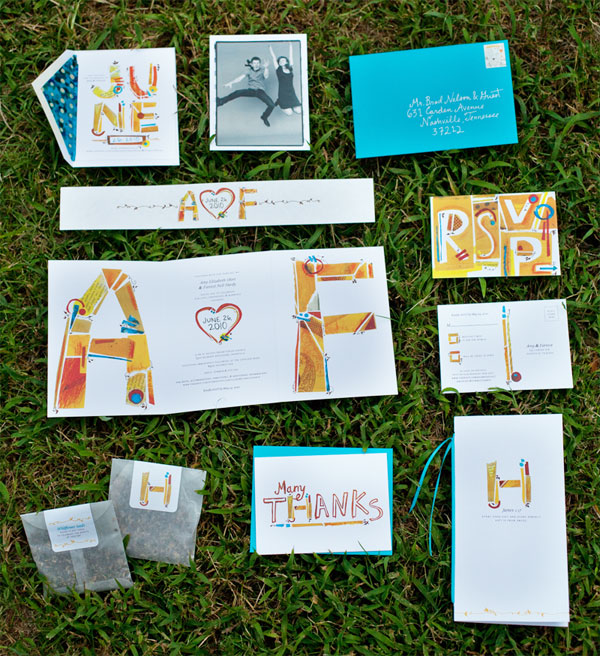
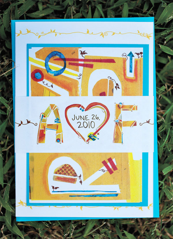
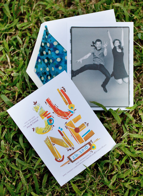
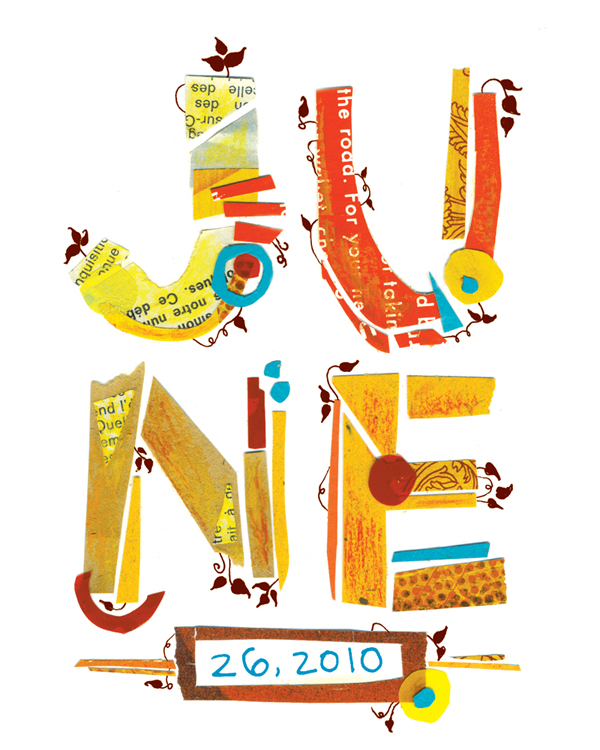
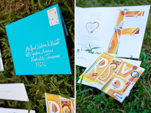
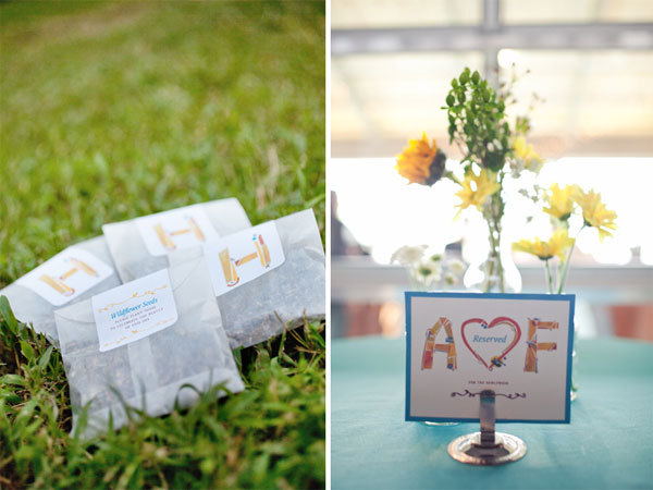
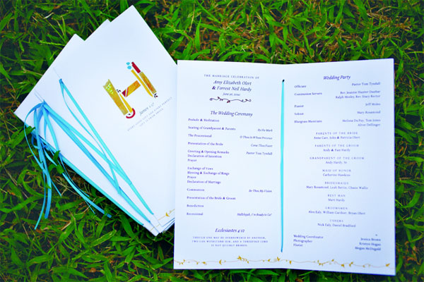
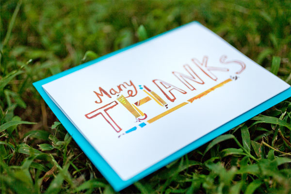
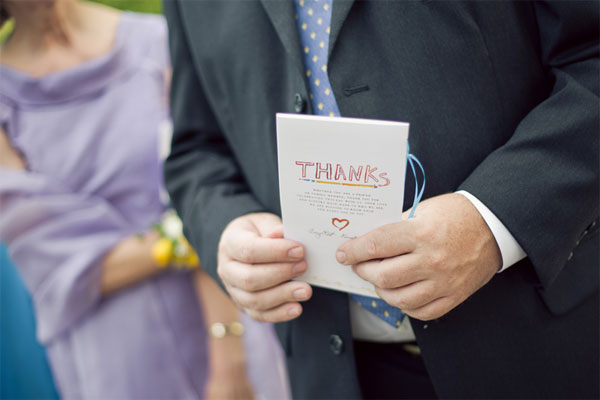
Our wedding stationery represented our creative and detail-oriented personalities, as well as our wedding’s charming, Southern summer theme. This included save-the-dates, invitations with a belly band and RSVP card, programs, favors, signage, and thank you cards. I considered every detail in the stationery—from the stamps to the envelope liners. After constructing individual letters out of paper, I added vine details and Delicato as a secondary typeface.
I was inspired by our unique obsessions and the details that define us as a couple. For instance, Forrest has a plant background, so I detailed the typography with vines. For favors, we made packets of wildflower seeds. Each packet read, “Wildflower Seeds: Please plant these to celebrate the beauty of this day.” I love bright colored accents (i.e. my husband’s bright red hair!) and hand-rendered typography, so we knew our stationery had to be typographic and colorful. Because of his blue eyes, red hair, and fun personality, Forrest wanted to wear a bright blue bow tie. That led to a bright, jewel blue as our founding color, with yellow as the accent. We had a blast at our Save the Date photo shoot, as seen in the photo we chose.
Bright colors indeed, and a human quality that makes these approachable and fun—a true reflexion of those involved.

Amy and Forrest Wedding Stationery
Production Method
Design
Amy Hardy
Printing
Advocate Marketing & Print
This post was published in the original layout of FPO so all images are smaller. Project descriptions as well as production lessons are quoted in the main content area.
Post Author
Bryony

Bryony Gomez-Palacio
Editor of FPO and co-founder of UnderConsideration LLC.
More: Online / On Twitter
Date Published
October 27, 2010
Filed Under
Wedding materials
Tagged with
bellyband
CMYK
digital
DIY
french paper
mohawk
vellum
wedding invitation
wedding materials


About
FPO (For Print Only), is a division of UnderConsideration, celebrating the reality that print is not dead by showcasing the most compelling printed projects.
FPO uses Fonts.com to render Siseriff and Avenir Next.
FPO is run with Six Apart’s MovableType
All comments, ideas and thoughts on FPO are property of their authors; reproduction without the author’s or FPO’s permission is strictly prohibited
Twitter @ucllc
Sign-up for Mailing List
Mailing list managed by MailChimp
Thanks to our advertisers
About UnderConsideration
UnderConsideration is a graphic design firm generating its own projects, initiatives, and content while taking on limited client work. Run by Bryony Gomez-Palacio and Armin Vit in Bloomington, IN. More…
blogs we publish
Brand New / Displaying opinions and focusing solely on corporate and brand identity work.
Art of the Menu / Cataloguing the underrated creativity of menus from around the world.
Quipsologies / Chronicling the most curious, creative, and notable projects, stories, and events of the graphic design industry on a daily basis.
products we sell
Flaunt: Designing effective, compelling and memorable portfolios of creative work.
Brand New Conference videos / Individual, downloadable videos of every presentation since 2010.
Prints / A variety of posters, the majority from our AIforGA series.
Other / Various one-off products.
events we organize
Brand New Conference / A two-day event on corporate and brand identity with some of today's most active and influential practitioners from around the world.
Brand Nieuwe Conference / Ditto but in Amsterdam.
Austin Initiative for Graphic Awesomeness / A speaker series in Austin, TX, featuring some of the graphic design industry's most awesome people.
also
Favorite Things we've Made / In our capacity as graphic designers.
Projects we've Concluded / Long- and short-lived efforts.
UCllc News / Updates on what's going at the corporate level of UnderConsideration.

Related entries
Herbst & Spungen Wedding Invitation Suite
Erin and Brian Wedding Invitation
Daniela & Rui Wedding Invitation
Benjamin & Catalina Wedding Announcement
Devon & Mike Wedding Invitation