ADV @ UNDERCONSIDERATION Peek here for details
BROWSE
Dimensions (Width × Height × Depth)
3.5 in × 7 in
Page Count
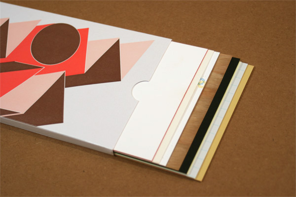
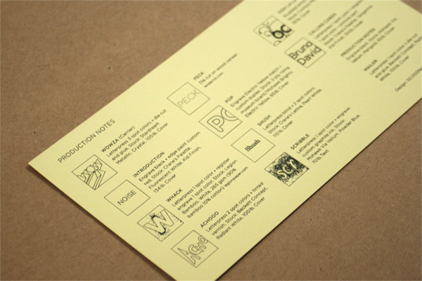
11 Cards + Carrier and Mailer
Paper Stock
12 Different Stocks
Number of Colors
12 Spot for Letterpress
5 Spot for Engraving
Varnishes
–
Binding
–
Typography
Gotham
Gotham Rounded
Hand lettering
New Century Schoolbook
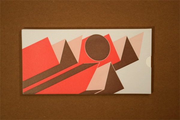
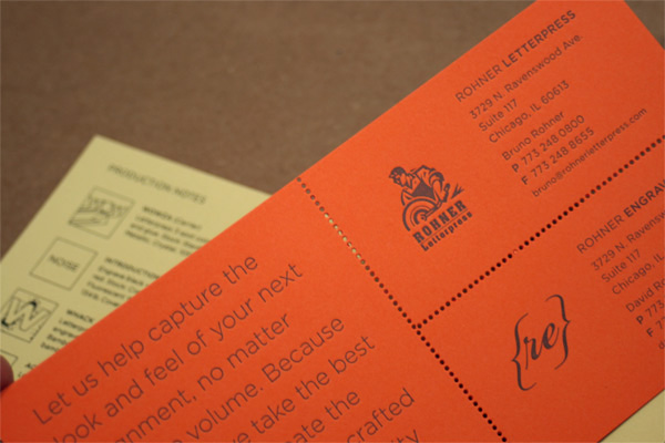
Before everybody had their own letterpress shop, back in the dot-com days of the early 2000s, only a few folks in the U.S. did good, solid polymer plate letterpress printing. I happened to share the hometown of Rohner Letterpress, Chicago. I printed this business card with them back then and I was immediately hooked. Seven or eight years later, and two American States later too, we still send stuff to Rohner, including our own holiday cards. Anyway, this is a very long way of saying that this is a promo for Rohner Letterpress and Rohner Engraving, designed in collaboration with Chicago-based 50,000feet, Inc., who explain:
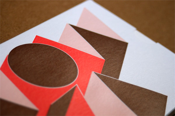
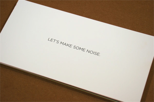
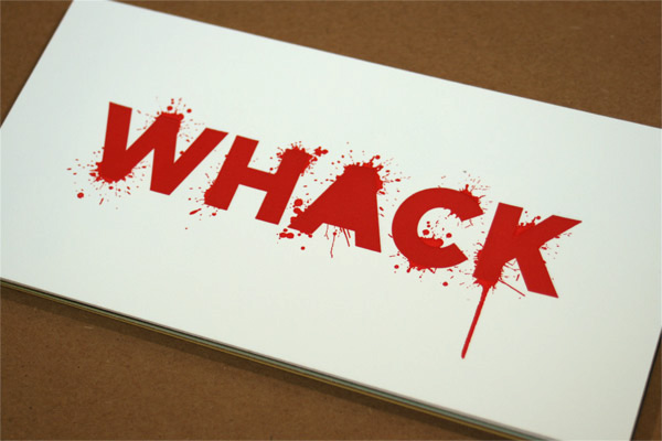
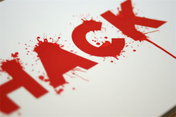
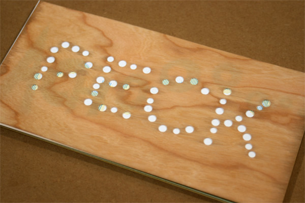
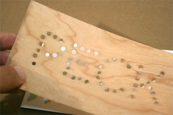
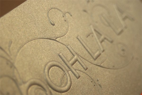
In late Spring 2009, Bruno and David Rohner approached us with a simple request — design a promotional postcard. Our approach made a direct appeal to the senses, playfully exploring how words can take the shape of the sounds they make. The postcard packed a powerful punch, with all the energy and sparkle of “snap, crackle and pop.” The first card grew into a package of eleven, combining sight, sound and touch in a simple, but impactful, way.
It was group consensus to challenge the assumptions of traditional letterpress and engraving. We wanted to break the mold without breaking the bank. Rather than dumping the entire kitchen sick into one card, we paced out treatment combinations with a fresh, affordable take on some very old techniques. For the most part, production ran smoothly, with only a few ideas that were not executable. One in particular was to engrave plastic but it was just too pliable. The greatest lesson learned was to take a collaborative approach and merge the craft and creative ideas early in the process.
The cards are really great and playful, each one surprising you in a different way. And they photograph as smooth as butter. I had a hard time editing the selection down to fifteen.








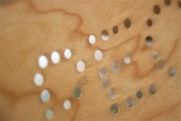

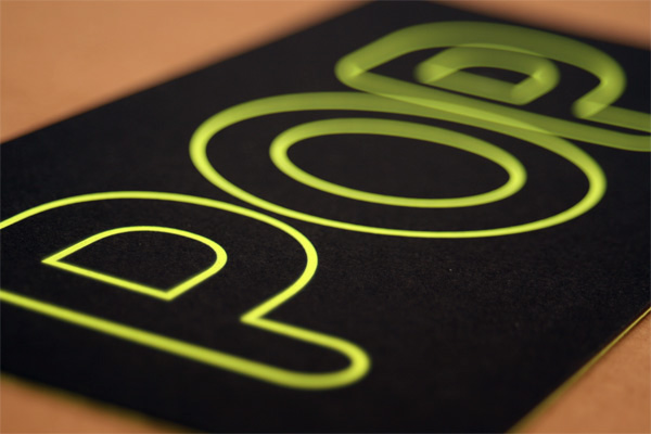

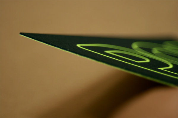

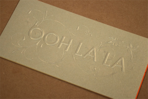



This post was published in the original layout of FPO so all images are smaller. Project descriptions as well as production lessons are quoted in the main content area.
Post Author
Armin

Armin Vit
Editor of FPO and co-founder of UnderConsideration LLC.
More: Online / On Twitter
Date Published
October 5, 2010
Filed Under
Promotional Cards
Tagged with
die-cut
different color stock
edge printing
emboss
engraving
letterpress
About
FPO (For Print Only), is a division of UnderConsideration, celebrating the reality that print is not dead by showcasing the most compelling printed projects.
FPO uses Fonts.com to render Siseriff and Avenir Next.
FPO is run with Six Apart’s MovableType
All comments, ideas and thoughts on FPO are property of their authors; reproduction without the author’s or FPO’s permission is strictly prohibited
Twitter @ucllc
Sign-up for Mailing List
Mailing list managed by MailChimp
Thanks to our advertisers
About UnderConsideration
UnderConsideration is a graphic design firm generating its own projects, initiatives, and content while taking on limited client work. Run by Bryony Gomez-Palacio and Armin Vit in Bloomington, IN. More…
blogs we publish
Brand New / Displaying opinions and focusing solely on corporate and brand identity work.
Art of the Menu / Cataloguing the underrated creativity of menus from around the world.
Quipsologies / Chronicling the most curious, creative, and notable projects, stories, and events of the graphic design industry on a daily basis.
products we sell
Flaunt: Designing effective, compelling and memorable portfolios of creative work.
Brand New Conference videos / Individual, downloadable videos of every presentation since 2010.
Prints / A variety of posters, the majority from our AIforGA series.
Other / Various one-off products.
events we organize
Brand New Conference / A two-day event on corporate and brand identity with some of today's most active and influential practitioners from around the world.
Brand Nieuwe Conference / Ditto but in Amsterdam.
Austin Initiative for Graphic Awesomeness / A speaker series in Austin, TX, featuring some of the graphic design industry's most awesome people.
also
Favorite Things we've Made / In our capacity as graphic designers.
Projects we've Concluded / Long- and short-lived efforts.
UCllc News / Updates on what's going at the corporate level of UnderConsideration.




Related entries
“Miniature Views” Promotion
Suspicion
Gap Semester Adventure Quest Folder
MONSTERBOX 150 Illustrated Monster Cards
I AM STERN Laser cut folding banner for NYU