ADV @ UNDERCONSIDERATION Peek here for details
BROWSE
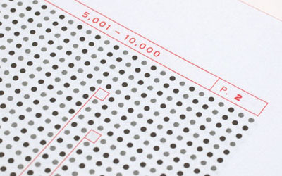
Dimensions (Width × Height × Depth)
280 mm × 380 mm (11.02 in × 14.96 in)
Page Count
–
Paper Stock
100% Cotton Acid-Free uncoated
Number of Colors
1 Spot + Blind
Varnishes
–
Binding
–
Typography
Hoefler Text (H&F-J)
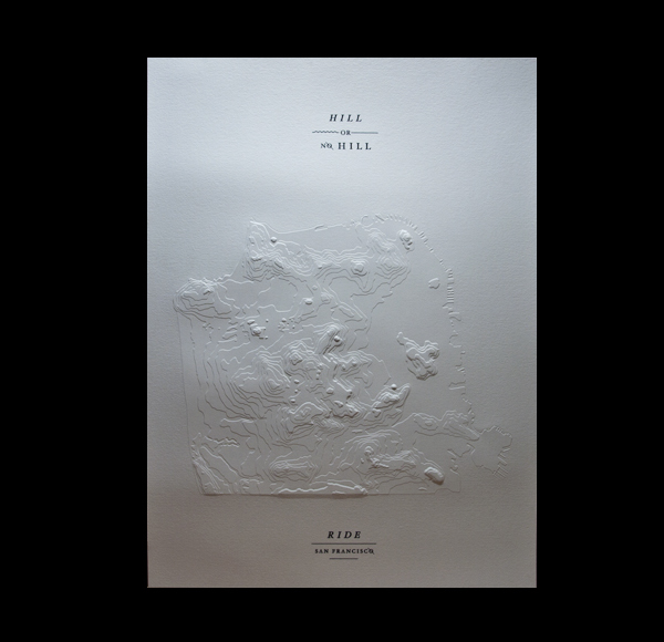
This poster was for the bicycle-themed Art Crank poster show. The simple brief asks for poster submissions that have something to do with bikes. Pretty darn open if you ask me.
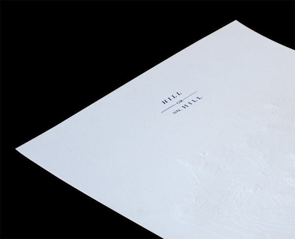
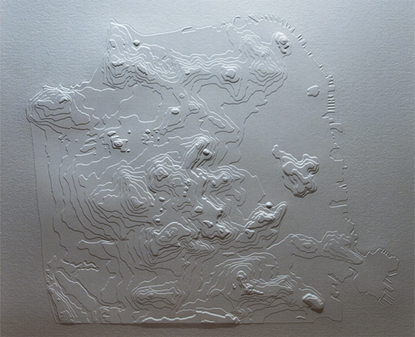
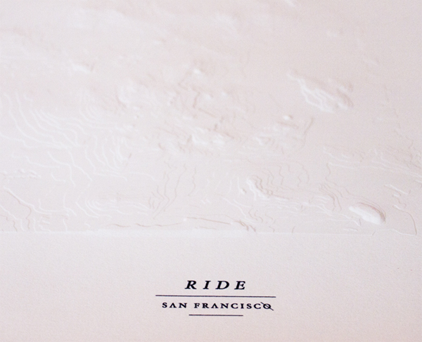
Living in San Francisco, where we are known for our multiple steep and inescapable hills, the concept of “hill or no hill — ride your bike” began to take form. I hand traced an old topography map of SF, traced it in Illustrator and separated the levels into vector layers and sent the file to many embossers for quotes, most of which were outrageous. After getting a reasonable quote, a sculptor used my illustrator file to hand engrave the topography of san francisco into a brass die and emboss my self-printed sheets. Two versions of the poster were made. One for the show, with the word “RIDE” printed on top of the embossing which sold out, and another alternate version with the embossed area clean of type.
While I have never personally used such an intricate emboss, I was not surprised to hear this:
Multilevel dies are exponentially more expensive than single level dies because they have to made out of brass and must be engraved. Also, it pays to take the time to ensure that you send embossers the most detailed files you can as you only get one shot at the die or you’ll have to pay for another one. Sheesh.
I think that 15 layers of topography is detailed enough to communicate the concept, and detailed enough to push the paper to its maximum elasticity.

This post was published in the original layout of FPO so all images are smaller. Project descriptions as well as production lessons are quoted in the main content area.
Post Author
Bryony

Bryony Gomez-Palacio
Editor of FPO and co-founder of UnderConsideration LLC.
More: Online / On Twitter
Date Published
December 8, 2010
Filed Under
Posters
Tagged with
15 levels
blind emboss
cotton
poster
uncoated


About
FPO (For Print Only), is a division of UnderConsideration, celebrating the reality that print is not dead by showcasing the most compelling printed projects.
FPO uses Fonts.com to render Siseriff and Avenir Next.
FPO is run with Six Apart’s MovableType
All comments, ideas and thoughts on FPO are property of their authors; reproduction without the author’s or FPO’s permission is strictly prohibited
Twitter @ucllc
Sign-up for Mailing List
Mailing list managed by MailChimp
Thanks to our advertisers
About UnderConsideration
UnderConsideration is a graphic design firm generating its own projects, initiatives, and content while taking on limited client work. Run by Bryony Gomez-Palacio and Armin Vit in Bloomington, IN. More…
blogs we publish
Brand New / Displaying opinions and focusing solely on corporate and brand identity work.
Art of the Menu / Cataloguing the underrated creativity of menus from around the world.
Quipsologies / Chronicling the most curious, creative, and notable projects, stories, and events of the graphic design industry on a daily basis.
products we sell
Flaunt: Designing effective, compelling and memorable portfolios of creative work.
Brand New Conference videos / Individual, downloadable videos of every presentation since 2010.
Prints / A variety of posters, the majority from our AIforGA series.
Other / Various one-off products.
events we organize
Brand New Conference / A two-day event on corporate and brand identity with some of today's most active and influential practitioners from around the world.
Brand Nieuwe Conference / Ditto but in Amsterdam.
Austin Initiative for Graphic Awesomeness / A speaker series in Austin, TX, featuring some of the graphic design industry's most awesome people.
also
Favorite Things we've Made / In our capacity as graphic designers.
Projects we've Concluded / Long- and short-lived efforts.
UCllc News / Updates on what's going at the corporate level of UnderConsideration.

Related entries
36 Days of Type Poster
Ministry of Environment in Colombia Poster
National Parks Map
eBoy Poster
“Love Your Mother” Print