ADV @ UNDERCONSIDERATION Peek here for details
BROWSE
Client
–
Quantity Produced
–
Production Cost
–
Production Time
–
Dimensions (Width × Height × Depth)
–
Page Count
–
Paper Stock
–
Number of Colors
–
Varnishes
–
Binding
–
Typography
–

“Fuck Up” Exhibit Poster

|
DESIGNED BY
|
PRINT METHOD
Silkscreen by Michael Nielsen and Eric Nyffeler
|

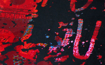
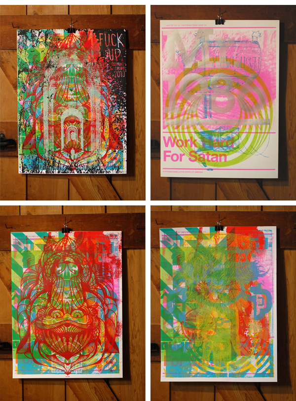
For an exhibit celebrating the art of the make-ready, the exhibit’s poster consists of sixteen layers, each layer a contribution from different artists.
Misfits in Richmond, VA Poster
|
DESIGNED BY
|
PRINT METHOD
Letterpress by Bowe House Press
|
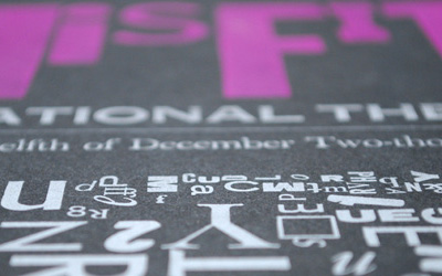
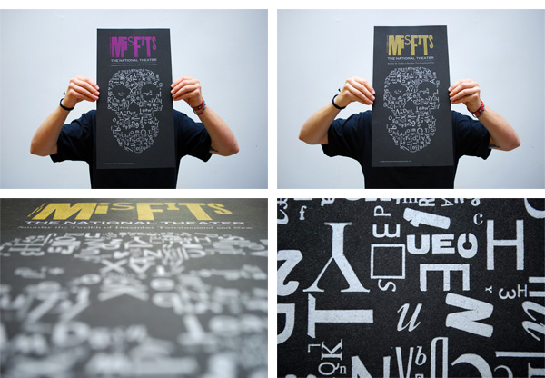
Made from actual metal type — or “ceated with all the misfit characters of former font family” as commenter Aaron put it — this Misfits poster is all hand-arranged.
“So You Need a Typeface?” Poster
|
DESIGNED BY
|
PRINT METHOD
|
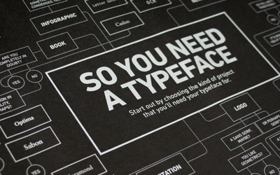
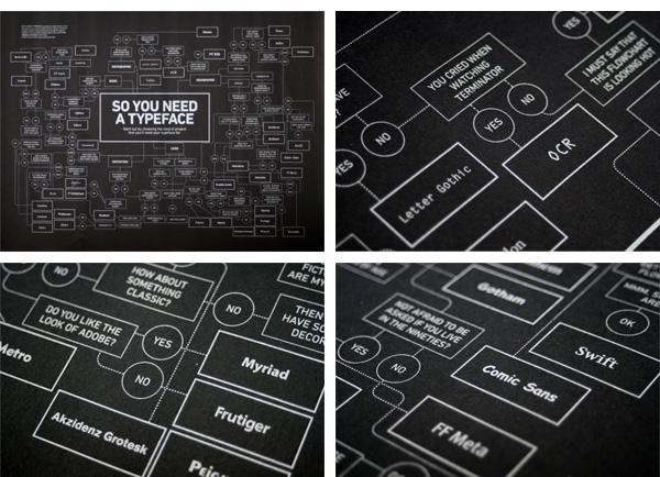
Originally popularized as a viral image around the design blogs, the metallic print on black paper is the perfect companion even if you don’t need a typeface.
The “Are You Absolutely, Positively, and Wholeheartedly Ready to Publish Your Novel?” Poster
|
DESIGNED BY
|
PRINT METHOD
Silkscreen by VGKids
|
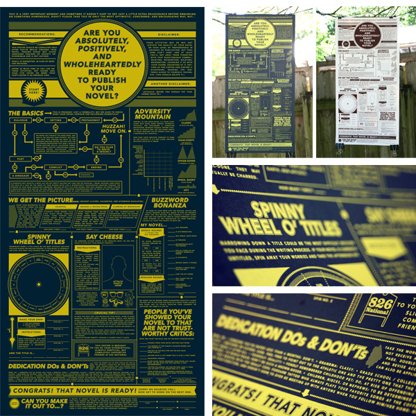
For authors in the making, this poster from 826 National asks the question no author wants to hear. For designers, it asks how cool is all this Avenir type put together like this?
Tweed Tom Poster
|
DESIGNED BY
|
PRINT METHOD
Silkscreen by Bob Eight Pop
|
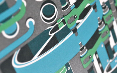
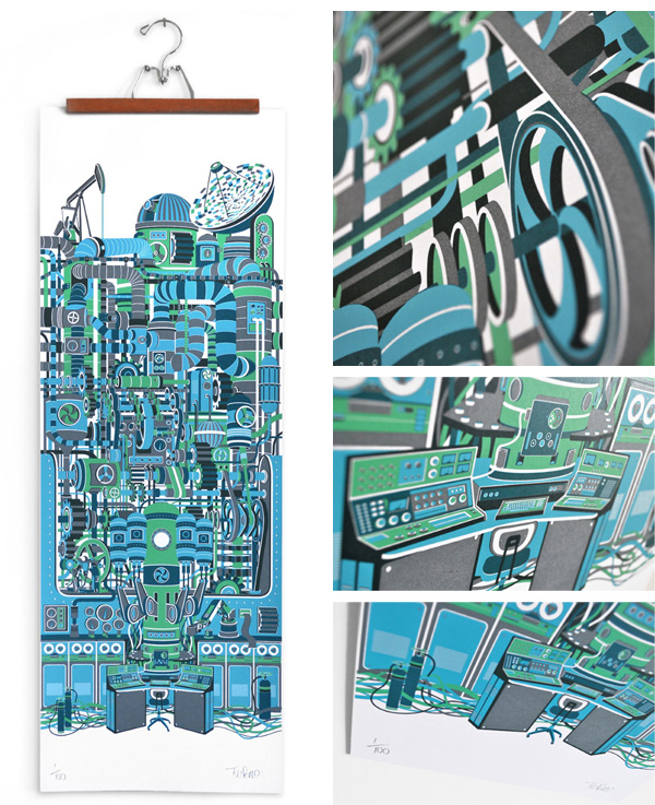
Early iPhone prototype? Steampunk installation? IBM headquarters? No, no, and no. Just 40 inches of silkscreen goodness.
The Cheaper Show Print
|
DESIGNED BY
|
PRINT METHOD
Intaglio by New Leaf Editions
|
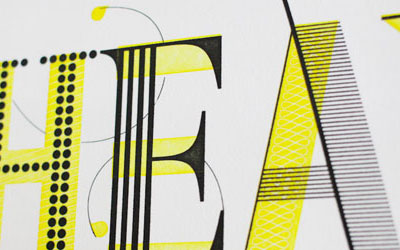
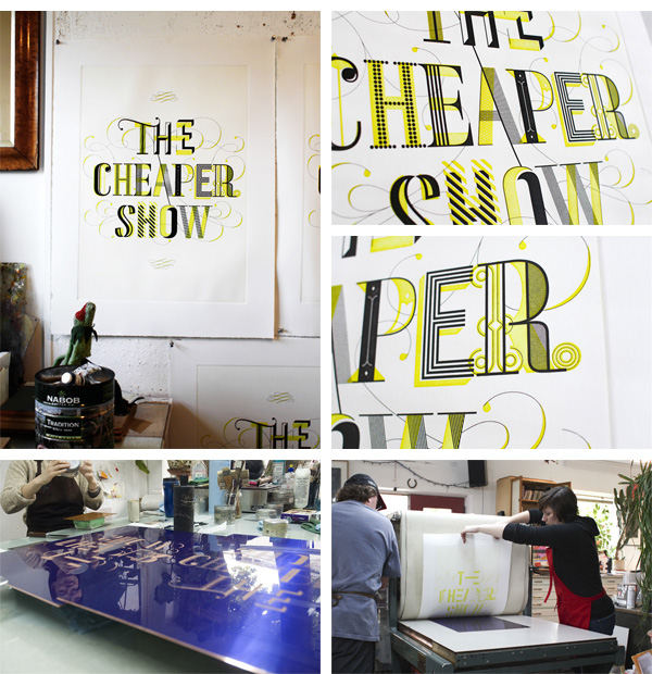
An amazingly designed poster executed through an exclusive process, Intaglio, “Sort of a reverse letterpress, where the design is etched in a plate, ink is placed in the hollow spaces, paper then placed on top of the plate, and finally pressed to grab the ink.”
“The Perfect Pour” Poster
|
DESIGNED BY
|
PRINT METHOD
Offset by MG Imaging
|
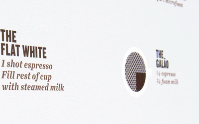
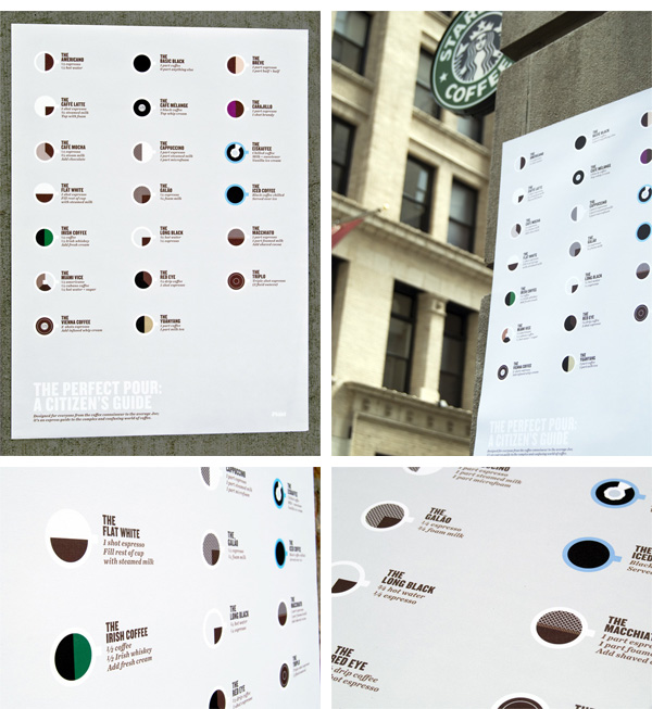
Even if you like your coffee black — or don’t like coffee and instead drink tea (freak!) — you will appreciate the graphic knowledge imparted by this delectable print.
Monster Friends Poster Series
|
DESIGNED BY
|
PRINT METHOD
Silkscreen by Kangaroo Press
|
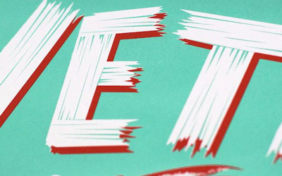
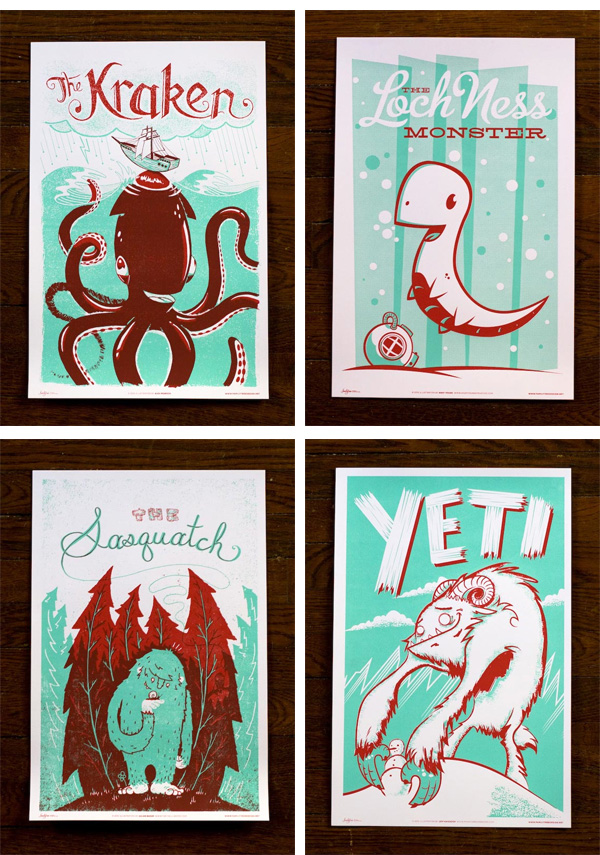
Adorable yet deadly. I’m talking about the monsters featured as well as the illustrations and the production.
Excuses Design Collective Poster
|
DESIGNED BY
|
PRINT METHOD
Silkscreen and Sprinkling by Excuses Design Collective
|
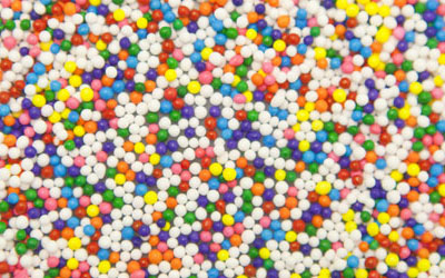
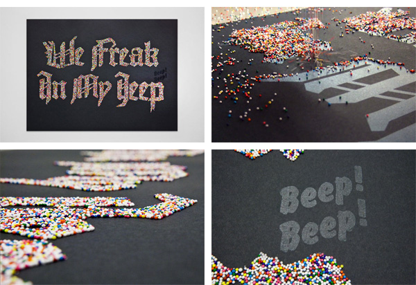
Katy Perry’s California Gurls begs to be typeset in blackletter and sprinkles. So glad someone had the mettle to make it happen.
Ligature, Loop & Stem Poster
|
DESIGNED BY
|
PRINT METHOD
Letterpress by Lunar Caustic Press
|
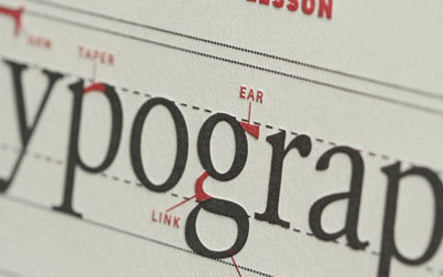
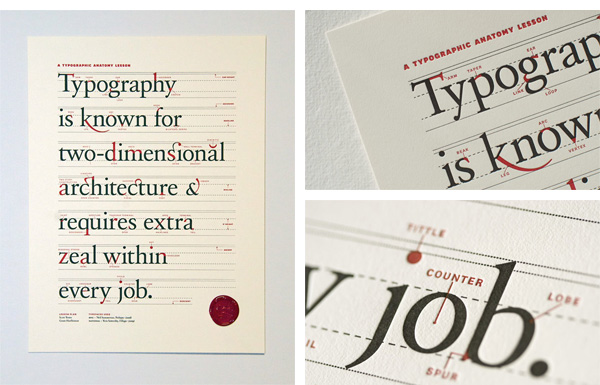
If you are going to learn a lesson, it might as well be in an exquisitely designed and deeply letterpressed piece of paper as is this Typographic Anatomy Lesson. This happened to be our most trafficed post of the year.
Indianapolis Museum of Art Title Graphic and Poster
|
DESIGNED BY
|
PRINT METHOD
Offset by Faulkenberg Printing Co.
|
Such a great concept: tear-off posters that encourage interactivity, that look hot, and that speak to the subject at hand. Rip!
“Like a Glove” Poster
|
DESIGNED BY
|
PRINT METHOD
Flocking by Great Lakes Flocking
|
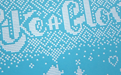
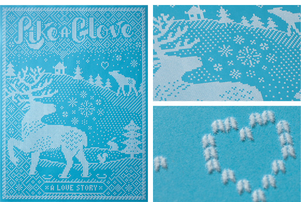
I personally enjoy closing FPO’s Best of 2010 with this poster, one of my favorites. Not only is it timely — I bet you are cold right now — but it employs a seldom used technique that looks and feels so great on paper. So, happy holidays and hope to see some great submissions to FPO in 2011.
This post was published in the original layout of FPO so all images are smaller. Project descriptions as well as production lessons are quoted in the main content area.
Post Author
Armin

Armin Vit
Editor of FPO and co-founder of UnderConsideration LLC.
More: Online / On Twitter
Date Published
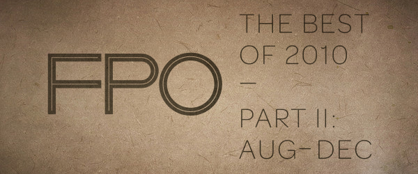
December 29, 2010
Filed Under
FPO News
Tagged with
Best of FPO


About
FPO (For Print Only), is a division of UnderConsideration, celebrating the reality that print is not dead by showcasing the most compelling printed projects.
FPO uses Fonts.com to render Siseriff and Avenir Next.
FPO is run with Six Apart’s MovableType
All comments, ideas and thoughts on FPO are property of their authors; reproduction without the author’s or FPO’s permission is strictly prohibited
Twitter @ucllc
Sign-up for Mailing List
Mailing list managed by MailChimp
Thanks to our advertisers
About UnderConsideration
UnderConsideration is a graphic design firm generating its own projects, initiatives, and content while taking on limited client work. Run by Bryony Gomez-Palacio and Armin Vit in Bloomington, IN. More…
blogs we publish
Brand New / Displaying opinions and focusing solely on corporate and brand identity work.
Art of the Menu / Cataloguing the underrated creativity of menus from around the world.
Quipsologies / Chronicling the most curious, creative, and notable projects, stories, and events of the graphic design industry on a daily basis.
products we sell
Flaunt: Designing effective, compelling and memorable portfolios of creative work.
Brand New Conference videos / Individual, downloadable videos of every presentation since 2010.
Prints / A variety of posters, the majority from our AIforGA series.
Other / Various one-off products.
events we organize
Brand New Conference / A two-day event on corporate and brand identity with some of today's most active and influential practitioners from around the world.
Brand Nieuwe Conference / Ditto but in Amsterdam.
Austin Initiative for Graphic Awesomeness / A speaker series in Austin, TX, featuring some of the graphic design industry's most awesome people.
also
Favorite Things we've Made / In our capacity as graphic designers.
Projects we've Concluded / Long- and short-lived efforts.
UCllc News / Updates on what's going at the corporate level of UnderConsideration.

Related entries
The End
No Posts this Week
We are Moving! (No Posts this Week)
The Best of 2016 on FPO, Part 2: Jul - Dec
The Best of 2016 on FPO, Part 1: Jan - Jun