ADV @ UNDERCONSIDERATION Peek here for details
BROWSE
Dimensions (Width × Height × Depth)
1 in × 3.5 in
Page Count
–
Paper Stock
Royal Complements, Wausau Paper, 100C on 100C
Number of Colors
Front: 1/c PMS
Back: Black + PMS with 4 color combinations
Varnishes
–
Binding
–
Typography
Gotham (Hoefler & Frere-Jones)
BAKER is, first and foremost, a culture of creative individuals. A place where everyone is invariably the same (a member of the BAKER community), but where everyone is also inherently different (an extraordinarily creative individual). It is a place where we are all part of a larger whole, and yet we are all welcome to be openly creative in our own distinct way. We are all part of the BAKER family and it is our people that make us unique.
Wow. That must be an amazing group of people, and frankly, if they already managed to band together to produce business cards that represent all of their ideas and points of view… well, this project vouches for their togetherness and cooperation.
Combined, we represent a broad range of diverse experiences, and in that we find strength. We are thinkers, doers, starters and finishers and an eclectic mix of old-school wisdom and young, kinetic talent. We know how to play by the rules, but we also know how and when to challenge them appropriately. It is the breadth of our collective knowledge that makes us such a dynamic and engaging force in the field of strategic branding and it is this thinking and experience that sets our brand apart.
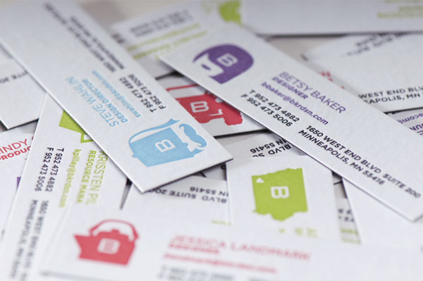
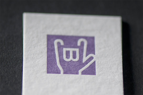
With creativity being identified as the heart of our brand we wanted to give our culture of creative individuals the opportunity to express themselves within the BAKER identity and not just the designers. We designed this flexible identity so that we are able to show a wide range of creativity and remain professional and buttoned-up when appropriate.
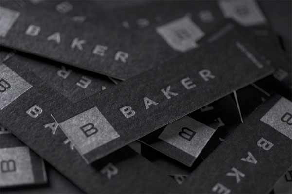
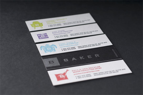
Our business cards are duplexed to show the different levels of our identity—in hindsight, a thicker stock paper would have been better: the cards are a little light, but luckily the adhesive from the duplexing provided some sturdiness.
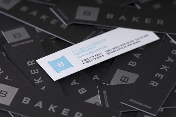
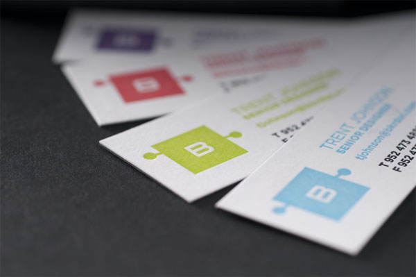
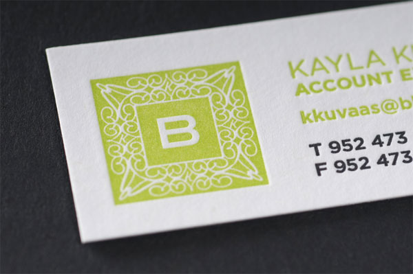
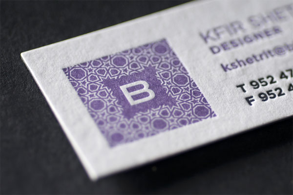
The first side, printed with a metallic PMS on black paper, is common to all cards and shows our buttoned-up look. It is all business and classically refined, much like wearing a fine suit to make a solid first impression. This represents the company as a whole. The second side, printed on white paper with 4 color combinations, allows each employee to show their personality and creative side. This is our let-your-hair-down-and-have-a-good-time approach. Each employee created their own B icon to show how they fit into this creative culture.
We were hoping to get our edges painted a color, but because we had a bleed on one side, there may have been overspray.
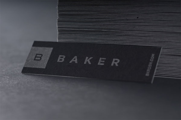

BAKER Business Card
Production Method
Design
BAKER
Creative Direction: Todd Dalebroux
Design: Lindsey Bennett, Trent Johnson, and Jen Soik
Production: Cindy Oman
Printing
Studio on Fire
This post was published in the original layout of FPO so all images are smaller. Project descriptions as well as production lessons are quoted in the main content area.
Post Author
Bryony

Bryony Gomez-Palacio
Editor of FPO and co-founder of UnderConsideration LLC.
More: Online / On Twitter
Date Published
February 24, 2011
Filed Under
Business Cards
Tagged with
business card
extreme horizontal
letterpress
PMS
wasau


About
FPO (For Print Only), is a division of UnderConsideration, celebrating the reality that print is not dead by showcasing the most compelling printed projects.
FPO uses Fonts.com to render Siseriff and Avenir Next.
FPO is run with Six Apart’s MovableType
All comments, ideas and thoughts on FPO are property of their authors; reproduction without the author’s or FPO’s permission is strictly prohibited
Twitter @ucllc
Sign-up for Mailing List
Mailing list managed by MailChimp
Thanks to our advertisers
About UnderConsideration
UnderConsideration is a graphic design firm generating its own projects, initiatives, and content while taking on limited client work. Run by Bryony Gomez-Palacio and Armin Vit in Bloomington, IN. More…
blogs we publish
Brand New / Displaying opinions and focusing solely on corporate and brand identity work.
Art of the Menu / Cataloguing the underrated creativity of menus from around the world.
Quipsologies / Chronicling the most curious, creative, and notable projects, stories, and events of the graphic design industry on a daily basis.
products we sell
Flaunt: Designing effective, compelling and memorable portfolios of creative work.
Brand New Conference videos / Individual, downloadable videos of every presentation since 2010.
Prints / A variety of posters, the majority from our AIforGA series.
Other / Various one-off products.
events we organize
Brand New Conference / A two-day event on corporate and brand identity with some of today's most active and influential practitioners from around the world.
Brand Nieuwe Conference / Ditto but in Amsterdam.
Austin Initiative for Graphic Awesomeness / A speaker series in Austin, TX, featuring some of the graphic design industry's most awesome people.
also
Favorite Things we've Made / In our capacity as graphic designers.
Projects we've Concluded / Long- and short-lived efforts.
UCllc News / Updates on what's going at the corporate level of UnderConsideration.

Related entries
KitchenAid Limited Edition Cards
Black Sheep Studio Business Cards and Promotional Items
Seegno Business Cards
Fracas Productions Business Cards
Elegante Press Business card