ADV @ UNDERCONSIDERATION Peek here for details
BROWSE
Client
Self-promotion
Quantity Produced
8,500
Production Cost
–
Production Time
3 Weeks
Dimensions (Width × Height × Depth)
148 mm × 106 mm (5.8 in × 4.17 in)
Page Count
28
Paper Stock
Cordenons Modigliani, 145gsm
Number of Colors
2 Spot (PMS Black 7 and 412)
Varnishes
–
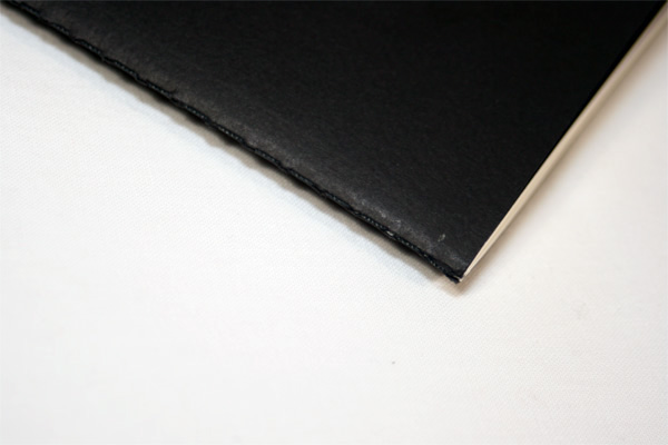
Binding
Singer sewn
Typography
Clarendon Van Dijck
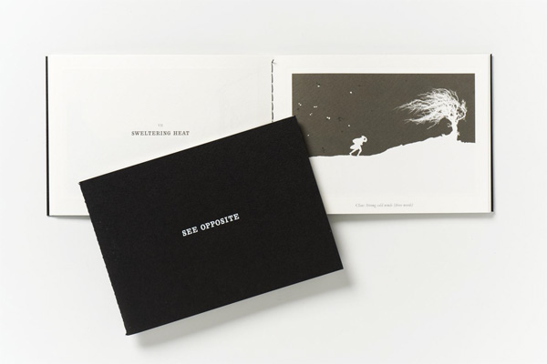
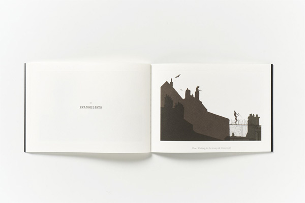
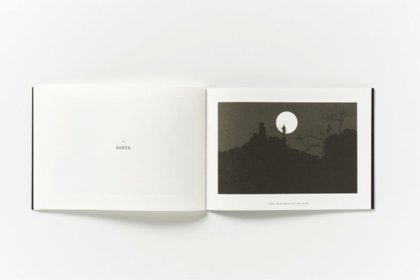
The opposite of getting a grocery store-purchased holiday card from your aunt is getting one of Pentagram’s epic holiday mailings (“cards” doesn’t do them justice). Consistently more than just happy wishing, their mailings typically involve puzzle solving or some other kind of visual diversion. Here is the explanation on this year’s “See Opposite”:
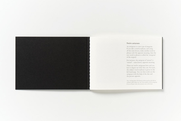
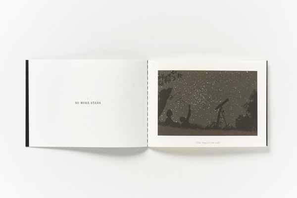
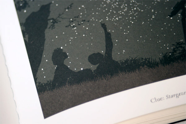
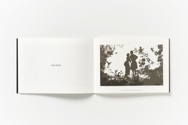
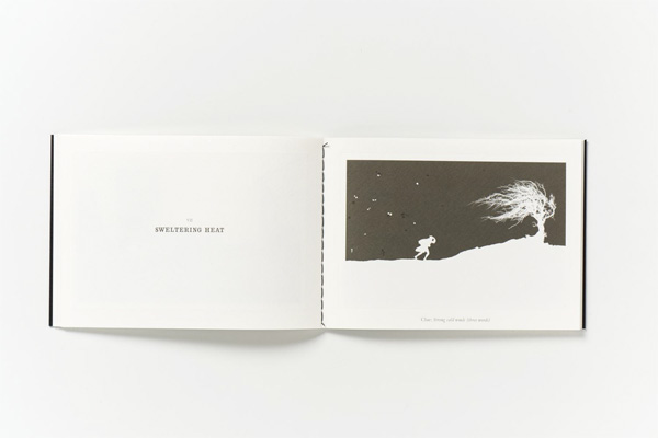
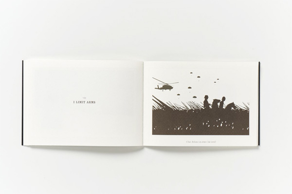
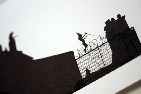
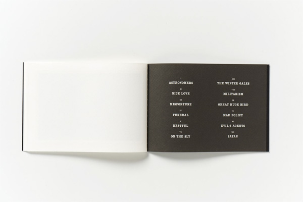
Intended to provide diversions during what, for many, can be a hectic period, the booklets traditionally avoid any direct reference to the festive season, adopting a strong graphic vocabulary, setting them apart from the myriad of cards received at this time of year. This year’s booklet features a series of antigrams illustrated with shadowy silhouettes. An antigram is a rare type of anagram. The object of the exercise is to discover a word or words that are the opposite of those printed using the same letters. The antigrams can be worked out with the help of a clue and the illustrations. Atypically this card does make a reference to Santa — though in a darkly gothic way.
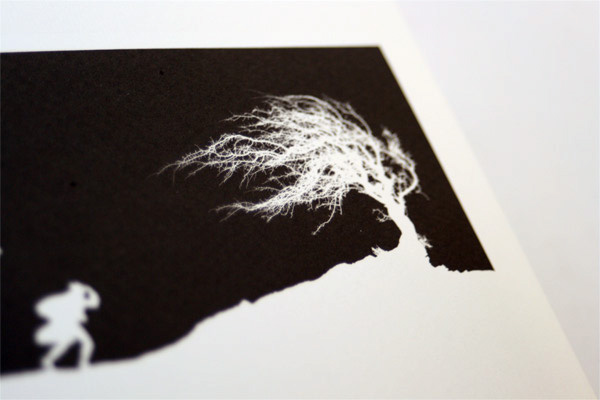
This type of paper does not lend itself to line debossing. When put under pressure the stock warps. We had to reduce the pressure on the plate to prevent this happening which lessened the impact of the debossing.
“See Opposite” is small and soft, with a sewn spine that gives it a nice vintage feel. Inside, the two spot colors have a brownish tint that give the illustrations an appearance of having been pulled from your grandma’s attic. It’s hard to tell on the photos, but each illustration is framed inside a debossed area. But as nice as the production is, the real delight is in solving the antigrams. Or not solving them. In which case, delight turns into frustration. Yeah… that sums up the holidays.
An animated web version of “See Opposite” with all the puzzles can be enjoyed here.

“See Opposite” Booklet
Production Method
Design
Pentagram
Partner in charge: Angus Hyland
Printing
Gavin Martin Colournet
This post was published in the original layout of FPO so all images are smaller. Project descriptions as well as production lessons are quoted in the main content area.
Post Author
Armin

Armin Vit
Editor of FPO and co-founder of UnderConsideration LLC.
More: Online / On Twitter
Date Published
February 2, 2011
Filed Under
Self promotion
Tagged with
deboss
self-promotion
sewing
uncoated


About
FPO (For Print Only), is a division of UnderConsideration, celebrating the reality that print is not dead by showcasing the most compelling printed projects.
FPO uses Fonts.com to render Siseriff and Avenir Next.
FPO is run with Six Apart’s MovableType
All comments, ideas and thoughts on FPO are property of their authors; reproduction without the author’s or FPO’s permission is strictly prohibited
Twitter @ucllc
Sign-up for Mailing List
Mailing list managed by MailChimp
Thanks to our advertisers
About UnderConsideration
UnderConsideration is a graphic design firm generating its own projects, initiatives, and content while taking on limited client work. Run by Bryony Gomez-Palacio and Armin Vit in Bloomington, IN. More…
blogs we publish
Brand New / Displaying opinions and focusing solely on corporate and brand identity work.
Art of the Menu / Cataloguing the underrated creativity of menus from around the world.
Quipsologies / Chronicling the most curious, creative, and notable projects, stories, and events of the graphic design industry on a daily basis.
products we sell
Flaunt: Designing effective, compelling and memorable portfolios of creative work.
Brand New Conference videos / Individual, downloadable videos of every presentation since 2010.
Prints / A variety of posters, the majority from our AIforGA series.
Other / Various one-off products.
events we organize
Brand New Conference / A two-day event on corporate and brand identity with some of today's most active and influential practitioners from around the world.
Brand Nieuwe Conference / Ditto but in Amsterdam.
Austin Initiative for Graphic Awesomeness / A speaker series in Austin, TX, featuring some of the graphic design industry's most awesome people.
also
Favorite Things we've Made / In our capacity as graphic designers.
Projects we've Concluded / Long- and short-lived efforts.
UCllc News / Updates on what's going at the corporate level of UnderConsideration.

Related entries
E.A.S.E. Stationery Set
End of Work iPad and Notebook Cases
Cranky Bucks Promotion
Pizza Box Promo Mailer
Bryan Patrick Todd Mailer