ADV @ UNDERCONSIDERATION Peek here for details
BROWSE
Client
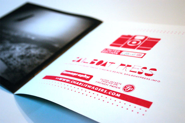
Sailboat Press
Quantity Produced
100
Production Cost
$500
Production Time
1 month
Dimensions (Width × Height × Depth)
7 in × 7 in
Page Count
20
Paper Stock
French Poptone Whip-Cream
Number of Colors
–
Varnishes
–
Binding
Saddle-stitched
Typography
Knockout
Futura
I’ve been interested in photography since I can remember, but lomography has particularly bemused me since I was given my first Holga about three years ago as a gift. It’s kind of like cooking vs. baking. While cooking, you can kind of throw stuff together and improvise and make something delicious. Baking requires patience, technicality, and trust. You can’t see or taste how good (or bad) it is until it’s out of the oven. My hat is off to those that can produce such captivating images.
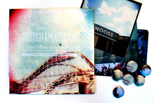
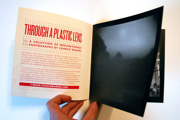
This is a small zine to commemorate a Photography Exhibit by Charlie Wagers. All photos were shot on analogue 120 film, through square-format, plastic-lens, lomographic cameras. The images are run through an array of experimental techniques to generate unexpected results.
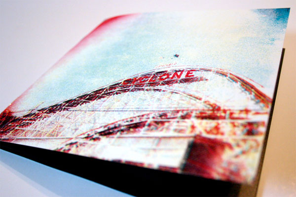
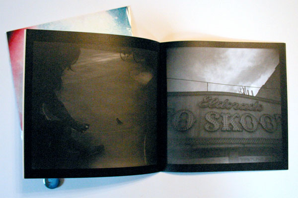
The zine is a special, hand-made limited edition, published by Sailboat Press. The zine has screen-printed front and back covers, printed on French Pop-Tone Whip Cream paper. Packaged in a clear sleeve, plus a 5 × 5 double-sided print, button and 2 postcards. Signed and hand-numbered out of 100 copies. The outside covers are CMYK hand screen-printed, and the inside covers are 1-color magenta. All inside images are black and white prints.
The main complication on this project was mixing a hand-made technique with a meticulous, machinery based assembly. The covers were all hand-printed, which included the slight mis-registration that coincides. Upon passing off the hand-printed covers to the printshop for assembly with the rest of the zine, they had to do a bit of work to make everything line up consistently.

“Through A Plastic Lens” Zine
Production Method
Design
Charlie Wagers
Printing
Covers: Charlie Wagers
Body and Stitching: Digital Color Imaging
Postcards: Jakprints
Buttons: Charlie Wagers

This post was published in the original layout of FPO so all images are smaller. Project descriptions as well as production lessons are quoted in the main content area.
Post Author
Lauren Dickens

Lauren Dickens
Former intern at UnderConsideration LLC.
More: Online / On Twitter
Date Published
February 16, 2011
Filed Under
Booklet
Tagged with
black and white
lomography
silkscreen
zine


About
FPO (For Print Only), is a division of UnderConsideration, celebrating the reality that print is not dead by showcasing the most compelling printed projects.
FPO uses Fonts.com to render Siseriff and Avenir Next.
FPO is run with Six Apart’s MovableType
All comments, ideas and thoughts on FPO are property of their authors; reproduction without the author’s or FPO’s permission is strictly prohibited
Twitter @ucllc
Sign-up for Mailing List
Mailing list managed by MailChimp
Thanks to our advertisers
About UnderConsideration
UnderConsideration is a graphic design firm generating its own projects, initiatives, and content while taking on limited client work. Run by Bryony Gomez-Palacio and Armin Vit in Bloomington, IN. More…
blogs we publish
Brand New / Displaying opinions and focusing solely on corporate and brand identity work.
Art of the Menu / Cataloguing the underrated creativity of menus from around the world.
Quipsologies / Chronicling the most curious, creative, and notable projects, stories, and events of the graphic design industry on a daily basis.
products we sell
Flaunt: Designing effective, compelling and memorable portfolios of creative work.
Brand New Conference videos / Individual, downloadable videos of every presentation since 2010.
Prints / A variety of posters, the majority from our AIforGA series.
Other / Various one-off products.
events we organize
Brand New Conference / A two-day event on corporate and brand identity with some of today's most active and influential practitioners from around the world.
Brand Nieuwe Conference / Ditto but in Amsterdam.
Austin Initiative for Graphic Awesomeness / A speaker series in Austin, TX, featuring some of the graphic design industry's most awesome people.
also
Favorite Things we've Made / In our capacity as graphic designers.
Projects we've Concluded / Long- and short-lived efforts.
UCllc News / Updates on what's going at the corporate level of UnderConsideration.

Related entries
Modern Era Booklet
Passover Haggadah
Neenah Paper CLASSIC® Rebrand
Legion Paper Artist Pads
Procter & Gamble Singapore Management Guide