ADV @ UNDERCONSIDERATION Peek here for details
BROWSE
Dimensions (Width × Height × Depth)
12.5 in × 19 in
Page Count
–
Paper Stock
Black Speckletone, Cover, 80lb
Number of Colors
–
Varnishes
–
Binding
–
Typography
–
I was about 9 years old when I bought my first comic. When I was 15 a graphic novel saved my life. My older sister collects manga. Now I live a stone’s throw away from a comic book shop.
Somehow, comics have always seemed to creep into my life. I feel as though this isn’t uncommon. Whether or not you’ve read the comics, everyone knows the story of the caped crusader and his vendetta on violence. Nice and thoughtful print.
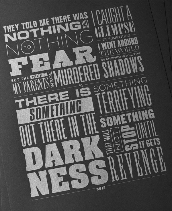
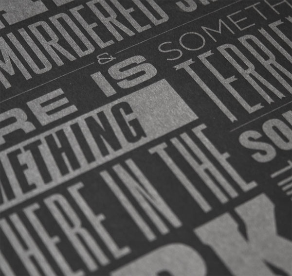
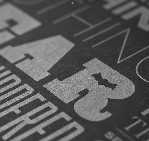
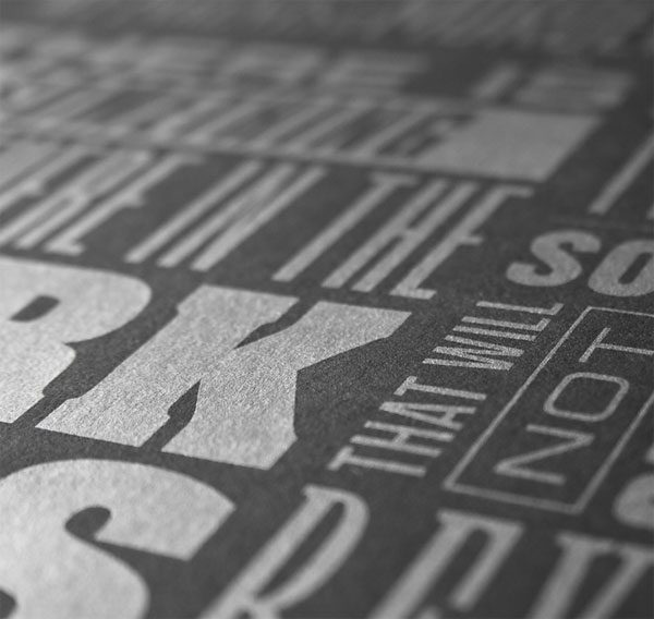
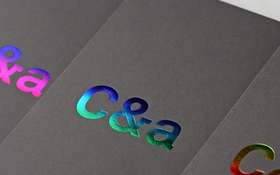
I love comic books, I love typography and I love print. I’ve wanted to merge the bunch for quite some time. This is the first of many comic-themed silkscreen prints I have planned for my online shop: Kryptonite. It was a blast to create and finding the perfect typeface to match the mood of each word was a tedious delight. I added in subtle details here and there to elevate the piece. Filling in the counter of the “A” in “FEAR”, because it’s dark, closed in, you don’t know where you’re going, switching the counter of the “R” for a bat: Batman’s original fear. Adding a halftone shadow to the word “SHADOWS”, things like that. I chose metallic silver on a black substrate to achieve the gunmetal appearance of the type. I wanted it dark, just like the grittiness of Batman’s words, and Mama’s Sauce did a great job in producing that.


This post was published in the original layout of FPO so all images are smaller. Project descriptions as well as production lessons are quoted in the main content area.
Post Author
Lauren Dickens

Lauren Dickens
Former intern at UnderConsideration LLC.
More: Online / On Twitter
Date Published
March 24, 2011
Filed Under
Posters
Tagged with
batman
french paper
french paper speckletone
metallic ink
silkscreen


About
FPO (For Print Only), is a division of UnderConsideration, celebrating the reality that print is not dead by showcasing the most compelling printed projects.
FPO uses Fonts.com to render Siseriff and Avenir Next.
FPO is run with Six Apart’s MovableType
All comments, ideas and thoughts on FPO are property of their authors; reproduction without the author’s or FPO’s permission is strictly prohibited
Twitter @ucllc
Sign-up for Mailing List
Mailing list managed by MailChimp
Thanks to our advertisers
About UnderConsideration
UnderConsideration is a graphic design firm generating its own projects, initiatives, and content while taking on limited client work. Run by Bryony Gomez-Palacio and Armin Vit in Bloomington, IN. More…
blogs we publish
Brand New / Displaying opinions and focusing solely on corporate and brand identity work.
Art of the Menu / Cataloguing the underrated creativity of menus from around the world.
Quipsologies / Chronicling the most curious, creative, and notable projects, stories, and events of the graphic design industry on a daily basis.
products we sell
Flaunt: Designing effective, compelling and memorable portfolios of creative work.
Brand New Conference videos / Individual, downloadable videos of every presentation since 2010.
Prints / A variety of posters, the majority from our AIforGA series.
Other / Various one-off products.
events we organize
Brand New Conference / A two-day event on corporate and brand identity with some of today's most active and influential practitioners from around the world.
Brand Nieuwe Conference / Ditto but in Amsterdam.
Austin Initiative for Graphic Awesomeness / A speaker series in Austin, TX, featuring some of the graphic design industry's most awesome people.
also
Favorite Things we've Made / In our capacity as graphic designers.
Projects we've Concluded / Long- and short-lived efforts.
UCllc News / Updates on what's going at the corporate level of UnderConsideration.

Related entries
36 Days of Type Poster
Ministry of Environment in Colombia Poster
National Parks Map
eBoy Poster
“Love Your Mother” Print