ADV @ UNDERCONSIDERATION Peek here for details
BROWSE
Client
Self
Quantity Produced
200
Production Cost
£400 (US$653)
Production Time
2 weeks
Dimensions (Width × Height × Depth)
–
Page Count
–
Paper Stock
Uncoated, Cotton, 720gsm
Number of Colors
1
Varnishes
–
Binding
–
Typography
–
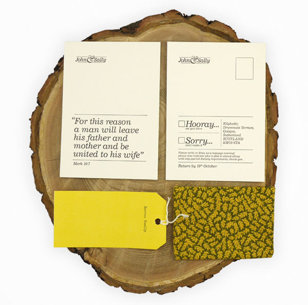
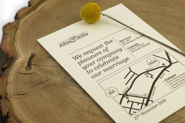
Nesting. That’s what these invitations evoke. They’re modest, yet beautifully executed and they do a really good job of giving an identity to the couple. I love the vintage cloth tag satchels. There’s a lot of personality within this spread. Also the photos have log cross-sections! An instant win.
I wanted to stay clear of the clichéd script faces and it was important that the invites reflected the ‘vintage’ casual style of our wedding and tied in with the ‘yellow’ theme. I think this was achieved with the use of the ‘cutesy’ italic typeface and the beautiful effect of the letterpress printing.
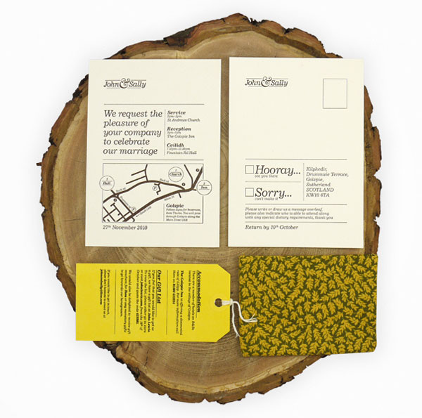
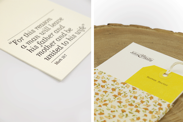
The luggage tags were personalized using a typewriter and the reverse was used to hold all the extra information like gift list, etc. Luggage tags were also used throughout the wedding for name places, cake descriptions etc.
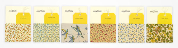
It was decided early on that we would use bunting to decorate our venue, so to compliment this I selected 8 of the same vintage and reclaimed fabrics to make pouches to house the invites. The idea was that when people arrived at the venue they could find ‘their’ fabric in amongst the bunting.
This project taught me how difficult it is to be ‘creative director’, ‘designer’, and ‘client’ all at the same time!
To complete this project I also had to learn how to use a sewing machine! As well as making 200 pouches to contain the invites themselves, I also produced around 150 meters of matching bunting to decorate the venue.

This post was published in the original layout of FPO so all images are smaller. Project descriptions as well as production lessons are quoted in the main content area.
Post Author
Lauren Dickens

Lauren Dickens
Former intern at UnderConsideration LLC.
More: Online / On Twitter
Date Published
April 5, 2011
Filed Under
Wedding materials
Tagged with
cotton
letterpress
wedding invitation


About
FPO (For Print Only), is a division of UnderConsideration, celebrating the reality that print is not dead by showcasing the most compelling printed projects.
FPO uses Fonts.com to render Siseriff and Avenir Next.
FPO is run with Six Apart’s MovableType
All comments, ideas and thoughts on FPO are property of their authors; reproduction without the author’s or FPO’s permission is strictly prohibited
Twitter @ucllc
Sign-up for Mailing List
Mailing list managed by MailChimp
Thanks to our advertisers
About UnderConsideration
UnderConsideration is a graphic design firm generating its own projects, initiatives, and content while taking on limited client work. Run by Bryony Gomez-Palacio and Armin Vit in Bloomington, IN. More…
blogs we publish
Brand New / Displaying opinions and focusing solely on corporate and brand identity work.
Art of the Menu / Cataloguing the underrated creativity of menus from around the world.
Quipsologies / Chronicling the most curious, creative, and notable projects, stories, and events of the graphic design industry on a daily basis.
products we sell
Flaunt: Designing effective, compelling and memorable portfolios of creative work.
Brand New Conference videos / Individual, downloadable videos of every presentation since 2010.
Prints / A variety of posters, the majority from our AIforGA series.
Other / Various one-off products.
events we organize
Brand New Conference / A two-day event on corporate and brand identity with some of today's most active and influential practitioners from around the world.
Brand Nieuwe Conference / Ditto but in Amsterdam.
Austin Initiative for Graphic Awesomeness / A speaker series in Austin, TX, featuring some of the graphic design industry's most awesome people.
also
Favorite Things we've Made / In our capacity as graphic designers.
Projects we've Concluded / Long- and short-lived efforts.
UCllc News / Updates on what's going at the corporate level of UnderConsideration.

Related entries
Herbst & Spungen Wedding Invitation Suite
Erin and Brian Wedding Invitation
Daniela & Rui Wedding Invitation
Benjamin & Catalina Wedding Announcement
Devon & Mike Wedding Invitation