ADV @ UNDERCONSIDERATION Peek here for details
BROWSE
Client
Self-Promotion
Quantity Produced
200
Production Cost
$1,095
Production Time
1 month
Dimensions (Width × Height × Depth)
5.25 in × 4 in
Page Count
–
Paper Stock
French Sweet Tooth Pop-tone 100lb cover and matching envelopes
Number of Colors
2
Varnishes
–
Binding
–
Typography
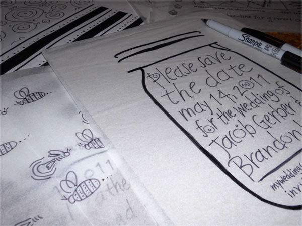
Design was hand lettered by Brandon Kirk, envelopes were hand lettered by Camille Long
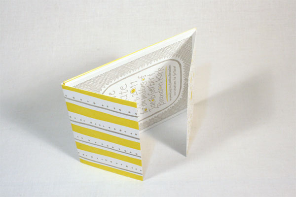
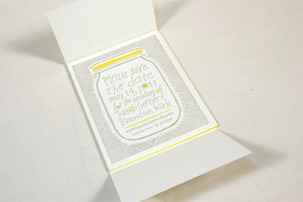
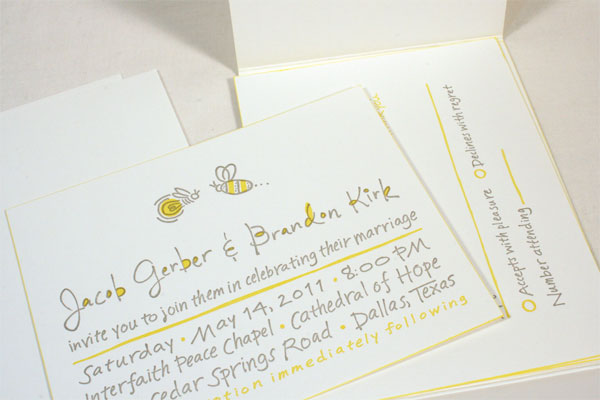
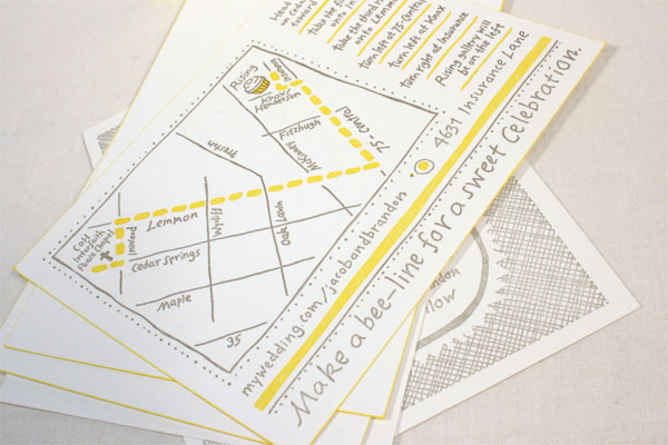
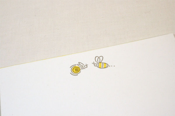
These invitations exude a cheerful, playful presence, partly through the use of color, partly because of the hand-drawn type, and partly, because they have quirky little illustrations throughout. Also it looks like their reception was located in a huge cupcake. Winning wedding.
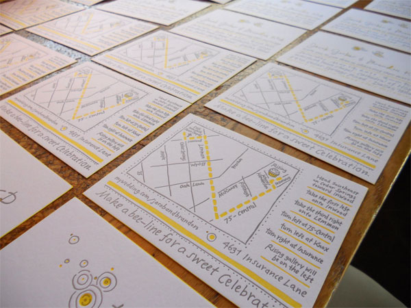
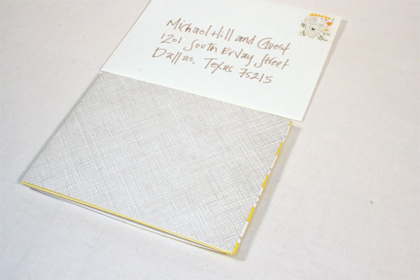
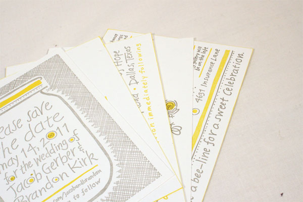
The wrapper was scored on press four times so it would lay flat when folded. Each insert card was hand edged with a rubber stamp ink pad to achieve the yellow edge. I designed rubber stamps for the return addresses on the save the date, reply cards and envelopes to save money. We used a yellow marker on the envelopes to create the yellow dingbats separating the address.
I wanted a very warm and inviting wedding invitation so I hand lettered everything and drew the illustrations and patterns by hand. Neither of us like things that are too frilly or fussy and are not fans of most script fonts. I based the illustrations and patterns on pet names we have for each other: me - a graphic designer (Bumble bee) and him - a lighting designer (Firefly). The colors followed the concept of light and design.
Hand lettering looks great but is very tedious and time consuming. I set text in another font first to rough in copy, spell check and proof before the final was done. We found out that the cross hatch pattern on the back did not create as deep of a relief in the paper as we expected because of the amount of coverage and how tight the lines are to each other. I would probably have made the pattern a little bigger so the pressure would disperse less evenly to create more texture from the letterpress.

Brandon & Jacob Wedding invitation
Production Method
Design
Brandon Kirk
Jacob Gerber
Printing
Lilco Letterpress
This post was published in the original layout of FPO so all images are smaller. Project descriptions as well as production lessons are quoted in the main content area.
Post Author
Lauren Dickens

Lauren Dickens
Former intern at UnderConsideration LLC.
More: Online / On Twitter
Date Published
May 25, 2011
Filed Under
Wedding materials
Tagged with
letterpress
wedding materials


About
FPO (For Print Only), is a division of UnderConsideration, celebrating the reality that print is not dead by showcasing the most compelling printed projects.
FPO uses Fonts.com to render Siseriff and Avenir Next.
FPO is run with Six Apart’s MovableType
All comments, ideas and thoughts on FPO are property of their authors; reproduction without the author’s or FPO’s permission is strictly prohibited
Twitter @ucllc
Sign-up for Mailing List
Mailing list managed by MailChimp
Thanks to our advertisers
About UnderConsideration
UnderConsideration is a graphic design firm generating its own projects, initiatives, and content while taking on limited client work. Run by Bryony Gomez-Palacio and Armin Vit in Bloomington, IN. More…
blogs we publish
Brand New / Displaying opinions and focusing solely on corporate and brand identity work.
Art of the Menu / Cataloguing the underrated creativity of menus from around the world.
Quipsologies / Chronicling the most curious, creative, and notable projects, stories, and events of the graphic design industry on a daily basis.
products we sell
Flaunt: Designing effective, compelling and memorable portfolios of creative work.
Brand New Conference videos / Individual, downloadable videos of every presentation since 2010.
Prints / A variety of posters, the majority from our AIforGA series.
Other / Various one-off products.
events we organize
Brand New Conference / A two-day event on corporate and brand identity with some of today's most active and influential practitioners from around the world.
Brand Nieuwe Conference / Ditto but in Amsterdam.
Austin Initiative for Graphic Awesomeness / A speaker series in Austin, TX, featuring some of the graphic design industry's most awesome people.
also
Favorite Things we've Made / In our capacity as graphic designers.
Projects we've Concluded / Long- and short-lived efforts.
UCllc News / Updates on what's going at the corporate level of UnderConsideration.

Related entries
Herbst & Spungen Wedding Invitation Suite
Erin and Brian Wedding Invitation
Daniela & Rui Wedding Invitation
Benjamin & Catalina Wedding Announcement
Devon & Mike Wedding Invitation