ADV @ UNDERCONSIDERATION Peek here for details
BROWSE
Client
Lee and Michael
Quantity Produced
150
Production Cost
$150
Production Time
12 hours
Dimensions (Width × Height × Depth)
5 in × 7 in
Page Count
–
Paper Stock
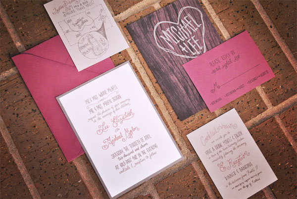
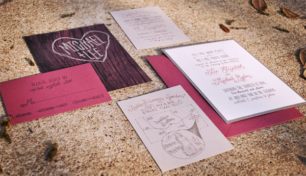
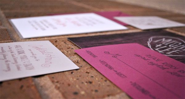
Uncoated stock from Paper Source. Colors include Gravel, Cement, and Rhubarb.
Number of Colors
CMYK
Varnishes
–
Binding
–
Typography
Hand-drawn
I’ve said it before, and I will say it again: I really appreciate wedding invitations that tell a story beyond providing the factual information about the upcoming event. Mallory’s hard work in creating the perfect lettering for Lee and Michael surely pays off by creating a unique visual vocabulary owned by the happy couple. Plus, nothing like a little DIY action to get in the wedding mood.
Lee and Michael are an incredibly vivacious couple—they posses this amazing blend of classic grace and modern comfort. Lee and I selected the color palette together and she waited patiently while I hand-lettered dozens of versions for the invitations. She and Michael wanted something reminiscent of the golden age of Hollywood, with a modern/casual twist. So we went with a traditional design blended with custom lettering and a neutral grey and rose color palette.
A recurring lesson I seem to be learning the hard way is calculating production time—when you’re producing things yourself, it always takes about 4 hours longer than the longest time you’d anticipate. I have learned to cope with this, by having a couple of friends, good music, plenty of beer and possibly some ice cream on hand…

Lee and Michael Wedding Invitation
Production Method
Design
Mallory Grigg
Printing
Canon Pixma Pro9000
This post was published in the original layout of FPO so all images are smaller. Project descriptions as well as production lessons are quoted in the main content area.
Post Author
Bryony

Bryony Gomez-Palacio
Editor of FPO and co-founder of UnderConsideration LLC.
More: Online / On Twitter
Date Published
July 1, 2011
Filed Under
Wedding materials
Tagged with
CMYK
color paper
DIY
inkjet
uncoated
wedding invitation


About
FPO (For Print Only), is a division of UnderConsideration, celebrating the reality that print is not dead by showcasing the most compelling printed projects.
FPO uses Fonts.com to render Siseriff and Avenir Next.
FPO is run with Six Apart’s MovableType
All comments, ideas and thoughts on FPO are property of their authors; reproduction without the author’s or FPO’s permission is strictly prohibited
Twitter @ucllc
Sign-up for Mailing List
Mailing list managed by MailChimp
Thanks to our advertisers
About UnderConsideration
UnderConsideration is a graphic design firm generating its own projects, initiatives, and content while taking on limited client work. Run by Bryony Gomez-Palacio and Armin Vit in Bloomington, IN. More…
blogs we publish
Brand New / Displaying opinions and focusing solely on corporate and brand identity work.
Art of the Menu / Cataloguing the underrated creativity of menus from around the world.
Quipsologies / Chronicling the most curious, creative, and notable projects, stories, and events of the graphic design industry on a daily basis.
products we sell
Flaunt: Designing effective, compelling and memorable portfolios of creative work.
Brand New Conference videos / Individual, downloadable videos of every presentation since 2010.
Prints / A variety of posters, the majority from our AIforGA series.
Other / Various one-off products.
events we organize
Brand New Conference / A two-day event on corporate and brand identity with some of today's most active and influential practitioners from around the world.
Brand Nieuwe Conference / Ditto but in Amsterdam.
Austin Initiative for Graphic Awesomeness / A speaker series in Austin, TX, featuring some of the graphic design industry's most awesome people.
also
Favorite Things we've Made / In our capacity as graphic designers.
Projects we've Concluded / Long- and short-lived efforts.
UCllc News / Updates on what's going at the corporate level of UnderConsideration.

Related entries
Herbst & Spungen Wedding Invitation Suite
Erin and Brian Wedding Invitation
Daniela & Rui Wedding Invitation
Benjamin & Catalina Wedding Announcement
Devon & Mike Wedding Invitation