ADV @ UNDERCONSIDERATION Peek here for details
BROWSE
Client
Monica & Kevin
Quantity Produced
100
Production Cost
$450
Production Time
10 hrs
Dimensions (Width × Height × Depth)
6.25 in × 6.25 in
Page Count
–
Paper Stock
Crane, Lettra, Flourescent White, 220 lb
Number of Colors
2 Spot with Overprint & Blind Emboss
Varnishes
–
Binding
–
Typography
Mousse Script
Gotham
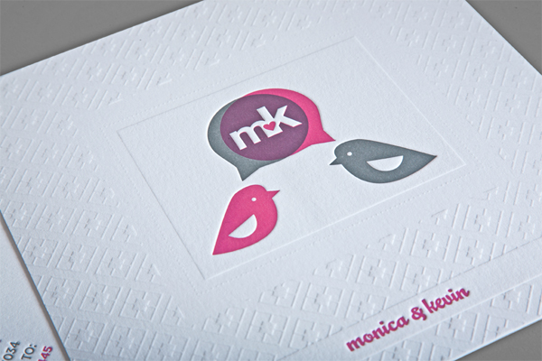
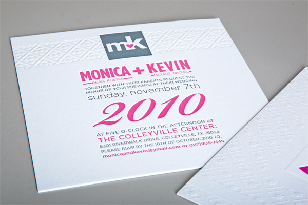
This is a well made wedding invitation featuring a pair of lovebirds with a nice overprint. The embossing is a very nice touch that looks to give the invitations a very tactile quality. The use of varied colors in the type help to define the hierarchy of information which makes the invitation easy to read. The birds and the speech bubbles are also nice departure from the squareness that would otherwise completely define the design.
When a good friend from college approached me last year about her upcoming wedding, I volunteered to design and print her invitations. Designing for friends or relatives can be somewhat touchy, but Monica only had a couple stipulations: they must be charcoal and magenta (her wedding colors) and she wanted something with a vintage feel.
I started by working on a monogram with the couples’ initials and developed the ‘mk’ within the speech bubble coming from the 2 birds (the birds being chosen as a symbol of the impending nuptials/starting of a new home, etc). She loved the direction and we sent out 100 copies to friends and family.
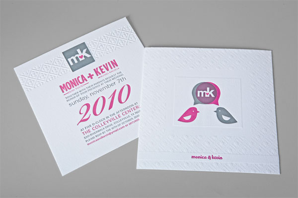

Monica & Kevin Wedding Invitation
Production Method
Design
Christine Clayton
Printing
The Arm Letterpress
This post was published in the original layout of FPO so all images are smaller. Project descriptions as well as production lessons are quoted in the main content area.
Post Author
Cole Baldwin

Cole Baldwin
Former intern at UnderConsideration LLC.
More: Online / On Twitter
Date Published
July 16, 2011
Filed Under
Wedding materials
Tagged with
emboss
letterpress
lettra
spot ink
wedding invitation


About
FPO (For Print Only), is a division of UnderConsideration, celebrating the reality that print is not dead by showcasing the most compelling printed projects.
FPO uses Fonts.com to render Siseriff and Avenir Next.
FPO is run with Six Apart’s MovableType
All comments, ideas and thoughts on FPO are property of their authors; reproduction without the author’s or FPO’s permission is strictly prohibited
Twitter @ucllc
Sign-up for Mailing List
Mailing list managed by MailChimp
Thanks to our advertisers
About UnderConsideration
UnderConsideration is a graphic design firm generating its own projects, initiatives, and content while taking on limited client work. Run by Bryony Gomez-Palacio and Armin Vit in Bloomington, IN. More…
blogs we publish
Brand New / Displaying opinions and focusing solely on corporate and brand identity work.
Art of the Menu / Cataloguing the underrated creativity of menus from around the world.
Quipsologies / Chronicling the most curious, creative, and notable projects, stories, and events of the graphic design industry on a daily basis.
products we sell
Flaunt: Designing effective, compelling and memorable portfolios of creative work.
Brand New Conference videos / Individual, downloadable videos of every presentation since 2010.
Prints / A variety of posters, the majority from our AIforGA series.
Other / Various one-off products.
events we organize
Brand New Conference / A two-day event on corporate and brand identity with some of today's most active and influential practitioners from around the world.
Brand Nieuwe Conference / Ditto but in Amsterdam.
Austin Initiative for Graphic Awesomeness / A speaker series in Austin, TX, featuring some of the graphic design industry's most awesome people.
also
Favorite Things we've Made / In our capacity as graphic designers.
Projects we've Concluded / Long- and short-lived efforts.
UCllc News / Updates on what's going at the corporate level of UnderConsideration.

Related entries
Herbst & Spungen Wedding Invitation Suite
Erin and Brian Wedding Invitation
Daniela & Rui Wedding Invitation
Benjamin & Catalina Wedding Announcement
Devon & Mike Wedding Invitation