ADV @ UNDERCONSIDERATION Peek here for details
BROWSE
Client
Patrick Heide Contemporary Art
Quantity Produced
1,200
Production Cost
–
Production Time
2 weeks
Dimensions (Width × Height × Depth)
240 mm (9.44 in) × 280 mm (11.02 in) × 12 mm (.47 in)
Page Count
100
Paper Stock
Coated 150 gr/mq
Number of Colors
CMYK + 1, black
Varnishes
–
Binding
Bodonian binding
Typography
FS Albert (Fontsmith)
Texture, color, imagery, materials, techniques, composition… so many elements to consider when developing a design project that can influence the final outcome. When these are inspired (or dictated) by a grander scope, such as an artists’ work, the rules of the game are different. In this case, I believe this parameters were a blessing, for the final catalogue is hard to put down as your eyes and fingers explore all the details.
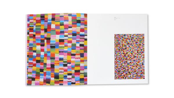
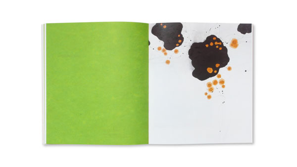
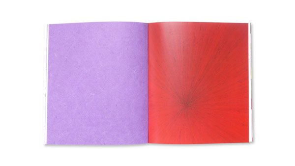
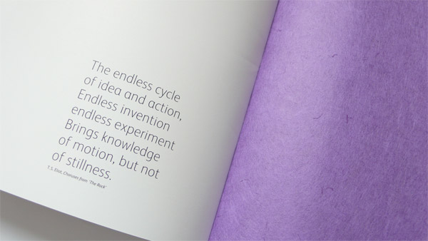
“There are no shortcuts to any place worth going.” This pearl of wisdom by the late American soprano Beverly Sills perfectly summarizes the catalogue for the Korean artist Minjung Kim. Although she represented her chosen homeland of Italy at the Venice Biennale with an installation, the artist is best known for her unique paintings that are meticulously built up of countless layers of singed Korean rice paper.
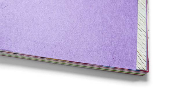
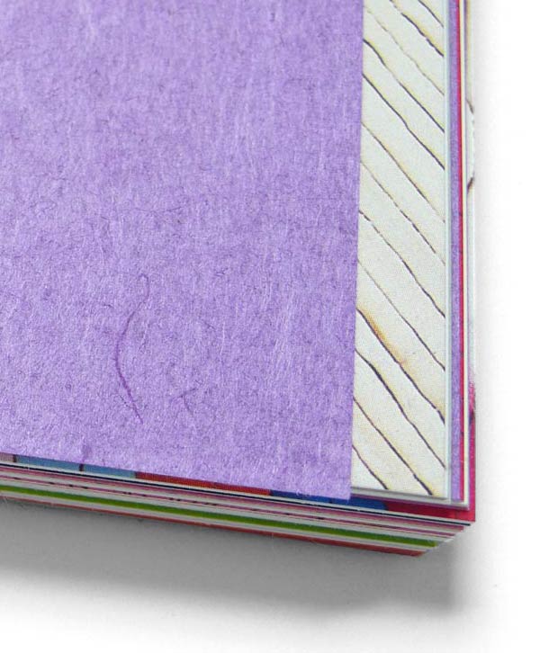
The catalogue of forty of Minjung Kim’s most recent works displays the same dedication and attention to material detail. Natural cover stock from France, Italian art paper and dividers made from the very rice paper the artist uses for her paintings have been skillfully combined to form a catalogue that was judged by the gallery owner to be “very Minjung Kim.”
We did have a main challenge to resolve, since this was the first time we wrapped sections with a rice paper. We had to go through several tests to be sure that the paper would survive the stress of the binding and the glue.
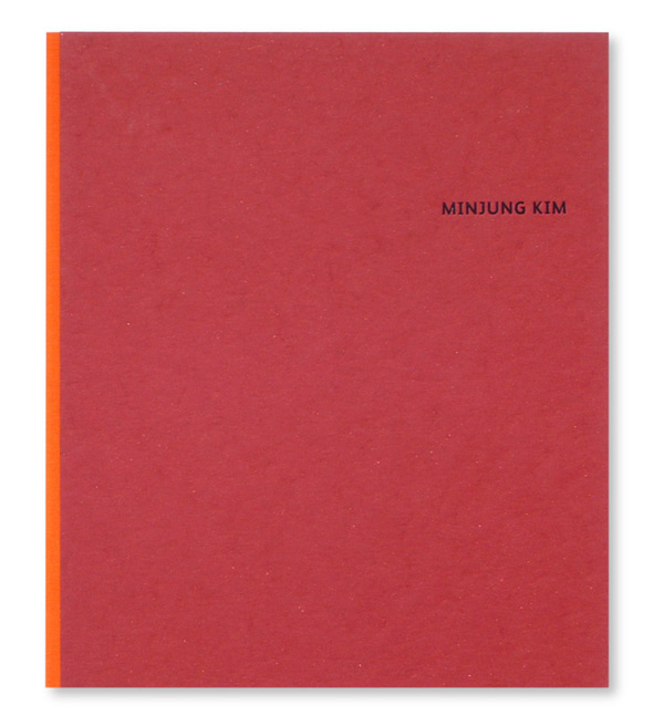

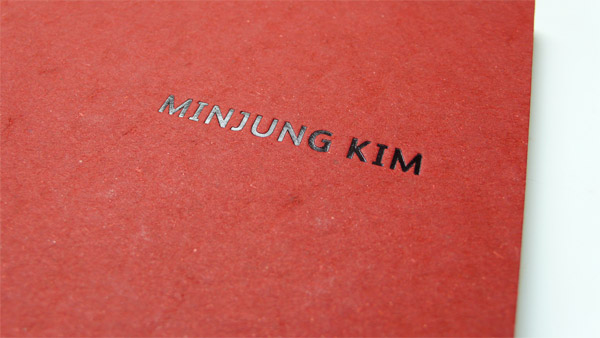
Minjung Kim Art Catalogue
Production Method
Design
Thomas Manss & Company
Printing
Printing: Tipolitografia Valbonesi
Repro and quality control: Gardel & Gardel
This post was published in the original layout of FPO so all images are smaller. Project descriptions as well as production lessons are quoted in the main content area.
Post Author
Bryony

Bryony Gomez-Palacio
Editor of FPO and co-founder of UnderConsideration LLC.
More: Online / On Twitter
Date Published
August 29, 2011
Filed Under
Catalogues
Tagged with
bodonian binding
catalogue
CMYK+K
coated
foil blocking
offset


About
FPO (For Print Only), is a division of UnderConsideration, celebrating the reality that print is not dead by showcasing the most compelling printed projects.
FPO uses Fonts.com to render Siseriff and Avenir Next.
FPO is run with Six Apart’s MovableType
All comments, ideas and thoughts on FPO are property of their authors; reproduction without the author’s or FPO’s permission is strictly prohibited
Twitter @ucllc
Sign-up for Mailing List
Mailing list managed by MailChimp
Thanks to our advertisers
About UnderConsideration
UnderConsideration is a graphic design firm generating its own projects, initiatives, and content while taking on limited client work. Run by Bryony Gomez-Palacio and Armin Vit in Bloomington, IN. More…
blogs we publish
Brand New / Displaying opinions and focusing solely on corporate and brand identity work.
Art of the Menu / Cataloguing the underrated creativity of menus from around the world.
Quipsologies / Chronicling the most curious, creative, and notable projects, stories, and events of the graphic design industry on a daily basis.
products we sell
Flaunt: Designing effective, compelling and memorable portfolios of creative work.
Brand New Conference videos / Individual, downloadable videos of every presentation since 2010.
Prints / A variety of posters, the majority from our AIforGA series.
Other / Various one-off products.
events we organize
Brand New Conference / A two-day event on corporate and brand identity with some of today's most active and influential practitioners from around the world.
Brand Nieuwe Conference / Ditto but in Amsterdam.
Austin Initiative for Graphic Awesomeness / A speaker series in Austin, TX, featuring some of the graphic design industry's most awesome people.
also
Favorite Things we've Made / In our capacity as graphic designers.
Projects we've Concluded / Long- and short-lived efforts.
UCllc News / Updates on what's going at the corporate level of UnderConsideration.

Related entries
Australian Book Design Association Award Catalogue 2016
L.A. Louver Catalog: Charles Garabedian
Andrew Curtis Catalogue
Minus-8 Catalog
“Bright Lights Dark City” Catalog