ADV @ UNDERCONSIDERATION Peek here for details
BROWSE
Dimensions (Width × Height × Depth)
18 in × 24 in
Page Count
–
Paper Stock
Cougar White Opaque 100 lb cover
Number of Colors
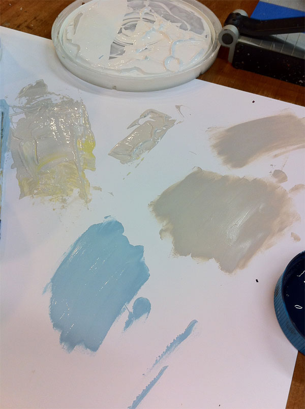
3 spot inks (custom)
Varnishes
–
Binding
–
Typography
Historical-FellTypeRoman (H&F-J)
Finding clients and new projects is no easy feat, but for some reason when there is the added element of personal passion for something in particular that the potential client/project has to offer it all becomes easier. Steve both stumbled upon and chased a couple of projects for singer and songwriter Rosanne Cash in such a manner, and I think his patience, perseverance and wit payed off.
Last fall I made the acquaintance of Rosanne Cash via Twitter. I designed a logo — which she loved — for her band, Hot Commando Bunny, and jokingly asked if I should bring t-shirts to her show in Ann Arbor the following evening. She said, “If you bring shirts, I will buy them from you.”
So that happened.
We remained in contact and I told her about Capital A and the gig posters we make by hand. Soon Christmas gifts were made for Hot Commando Bunny and not long after, Rosanne invited me to design an inspirational print around a line from her memoir, “Composed.” I get a lot of inspiration and imagery from The Library of Congress website. Most images are in the public domain and are often production-quality resolution. I think Rosanne liked the vintage feel of the HCB poster, so I went back to that source.
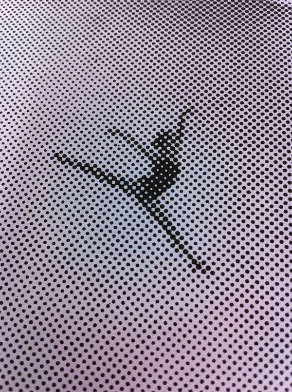
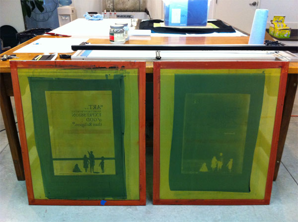
Being a poster of a quote, the words are the main attraction, so I wanted an image with a lot of space. I had just finished reading ‘Composed’ and taken note of Rosanne’s relationship with the sea. The quote spoke to me of wonder and a little sadness, which drew me to children and innocence. But the words also evoked elevation, the ‘lifting up’ that comes with art and music and faith and love. So I added the leaping dancer, far away. A vision. A god-like juxtaposition of beauty and mystery. That, combined with the pointing, curious, stopped-in-their-tracks children made it work for me, and&emdash;after a bit of collaboration&emdash;work for Rosanne.
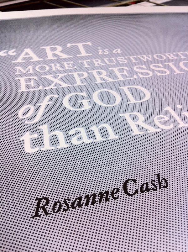
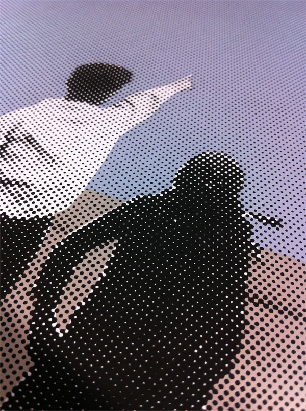
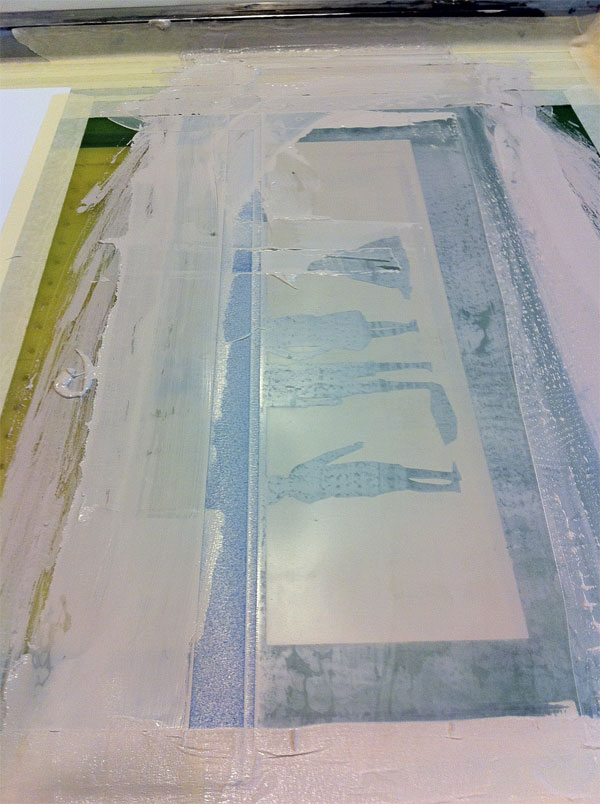
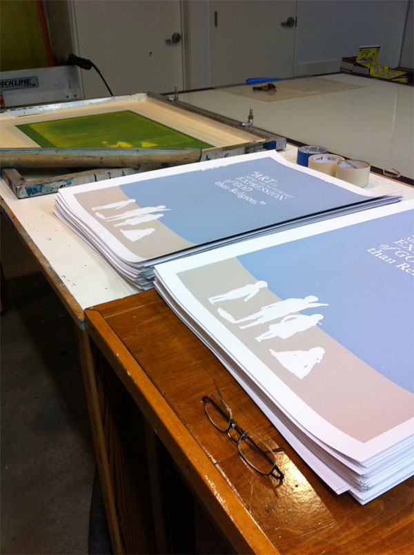
Though screen printing is a very forgiving production method, when making a high-profile print, one becomes aware of idiosyncrasies that might’ve gotten a pass on other projects. We had a slightly confounding problem with our homemade vacuum table that needed to be worked out. Seems that, over time, moisture in the air holes caused the melamine to dimple up in spots and caused a strange pattern in the prints. All 3 colors were pretty heavy coverage and this undesirable pattern was coming up in every one of our screens! Took some time to track down and about a hundred blown sheets, but a little sandpaper took care of the problem. And we had some exposure issues (blown out) with the big, black halftone. These were traced back to some old (stale?) emulsion. Turns out fresh emulsion is more light sensitive. Huh.
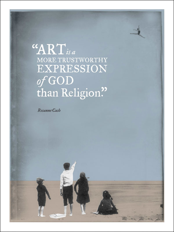

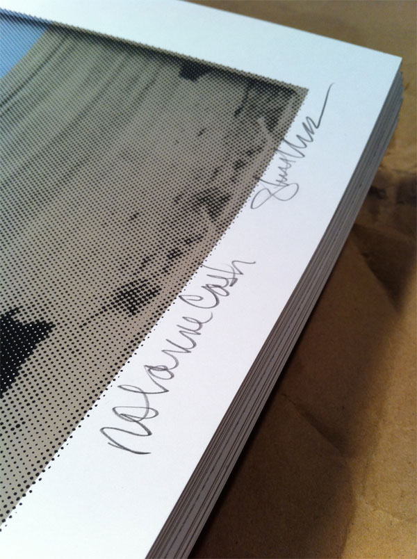
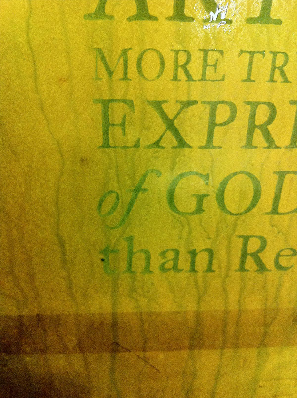
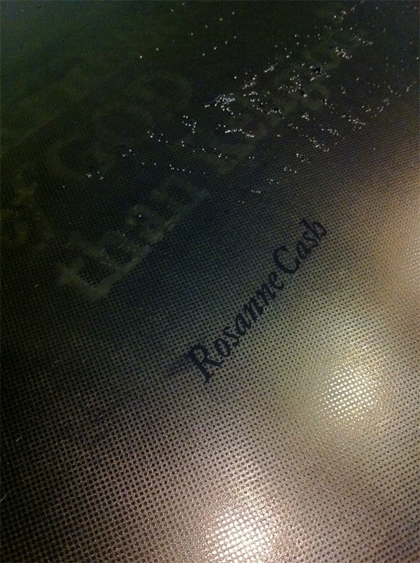
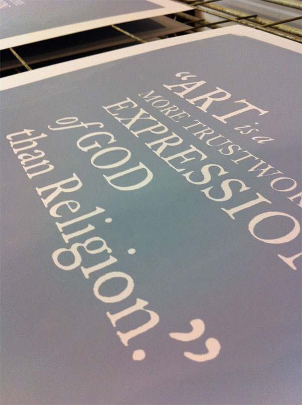
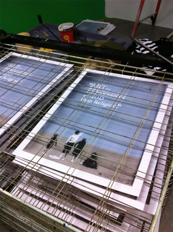
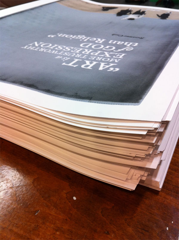
Rosanne Cash Poster
Production Method
Design
Copy: Rosanne Cash
Design: Steve Mockensturm
Photograph courtesy of Library of Congress Prints and Photographs Division Washington, D.C. 20540 USA
Printing
Capital A, screen printers
This post was published in the original layout of FPO so all images are smaller. Project descriptions as well as production lessons are quoted in the main content area.
Post Author
Bryony

Bryony Gomez-Palacio
Editor of FPO and co-founder of UnderConsideration LLC.
More: Online / On Twitter
Date Published
August 19, 2011
Filed Under
Posters
Tagged with
cougar
library of congress
poster
silkscreen
trouble
uncoated


About
FPO (For Print Only), is a division of UnderConsideration, celebrating the reality that print is not dead by showcasing the most compelling printed projects.
FPO uses Fonts.com to render Siseriff and Avenir Next.
FPO is run with Six Apart’s MovableType
All comments, ideas and thoughts on FPO are property of their authors; reproduction without the author’s or FPO’s permission is strictly prohibited
Twitter @ucllc
Sign-up for Mailing List
Mailing list managed by MailChimp
Thanks to our advertisers
About UnderConsideration
UnderConsideration is a graphic design firm generating its own projects, initiatives, and content while taking on limited client work. Run by Bryony Gomez-Palacio and Armin Vit in Bloomington, IN. More…
blogs we publish
Brand New / Displaying opinions and focusing solely on corporate and brand identity work.
Art of the Menu / Cataloguing the underrated creativity of menus from around the world.
Quipsologies / Chronicling the most curious, creative, and notable projects, stories, and events of the graphic design industry on a daily basis.
products we sell
Flaunt: Designing effective, compelling and memorable portfolios of creative work.
Brand New Conference videos / Individual, downloadable videos of every presentation since 2010.
Prints / A variety of posters, the majority from our AIforGA series.
Other / Various one-off products.
events we organize
Brand New Conference / A two-day event on corporate and brand identity with some of today's most active and influential practitioners from around the world.
Brand Nieuwe Conference / Ditto but in Amsterdam.
Austin Initiative for Graphic Awesomeness / A speaker series in Austin, TX, featuring some of the graphic design industry's most awesome people.
also
Favorite Things we've Made / In our capacity as graphic designers.
Projects we've Concluded / Long- and short-lived efforts.
UCllc News / Updates on what's going at the corporate level of UnderConsideration.

Related entries
36 Days of Type Poster
Ministry of Environment in Colombia Poster
National Parks Map
eBoy Poster
“Love Your Mother” Print