ADV @ UNDERCONSIDERATION Peek here for details
BROWSE
Client
Periscope Creative
Quantity Produced
500
Production Cost
$409
Production Time
2 Weeks
Dimensions (Width × Height × Depth)
3.5 in × 1.75 in
Page Count
–
Paper Stock
Crane Lettra, 220 lb Cover
Number of Colors
2 Spot over 1 Spot
Varnishes
–
Binding
–
Typography
Caslon
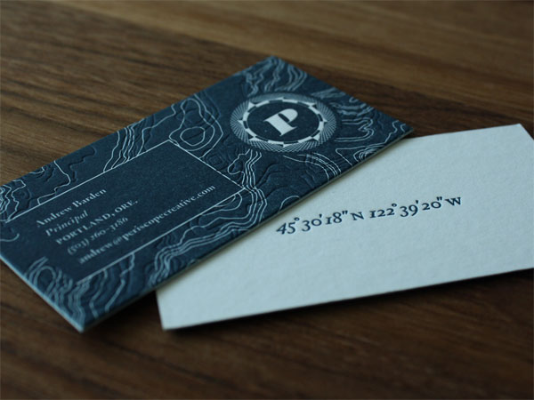
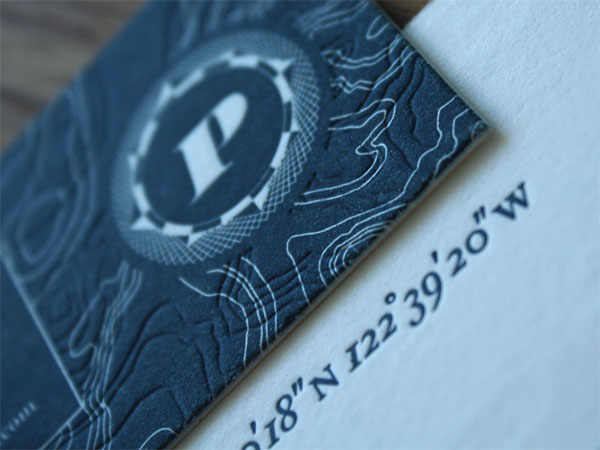
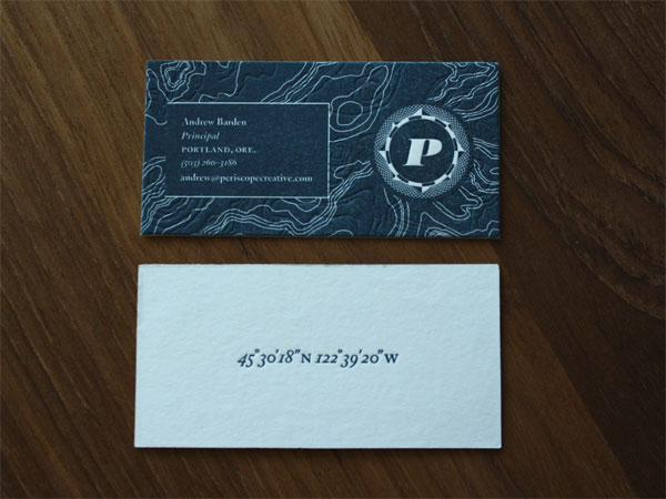
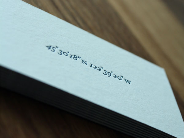
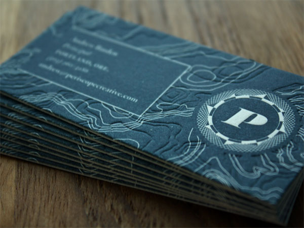
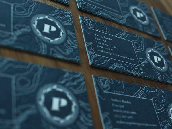
Periscope Creative, a Portland, OR-based creative agency has adopted a nautical theme for their brand. This deep blue business card features two topographic maps that weave in and out of one another creating a rhythmic flowing quality. The back of the card features the geographic coordinates of the agency which provides a nice contrast to the bold color and movement on the front.
Client Andrew Barden of Periscope Creative knew he wanted the approachable warmth of letterpress in his stationery system, and it was my charge to communicate the company’s new maritime-inspired brand voice through this vehicle. The result was an economical two-sided, one-color business card that featured the usual contact/title information on the front side, and the geographic location of the Periscope office on the reverse.
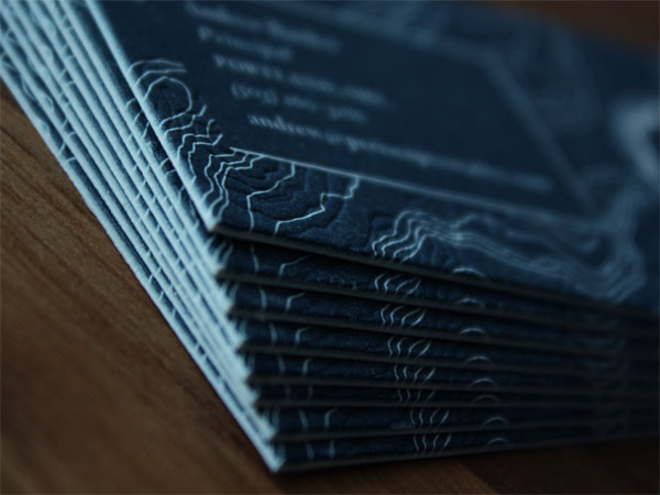
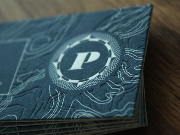
The pattern of two overlayed topographic maps feature on the card front ‚Äî one represents undersea topography and the company’s coastal-Oregon roots, the other the mountainous topography of the company’s current home in Portland, Oregon. They also nicely reference the company’s functional expertise in front-end design and back-end programming. The blind emboss of the undersea map prevented any difficult traps or overprints, while creating a lovely tactile surface.

This post was published in the original layout of FPO so all images are smaller. Project descriptions as well as production lessons are quoted in the main content area.
Post Author
Cole Baldwin

Cole Baldwin
Former intern at UnderConsideration LLC.
More: Online / On Twitter
Date Published
September 29, 2011
Filed Under
Business Cards
Tagged with
business card
crane lettra
letterpress
spot ink


About
FPO (For Print Only), is a division of UnderConsideration, celebrating the reality that print is not dead by showcasing the most compelling printed projects.
FPO uses Fonts.com to render Siseriff and Avenir Next.
FPO is run with Six Apart’s MovableType
All comments, ideas and thoughts on FPO are property of their authors; reproduction without the author’s or FPO’s permission is strictly prohibited
Twitter @ucllc
Sign-up for Mailing List
Mailing list managed by MailChimp
Thanks to our advertisers
About UnderConsideration
UnderConsideration is a graphic design firm generating its own projects, initiatives, and content while taking on limited client work. Run by Bryony Gomez-Palacio and Armin Vit in Bloomington, IN. More…
blogs we publish
Brand New / Displaying opinions and focusing solely on corporate and brand identity work.
Art of the Menu / Cataloguing the underrated creativity of menus from around the world.
Quipsologies / Chronicling the most curious, creative, and notable projects, stories, and events of the graphic design industry on a daily basis.
products we sell
Flaunt: Designing effective, compelling and memorable portfolios of creative work.
Brand New Conference videos / Individual, downloadable videos of every presentation since 2010.
Prints / A variety of posters, the majority from our AIforGA series.
Other / Various one-off products.
events we organize
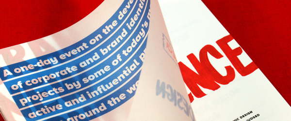
Brand New Conference / A two-day event on corporate and brand identity with some of today's most active and influential practitioners from around the world.
Brand Nieuwe Conference / Ditto but in Amsterdam.
Austin Initiative for Graphic Awesomeness / A speaker series in Austin, TX, featuring some of the graphic design industry's most awesome people.
also
Favorite Things we've Made / In our capacity as graphic designers.
Projects we've Concluded / Long- and short-lived efforts.
UCllc News / Updates on what's going at the corporate level of UnderConsideration.

Related entries
KitchenAid Limited Edition Cards
Black Sheep Studio Business Cards and Promotional Items
Seegno Business Cards
Fracas Productions Business Cards
Elegante Press Business card