ADV @ UNDERCONSIDERATION Peek here for details
BROWSE
Dimensions (Width × Height × Depth)
11 in × 17 in
Page Count
Letterpress
Giclée
Paper Stock
Uncoated, 110
Number of Colors
CMYK + 1
Varnishes
–
Binding
–
Typography
–
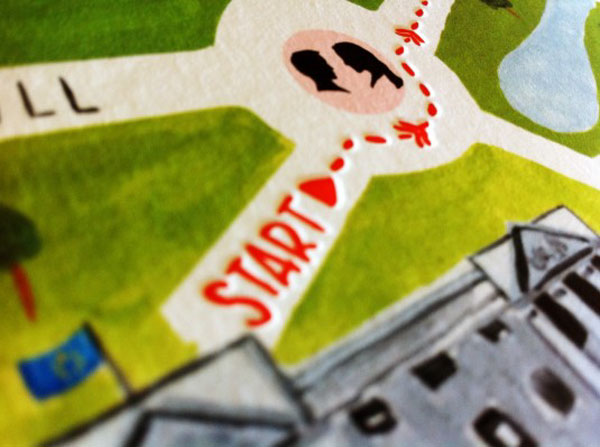
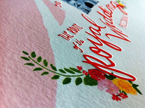
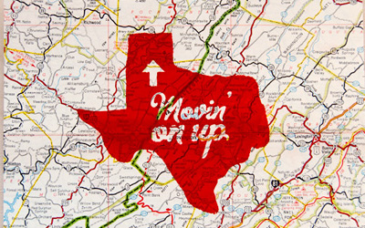
With all of the Royal Wedding hoopla we got to see some rather questionable design choices being made. We may agree or disagree on the event’s branding effort, but that does not matter. Far more interesting is the poster developed by Brittany Watson Jepsen that showcases the royal procession route in a beautifully designed and printed poster that combines an illustration printed in giclée and hit of red letterpress.
This poster was designed for the royal wedding of Prince William and Kate Middleton. It shows the drive from Buckingham Palace to the place of the wedding site, Westminster Abbey and indicates major London locations.
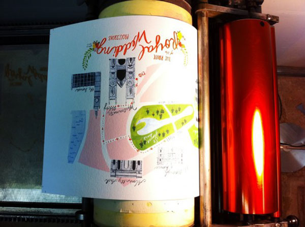
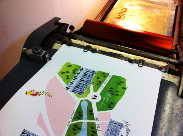
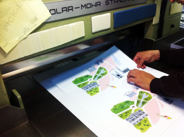
A poster worth a thousand lessons…Registering letterpress to giclée can be quite a challenge. Each sheet of Crane Lettra had to be hand fed into the giclée printer very carefully to ensure consistent printing of the image so we wouldn’t be angry at ourselves when trying to register the photopolymer letterpress plates to the giclée image. After the paper is through in the giclée printer, we cut down the parent sheets to fit into our vintage Vandercook SP-15 letterpress. After adjusting the registration, packing, and amount of ink on the press, everything was just right and we started the process of hand printing the posters one at a time. Once we are to this point there is little adjustment and, other than adjusting the ink, it is only a matter of printing through the pieces. So that is what we did.
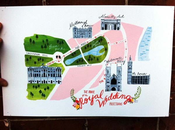

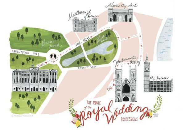
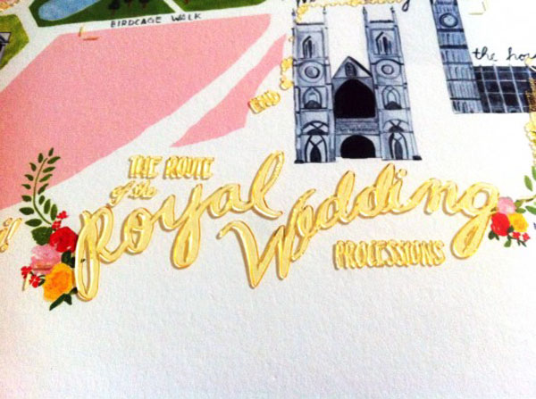
Royal Wedding Processional Map Poster
Production Method
Design
Brittany Watson Jepsen
Printing
Rowley Press
This post was published in the original layout of FPO so all images are smaller. Project descriptions as well as production lessons are quoted in the main content area.
Post Author
Bryony

Bryony Gomez-Palacio
Editor of FPO and co-founder of UnderConsideration LLC.
More: Online / On Twitter
Date Published
September 1, 2011
Filed Under
Posters
Tagged with
CMYK
giclée
letterpress
PMS
poster
uncoated


About
FPO (For Print Only), is a division of UnderConsideration, celebrating the reality that print is not dead by showcasing the most compelling printed projects.
FPO uses Fonts.com to render Siseriff and Avenir Next.
FPO is run with Six Apart’s MovableType
All comments, ideas and thoughts on FPO are property of their authors; reproduction without the author’s or FPO’s permission is strictly prohibited
Twitter @ucllc
Sign-up for Mailing List
Mailing list managed by MailChimp
Thanks to our advertisers
About UnderConsideration
UnderConsideration is a graphic design firm generating its own projects, initiatives, and content while taking on limited client work. Run by Bryony Gomez-Palacio and Armin Vit in Bloomington, IN. More…
blogs we publish
Brand New / Displaying opinions and focusing solely on corporate and brand identity work.
Art of the Menu / Cataloguing the underrated creativity of menus from around the world.
Quipsologies / Chronicling the most curious, creative, and notable projects, stories, and events of the graphic design industry on a daily basis.
products we sell
Flaunt: Designing effective, compelling and memorable portfolios of creative work.
Brand New Conference videos / Individual, downloadable videos of every presentation since 2010.
Prints / A variety of posters, the majority from our AIforGA series.
Other / Various one-off products.
events we organize
Brand New Conference / A two-day event on corporate and brand identity with some of today's most active and influential practitioners from around the world.
Brand Nieuwe Conference / Ditto but in Amsterdam.
Austin Initiative for Graphic Awesomeness / A speaker series in Austin, TX, featuring some of the graphic design industry's most awesome people.
also
Favorite Things we've Made / In our capacity as graphic designers.
Projects we've Concluded / Long- and short-lived efforts.
UCllc News / Updates on what's going at the corporate level of UnderConsideration.

Related entries
36 Days of Type Poster
Ministry of Environment in Colombia Poster
National Parks Map
eBoy Poster
“Love Your Mother” Print