ADV @ UNDERCONSIDERATION Peek here for details
BROWSE
Client
TOKYO, student organization of the Aalto University School of Art and Design
Quantity Produced
1,000
Production Cost
€10,300 (US$14,600)
Production Time
3 weeks
Dimensions (Width × Height × Depth)
A6: 105 mm (4.13 in) × 148 mm (5.82 in)
Page Count
224
Paper Stock
Uncoated Cocoon Offset 90 g/m2 and 200 g/m2, 100% recycled
Number of Colors
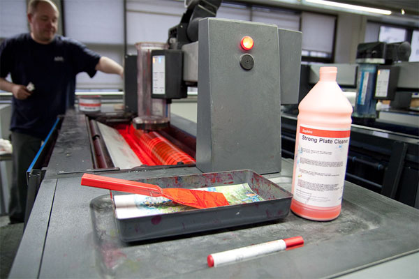
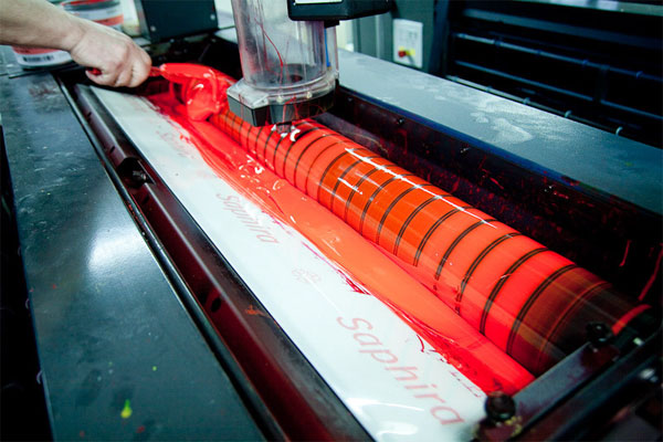
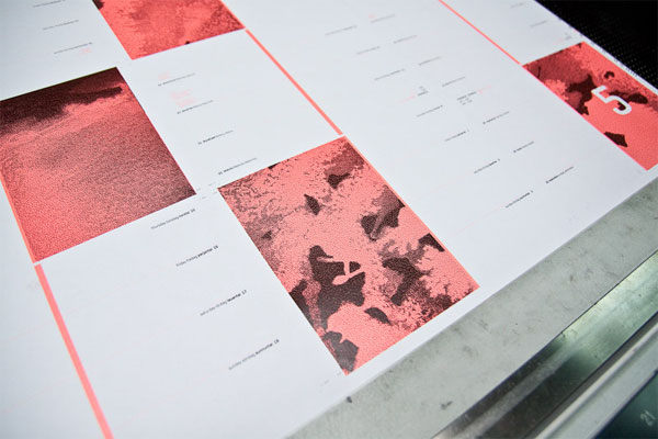
2 spot inks, Neon pink PMS 805 U and black
Varnishes
–
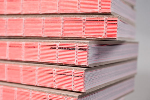
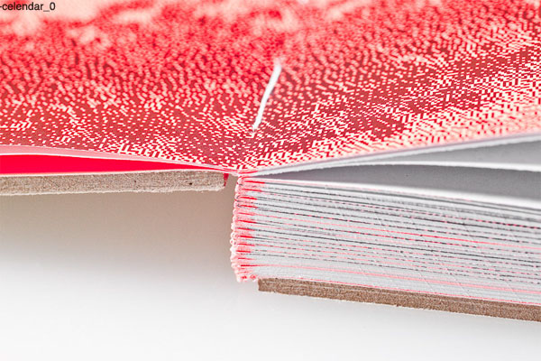
Binding
Open-bound sandwich
Typography
Geogrotesque (Eduardo Manso, Emtype Foundry)
Personally, in this day and age, I don’t care much for printed calendars. One more thing to carry around, often with limited space and no recurring appointments with a single click. But — and this is a big but — a calendar like this one would make me reconsider my ways. At least I could use it for birthdays or something, a little treasure to keep close.
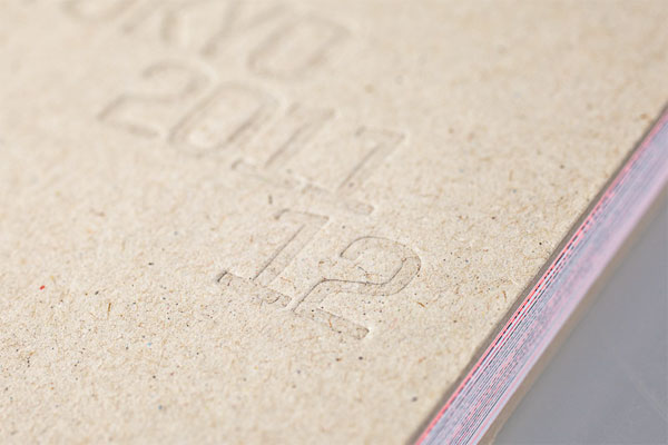
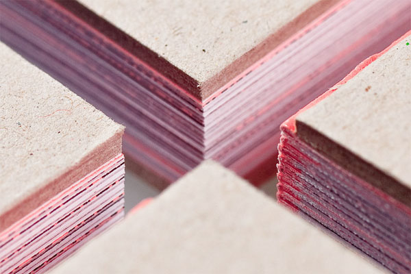
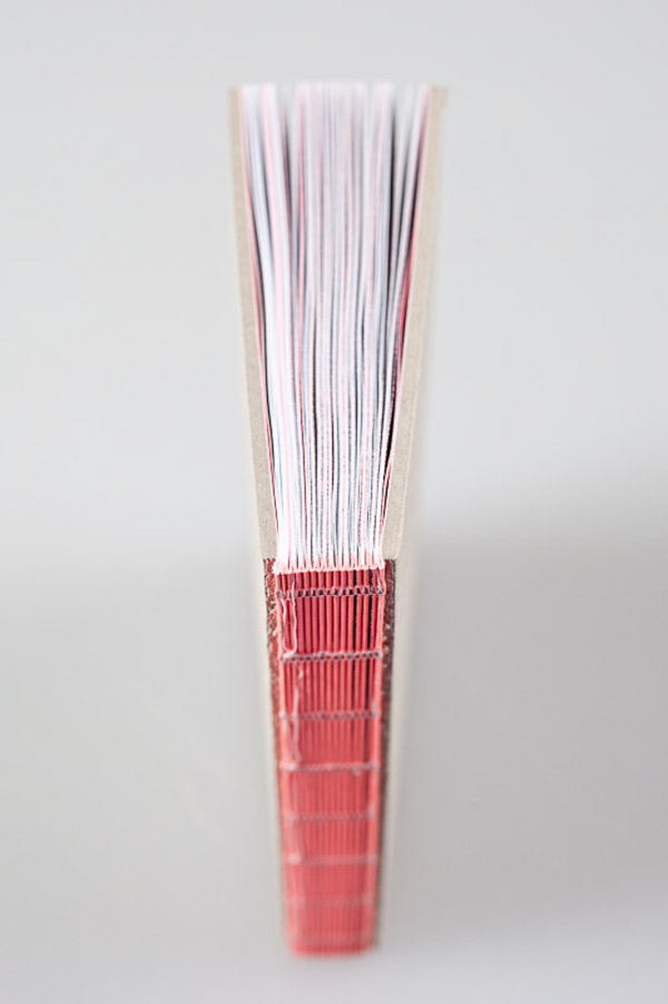
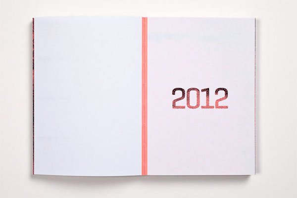
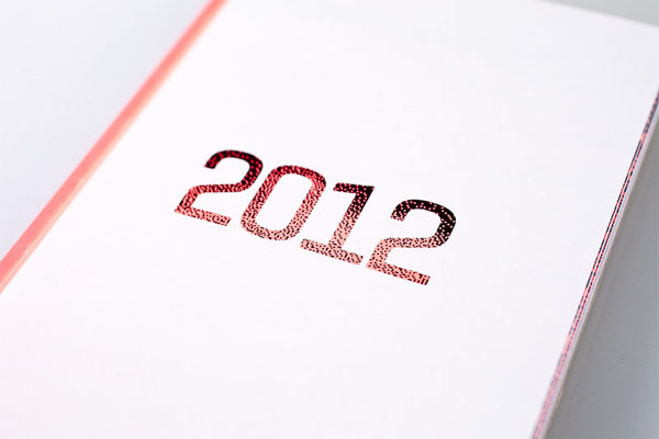
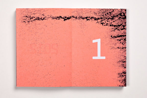
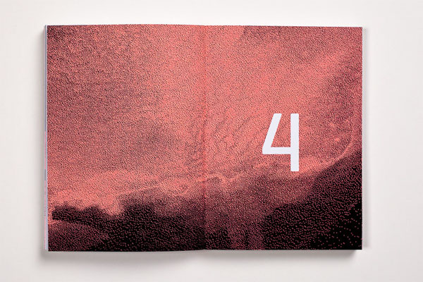
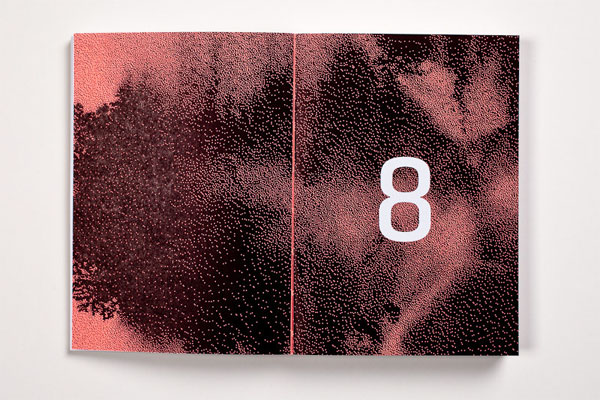
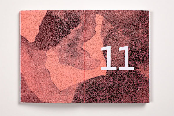
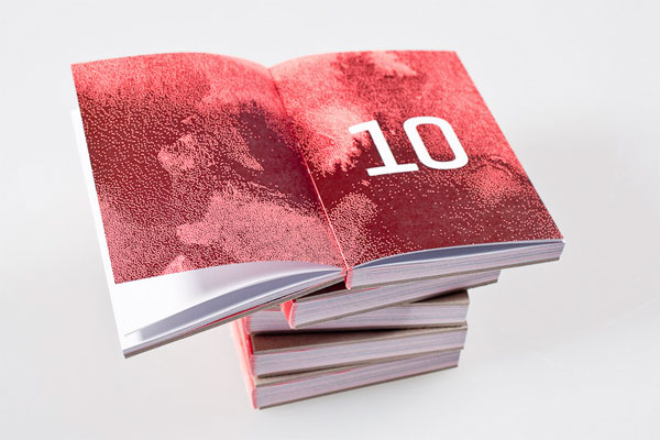
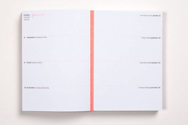
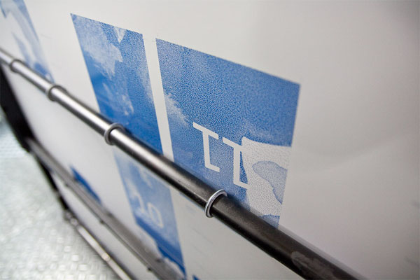
The TOKYO Design calendar is annually chosen through a design competition within the Aalto University School of Art and Design. Our approach was to make this calendar as functional, beautiful and innovative as possible. With an open sandwich-bound spine the calendar spreads fully and maintains exceptional usability. The hard covers ensure that this beautiful construction is also strong. We chose the materials with the environment in mind: the pages are printed on 100% recycled paper. Both the inside and the cover are uncoated.
This kind of binding is rarely seen, so the most important step in the calendar’s production was to find an ambitious printer with good contacts. Fortunately, we found one very early on which gave us the opportunity to focus on the actual insides of the calendar.
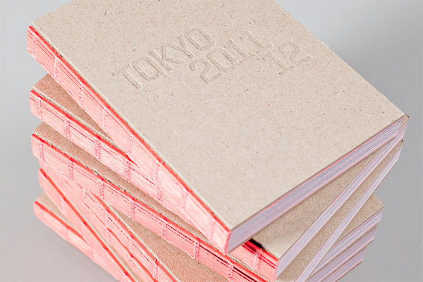

TOKYO Design Calendar
Production Method
Design
Safa Hovinen and Pauliina Nykänen
Printing
Printing: ArtPrint
Binding: Finnreklama
This post was published in the original layout of FPO so all images are smaller. Project descriptions as well as production lessons are quoted in the main content area.
Post Author
Bryony

Bryony Gomez-Palacio
Editor of FPO and co-founder of UnderConsideration LLC.
More: Online / On Twitter
Date Published
September 6, 2011
Filed Under
Books
Tagged with
A6
book
contest
offset
open-bound sandwich
PMS
uncoated


About
FPO (For Print Only), is a division of UnderConsideration, celebrating the reality that print is not dead by showcasing the most compelling printed projects.
FPO uses Fonts.com to render Siseriff and Avenir Next.
FPO is run with Six Apart’s MovableType
All comments, ideas and thoughts on FPO are property of their authors; reproduction without the author’s or FPO’s permission is strictly prohibited
Twitter @ucllc
Sign-up for Mailing List
Mailing list managed by MailChimp
Thanks to our advertisers
About UnderConsideration
UnderConsideration is a graphic design firm generating its own projects, initiatives, and content while taking on limited client work. Run by Bryony Gomez-Palacio and Armin Vit in Bloomington, IN. More…
blogs we publish
Brand New / Displaying opinions and focusing solely on corporate and brand identity work.
Art of the Menu / Cataloguing the underrated creativity of menus from around the world.
Quipsologies / Chronicling the most curious, creative, and notable projects, stories, and events of the graphic design industry on a daily basis.
products we sell
Flaunt: Designing effective, compelling and memorable portfolios of creative work.
Brand New Conference videos / Individual, downloadable videos of every presentation since 2010.
Prints / A variety of posters, the majority from our AIforGA series.
Other / Various one-off products.
events we organize
Brand New Conference / A two-day event on corporate and brand identity with some of today's most active and influential practitioners from around the world.
Brand Nieuwe Conference / Ditto but in Amsterdam.
Austin Initiative for Graphic Awesomeness / A speaker series in Austin, TX, featuring some of the graphic design industry's most awesome people.
also
Favorite Things we've Made / In our capacity as graphic designers.
Projects we've Concluded / Long- and short-lived efforts.
UCllc News / Updates on what's going at the corporate level of UnderConsideration.

Related entries
Severe(d): A Creepy Poetry Collection by Holly Riordan
BOYCO Classpack® Book
Antes de Perder la Esperanza Book
Gunnel Wåhlstrand Exhibit Book
Szép versek & Körkép Book Covers