ADV @ UNDERCONSIDERATION Peek here for details
BROWSE
Client
Self-Promotional
Quantity Produced
300
Production Cost
–
Production Time
2 Weeks
Dimensions (Width × Height × Depth)
3.5 in × 2 in
Page Count
–
Paper Stock
Crane Uncoated 179lb Cover
Number of Colors
3 Spot
Varnishes
–
Binding
–
Typography
Futura
Bodoni
Akzidenz Grotesk Condensed
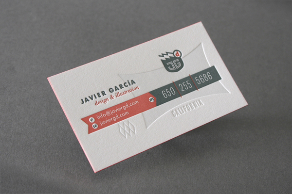
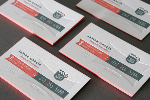
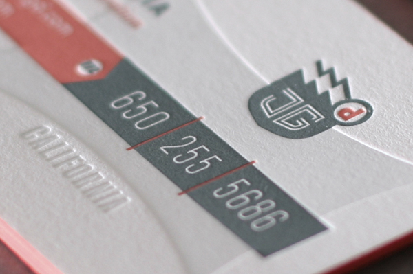
How do three colors, letterpress, and debossing team up to send an understated message? More is less in this case as every vibrant detail harmonizes into one soothing song of eternal summer. It makes me crave baseball. One could easily pass 9 innings exploring each exquisite mark in this detailed field, making a favorite pastime of zooming out to appreciate the individual blades of grass combining into a cohesive whole.
Initially wanted to have the background (blind/hint shape) as a foil stamp but It might have taken too much attention and caused some production problems such as ink not being absorbed by the foil when letterpressed. So I decided to go with a blind deboss with just a slight hint of color. The edge coloring was done by myself on a few of them just for test.


This post was published in the original layout of FPO so all images are smaller. Project descriptions as well as production lessons are quoted in the main content area.
Post Author
Kelly Cree

Kelly Cree
Writer for UnderConsideration LLC.
More: Online / On Twitter
Date Published
October 11, 2011
Filed Under
Business Cards
Tagged with
business card
deboss
letterpress
spot ink
uncoated


About
FPO (For Print Only), is a division of UnderConsideration, celebrating the reality that print is not dead by showcasing the most compelling printed projects.
FPO uses Fonts.com to render Siseriff and Avenir Next.
FPO is run with Six Apart’s MovableType
All comments, ideas and thoughts on FPO are property of their authors; reproduction without the author’s or FPO’s permission is strictly prohibited
Twitter @ucllc
Sign-up for Mailing List
Mailing list managed by MailChimp
Thanks to our advertisers
About UnderConsideration
UnderConsideration is a graphic design firm generating its own projects, initiatives, and content while taking on limited client work. Run by Bryony Gomez-Palacio and Armin Vit in Bloomington, IN. More…
blogs we publish
Brand New / Displaying opinions and focusing solely on corporate and brand identity work.
Art of the Menu / Cataloguing the underrated creativity of menus from around the world.
Quipsologies / Chronicling the most curious, creative, and notable projects, stories, and events of the graphic design industry on a daily basis.
products we sell
Flaunt: Designing effective, compelling and memorable portfolios of creative work.
Brand New Conference videos / Individual, downloadable videos of every presentation since 2010.
Prints / A variety of posters, the majority from our AIforGA series.
Other / Various one-off products.
events we organize
Brand New Conference / A two-day event on corporate and brand identity with some of today's most active and influential practitioners from around the world.
Brand Nieuwe Conference / Ditto but in Amsterdam.
Austin Initiative for Graphic Awesomeness / A speaker series in Austin, TX, featuring some of the graphic design industry's most awesome people.
also
Favorite Things we've Made / In our capacity as graphic designers.
Projects we've Concluded / Long- and short-lived efforts.
UCllc News / Updates on what's going at the corporate level of UnderConsideration.

Related entries
KitchenAid Limited Edition Cards
Black Sheep Studio Business Cards and Promotional Items
Seegno Business Cards
Fracas Productions Business Cards
Elegante Press Business card