ADV @ UNDERCONSIDERATION Peek here for details
BROWSE
Dimensions (Width × Height × Depth)
170mm × 220 mm (6.69 in × 8.66 in)
Page Count
–
Paper Stock
Uncoated
Number of Colors
4 spot inks
Varnishes
–
Binding
–
Typography
Bebas Neue
Quicksand
Baruta Black
ChunkFive
Bergamo Std
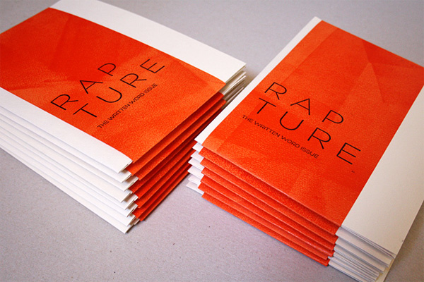
Another project of many hats and a single creator, where the desire to share a passion and learn more about how to make things come together to create a beautiful set of materials under the title RAPTURE. A perfect name, if you ask me.
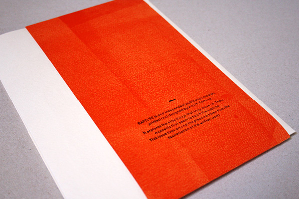
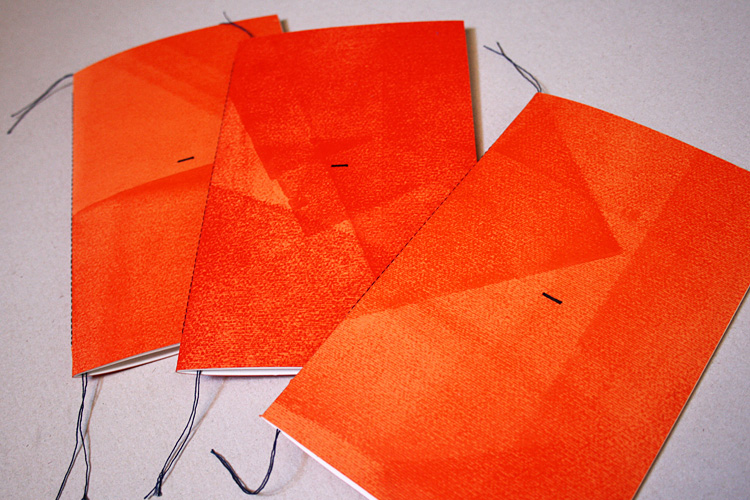
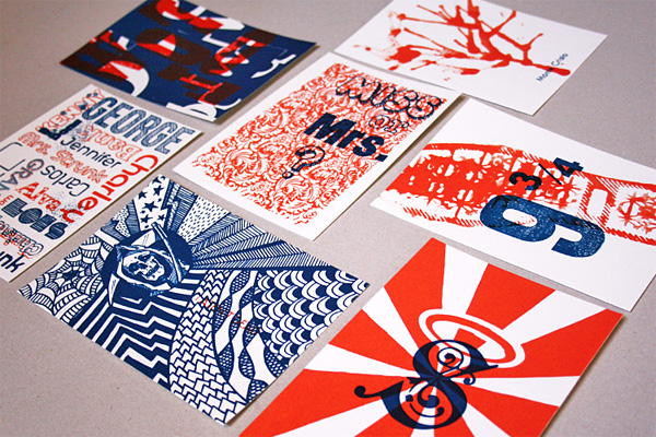
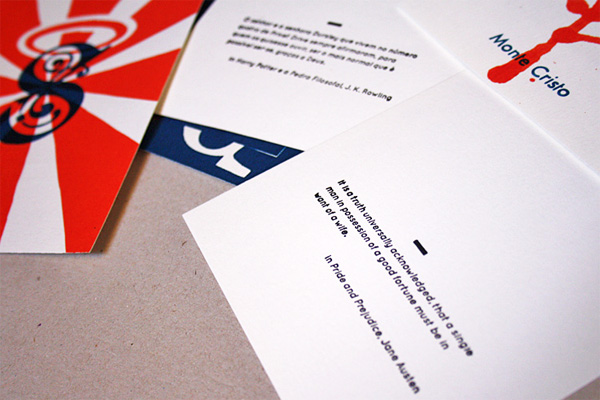
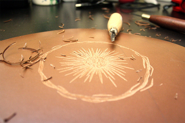
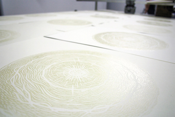
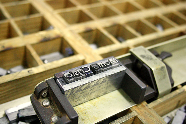
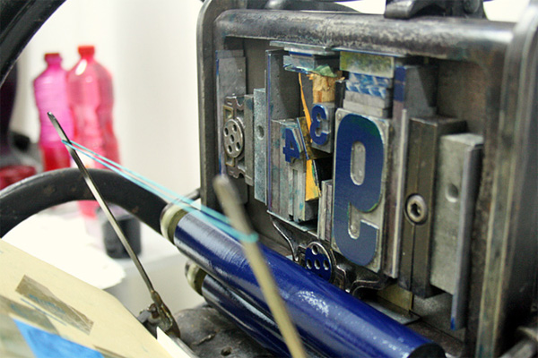
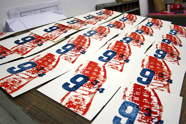
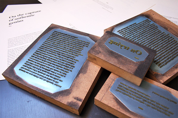
RAPTURE is an independent publication created, printed and designed by me, where I had the pleasure to explore several printing techniques: silkscreening, movable type, nylon print, and linoleum carving.</small?
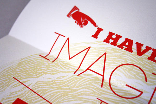
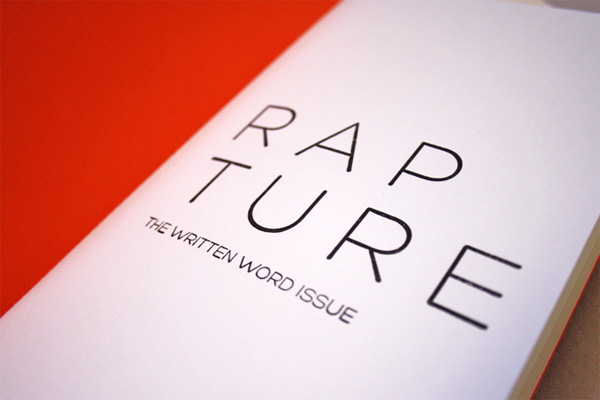
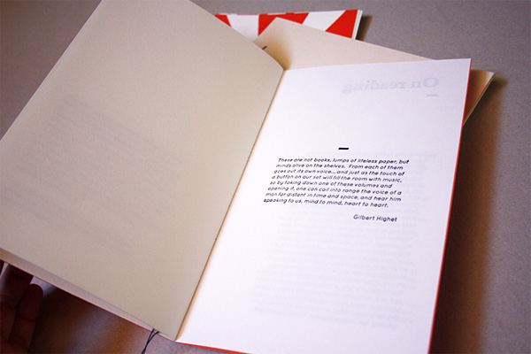
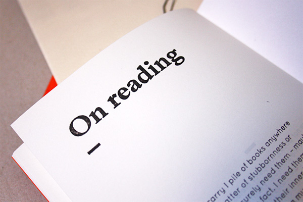
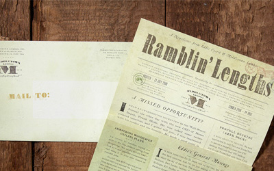
In it I explore the little things that truly move us. Those moments that seem to touch the sublime. This particular issue of RAPTURE lives around the pleasure taken from the appreciation of the written word.
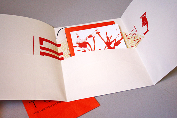
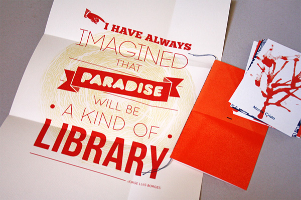
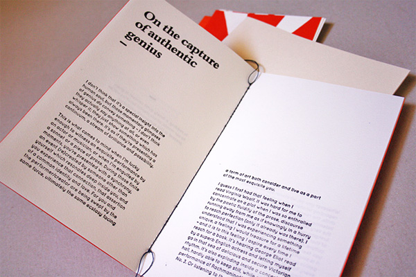
In order to explore this concept, I created a poster with a quote from Jorge Luis Borges that represented his love for reading. The postcards are a visual exploration of seven books that have some particular meaning to me, each one with the first sentence of each book printed on it’s back. The booklet contains essays from Pedro Ferreira revolving around the theme of reading and literature.
So, now that we know how the project came to be and its various pieces, I bet you are wondering about how it went in exploring the actual production.
These techniques can be pretty challenging, but the result is worth all the hard work. Since this was the first time I experimented with them, and being used to work in the neat digital printing world, I decided to embrace the small “errors” that these techniques present and make them part of the graphic approach.

Rapture Publication
Production Method
Design
Ana Ferreira
Printing
Ana Ferreira with the support of Oficina do Cego
This post was published in the original layout of FPO so all images are smaller. Project descriptions as well as production lessons are quoted in the main content area.
Post Author
Bryony

Bryony Gomez-Palacio
Editor of FPO and co-founder of UnderConsideration LLC.
More: Online / On Twitter
Date Published
October 13, 2011
Filed Under
Booklet
Tagged with
DIY
fold
linoleum
nylon print
PMS
silkscreen
uncoated


About
FPO (For Print Only), is a division of UnderConsideration, celebrating the reality that print is not dead by showcasing the most compelling printed projects.
FPO uses Fonts.com to render Siseriff and Avenir Next.
FPO is run with Six Apart’s MovableType
All comments, ideas and thoughts on FPO are property of their authors; reproduction without the author’s or FPO’s permission is strictly prohibited
Twitter @ucllc
Sign-up for Mailing List
Mailing list managed by MailChimp
Thanks to our advertisers
About UnderConsideration
UnderConsideration is a graphic design firm generating its own projects, initiatives, and content while taking on limited client work. Run by Bryony Gomez-Palacio and Armin Vit in Bloomington, IN. More…
blogs we publish
Brand New / Displaying opinions and focusing solely on corporate and brand identity work.
Art of the Menu / Cataloguing the underrated creativity of menus from around the world.
Quipsologies / Chronicling the most curious, creative, and notable projects, stories, and events of the graphic design industry on a daily basis.
products we sell
Flaunt: Designing effective, compelling and memorable portfolios of creative work.
Brand New Conference videos / Individual, downloadable videos of every presentation since 2010.
Prints / A variety of posters, the majority from our AIforGA series.
Other / Various one-off products.
events we organize
Brand New Conference / A two-day event on corporate and brand identity with some of today's most active and influential practitioners from around the world.
Brand Nieuwe Conference / Ditto but in Amsterdam.
Austin Initiative for Graphic Awesomeness / A speaker series in Austin, TX, featuring some of the graphic design industry's most awesome people.
also
Favorite Things we've Made / In our capacity as graphic designers.
Projects we've Concluded / Long- and short-lived efforts.
UCllc News / Updates on what's going at the corporate level of UnderConsideration.

Related entries
Modern Era Booklet
Passover Haggadah
Neenah Paper CLASSIC® Rebrand
Legion Paper Artist Pads
Procter & Gamble Singapore Management Guide