ADV @ UNDERCONSIDERATION Peek here for details
BROWSE
Client
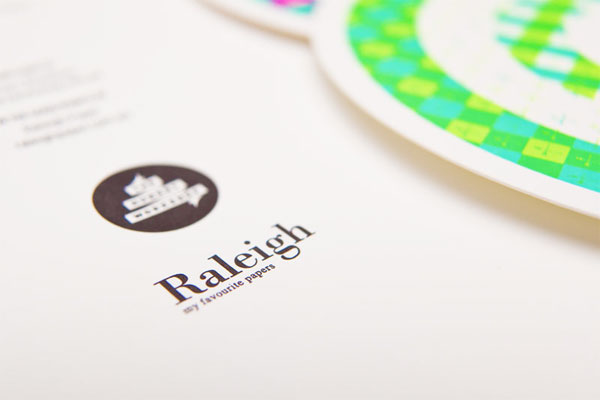
Raleigh Paper
Quantity Produced
Sketchbooks: 1,000
Targets: 600
Production Cost
–
Production Time
3 weeks
Dimensions (Width × Height × Depth)
Sketchbooks: 130 mm (5.11 in) × 200mm (7.87 in)
Targets: 120 mm (4.72 in) × 120 mm (4.72 in)
Page Count
–
Paper Stock
Superfine Ultra White Eggshell 352gsm and 104gsm
Number of Colors
4 spot (3 fluorescents + black)
Varnishes
–
Binding
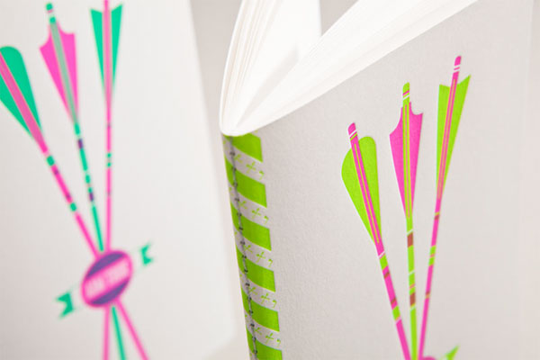
Stitched in silver thread
Typography
–
Those projects that intimidate you when they come in the door can either wither and barely survive, or they can turn into a proud conquer. Such was the case for The Hungry Workshop folks when Raleigh Paper commissioned them to design a letterpress giveaway for their yearly tour of The Mohawk Show.
Designing for such a well renowned show is quite a challenge. Having our work next to some of the world’s finest was daunting, until we realized that what we were designing was not there to sit alongside the awarded work, but to support it.<.small>
The Mohawk Show is one of a few events that sets a standard within the community. We knew graphic designers would be attending the show to admire and be inspired by the work, and Raleigh wanted us to create something tangible that these attendees could take away with them. They would already be walking away inspired, so how could we support that?
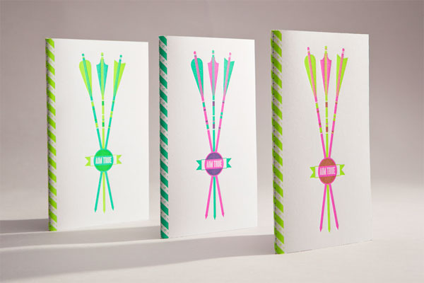
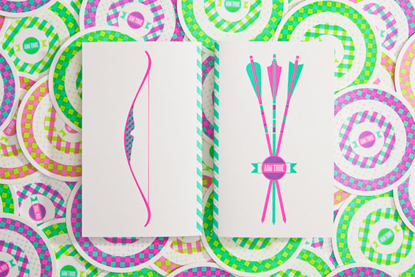
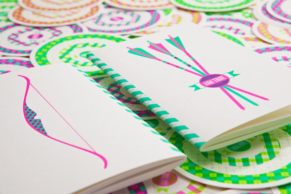
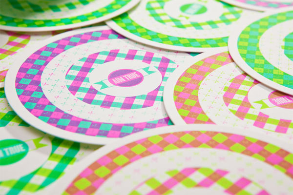
We created a letterpress printed sketchbook, a place to store their ideas. The back cover has a stylized bow, the front has a set of arrows, with the words “Aim True”—a simple reminder to stay inspired and to achieve their targets, whatever these targets may be!
To decorate and theme the show we also created a series of letterpress printed targets, again with the “Aim True” mantra, to hang above the work. The piece not only showcases Raleigh’s fine paper, but also their commitment to the design industry: to provide excellent paper as the vessel for amazing ideas.
We wanted to create variation in the pieces, but keep the labour down. So, we used three fluorescent inks, in three different pairs. This meant that we could run the colours back to back, reducing the amount of time washing up the press. Printing this way saved us a lot of time on the press, but required a lot more time in planning the print run.

The Hungry Workshop Giveaway
Production Method
Design
The Hungry Workshop
Printing
The Hungry Workshop
This post was published in the original layout of FPO so all images are smaller. Project descriptions as well as production lessons are quoted in the main content area.
Post Author
Bryony

Bryony Gomez-Palacio
Editor of FPO and co-founder of UnderConsideration LLC.
More: Online / On Twitter
Date Published
October 21, 2011
Filed Under
Booklet
Tagged with
fluorescent
letterpress
mohawk
mohawk superfine
sketchbook


About
FPO (For Print Only), is a division of UnderConsideration, celebrating the reality that print is not dead by showcasing the most compelling printed projects.
FPO uses Fonts.com to render Siseriff and Avenir Next.
FPO is run with Six Apart’s MovableType
All comments, ideas and thoughts on FPO are property of their authors; reproduction without the author’s or FPO’s permission is strictly prohibited
Twitter @ucllc
Sign-up for Mailing List
Mailing list managed by MailChimp
Thanks to our advertisers
About UnderConsideration
UnderConsideration is a graphic design firm generating its own projects, initiatives, and content while taking on limited client work. Run by Bryony Gomez-Palacio and Armin Vit in Bloomington, IN. More…
blogs we publish
Brand New / Displaying opinions and focusing solely on corporate and brand identity work.
Art of the Menu / Cataloguing the underrated creativity of menus from around the world.
Quipsologies / Chronicling the most curious, creative, and notable projects, stories, and events of the graphic design industry on a daily basis.
products we sell
Flaunt: Designing effective, compelling and memorable portfolios of creative work.
Brand New Conference videos / Individual, downloadable videos of every presentation since 2010.
Prints / A variety of posters, the majority from our AIforGA series.
Other / Various one-off products.
events we organize
Brand New Conference / A two-day event on corporate and brand identity with some of today's most active and influential practitioners from around the world.
Brand Nieuwe Conference / Ditto but in Amsterdam.
Austin Initiative for Graphic Awesomeness / A speaker series in Austin, TX, featuring some of the graphic design industry's most awesome people.
also
Favorite Things we've Made / In our capacity as graphic designers.
Projects we've Concluded / Long- and short-lived efforts.
UCllc News / Updates on what's going at the corporate level of UnderConsideration.

Related entries
Modern Era Booklet
Passover Haggadah
Neenah Paper CLASSIC® Rebrand
Legion Paper Artist Pads
Procter & Gamble Singapore Management Guide