ADV @ UNDERCONSIDERATION Peek here for details
BROWSE
Client
Self-Promotional
Quantity Produced
500
Production Cost
–
Production Time
2 weeks
Dimensions (Width × Height × Depth)
6 in × 11 in
Page Count
–
Paper Stock
Chipboard
Number of Colors
3
Varnishes
–
Binding
–
Typography
Trade Gothic
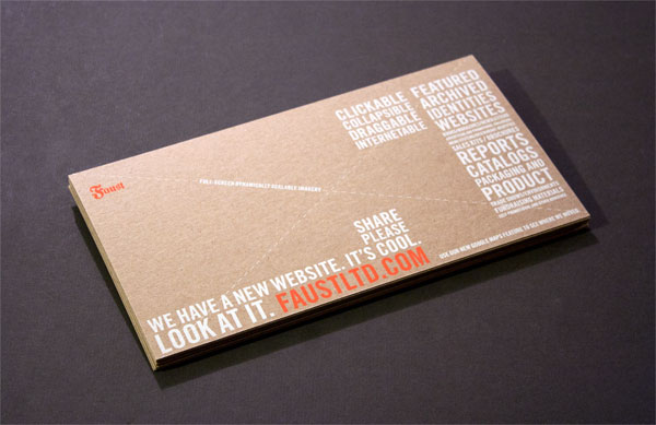
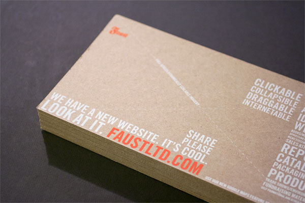
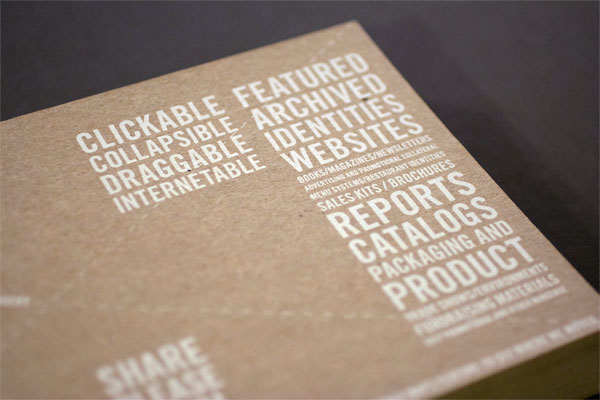
My favorite thing about print design is when it’s telling me about something on the Internet. Nothing gets me more excited than the smell of hand screenprinted typography outlining the newest advancements in web design. It reminds me that print will always have a purpose. To get people online.
We created a new site maintaining all the positive organizational and communicative aspects of our old site while capitalizing on new technologies and what the web experience could bring to the presentation of our work today. This print promo needed to perform in a similar way while arriving ON someone’s actual desk instead of ON their monitor, so we used materials and processes that beg to be touched and for attention in a decidedly non-electronic way. The type is the illustration which is the communication of all the fancy new things the site does, delivered in a non-fancy way.
Not too many folks do silkscreening these days, but the ones that do are artisans which is an amazing addition to the production mix. We were concerned about legibility of the white ink on the chipboard and that the orange would still pop, but knowing Angee at Spudnik Press was not only our technician, but also our partner quelled all our nerves and produced a piece that makes us as proud as the site it drives you to.

Faust Website Promotion
Production Method
Design
Faust Associates
Bob Faust + Ben Deter
Printing
Spudnik Press
Angee Lennard
This post was published in the original layout of FPO so all images are smaller. Project descriptions as well as production lessons are quoted in the main content area.
Post Author
Jessica Mullen

Jessica Mullen
Writer for UnderConsideration LLC.
More: Online / On Twitter
Date Published
November 7, 2011
Filed Under
Promotional Cards
Tagged with
chipboard
promotion
silkscreen
typography


About
FPO (For Print Only), is a division of UnderConsideration, celebrating the reality that print is not dead by showcasing the most compelling printed projects.
FPO uses Fonts.com to render Siseriff and Avenir Next.
FPO is run with Six Apart’s MovableType
All comments, ideas and thoughts on FPO are property of their authors; reproduction without the author’s or FPO’s permission is strictly prohibited
Twitter @ucllc
Sign-up for Mailing List
Mailing list managed by MailChimp
Thanks to our advertisers
About UnderConsideration
UnderConsideration is a graphic design firm generating its own projects, initiatives, and content while taking on limited client work. Run by Bryony Gomez-Palacio and Armin Vit in Bloomington, IN. More…
blogs we publish
Brand New / Displaying opinions and focusing solely on corporate and brand identity work.
Art of the Menu / Cataloguing the underrated creativity of menus from around the world.
Quipsologies / Chronicling the most curious, creative, and notable projects, stories, and events of the graphic design industry on a daily basis.
products we sell
Flaunt: Designing effective, compelling and memorable portfolios of creative work.
Brand New Conference videos / Individual, downloadable videos of every presentation since 2010.
Prints / A variety of posters, the majority from our AIforGA series.
Other / Various one-off products.
events we organize
Brand New Conference / A two-day event on corporate and brand identity with some of today's most active and influential practitioners from around the world.
Brand Nieuwe Conference / Ditto but in Amsterdam.
Austin Initiative for Graphic Awesomeness / A speaker series in Austin, TX, featuring some of the graphic design industry's most awesome people.
also
Favorite Things we've Made / In our capacity as graphic designers.
Projects we've Concluded / Long- and short-lived efforts.
UCllc News / Updates on what's going at the corporate level of UnderConsideration.

Related entries
“Miniature Views” Promotion
Suspicion
Gap Semester Adventure Quest Folder
MONSTERBOX 150 Illustrated Monster Cards
I AM STERN Laser cut folding banner for NYU