ADV @ UNDERCONSIDERATION Peek here for details
BROWSE
Client
Self-Promotion
Quantity Produced
1,000
Production Cost
–
Production Time
–
Dimensions (Width × Height × Depth)
3.5 in × 2 in
Page Count
–
Paper Stock
120lbs French Paper Pop-Tone Lemon Drop and Black Licorice
Number of Colors
1
Varnishes
–
Binding
–
Typography
Vacant Light
Din Black
WeAreNotYou’s card is like a riddle wrapped in a puzzle. The existential company name is reduced to an acronym in blocks, infusing the statement with authority and stability. The vertical orientation of the card emphasizes the structural logo, but the stencil type indicates an openness to change. Printed with letterpress, the card has a dimension that adds to the puzzle-piece quality.
We were looking to revamp our branding to breathe new life into the company and our visual collateral. We wanted to keep it clean and straight forward and yet still get a punch to the eye, which is why we went with the bright yellow and stark black. The integration of our new box logo worked out perfectly using stock that matched our branding colors, and with it being 2 stocks glued shows a cool mirror effect with the logo.
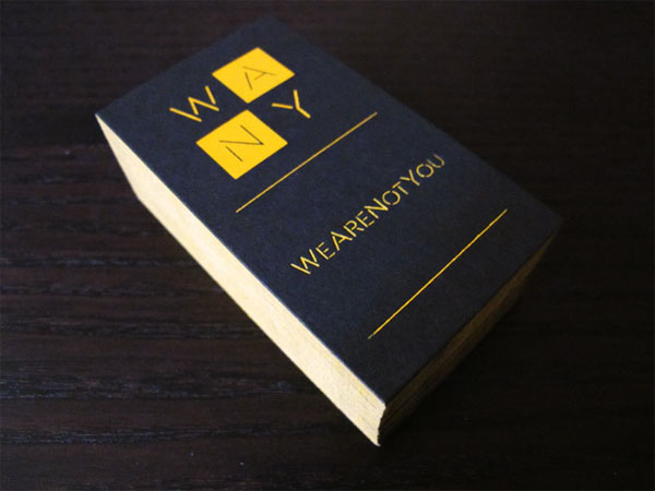

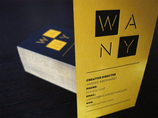
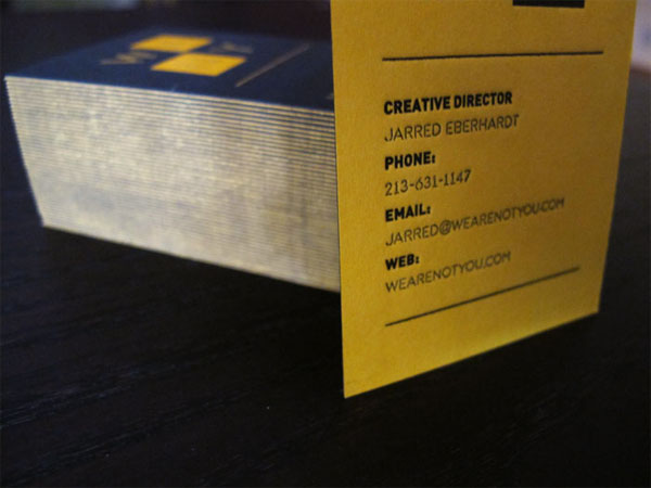
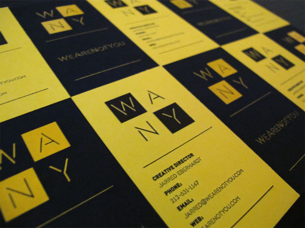
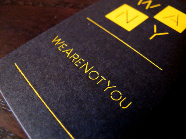
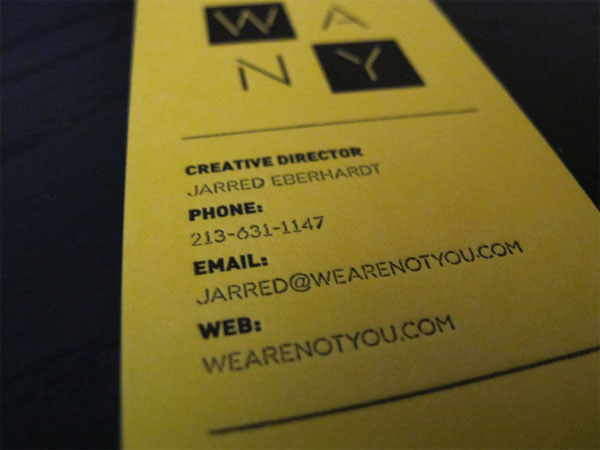
WeAreNotYou Business Card
Production Method
Design
WeAreNotYou
Jarred Eberhardt
Printing
Aardvark Letterpress
This post was published in the original layout of FPO so all images are smaller. Project descriptions as well as production lessons are quoted in the main content area.
Post Author
Jessica Mullen

Jessica Mullen
Writer for UnderConsideration LLC.
More: Online / On Twitter
Date Published
November 9, 2011
Filed Under
Business Cards
Tagged with
business card
identity materials
letterpress


About
FPO (For Print Only), is a division of UnderConsideration, celebrating the reality that print is not dead by showcasing the most compelling printed projects.
FPO uses Fonts.com to render Siseriff and Avenir Next.
FPO is run with Six Apart’s MovableType
All comments, ideas and thoughts on FPO are property of their authors; reproduction without the author’s or FPO’s permission is strictly prohibited
Twitter @ucllc
Sign-up for Mailing List
Mailing list managed by MailChimp
Thanks to our advertisers
About UnderConsideration
UnderConsideration is a graphic design firm generating its own projects, initiatives, and content while taking on limited client work. Run by Bryony Gomez-Palacio and Armin Vit in Bloomington, IN. More…
blogs we publish
Brand New / Displaying opinions and focusing solely on corporate and brand identity work.
Art of the Menu / Cataloguing the underrated creativity of menus from around the world.
Quipsologies / Chronicling the most curious, creative, and notable projects, stories, and events of the graphic design industry on a daily basis.
products we sell
Flaunt: Designing effective, compelling and memorable portfolios of creative work.
Brand New Conference videos / Individual, downloadable videos of every presentation since 2010.
Prints / A variety of posters, the majority from our AIforGA series.
Other / Various one-off products.
events we organize
Brand New Conference / A two-day event on corporate and brand identity with some of today's most active and influential practitioners from around the world.
Brand Nieuwe Conference / Ditto but in Amsterdam.
Austin Initiative for Graphic Awesomeness / A speaker series in Austin, TX, featuring some of the graphic design industry's most awesome people.
also
Favorite Things we've Made / In our capacity as graphic designers.
Projects we've Concluded / Long- and short-lived efforts.
UCllc News / Updates on what's going at the corporate level of UnderConsideration.

Related entries
KitchenAid Limited Edition Cards
Black Sheep Studio Business Cards and Promotional Items
Seegno Business Cards
Fracas Productions Business Cards
Elegante Press Business card