ADV @ UNDERCONSIDERATION Peek here for details
BROWSE
Client
Self
Quantity Produced
1,000
Production Cost
–
Production Time
1 month
Dimensions (Width × Height × Depth)
3.5 in × 2 in
Page Count
–
Paper Stock
French Poptone, Starch White, 140 lb Cover, custom duplexed
Number of Colors
3 Pantone spot + 1 spot varnish - both sides
Varnishes
Spot
Binding
Custom diecut; custom duplex
Typography
ATOMICvibe logotype: custom
Miso
Though the studio name makes me want to search for the “on” button, these cards communicate literal energy and a microscopic attention to detail. Each printing process was carefully selected to represent the brand, producing a visual fusion of science and design.
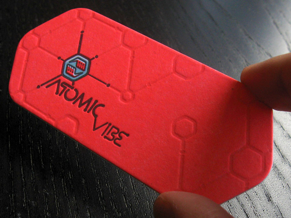
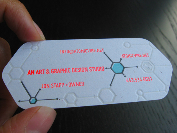
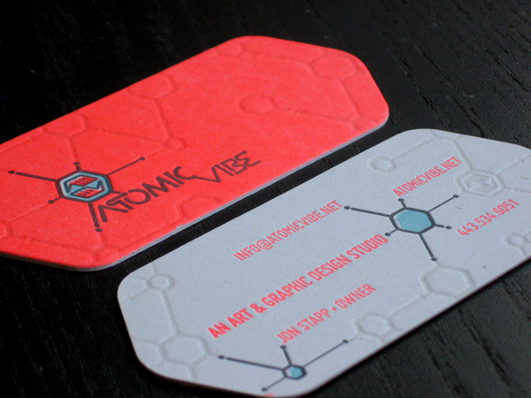
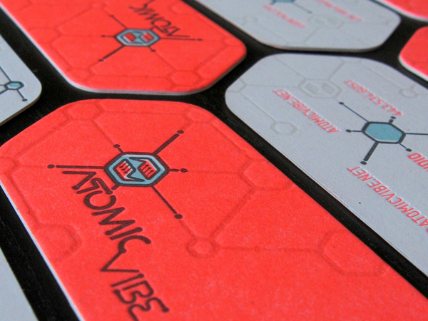
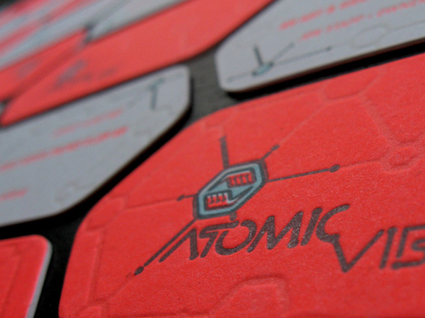
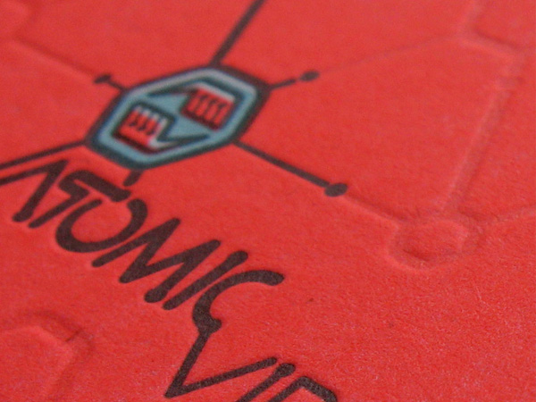
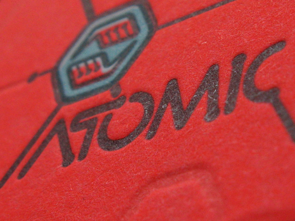
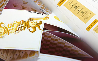
These cards were designed to compliment the aesthetic I’ve established for my art and graphic design studio’s visual identity. I define the ATOMICvibe as the “a-HA!” moment of clarity in the creative process. Like nuclear fusion, it’s when tiny ideas coalesce, and then explode into beautiful design. The logo visually depicts this creative reaction. Forming abstract A & V shapes, the converging hands cradle the tiny beginnings of a big idea, fusing them until they discharge a shockwave of creativity. The custom type, designed to perfectly integrate with the mark, is meant to symbolize the path of electrons. The mark is inspired by retro imagery from the Atomic Age such as science, the Space Race, Sputnik, and the iconic George Nelson Ball Clock.
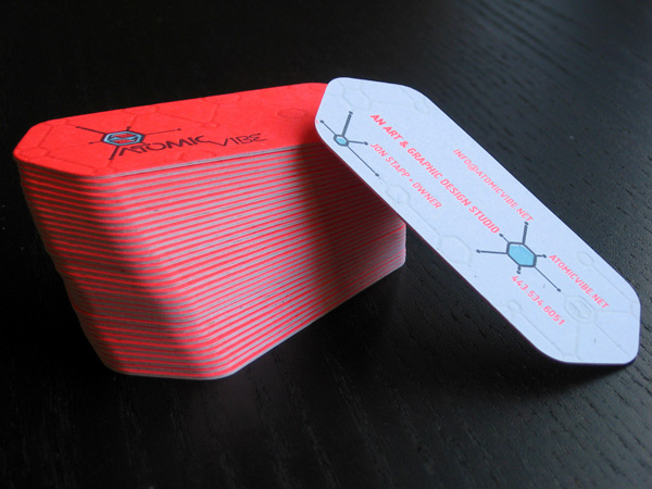
The cards feature a custom, hexagonal die cut, which is inspired by the shape of the logo. To preserve the deep impressions on either side, the fronts and backs were printed separately, and then custom duplexed together. This gives each card some serious thump factor. Since the card uses a logo and other elements designed with intentional misregistration, and a paper stock flecked with visible fibers, I chose letterpress over offset specifically because its imperfect printing process lent itself perfectly to my retro-inspired aesthetic.

Atomic Vibe Business Card
Production Method
Die-cut
Letterpress
Design
Jon Stapp
Printing
Studio On Fire

This post was published in the original layout of FPO so all images are smaller. Project descriptions as well as production lessons are quoted in the main content area.
Post Author
Jessica Mullen

Jessica Mullen
Writer for UnderConsideration LLC.
More: Online / On Twitter
Date Published
December 5, 2011
Filed Under
Business Cards
Die-cut
Letterpress
Tagged with
business card
die-cut
duplex
letterpress
spot varnish


About
FPO (For Print Only), is a division of UnderConsideration, celebrating the reality that print is not dead by showcasing the most compelling printed projects.
FPO uses Fonts.com to render Siseriff and Avenir Next.
FPO is run with Six Apart’s MovableType
All comments, ideas and thoughts on FPO are property of their authors; reproduction without the author’s or FPO’s permission is strictly prohibited
Twitter @ucllc
Sign-up for Mailing List
Mailing list managed by MailChimp
Thanks to our advertisers
About UnderConsideration
UnderConsideration is a graphic design firm generating its own projects, initiatives, and content while taking on limited client work. Run by Bryony Gomez-Palacio and Armin Vit in Bloomington, IN. More…
blogs we publish
Brand New / Displaying opinions and focusing solely on corporate and brand identity work.
Art of the Menu / Cataloguing the underrated creativity of menus from around the world.
Quipsologies / Chronicling the most curious, creative, and notable projects, stories, and events of the graphic design industry on a daily basis.
products we sell
Flaunt: Designing effective, compelling and memorable portfolios of creative work.
Brand New Conference videos / Individual, downloadable videos of every presentation since 2010.
Prints / A variety of posters, the majority from our AIforGA series.
Other / Various one-off products.
events we organize
Brand New Conference / A two-day event on corporate and brand identity with some of today's most active and influential practitioners from around the world.
Brand Nieuwe Conference / Ditto but in Amsterdam.
Austin Initiative for Graphic Awesomeness / A speaker series in Austin, TX, featuring some of the graphic design industry's most awesome people.
also
Favorite Things we've Made / In our capacity as graphic designers.
Projects we've Concluded / Long- and short-lived efforts.
UCllc News / Updates on what's going at the corporate level of UnderConsideration.

Related entries
KitchenAid Limited Edition Cards
Black Sheep Studio Business Cards and Promotional Items
Seegno Business Cards
Fracas Productions Business Cards
Elegante Press Business card