ADV @ UNDERCONSIDERATION Peek here for details
BROWSE
Client
–
Quantity Produced
–
Production Cost
–
Production Time
–
Dimensions (Width × Height × Depth)
–
Page Count
–
Paper Stock
–
Number of Colors
–
Varnishes
–
Binding
–
Typography
–

Woes van Haaften Business Card & Social Experiment

|
DESIGNED BY
|
PRINT METHOD
Laser-Cutting by ID Laser
|

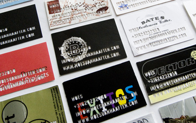
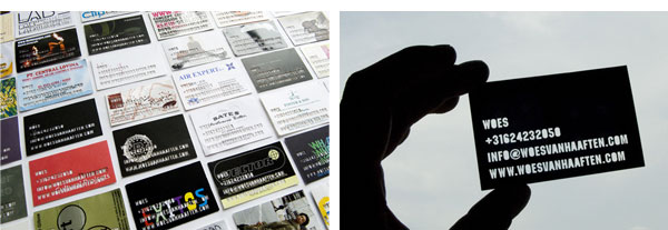
Talk about occupying. Woes has taken all of his business card collection and laser-cut his own business card on them. So meta it hurts.
V Premio de Arquitectura Enor Invitation
|
DESIGNED BY
|
PRINT METHOD
Offset by Graficas Brial
|
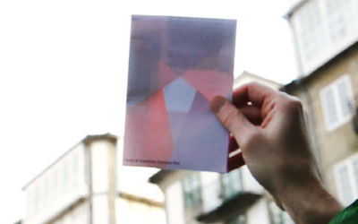
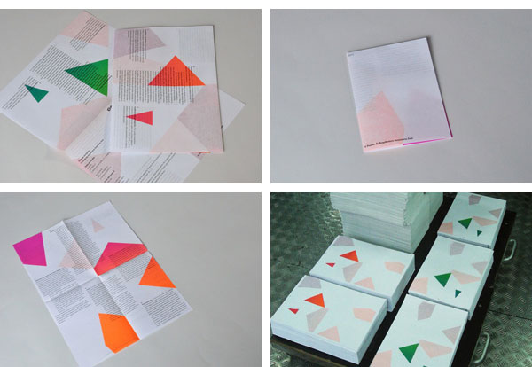
Printed on extra light paper, this invitation reveals a pentagon when folded, created from what otherwise look like randomly placed shapes when opened.
The Swedish Royal Institute of Art Degree Show Catalogue
|
DESIGNED BY
|
PRINT METHOD
Offset by Aare Grafiska + Göteborgstryckeriet
|
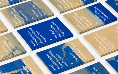
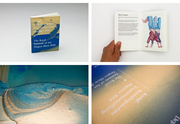
I’m still not exactly sure how this works in offset, but you can shake and fool around with the color fountains as the machine is printing to create one-of-a-kind covers as with this 1,500-print-run catalogue with 1,500 different covers.
Surprise Announcement
|
DESIGNED BY
|
PRINT METHOD
Letterpress by The Mandate Press
|
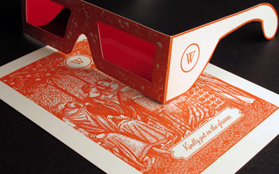
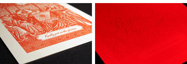
Kind of cloying, but also kind of awesome. Hidden letterpressing comes into view only with red-tinted glasses that cancel out the red ink.
344 Loves You Card
|
DESIGNED BY
|
PRINT METHOD
Blind Embossing by The Ligature
|
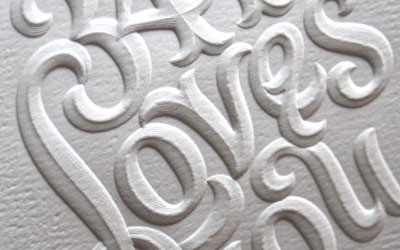
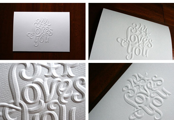
Lettered by the late Doyald Young for Stefan Bucher’s 344 Design, this sculptured, multi-level, blind emboss is one of the most gorgeous pieces of the year.
A Hundred Monkeys’ Flying Monkey Kit
|
DESIGNED BY
|
PRINT METHOD
Letterpress by Cranky Pressman
|
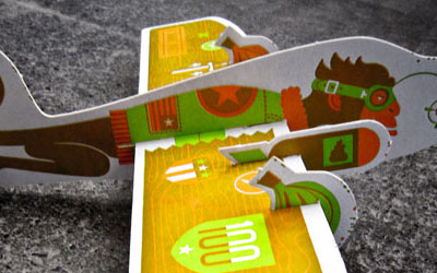
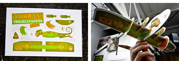
Make my own flying monkey that can drop banana bombs? Yes, please! Even more amazing, it’s only printed in 2 spot colors, green and orange, which, when overprinted, render perfect monkey brown.
“Celebrate New Traditions” Holiday Catalog 2010
|
DESIGNED BY
|
PRINT METHOD
Offset, Emboss, Foil Stamp, and Die-cutting by N/A
|
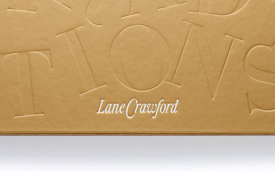
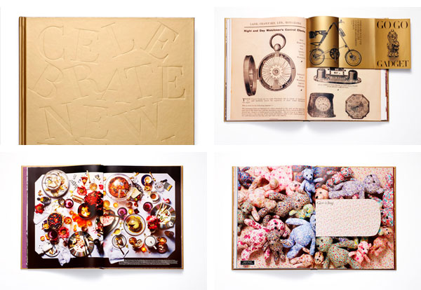
It’s hard to describe all that is going on with this catalog but it’s definitely one of the most tricked out multi-page pieces of the year. Different stocks, tons of inserts, and surprising fold-outs make this expertly offset printed catalog a keeper.
Nike “All For One” Book
|
DESIGNED BY
Everett Vangsnes
|
PRINT METHOD
Digital, Letterpess, and Foil Stamp by Premier Press
|
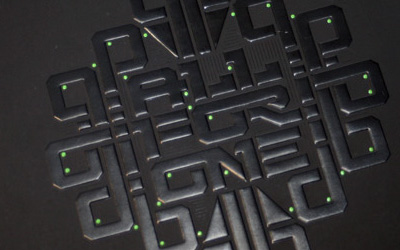
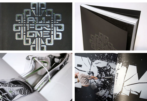
While the cover is pretty cool with some letterpress and foil stamping, the inside, printed digitally is the true standout of this piece. Printed on uncoated Finch, the digital reproduction looks and feels sharp and toothy.
4th Annual Hatch Design Easter Egg Coloring Kit
|
DESIGNED BY
|
PRINT METHOD
Offset and Flocking by N/A
|
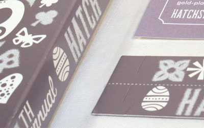
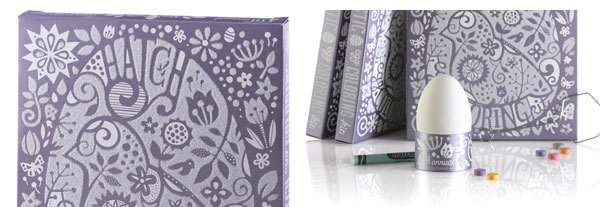
We are suckers for flocking and this thin, eggceptional, purple box delivers all the fuzzies we’ve come to expect from this technique.
Halftone Def Business Cards
|
DESIGNED BY
|
PRINT METHOD
Letterpress by 42 Pressed
|
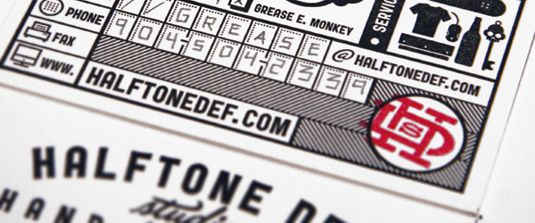
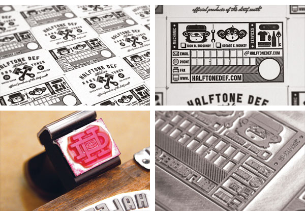
Of all the different business cards we saw all year I kept coming back to this one as one of my favorites. From the dense layouts to the nice use of a rubber stamp these cards don’t let up.
Olli Business Card
|
DESIGNED BY
|
PRINT METHOD
Letterpress by Studio on Fire
|
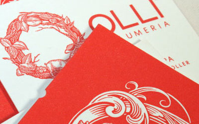
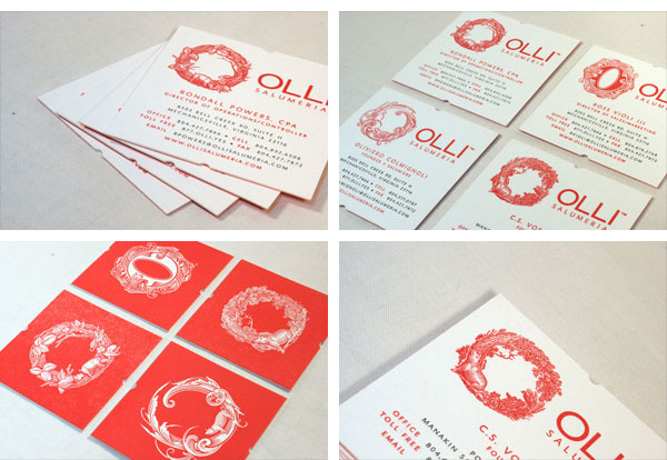
Okay, these are also some of my favorite business cards of the year. The printing is pretty straightforward letterpress but what elevates these are the adorable pigs embedded in the elegant, custom scratchboard “O”s.
“Art of the Beat” Booklet
|
DESIGNED BY
|
PRINT METHOD
Inkjet by Kate Thomas
|
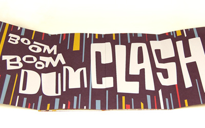
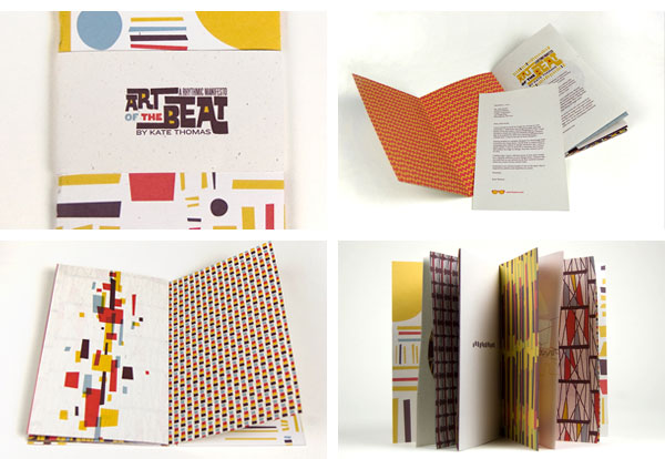
I remember getting this piece in the mail before I had read the specs about how it was made. I had assumed it was offset printed but, to my surprise, it was all inkjet, showcasing the colorful, energetic patterns by Kate. Perfectly crafted to boot.
This post was published in the original layout of FPO so all images are smaller. Project descriptions as well as production lessons are quoted in the main content area.
Post Author
Armin

Armin Vit
Editor of FPO and co-founder of UnderConsideration LLC.
More: Online / On Twitter
Date Published
December 19, 2011
Filed Under
End of Year List
Tagged with
announcement
end of year list


About
FPO (For Print Only), is a division of UnderConsideration, celebrating the reality that print is not dead by showcasing the most compelling printed projects.
FPO uses Fonts.com to render Siseriff and Avenir Next.
FPO is run with Six Apart’s MovableType
All comments, ideas and thoughts on FPO are property of their authors; reproduction without the author’s or FPO’s permission is strictly prohibited
Twitter @ucllc
Sign-up for Mailing List
Mailing list managed by MailChimp
Thanks to our advertisers
About UnderConsideration
UnderConsideration is a graphic design firm generating its own projects, initiatives, and content while taking on limited client work. Run by Bryony Gomez-Palacio and Armin Vit in Bloomington, IN. More…
blogs we publish
Brand New / Displaying opinions and focusing solely on corporate and brand identity work.
Art of the Menu / Cataloguing the underrated creativity of menus from around the world.
Quipsologies / Chronicling the most curious, creative, and notable projects, stories, and events of the graphic design industry on a daily basis.
products we sell
Flaunt: Designing effective, compelling and memorable portfolios of creative work.
Brand New Conference videos / Individual, downloadable videos of every presentation since 2010.
Prints / A variety of posters, the majority from our AIforGA series.
Other / Various one-off products.
events we organize
Brand New Conference / A two-day event on corporate and brand identity with some of today's most active and influential practitioners from around the world.
Brand Nieuwe Conference / Ditto but in Amsterdam.
Austin Initiative for Graphic Awesomeness / A speaker series in Austin, TX, featuring some of the graphic design industry's most awesome people.
also
Favorite Things we've Made / In our capacity as graphic designers.
Projects we've Concluded / Long- and short-lived efforts.
UCllc News / Updates on what's going at the corporate level of UnderConsideration.

Related entries
The Best of 2011 on FPO, Part 3: Posters
The Best of 2011 on FPO, Part 2: Jul - Dec
The Best of FPO 2010, Part I: Jan – Jul