ADV @ UNDERCONSIDERATION Peek here for details
BROWSE
Client
–
Quantity Produced
–
Production Cost
–
Production Time
–
Dimensions (Width × Height × Depth)
–
Page Count
–
Paper Stock
–
Number of Colors
–
Varnishes
–
Binding
–
Typography
–

“Hello” Greeting Card

|
DESIGNED BY
|
PRINT METHOD
Laser-Cutting by Beau Eaton
|

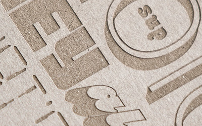
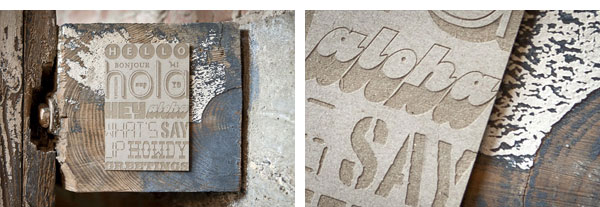
An underused and underappreciated attribute of laser-cutting is that you can control the heat and power of the laser, allowing you to etch instead of vaporize the paper. Here, Beau says hello in different ways on a poor piece of chipboard that never knew what hit it.
Real Estate Council Fundraiser Invitation and Collateral
|
DESIGNED BY
|
PRINT METHOD
Offset and Silkscreen by Lincoln Press
|
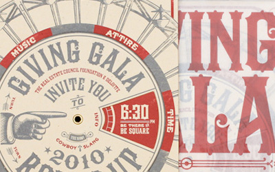
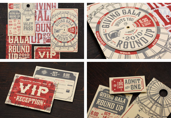
If you are going to do a Cowboy-themed invite for real estate people in Dallas you best go big or go home, no pun intended. Matchbox goes The Full Western with this tricked out moving wheel invite.
Scott Spooner’s Graduation Announcements
|
DESIGNED BY
|
PRINT METHOD
Inkjet by Scott Spooner
|
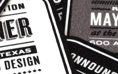
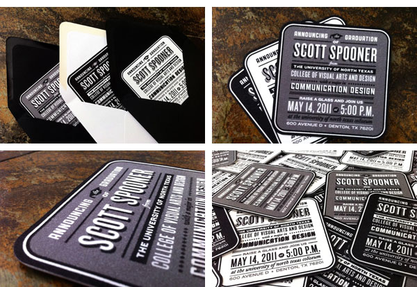
Sometimes the best effects are achieved right at home on a trusty inkject printer. As Scott points out, it’s all in the details: “it really came down to messing with the right settings so that the coasters would print slow enough for them to soak up the ink without it bleeding everywhere.”
Mama’s Sauce Business Cards
|
DESIGNED BY
|
PRINT METHOD
Letterpress by Mama’s Sauce
|
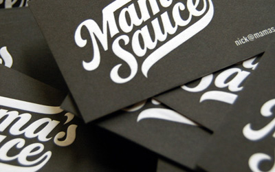
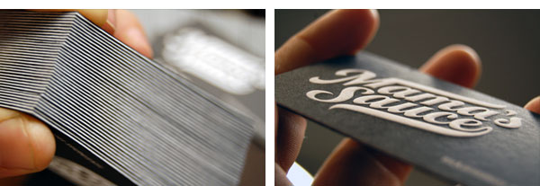
This is probably the most clever use of letterpress all year: the cards are printed with black ink, so the parts of the paper that are not inked and pressed look like they were embossed by an angel.
Jaime & Anthony Wedding Invitation
|
DESIGNED BY
|
PRINT METHOD
Letterpress by Paper Mill Designs Stationery & Letterpress Studio + Studio on Fire
|
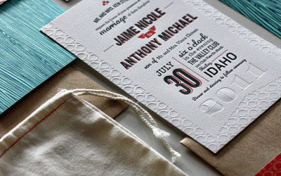
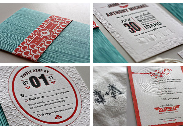
We see a lot of letterpress wedding invitations on FPO but this one stands out for the cohesiveness across all pieces and the use of blind letterpressing to achieve some awesome textures.
Javier Garcia Business Card
|
DESIGNED BY
|
PRINT METHOD
Letterpress by Dependable Letterpress
|
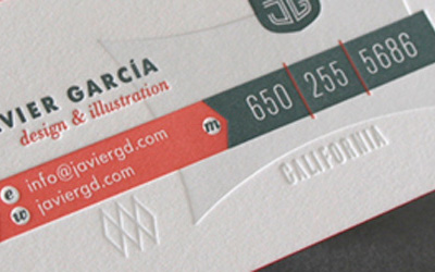
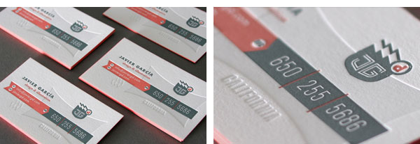
And we also get a lot of letterpress business cards on FPO but what makes this one stand out is also the use of blind letterpressing in an unexpected way. Plus, the type and colors are very pretty to look at.
Fedrigoni Hotel Book
|
DESIGNED BY
|
PRINT METHOD
Offset, Emboss, Foil Stamp, and Die-cut by Intergrafica Verona S.r.l.
|

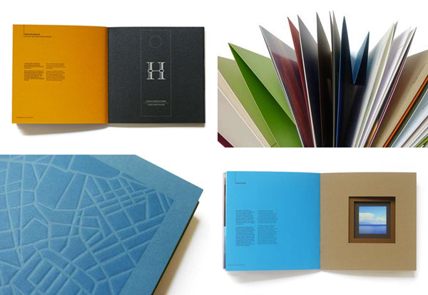
Although not as “sexy” as other bests of the year, this small but brick-ish book is a wonderful paper promo, showcasing over 50 styles and weights through sophisticated offset printing and smart use of die-cuts.
“Free Your Brand” Mailer
|
DESIGNED BY
|
PRINT METHOD
Offset and Silkscreen by Alpha Screen Graphics Inc. + Champ Printing Company Inc.
|
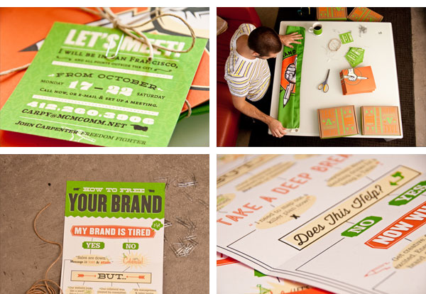
When a cold call just won’t do, you have to pull out the big guns, like this comprehensive boxed set of client-impressing design and printing goodness.
Playground Studio Business Card and Letterhead
|
DESIGNED BY
|
PRINT METHOD
Rubber Stamp
|
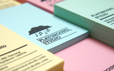
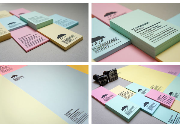
Probably the best use of rubbers stamps this year. Using only two of them, one of the logo and one for the contact info, and a range of subdued colored paper, this stationery looks perfectly consistent yet never boring or repetitive.
Notm Ormon Certificate and Envelope
|
DESIGNED BY
|
PRINT METHOD
|
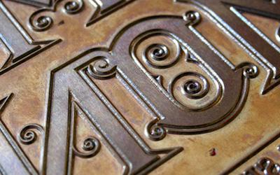
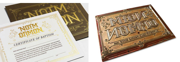
Although the subject matter wasn’t to everyone’s delight, the deliciousness of the foil stamp on chocolate brown paper could not be denied.
FEB Design Stationery
|
DESIGNED BY
|
PRINT METHOD
Silkscreen by FEB Design
|
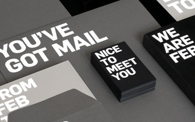
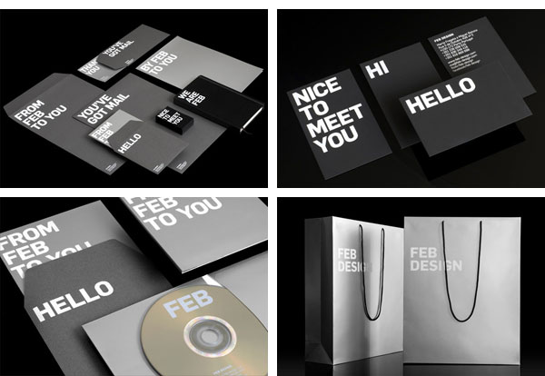
White silkscreened type. Black and gray paper stocks. Done. It’s hard to pull of simplicity this convincingly.
Red Square Stationery
|
DESIGNED BY
|
PRINT METHOD
Offset by Gwin’s Commercial Printing
|
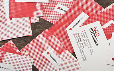
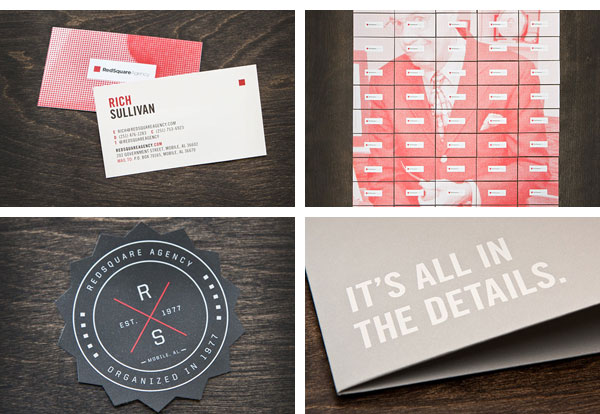
Printed in simple and confident 2-color offset, this stationery brings the funny with a cheesy image of the company’s founder that becomes evident only when you put together the 60 different business cards or 4 letterheads.
This post was published in the original layout of FPO so all images are smaller. Project descriptions as well as production lessons are quoted in the main content area.
Post Author
Armin

Armin Vit
Editor of FPO and co-founder of UnderConsideration LLC.
More: Online / On Twitter
Date Published
December 22, 2011
Filed Under
End of Year List
Tagged with
announcement
end of year list


About
FPO (For Print Only), is a division of UnderConsideration, celebrating the reality that print is not dead by showcasing the most compelling printed projects.
FPO uses Fonts.com to render Siseriff and Avenir Next.
FPO is run with Six Apart’s MovableType
All comments, ideas and thoughts on FPO are property of their authors; reproduction without the author’s or FPO’s permission is strictly prohibited
Twitter @ucllc
Sign-up for Mailing List
Mailing list managed by MailChimp
Thanks to our advertisers
About UnderConsideration
UnderConsideration is a graphic design firm generating its own projects, initiatives, and content while taking on limited client work. Run by Bryony Gomez-Palacio and Armin Vit in Bloomington, IN. More…
blogs we publish
Brand New / Displaying opinions and focusing solely on corporate and brand identity work.
Art of the Menu / Cataloguing the underrated creativity of menus from around the world.
Quipsologies / Chronicling the most curious, creative, and notable projects, stories, and events of the graphic design industry on a daily basis.
products we sell
Flaunt: Designing effective, compelling and memorable portfolios of creative work.
Brand New Conference videos / Individual, downloadable videos of every presentation since 2010.
Prints / A variety of posters, the majority from our AIforGA series.
Other / Various one-off products.
events we organize
Brand New Conference / A two-day event on corporate and brand identity with some of today's most active and influential practitioners from around the world.
Brand Nieuwe Conference / Ditto but in Amsterdam.
Austin Initiative for Graphic Awesomeness / A speaker series in Austin, TX, featuring some of the graphic design industry's most awesome people.
also
Favorite Things we've Made / In our capacity as graphic designers.
Projects we've Concluded / Long- and short-lived efforts.
UCllc News / Updates on what's going at the corporate level of UnderConsideration.

Related entries
The Best of 2011 on FPO, Part 3: Posters
The Best of 2011 on FPO, Part 1: Jan - Jun
The Best of FPO 2010, Part I: Jan – Jul