ADV @ UNDERCONSIDERATION Peek here for details
BROWSE
Client
–
Quantity Produced
–
Production Cost
–
Production Time
–
Dimensions (Width × Height × Depth)
–
Page Count
–
Paper Stock
–
Number of Colors
–
Varnishes
–
Binding
–
Typography
–

“The Hidden Message of Jingle Bells” Poster

|
DESIGNED BY
|
PRINT METHOD
Letterpress by N/A
|

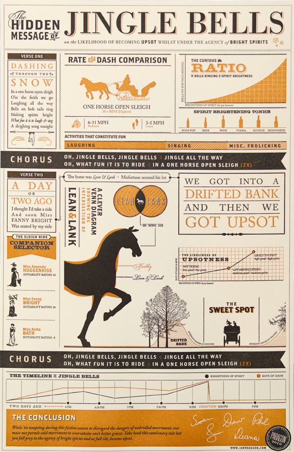
Jingle bells decoded as an infographic? Letterpressed in heart-warming hues? I feel jingly inside!
Good Morning/Good Night Poster
|
DESIGNED BY
|
PRINT METHOD
Letterpress by Dolce Press
|
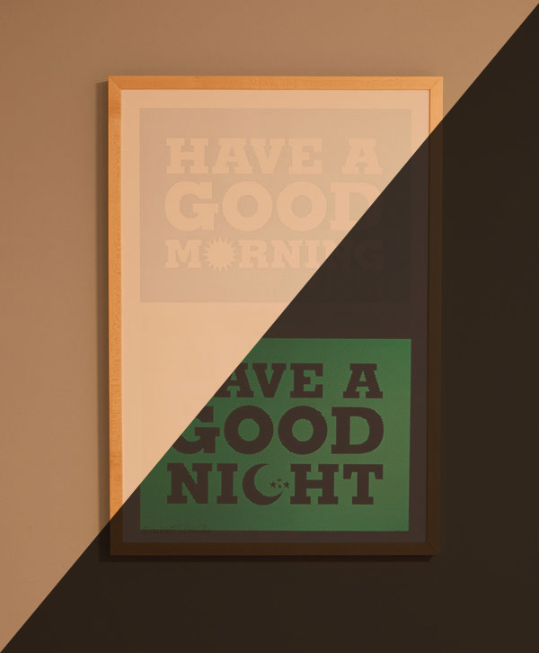
The world would probably be a better place if more things were letterpressed in glow-in-the-dark ink. Until then, this poster can keep you company all morning and all night.
“Typefaces of the World” Poster
|
DESIGNED BY
|
PRINT METHOD
Offset by Cereus Graphics
|
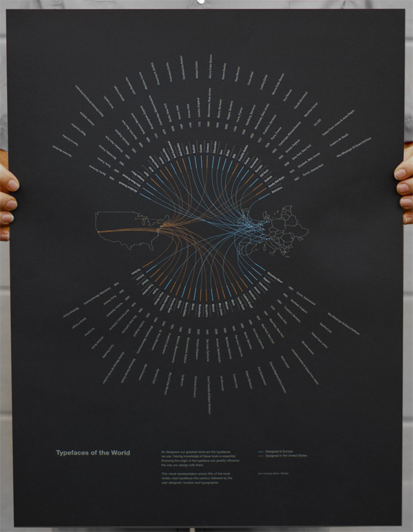
The quick folks at Scribble on Everything scooped up this image that was making the rounds on the internet to convert it into an amazing offset poster on black paper.
HyperQuake 10th Anniversary Letterpress Poster
|
DESIGNED BY
|
PRINT METHOD
Letterpress by Defrance Printing
|
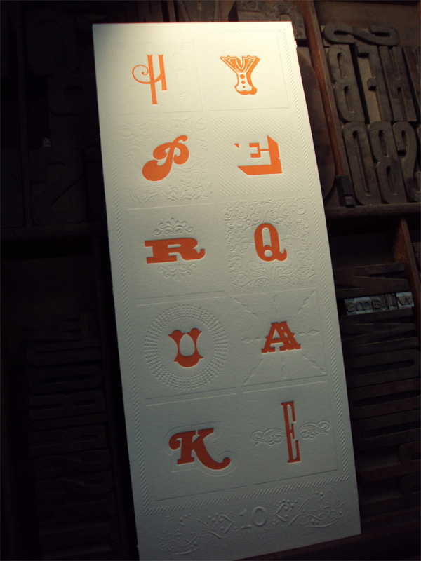
As far as posters of the year go, this is one of the tiniest but it packs a big punch with bold, orange typography and exemplary ornamentation in blind letterpress. It not only looks great but also feels great to the touch.
Something Terrifying Poster
|
DESIGNED BY
|
PRINT METHOD
Silkscreen by Mama’s Sauce
|
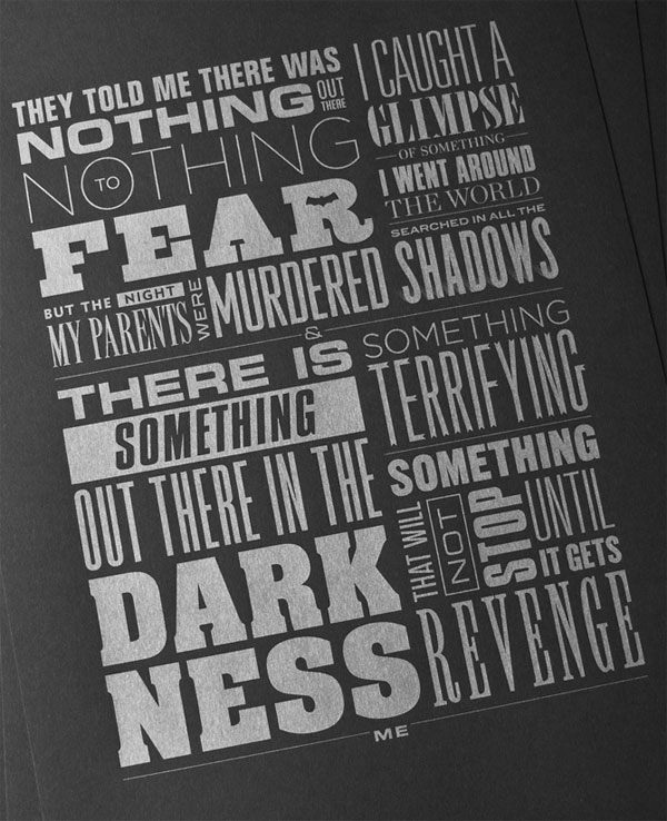
Another great black paper poster that will appeal to both Batman and typography fanboys. Simple. Fearsome.
Weather Visualization Poster
|
DESIGNED BY
|
PRINT METHOD
Offset by Zwaan Printmedia
|
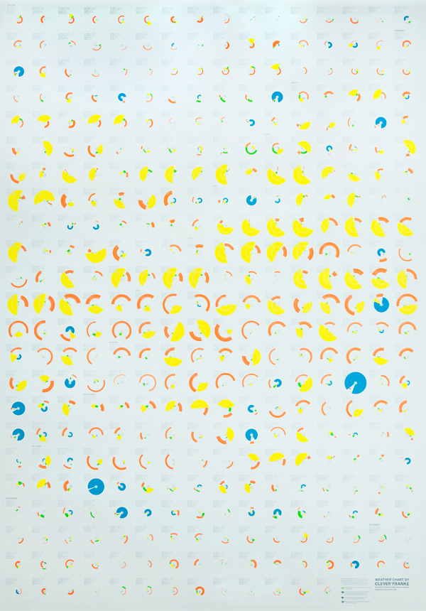
Weather, data, and infographic nerds rejoice! This huge poster reproduces the 2010 weather data in Utrecht, The Netherlands.
AIGA 2011 Cause/Affect Poster
|
DESIGNED BY
|
PRINT METHOD
Offset by Hemlock Printers
Silkscreen by Various |
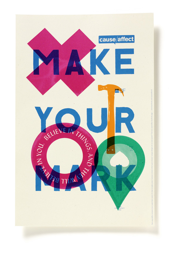
These are true collaborative posters in more ways than one: the first blue layer was designed by Tim Belonax, then special “marks” (the hammer, the “x”, etc.) were designed by various designers, and then they all came together to silkscreen those marks on top of the previously offset printed layer.
Fauna Friends Japanimals Posters
|
DESIGNED BY
|
PRINT METHOD
Silkscreen by Kangaroo Press
|
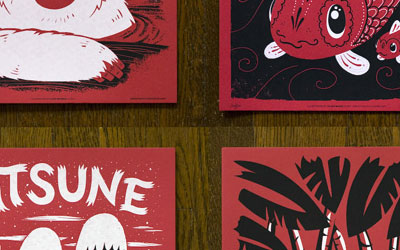
Alex Pearson makes it into the FPO Best of the Year two times in a row with another wonderful, collaborative set of posters. Printed on red paper, this collection features mythical animals from the Far East.
MeWithoutYou Poster
|
DESIGNED BY
|
PRINT METHOD
Silkscreen by Shed Labs
|
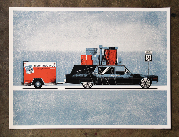
This poster manages to be both joyous and lugubrious. Perhaps it’s the gloss varnish they added to the black that makes it work so well in both spectrums.
Henry + Co. Posters
|
DESIGNED BY
|
PRINT METHOD
Offset, Foil Stamping, Embossing, and Die-cut by Henry + Co.
|
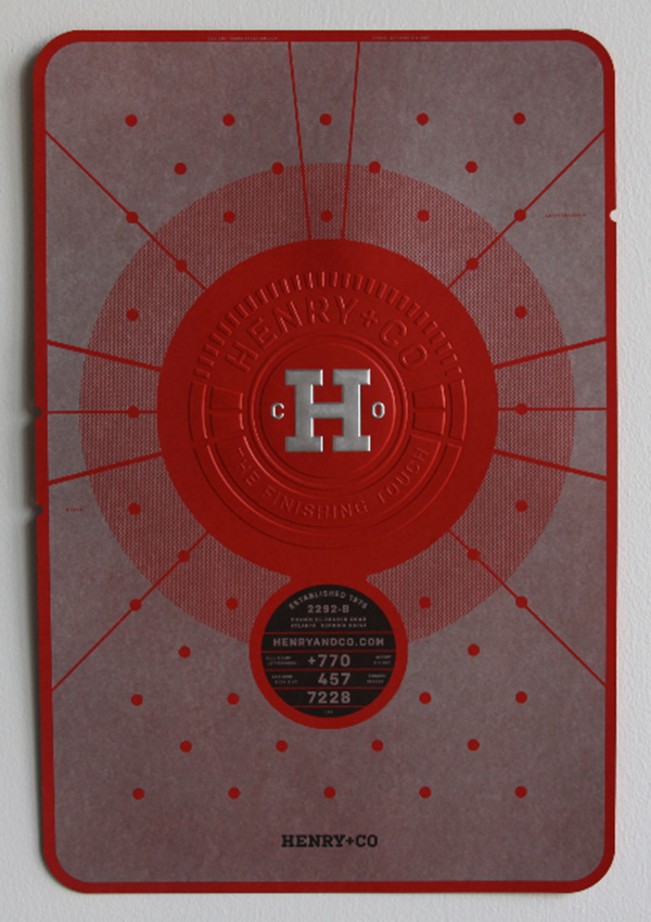
These posters are embossed so hard and foil stamped so shiny that they could pass for a shield in 300.
Tom Rowe Promotional Poster
|
DESIGNED BY
|
PRINT METHOD
Silkscreen by Bob Eight Pop
|
There is no poster like a Tweed Tom poster: dense with joy and graphics and color and how-did-he-do-that?s that it’s almost annoying. This 5-color beauty comes with a subtle gradient in the back that goes from green to blue, adding some unexpected dimension.
Just My Type Poster
|
DESIGNED BY
|
PRINT METHOD
Silkscreen by Jude Landry
|
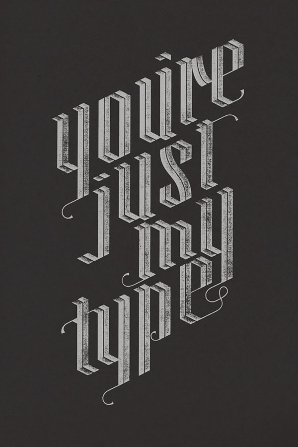
And, also, there is no poster like a Jude Landry poster: simple, striking, and all kinds of hangable. This poster is a scratchy rendition of his own beautifully letterspaced alphabet, “Blackzidenz.”
This post was published in the original layout of FPO so all images are smaller. Project descriptions as well as production lessons are quoted in the main content area.
Post Author
Armin

Armin Vit
Editor of FPO and co-founder of UnderConsideration LLC.
More: Online / On Twitter
Date Published
December 26, 2011
Filed Under
End of Year List
Tagged with
announcement
end of year list


About
FPO (For Print Only), is a division of UnderConsideration, celebrating the reality that print is not dead by showcasing the most compelling printed projects.
FPO uses Fonts.com to render Siseriff and Avenir Next.
FPO is run with Six Apart’s MovableType
All comments, ideas and thoughts on FPO are property of their authors; reproduction without the author’s or FPO’s permission is strictly prohibited
Twitter @ucllc
Sign-up for Mailing List
Mailing list managed by MailChimp
Thanks to our advertisers
About UnderConsideration
UnderConsideration is a graphic design firm generating its own projects, initiatives, and content while taking on limited client work. Run by Bryony Gomez-Palacio and Armin Vit in Bloomington, IN. More…
blogs we publish
Brand New / Displaying opinions and focusing solely on corporate and brand identity work.
Art of the Menu / Cataloguing the underrated creativity of menus from around the world.
Quipsologies / Chronicling the most curious, creative, and notable projects, stories, and events of the graphic design industry on a daily basis.
products we sell
Flaunt: Designing effective, compelling and memorable portfolios of creative work.
Brand New Conference videos / Individual, downloadable videos of every presentation since 2010.
Prints / A variety of posters, the majority from our AIforGA series.
Other / Various one-off products.
events we organize
Brand New Conference / A two-day event on corporate and brand identity with some of today's most active and influential practitioners from around the world.
Brand Nieuwe Conference / Ditto but in Amsterdam.
Austin Initiative for Graphic Awesomeness / A speaker series in Austin, TX, featuring some of the graphic design industry's most awesome people.
also
Favorite Things we've Made / In our capacity as graphic designers.
Projects we've Concluded / Long- and short-lived efforts.
UCllc News / Updates on what's going at the corporate level of UnderConsideration.

Related entries
The Best of 2011 on FPO, Part 2: Jul - Dec
The Best of 2011 on FPO, Part 1: Jan - Jun
The Best of FPO 2010, Part I: Jan – Jul