ADV @ UNDERCONSIDERATION Peek here for details
BROWSE
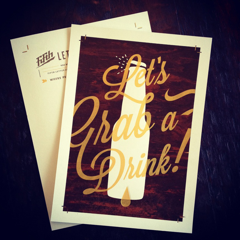
Fifth Letter Outreach Card
Production Method
Letterpress
Silkscreen
Design
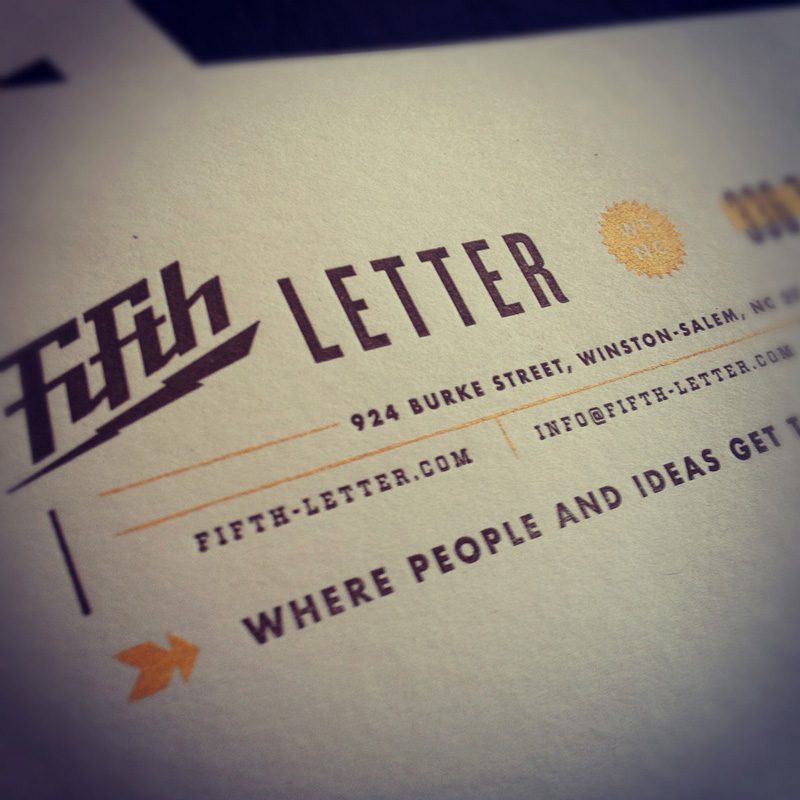
Fifth Letter
Art Direction: Elliot Strunk
Design: Matthew Cook
Printing
Device Printshop
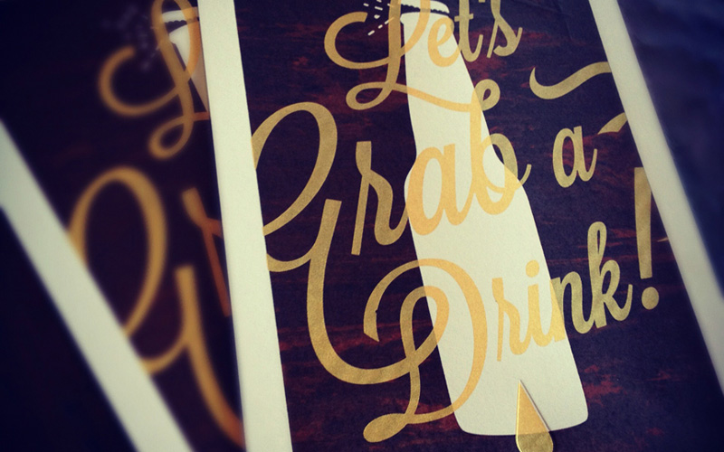
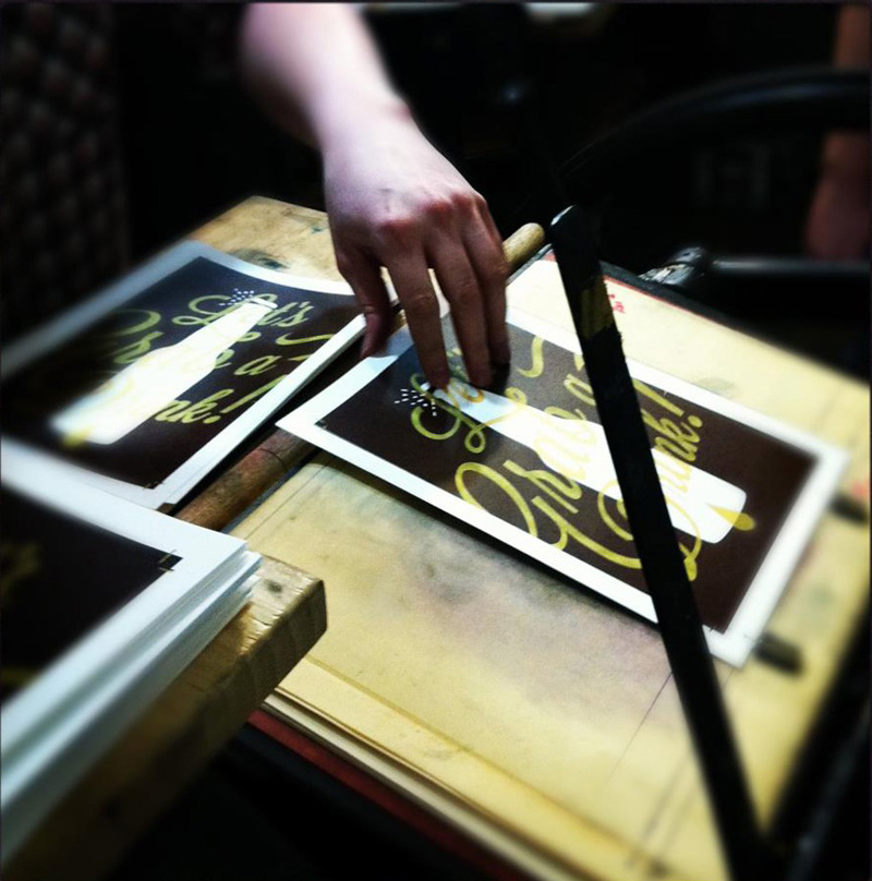
Fifth Letter hopes to cause a “positive disruption” with its screen-printed drink invitation, prompting potential clients to imagine how the firm can help them create a similar experience with their own happy hour hopefuls. Each card has a personally addressed and handwritten note on the back. Cheers!
Client
Self-Promotional
Quantity Produced
50
Production Cost
–
Production Time
10 days
Dimensions (Width × Height × Depth)
6 in × 9 in
Page Count
–
Paper Stock
French Paper Poptone Whip Cream 140# Cover
Number of Colors
3 Spot (2 silkscreen, 1 letterpress)
Varnishes
–
Binding
–
Typography
Lavanderia by Lost Type Co-op
Futura by Paul Renner
Vitesse by HFJ
Knockout by HFJ
Project Description
Fifth Letter always attempts to connect with clients that will be a good fit. We seek out clients that appreciate what we bring to the table in terms of creativity, craft, and attention to detail. The aim of this card is to cause a "positive disruption" that prompts the recipient to pause for a moment and imagine how we can help them have a similar effect on their clients and/or customers.Coupled with this "Let's Grab a Drink" invitation, is a hand-written note on the back of the card letting clients know that we have taken the time to address them personally and individually. We hope that this will resonate with the client making them feel unique and not just a part of another mass-produced campaign.
Production Lesson(s)
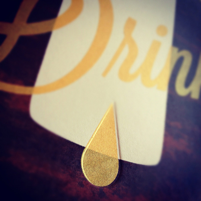
We figured out how to get the marbled "wood grain" effect on the front of the cards by not mixing all of the brown and black ink together evenly. When the squeegee was pulled over the screen, it created a unique effect in which every pull produced different, spectacular, results. We felt this perfectly complimented the one-off nature of the medium.The other trick came in setting up the registration front to back when printing or debossing a total of five times. We managed to dial it in reasonably close. Next time, however, we'll add more bleed to push the crop marks much farther out.
Also, we used photopolymer plates that imprint the page surprisingly well compared to their traditional magnesium plate counterparts.

Post Author

Kelly Cree
Writer for UnderConsideration LLC.
More: Online / On Twitter
Date Published
March 22, 2012
Filed Under
Letterpress
Self promotion
Silkscreen
V1 to V2
Tagged with
letterpress
marbleized
screenprint
self-promotion
spot ink


About
FPO (For Print Only), is a division of UnderConsideration, celebrating the reality that print is not dead by showcasing the most compelling printed projects.
FPO uses Fonts.com to render Siseriff and Avenir Next.
FPO is run with Six Apart’s MovableType
All comments, ideas and thoughts on FPO are property of their authors; reproduction without the author’s or FPO’s permission is strictly prohibited
Twitter @ucllc
Sign-up for Mailing List
Mailing list managed by MailChimp
Thanks to our advertisers
About UnderConsideration
UnderConsideration is a graphic design firm generating its own projects, initiatives, and content while taking on limited client work. Run by Bryony Gomez-Palacio and Armin Vit in Bloomington, IN. More…
blogs we publish
Brand New / Displaying opinions and focusing solely on corporate and brand identity work.
Art of the Menu / Cataloguing the underrated creativity of menus from around the world.
Quipsologies / Chronicling the most curious, creative, and notable projects, stories, and events of the graphic design industry on a daily basis.
products we sell
Flaunt: Designing effective, compelling and memorable portfolios of creative work.
Brand New Conference videos / Individual, downloadable videos of every presentation since 2010.
Prints / A variety of posters, the majority from our AIforGA series.
Other / Various one-off products.
events we organize
Brand New Conference / A two-day event on corporate and brand identity with some of today's most active and influential practitioners from around the world.
Brand Nieuwe Conference / Ditto but in Amsterdam.
Austin Initiative for Graphic Awesomeness / A speaker series in Austin, TX, featuring some of the graphic design industry's most awesome people.
also
Favorite Things we've Made / In our capacity as graphic designers.
Projects we've Concluded / Long- and short-lived efforts.
UCllc News / Updates on what's going at the corporate level of UnderConsideration.

Related entries
“Poetics of Harmony” Experimental Publication
Big Scary Monsters CD/DVD Package
Portland General Store Brochure
Papergirl Wrapping Products
The University of Houston Graphics Alumni Partnership Poster Series