ADV @ UNDERCONSIDERATION Peek here for details
BROWSE
Wright & Goebel Business Cards
Production Method
Deboss
Letterpress
Design
The Working Assembly
Lawrence O'Toole + Jolene Delisle
Printing
Rise and Shine Letterpress
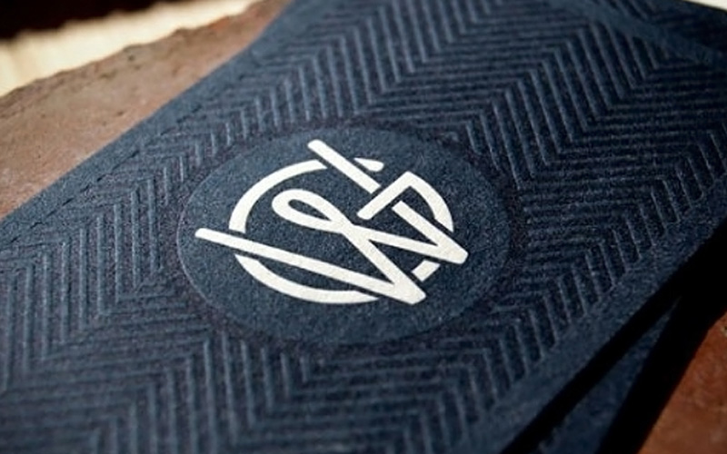
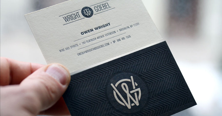
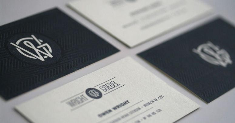
Color & texture tie one on in this nautical themed identity package for wine & spirit vendor Wright & Goebel.
Dimensions (Width × Height × Depth)
3.5 in × 2 in
Page Count
–
Paper Stock
Crane Lettra / Ecru / 110 C (300GSM)
Number of Colors
1/1 PMS 553U soy ink
Varnishes
–
Binding
–
Typography
Akzidenz-Grotesk
Project Description
The challenge put forth by the owners was to envision a look that was completely different than most other wine shops—no old world, barrel, glass or grape imagery here. Instead, the owners were taking a decidedly more modern approach to the store, presenting bottles in a curated, gallery-like atmosphere. The feel of the space was to be west coast, modern, and inspired by yachting and nautical lifestyles.The letters W and G overlap, joined by an implied ampersand, which also reads as a knot. In keeping with the nautical inspiration, the chosen colors are a muted navy over an ecru stock.
Production Lesson(s)
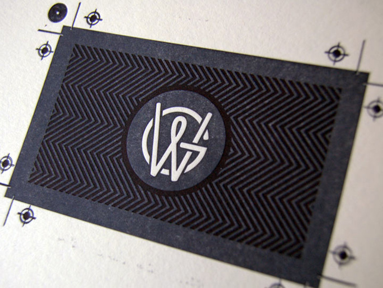
Rather than true blind embossing, which would cause issues with push-through on the face of the card, we used two plates for printing the reverse: the first was for the overall field of blue, which allows the central monogram to rise in texture, and the second was for the pattern.Once the first pass of the reverse was dry, we ran the cards through the press with using the pattern plate and no ink. The effect was a subtle blind deboss of the pattern. This is what we were looking for, but the pattern was just a little bit too subtle. However, after some experimentation, we ran the plate again over the cards with another hit of blue on just the pattern, which debossed the pattern and made an interesting two-tone effect.

Post Author

Kelly Cree
Writer for UnderConsideration LLC.
More: Online / On Twitter
Date Published
May 1, 2012
Filed Under
Business Cards
Deboss
Letterpress
Tagged with
deboss
letterpress
About
FPO (For Print Only), is a division of UnderConsideration, celebrating the reality that print is not dead by showcasing the most compelling printed projects.
FPO uses Fonts.com to render Siseriff and Avenir Next.
FPO is run with Six Apart’s MovableType
All comments, ideas and thoughts on FPO are property of their authors; reproduction without the author’s or FPO’s permission is strictly prohibited
Twitter @ucllc
Sign-up for Mailing List
Mailing list managed by MailChimp
Thanks to our advertisers
About UnderConsideration
UnderConsideration is a graphic design firm generating its own projects, initiatives, and content while taking on limited client work. Run by Bryony Gomez-Palacio and Armin Vit in Bloomington, IN. More…
blogs we publish
Brand New / Displaying opinions and focusing solely on corporate and brand identity work.
Art of the Menu / Cataloguing the underrated creativity of menus from around the world.
Quipsologies / Chronicling the most curious, creative, and notable projects, stories, and events of the graphic design industry on a daily basis.
products we sell
Flaunt: Designing effective, compelling and memorable portfolios of creative work.
Brand New Conference videos / Individual, downloadable videos of every presentation since 2010.
Prints / A variety of posters, the majority from our AIforGA series.
Other / Various one-off products.
events we organize
Brand New Conference / A two-day event on corporate and brand identity with some of today's most active and influential practitioners from around the world.
Brand Nieuwe Conference / Ditto but in Amsterdam.
Austin Initiative for Graphic Awesomeness / A speaker series in Austin, TX, featuring some of the graphic design industry's most awesome people.
also
Favorite Things we've Made / In our capacity as graphic designers.
Projects we've Concluded / Long- and short-lived efforts.
UCllc News / Updates on what's going at the corporate level of UnderConsideration.




Related entries
KitchenAid Limited Edition Cards
Black Sheep Studio Business Cards and Promotional Items
Seegno Business Cards
Fracas Productions Business Cards
Elegante Press Business card