ADV @ UNDERCONSIDERATION Peek here for details
BROWSE

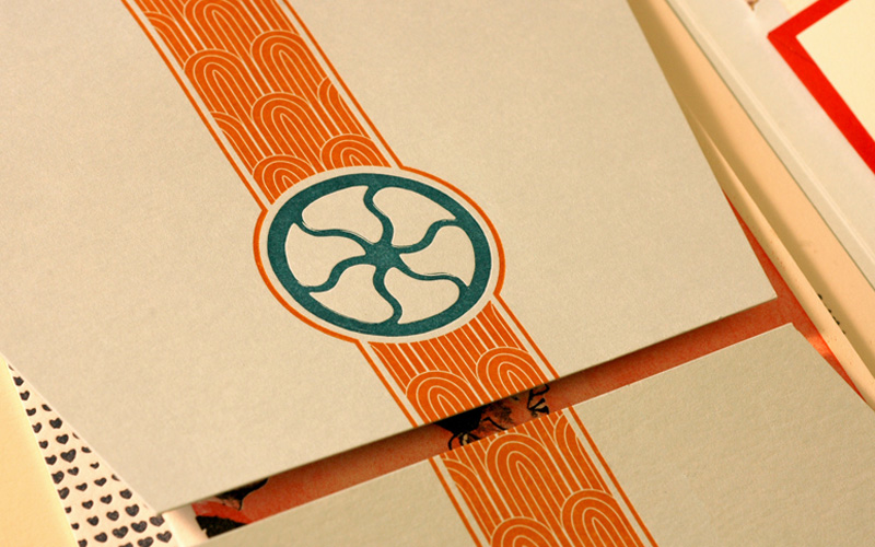
Fat Cow Restaurant Menu and Collateral
Production Method
Etching
Laser printer
Laser-Cut
Design
Foreign Policy Design Group
Printing
Laser Etching and Wood Cutting:Plixo
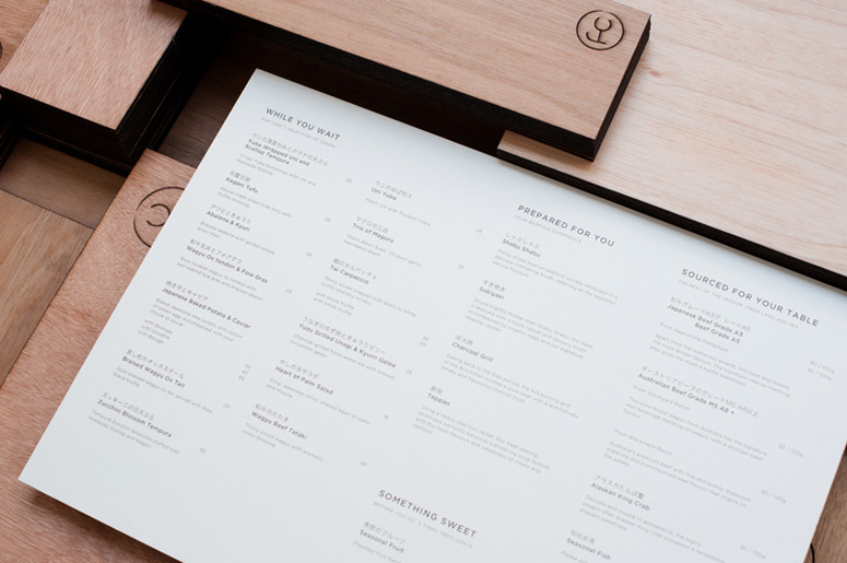
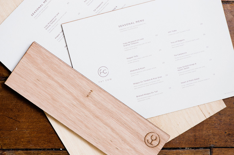
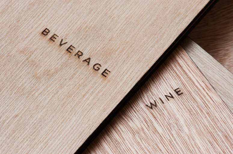
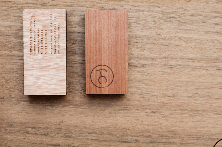
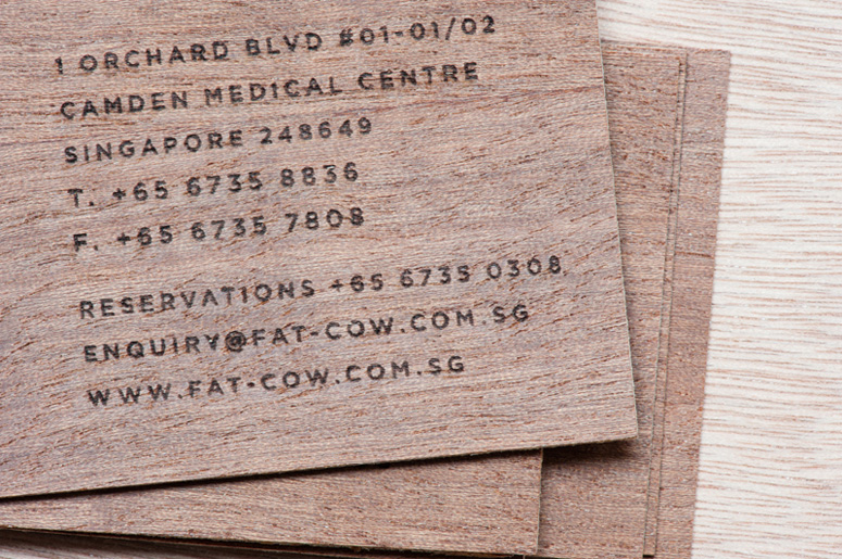
While wooden menus and business cards may be rare, this seared identity collateral for Japanese beef restaurant Fat Cow is well done.
Client
Fat Cow
Quantity Produced
Business Cards: 5,000
Menus: 50 each
Production Cost
–
Production Time
–
Dimensions (Width × Height × Depth)
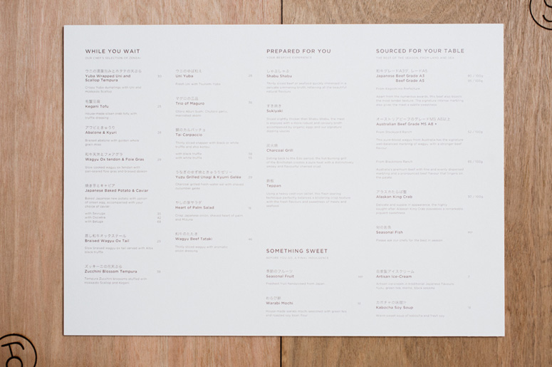
Food Menu: 16.5 × 11.6 in.
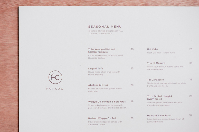
Seasonal Menu: 11.4 × 8.5 in.
Wine Menu: 3.7 × 12 in.
Business Card: 3.3 × 2.2 in.
Page Count
–
Paper Stock
Recypal
Number of Colors
1
Varnishes
–
Binding
–
Typography
–

Project Description
Drawing inspiration largely from the Japanese aesthetic Wabi Sabi with traits that include simplicity, economy, austerity, modesty and the appreciation of the ingenuous integrity of natural objects and processes, wood is used primarily as the platform of this brand communication. The non-uniformity and texture suggests the Wabi Sabi beauty of imperfection. The mark and the searing on the wood are also reminiscent of the branding of cattle.Production Lesson(s)
The burning (laser-etching) of the logo onto the wood was not that all straightforward. We had many rounds of experiments and nit-picks before finally getting to a perfect "sear". The etching has to be controlled such that it does not toast out the logo yet heavy enough to leave a slight de-boss on the wood.The ideal wood that we initially visioned to use - the matsu - is not available in Singapore. The closest one was the Balsa wood but that was too thin. The decision of which one to use was not easy one; since the logo is quite fine in size, it would be lost with certain wood grains if the wrong wood is picked.

Post Author

Kelly Cree
Writer for UnderConsideration LLC.
More: Online / On Twitter
Date Published
July 20, 2012
Filed Under
Collateral
Etching
Laser printer
Laser-Cut
Tagged with
japanese
restaurant
wood


About
FPO (For Print Only), is a division of UnderConsideration, celebrating the reality that print is not dead by showcasing the most compelling printed projects.
FPO uses Fonts.com to render Siseriff and Avenir Next.
FPO is run with Six Apart’s MovableType
All comments, ideas and thoughts on FPO are property of their authors; reproduction without the author’s or FPO’s permission is strictly prohibited
Twitter @ucllc
Sign-up for Mailing List
Mailing list managed by MailChimp
Thanks to our advertisers
About UnderConsideration
UnderConsideration is a graphic design firm generating its own projects, initiatives, and content while taking on limited client work. Run by Bryony Gomez-Palacio and Armin Vit in Bloomington, IN. More…
blogs we publish
Brand New / Displaying opinions and focusing solely on corporate and brand identity work.
Art of the Menu / Cataloguing the underrated creativity of menus from around the world.
Quipsologies / Chronicling the most curious, creative, and notable projects, stories, and events of the graphic design industry on a daily basis.
products we sell
Flaunt: Designing effective, compelling and memorable portfolios of creative work.
Brand New Conference videos / Individual, downloadable videos of every presentation since 2010.
Prints / A variety of posters, the majority from our AIforGA series.
Other / Various one-off products.
events we organize
Brand New Conference / A two-day event on corporate and brand identity with some of today's most active and influential practitioners from around the world.
Brand Nieuwe Conference / Ditto but in Amsterdam.
Austin Initiative for Graphic Awesomeness / A speaker series in Austin, TX, featuring some of the graphic design industry's most awesome people.
also
Favorite Things we've Made / In our capacity as graphic designers.
Projects we've Concluded / Long- and short-lived efforts.
UCllc News / Updates on what's going at the corporate level of UnderConsideration.

Related entries
Black Sheep Studio Business Cards and Promotional Items
CNN Digital New Hire Kit
Legion Paper All National Stationery Show Promotion
ICONICA Collection
Aftel Archive of Curious Scents: Perfume Blotters