ADV @ UNDERCONSIDERATION Peek here for details
BROWSE
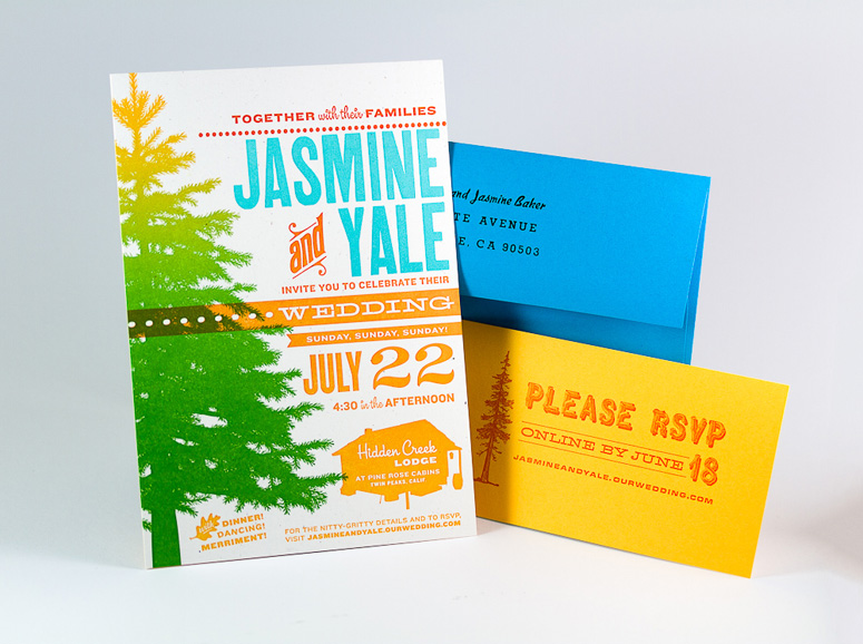
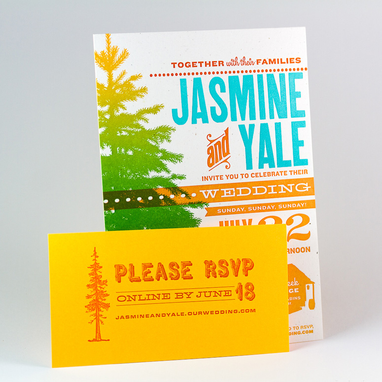
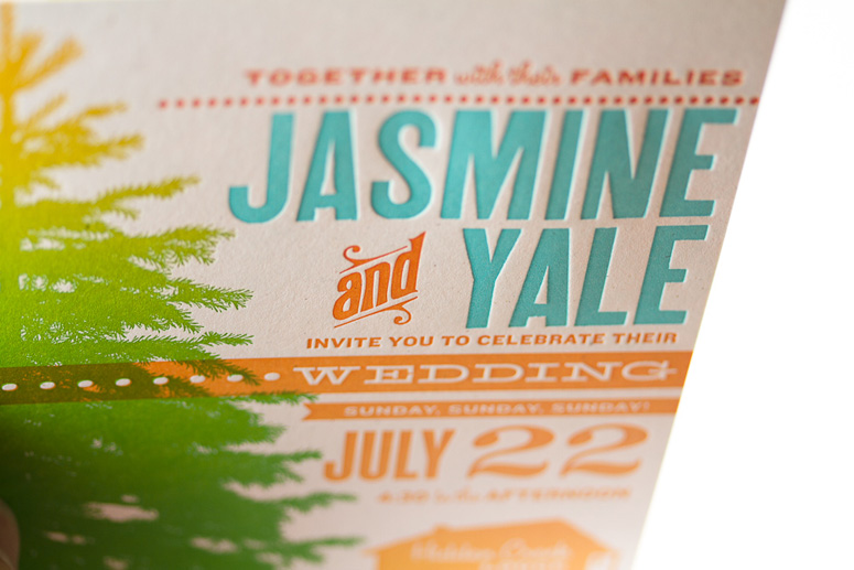
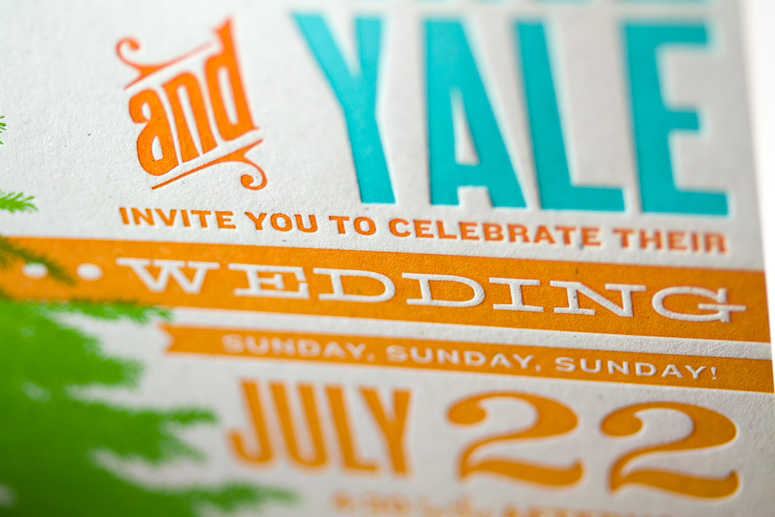
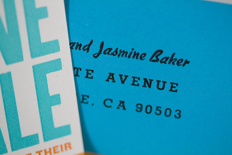
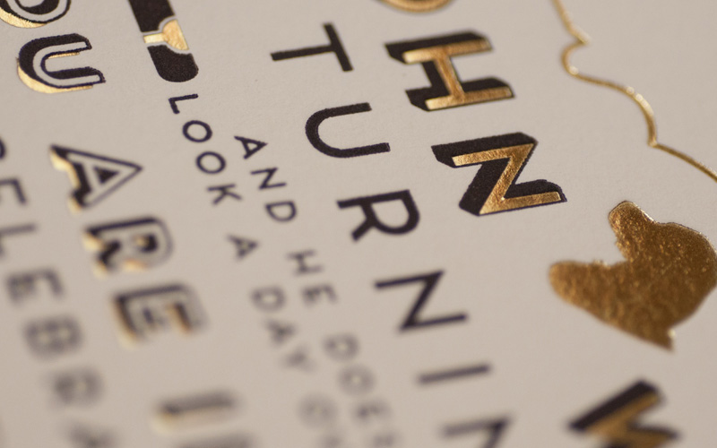
Jasmine & Yale Wedding Invitation
Production Method
Letterpress
Design
Three Steps Ahead
Josh Korwin & Alyssa Zukas
Printing
Josh Korwin
(with help from Mike Mische, Alyssa Zukas, Jasmine Baker)
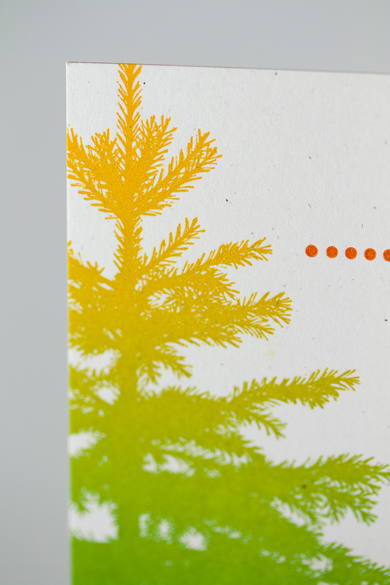
Two wrongs don’t make a right, but two split fountains form a harmonious bond in this fun and colorful wedding invite from Three Steps Ahead.
Client
Jasmine Baker & Yale Quan
Quantity Produced
200
Production Cost
$350
Production Time
2 Weeks
Dimensions (Width × Height × Depth)
5 × 7 × in
Page Count
3
Paper Stock
Neenah / Environment / Birch / 80C
French Paper / Glo-Tone /Yellow Light / 65C
French Paper / Glo-Tone / Blue Light / A-7 envelopes
Number of Colors
3 plates, 5 colors (split fountain)
Varnishes
–
Binding
–
Typography
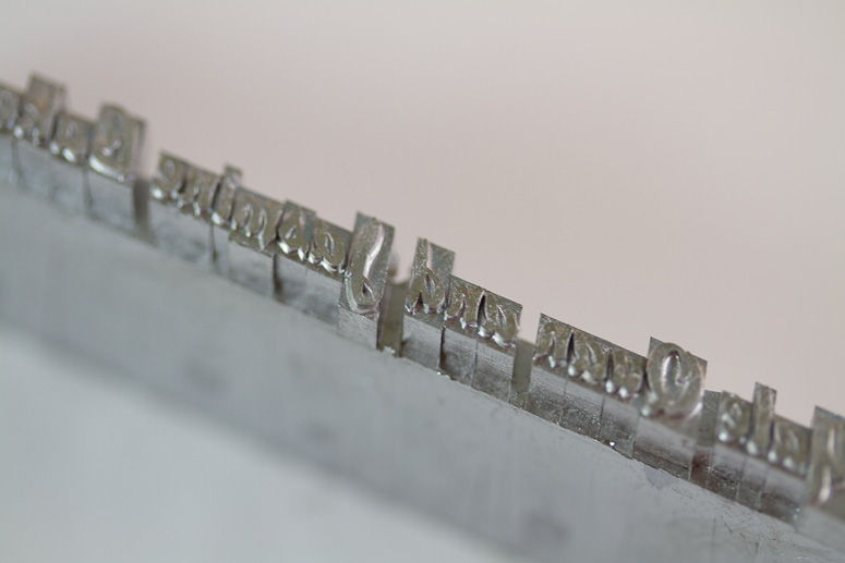
Studio Lettering by House Industries, Knockout by H&FJ, Hellenic Wide(foundry type)
Rustic (foundry type)
Microgramma/Eurostile (foundry type)
anonymous condensed gothic (wood type)

Project Description
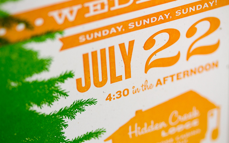
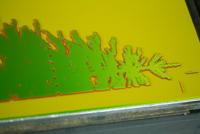
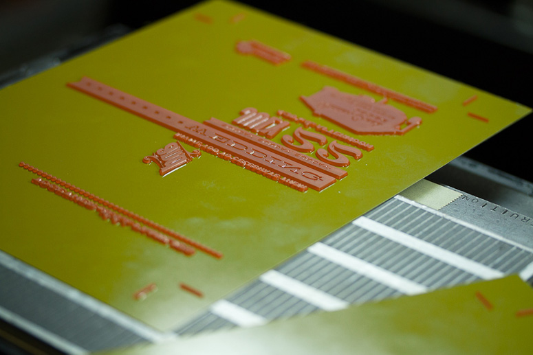
Our friends Jasmine & Yale are getting married soon, and we decided to go all-out with our letterpress habit to create their invitations. The design process started on the computer, but the goal from the start was to create something really special, where the computer would only play one part of the tune. For the invitation itself, we decided to create a 5-by-7-inch card with a three color design (3/0), using two plates of computer-generated photopolymer, and one “plate” of actual, historic wood type.Production Lesson(s)
Using two split fountains in one job ended up creating the illusion of way more plates than we really used. It's a heck of a good way to make use of a limited number of plates.
Post Author

Kelly Cree
Writer for UnderConsideration LLC.
More: Online / On Twitter
Date Published
July 10, 2012
Filed Under
Letterpress
Wedding materials
Tagged with
duplex
split fountain
wood type


About
FPO (For Print Only), is a division of UnderConsideration, celebrating the reality that print is not dead by showcasing the most compelling printed projects.
FPO uses Fonts.com to render Siseriff and Avenir Next.
FPO is run with Six Apart’s MovableType
All comments, ideas and thoughts on FPO are property of their authors; reproduction without the author’s or FPO’s permission is strictly prohibited
Twitter @ucllc
Sign-up for Mailing List
Mailing list managed by MailChimp
Thanks to our advertisers
About UnderConsideration
UnderConsideration is a graphic design firm generating its own projects, initiatives, and content while taking on limited client work. Run by Bryony Gomez-Palacio and Armin Vit in Bloomington, IN. More…
blogs we publish
Brand New / Displaying opinions and focusing solely on corporate and brand identity work.
Art of the Menu / Cataloguing the underrated creativity of menus from around the world.
Quipsologies / Chronicling the most curious, creative, and notable projects, stories, and events of the graphic design industry on a daily basis.
products we sell
Flaunt: Designing effective, compelling and memorable portfolios of creative work.
Brand New Conference videos / Individual, downloadable videos of every presentation since 2010.
Prints / A variety of posters, the majority from our AIforGA series.
Other / Various one-off products.
events we organize
Brand New Conference / A two-day event on corporate and brand identity with some of today's most active and influential practitioners from around the world.
Brand Nieuwe Conference / Ditto but in Amsterdam.
Austin Initiative for Graphic Awesomeness / A speaker series in Austin, TX, featuring some of the graphic design industry's most awesome people.
also
Favorite Things we've Made / In our capacity as graphic designers.
Projects we've Concluded / Long- and short-lived efforts.
UCllc News / Updates on what's going at the corporate level of UnderConsideration.

Related entries
Herbst & Spungen Wedding Invitation Suite
Erin and Brian Wedding Invitation
Daniela & Rui Wedding Invitation
Benjamin & Catalina Wedding Announcement
Devon & Mike Wedding Invitation