ADV @ UNDERCONSIDERATION Peek here for details
BROWSE
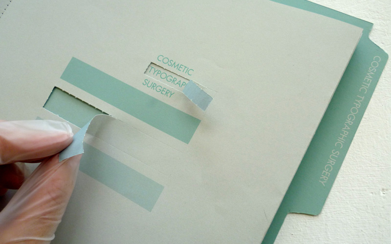
 We are having trouble with the ink of a PMS setting right on GF Smith Plike. Does anyone have experience printing a solid on this paper or should I look at another stock?
The card is printed using 2 spot colors (pantone 302 and 423), embossed, and spot UV varnished. The printer is having great difficulty getting the ink to sit on the paper. They grey background colour is appearing mottled.
Plike can be a challenging stock to work with at times. I've found that occasionally when the stock is embossed, there may be a halo around the embossed area where the finish comes in contact with the counter and die. Plike also generally takes longer to dry than usual, so if you're running multiple processes it's important to give it plenty of time or use hard dry ink - especially if you're printing the pantone 423 as a background flood. Plike is also very sensitive to humidity. A mottled look usually comes from an issue with the ink's emulsion, often caused by water on the press. If your printer continues to have issues with this stock and can't work out a solution with the ink supplier, you may be able to achieve a similar tactile feel with special coatings, like soft touch varnish.
Plike recommends fully oxidizing inks (high solid/low solvent) with a maximum of 3% grafo drier and to run water at a minimum with a pH of 6.0 or below with a specific water-soluble drier to the fountain solution. I think the biggest issue you may be having is because there is a high transparent white content in 423. Unfortunately there are not many workarounds. Maybe a high LPI screen of a darker color?
Based on what you are describing, it sounds like you're experiencing what my pressman calls "mudcracking". Under a loupe, it looks like what's left after a lake dries up, like cracked mud...like our Midwest corn fields this year! It's what happens when inks and coatings have incompatible drying formulas -- incompatible, either with each other, or with the substrate they're printed on.
Check out the back cover of the Plike swatch book for the manufacturer's recommendations on how best to print on this sheet. The surface coating on this paper makes it pretty tricky to print on. You're literally printing on plastic, not paper. Ask your printer if he/she shared this info with the ink chemist. I'm not saying that your printer or ink chemist made a mistake with the inks because I don't have all the facts. It's just one idea you may want to explore.
That said, let's talk about using another paper. You picked Plike because of that great suede-like tactile feel, yes? And you paid a pretty penny for it. Depending on your print quantity, the cost of the paper can account for over 60 percent of the total print job. Did you know this? There's an alternative method where you can achieve that same feel, using a less expensive paper. Your printer may have to charge for the extra work, but he'll be happy about this because his profit comes from his expert service, not from his commission from selling expensive paper. It could be a win/win.
Start with a gloss coated white sheet. This will give you a nice hard surface for a smooth laydown of ink. Don't worry, it won't be glossy when it's finished. Print with conventional inks and an in-line satin aqueous coating over the entire sheet. Let it sit overnight. Then, double coat the sheet with soft touch aqueous. (One coat may do the trick, but the second pass of soft touch aqueous should be applied, again, as a dry trap, next day.) Then apply your spot UV. Voilá!
P.S. Here's a tip about embossing: Don't use a sheet with recycled fiber content greater than 10 percent, if you are going to emboss. 100 percent virgin fiber is the best. You need the longer fibers in the virgin paper to give the sheet body to allow a deeper emboss without tearing. The shorter recycled fibers break too easily. Best of luck to you.
Post Author

Armin Vit
Editor of FPO and co-founder of UnderConsideration LLC.
More: Online / On Twitter
Date Published
August 6, 2012
Filed Under
Ask the Experts
On Press
Paper
Tagged with


About
FPO (For Print Only), is a division of UnderConsideration, celebrating the reality that print is not dead by showcasing the most compelling printed projects.
FPO uses Fonts.com to render Siseriff and Avenir Next.
FPO is run with Six Apart’s MovableType
All comments, ideas and thoughts on FPO are property of their authors; reproduction without the author’s or FPO’s permission is strictly prohibited
Twitter @ucllc
Sign-up for Mailing List
Mailing list managed by MailChimp
Thanks to our advertisers
About UnderConsideration
UnderConsideration is a graphic design firm generating its own projects, initiatives, and content while taking on limited client work. Run by Bryony Gomez-Palacio and Armin Vit in Bloomington, IN. More…
blogs we publish
Brand New / Displaying opinions and focusing solely on corporate and brand identity work.
Art of the Menu / Cataloguing the underrated creativity of menus from around the world.
Quipsologies / Chronicling the most curious, creative, and notable projects, stories, and events of the graphic design industry on a daily basis.
products we sell
Flaunt: Designing effective, compelling and memorable portfolios of creative work.
Brand New Conference videos / Individual, downloadable videos of every presentation since 2010.
Prints / A variety of posters, the majority from our AIforGA series.
Other / Various one-off products.
events we organize
Brand New Conference / A two-day event on corporate and brand identity with some of today's most active and influential practitioners from around the world.
Brand Nieuwe Conference / Ditto but in Amsterdam.
Austin Initiative for Graphic Awesomeness / A speaker series in Austin, TX, featuring some of the graphic design industry's most awesome people.
also
Favorite Things we've Made / In our capacity as graphic designers.
Projects we've Concluded / Long- and short-lived efforts.
UCllc News / Updates on what's going at the corporate level of UnderConsideration.

Related entries
Ask the Experts #11
Ask the Experts #10
Ask the Experts #8
Ask the Experts #7