ADV @ UNDERCONSIDERATION Peek here for details
BROWSE
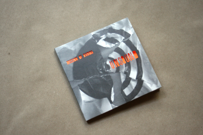
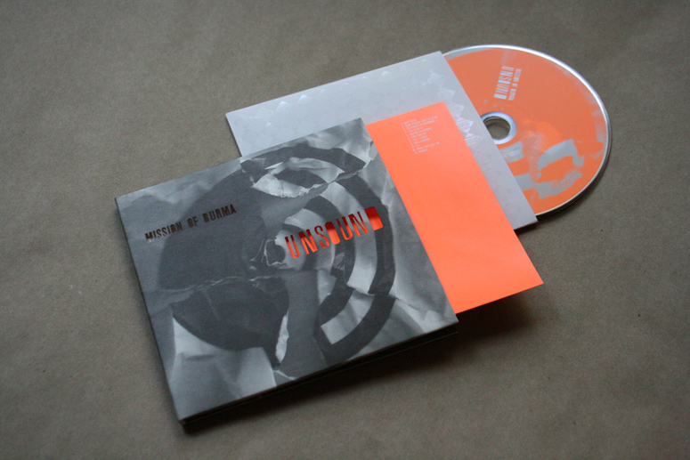
Unsound by Mission of Burma CD Packaging
Production Method
Die-cut
Offset
Design
John Foster
Printing
Sound Performance
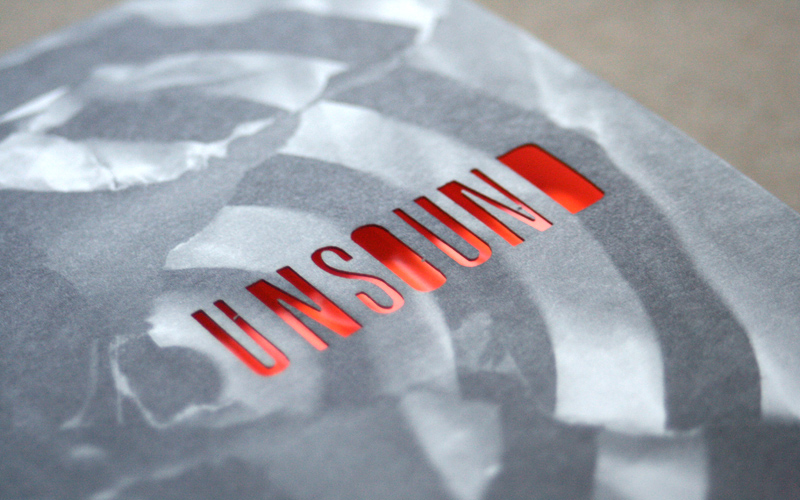
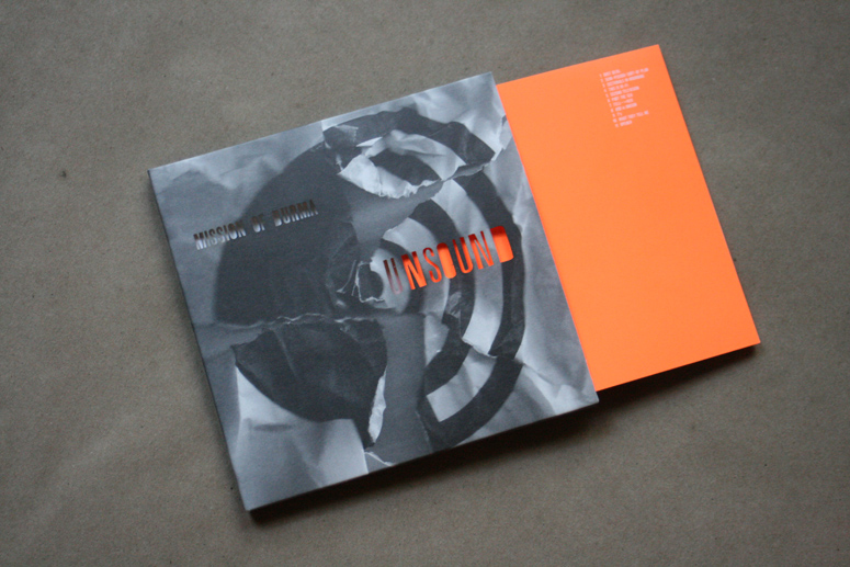
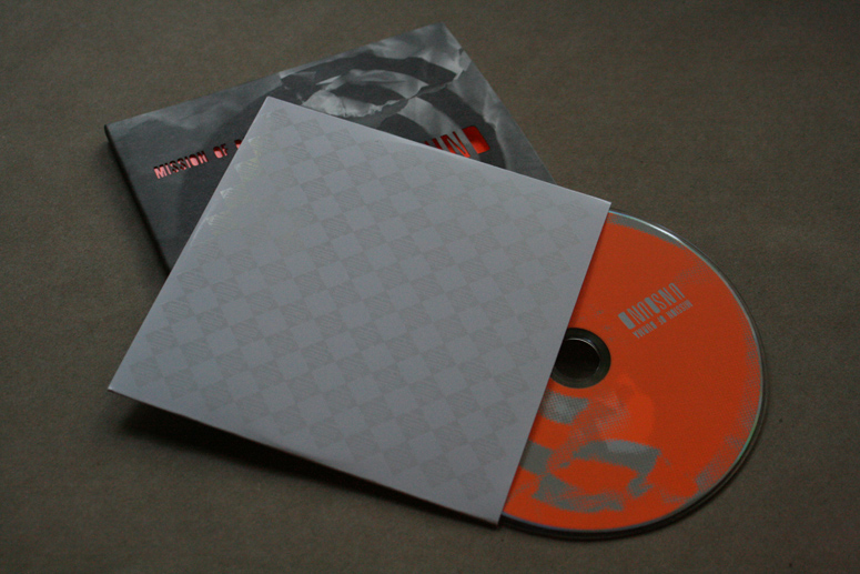
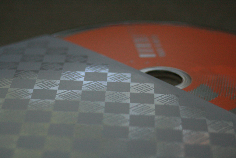
Also known as blaze orange, vivid orange, or Dayglo orange, safety orange is used to set objects apart from their surroundings. Mission accomplished.
Dimensions (Width × Height × Depth)
–
Page Count
–
Paper Stock
–
Number of Colors
Booklet: 1
Sleeve: 1
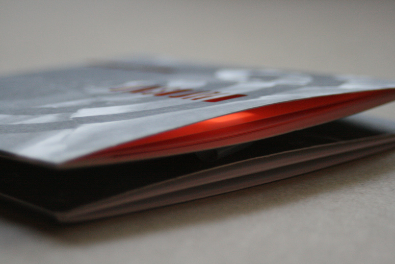
Varnishes
Matte UV throughout
Spot Gloss UV on inner wallet
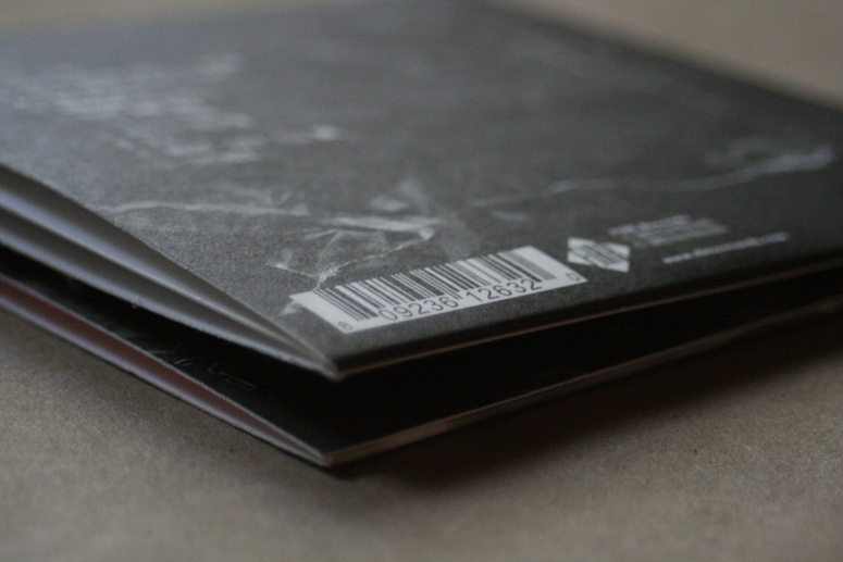
Binding
Booklet: Saddle-stitched
Typography
Custom
Trade Gothic Condensed Bold 20
Project Description
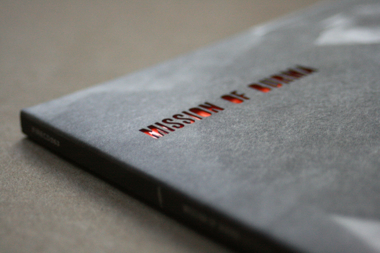
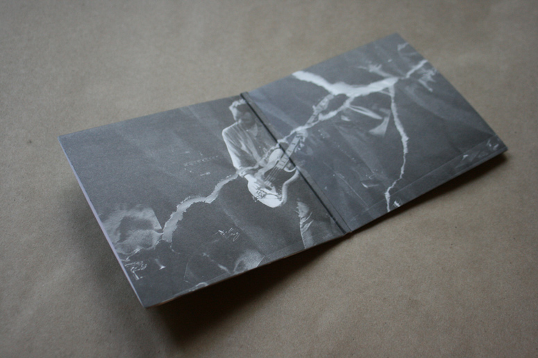
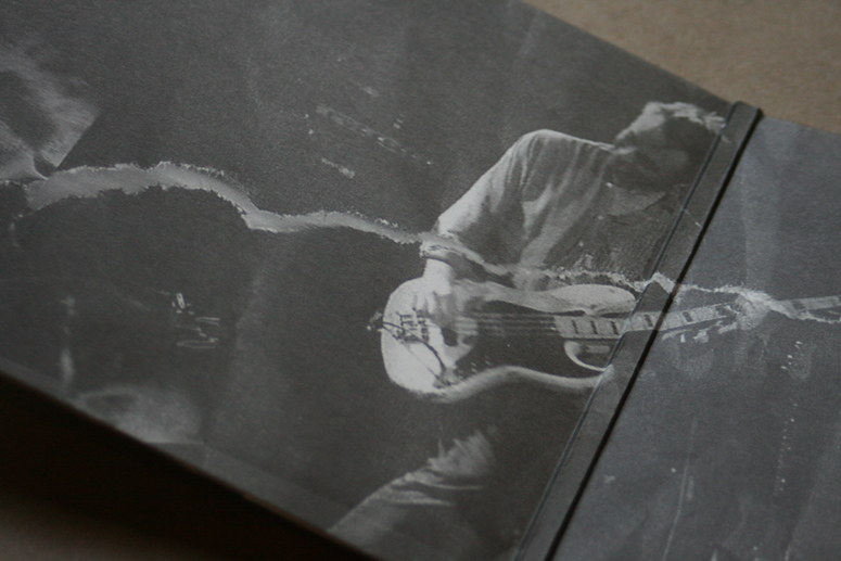
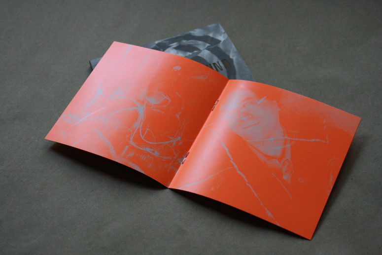
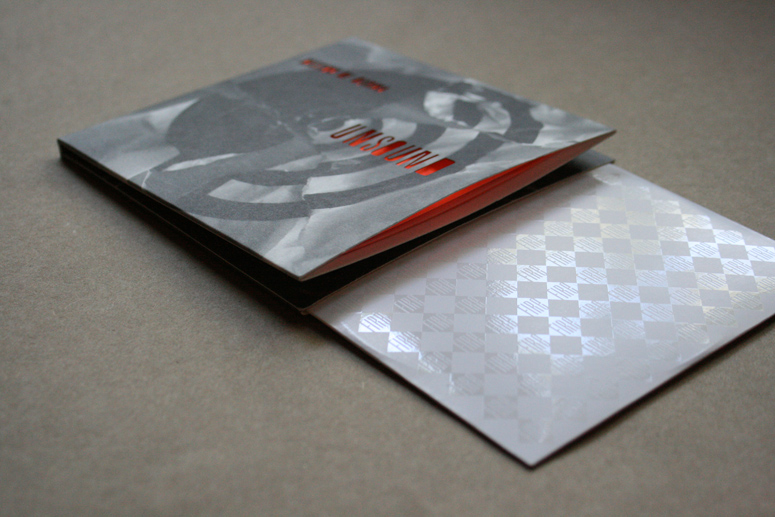
Talking with the band about the creation of this record, one of the real focuses was to challenge themselves and kind of tear up the Mission of Burma blueprint. They traded instruments, tried new ways of playing and recording and generally roughed up their mode of working as best they could. The funny result is that it is an undeniably true Mission of Burma record in the end. They are that pure as creatives. I started out with an idea involving spray paint, but moved on to a target/speaker graphic (while retaining the desire for some day glo orange color.) Then tore it up in the same mode of thinking. I did the same with photos of the band playing live and the type I had laid out for the back panel. I then started to do photographic experiments with the re-assembled images hastily taped back together.Sharing the results with the band, they stated a desire to somehow show the open holes in the imagery. This led us to move towards using the type on the cover to fulfill that role. Once we started playing with the idea of showing the eye-burning fluorescent orange via the booklet inside, there was no turning back.
Production Lesson(s)
I am usually inspired by the music itself when working on packaging, but in this case it was a combination of the songs and the way that they were created. I deconstructed my design and put it back together based on the band's stories about their own process. This also led to new challenges for my typographic and photographic skills. On the production end, once we knew we wanted a die-cut, that changed everything. We didn't want to compromise to achieve it, so it had to be a very expensive laser die. In music packaging, adding even a penny per unit has to be closely watched. But Fire is also dedicated to providing a premium experience for the buyer. The packaging for the label is one of the factors that truly sets it apart. We had to find a way to make it work. So I designed a powerful sleeve that could be printed using only black ink, and we kept the booklet to one color as well, using a spot fluorescent orange to great effect.There is also a great deal of planning that goes into a die on a multi -fold heavy stock piece like this. You can create creases and unforeseen problems if you don't know what you are doing. I wouldn't have risked something so intricate without prior experience.

Post Author

Kelly Cree
Writer for UnderConsideration LLC.
More: Online / On Twitter
Date Published
August 16, 2012
Filed Under
CD Packaging
Die-cut
Offset
Tagged with
gloss uv
matte varnish
saddle-stitch


About
FPO (For Print Only), is a division of UnderConsideration, celebrating the reality that print is not dead by showcasing the most compelling printed projects.
FPO uses Fonts.com to render Siseriff and Avenir Next.
FPO is run with Six Apart’s MovableType
All comments, ideas and thoughts on FPO are property of their authors; reproduction without the author’s or FPO’s permission is strictly prohibited
Twitter @ucllc
Sign-up for Mailing List
Mailing list managed by MailChimp
Thanks to our advertisers
About UnderConsideration
UnderConsideration is a graphic design firm generating its own projects, initiatives, and content while taking on limited client work. Run by Bryony Gomez-Palacio and Armin Vit in Bloomington, IN. More…
blogs we publish
Brand New / Displaying opinions and focusing solely on corporate and brand identity work.
Art of the Menu / Cataloguing the underrated creativity of menus from around the world.
Quipsologies / Chronicling the most curious, creative, and notable projects, stories, and events of the graphic design industry on a daily basis.
products we sell
Flaunt: Designing effective, compelling and memorable portfolios of creative work.
Brand New Conference videos / Individual, downloadable videos of every presentation since 2010.
Prints / A variety of posters, the majority from our AIforGA series.
Other / Various one-off products.
events we organize
Brand New Conference / A two-day event on corporate and brand identity with some of today's most active and influential practitioners from around the world.
Brand Nieuwe Conference / Ditto but in Amsterdam.
Austin Initiative for Graphic Awesomeness / A speaker series in Austin, TX, featuring some of the graphic design industry's most awesome people.
also
Favorite Things we've Made / In our capacity as graphic designers.
Projects we've Concluded / Long- and short-lived efforts.
UCllc News / Updates on what's going at the corporate level of UnderConsideration.

Related entries
Um Caminho para Santiago CD Package and Diary
Live Current Vol.10 + Cover to Cover Album Artwork
Until The Break of Dawn Album Packaging Design
Texas State University VocaLibre CD Packaging
Tulipa Ruiz “Dancê” CD Cover