ADV @ UNDERCONSIDERATION Peek here for details
BROWSE
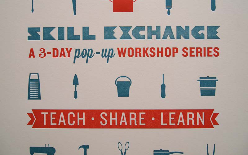
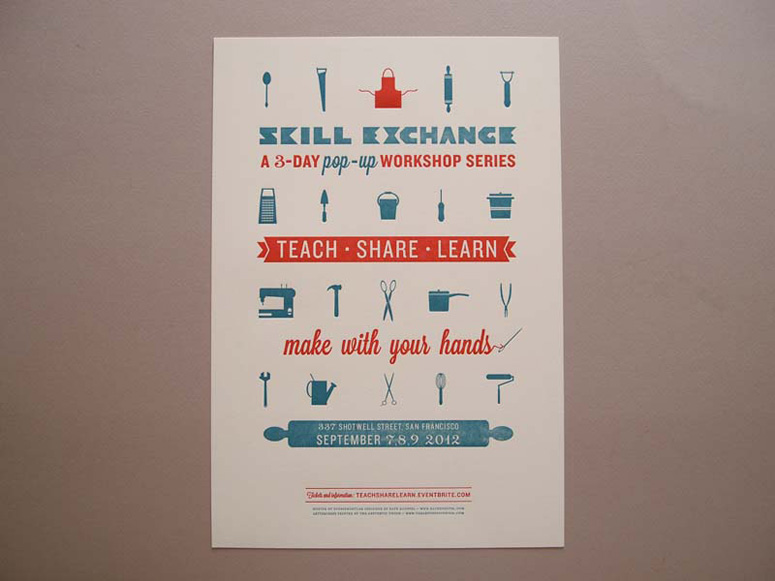
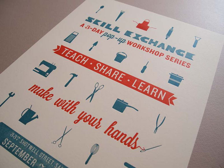
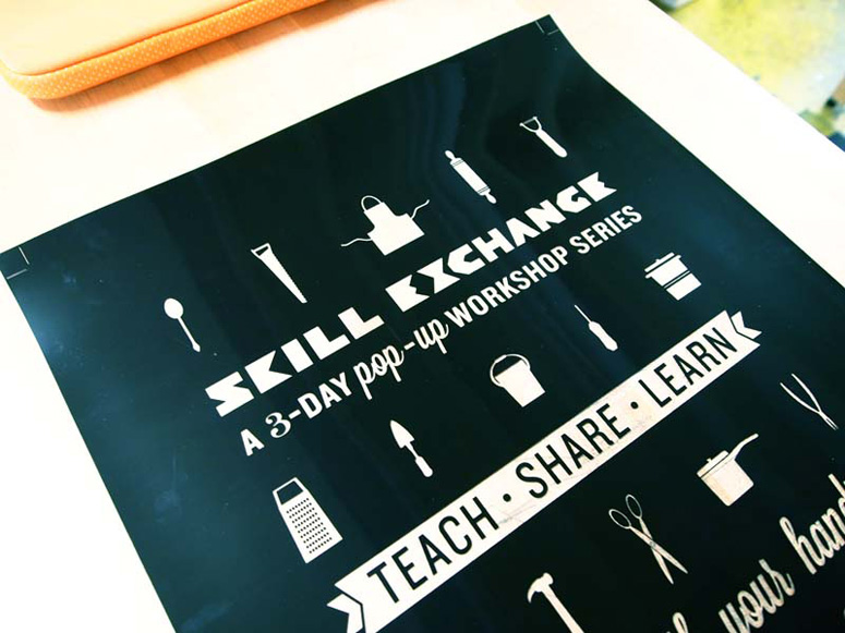
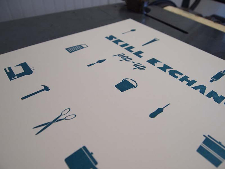
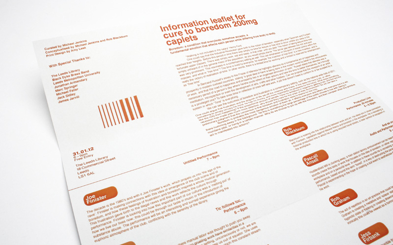
Skill Exchange Pop-up Workshop Poster
Production Method
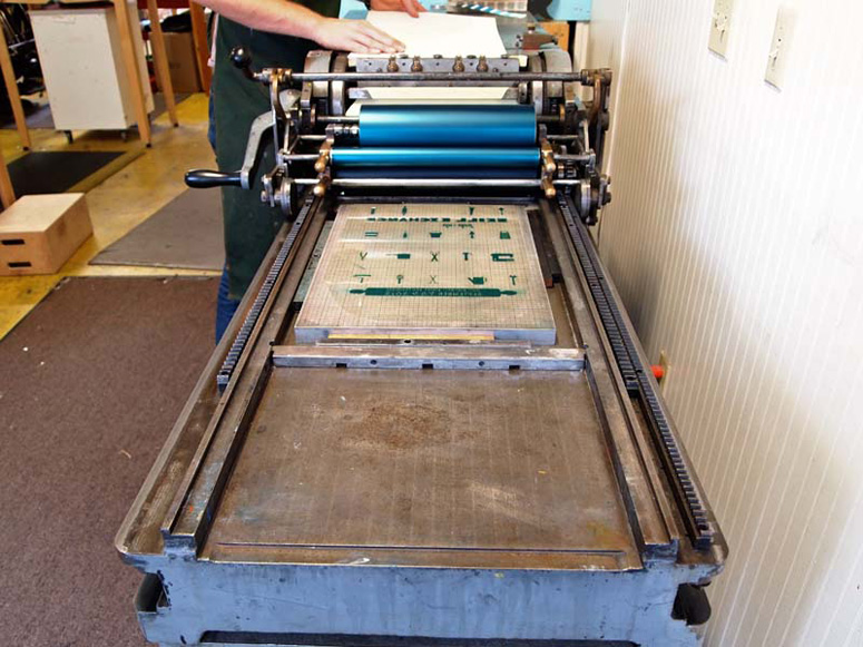
Letterpress
Design
Kate Koeppel
Printing
The Aesthetic Union
Skill Exchange is a community-based workshop series aimed at empowering through hand making skills. From grating cheese to chopping wood, designer Kate Koeppel’s charming, letterpressed icons encourage makers and teachers to share their passion for their own handiwork.
Dimensions (Width × Height × Depth)
13 × 19 in.
Page Count
–
Paper Stock
Coronado / Smooth Bright White / 130
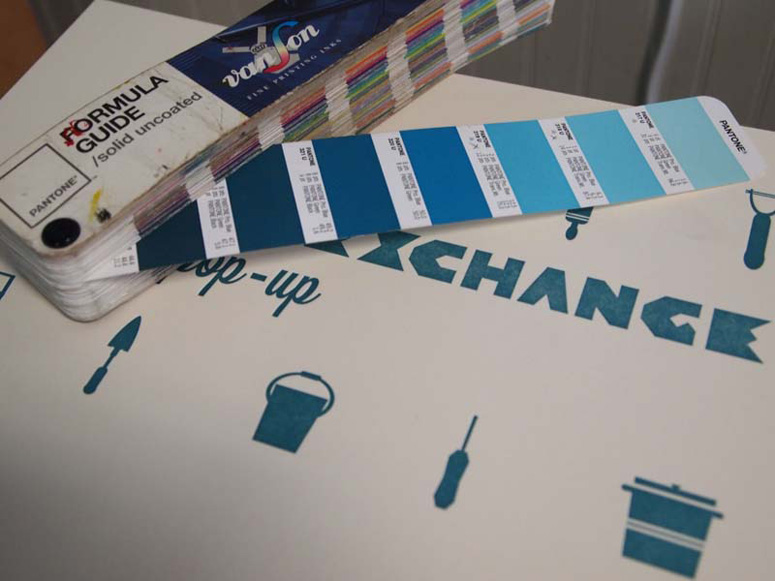
Number of Colors
2
Varnishes
–
Binding
–
Typography
Mrs. Eaves Bold
Dalliance Roman
Knockout Junior Liteweight
Knockout Welterweight
Lavenderia Sturdy
Custom
Project Description
This letterpress poster is a promotional piece for Skill Exchange's 3-day pop-up workshop series in San Francisco.Skill Exchange is a community-based workshop series which aims to inspire the community to use their hands, and learn new and traditional hand making skills in a fun, social setting. As handcrafting skills are too often undervalued and under-practiced— Skill Exchange seeks to encourage self-reliance through social skill exchange by bringing together enthusiastic makers and teachers to share their passion and craft with our communities.
I wanted to create a physical poster that would represent the value and philosophy of the whole project— people coming together to teach and practice traditional hand-making skills. I've had a little experience with letterpress printing, but after designing the poster, I wanted to hand it off to a professional that was really skilled in his craft, and would put the same energy into the project as I had.
Production Lesson(s)
Simple is better. Of the 5-10 (or 20) different versions I created, the simpler one worked best for letterpress, and for the overall hierarchy of the poster. Next time I'd love to play with creating a third color with two plates. Printing sheets areas with photopolymer and lots of dead space can ink up the negative plate space, so I cut most of the non-printing area from the base.
Post Author

Kelly Cree
Writer for UnderConsideration LLC.
More: Online / On Twitter
Date Published
October 5, 2012
Filed Under
Letterpress
Posters
Tagged with
event
icons


About
FPO (For Print Only), is a division of UnderConsideration, celebrating the reality that print is not dead by showcasing the most compelling printed projects.
FPO uses Fonts.com to render Siseriff and Avenir Next.
FPO is run with Six Apart’s MovableType
All comments, ideas and thoughts on FPO are property of their authors; reproduction without the author’s or FPO’s permission is strictly prohibited
Twitter @ucllc
Sign-up for Mailing List
Mailing list managed by MailChimp
Thanks to our advertisers
About UnderConsideration
UnderConsideration is a graphic design firm generating its own projects, initiatives, and content while taking on limited client work. Run by Bryony Gomez-Palacio and Armin Vit in Bloomington, IN. More…
blogs we publish
Brand New / Displaying opinions and focusing solely on corporate and brand identity work.
Art of the Menu / Cataloguing the underrated creativity of menus from around the world.
Quipsologies / Chronicling the most curious, creative, and notable projects, stories, and events of the graphic design industry on a daily basis.
products we sell
Flaunt: Designing effective, compelling and memorable portfolios of creative work.
Brand New Conference videos / Individual, downloadable videos of every presentation since 2010.
Prints / A variety of posters, the majority from our AIforGA series.
Other / Various one-off products.
events we organize
Brand New Conference / A two-day event on corporate and brand identity with some of today's most active and influential practitioners from around the world.
Brand Nieuwe Conference / Ditto but in Amsterdam.
Austin Initiative for Graphic Awesomeness / A speaker series in Austin, TX, featuring some of the graphic design industry's most awesome people.
also
Favorite Things we've Made / In our capacity as graphic designers.
Projects we've Concluded / Long- and short-lived efforts.
UCllc News / Updates on what's going at the corporate level of UnderConsideration.

Related entries
36 Days of Type Poster
Ministry of Environment in Colombia Poster
National Parks Map
eBoy Poster
“Love Your Mother” Print