ADV @ UNDERCONSIDERATION Peek here for details
BROWSE
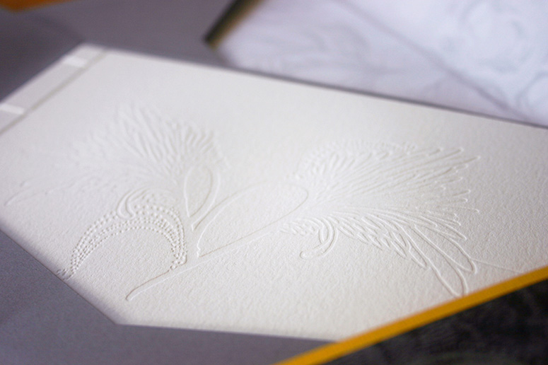
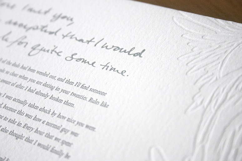
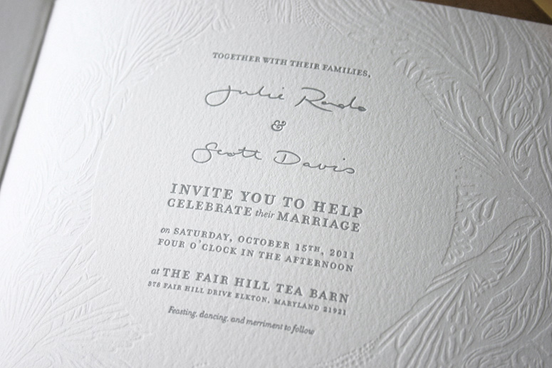
Julie + Scott Wedding Invitation
Production Method
Inkjet
Letterpress
Rubber stamp
Design
Julie Rado
Printing
Rory Sparks
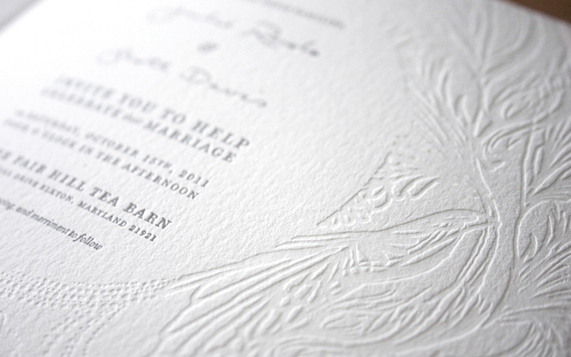
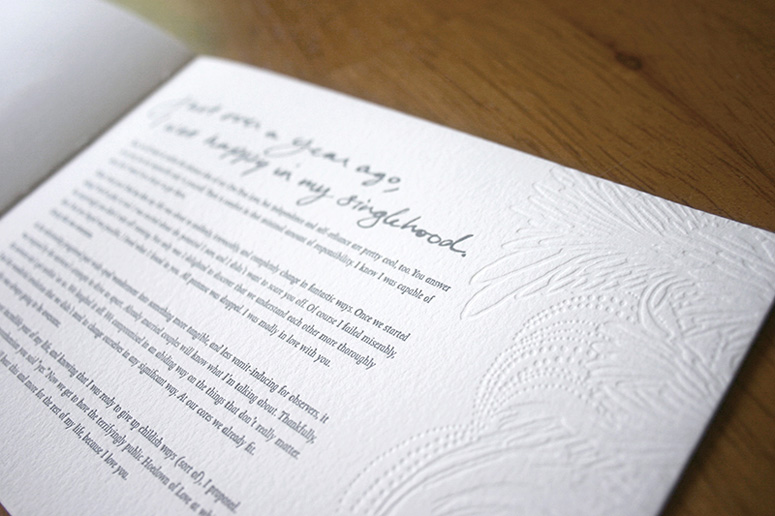
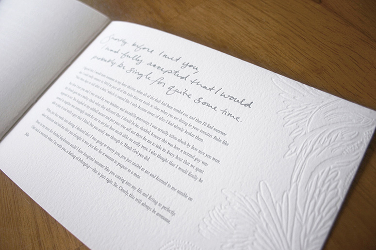
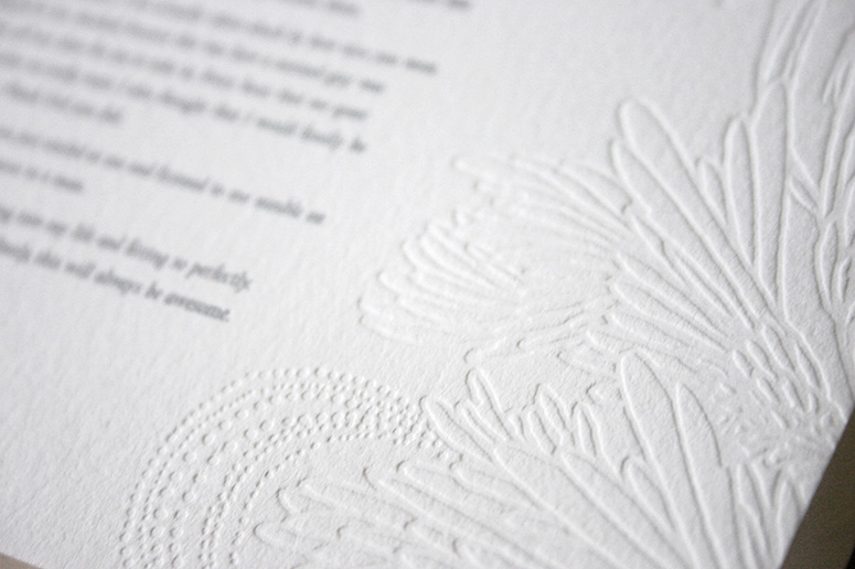
Delicately bound, letterpressed with love, and personalized with letters from the bride and groom, this invitation’s strength is in its vulnerability.
Dimensions (Width × Height × Depth)
8.125 × 5.125 in
Page Count
4
Paper Stock
Crane / Lettra Pearl / 110 C
Number of Colors
2
Varnishes
–
Binding
Japanese 4-stitch
Typography
Joanna
Filosofia
hand type
Project Description
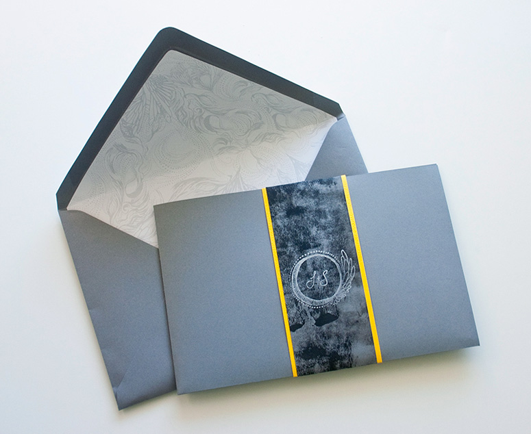
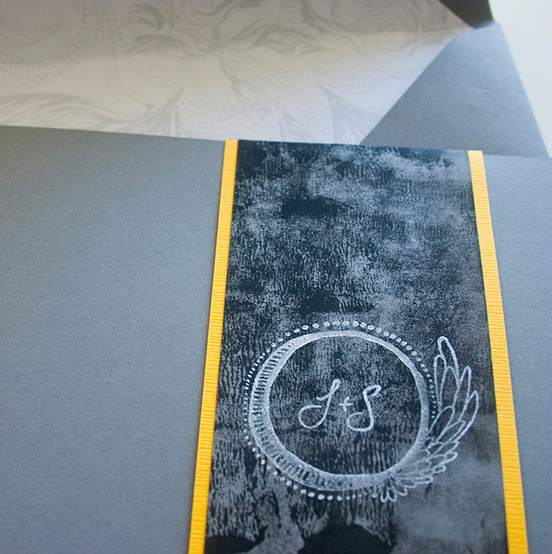
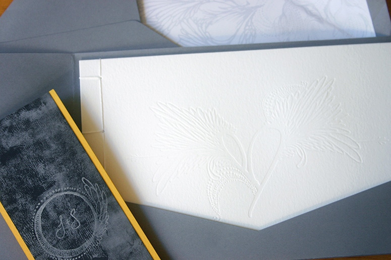
As a designer, staring down the project of completing your own wedding invitations can be terrifying. I wanted to do something different, something handmade, letterpressed, personal, and classic, and I let ideas simmer in the back of my head for months. I came up with the concept of my fiancee and I writing each other letters about how we fell in love, since we hadn't dated for that long before getting engaged and not all of our guests knew how we met. After some initial apprehension, my fiancee agreed to publicly pour his heart out on paper along with me. He endured good-natured ridicule from his male friends and tears from our mothers and compliments all around from everyone else. The invitations ended up being four pages: a cover, our letters, and the last page with the details, which I bound together as a booklet. I knew that I wanted to incorporate blind letterpress and an aspect of my own illustrations into the invitations. I also wanted calligraphy, but couldn't afford to hire a pro, so I got out my pen nibs and a bottle of ink and practiced my writing. I made a protective cover for the booklet, which is the gray outer layer—I made all of these by hand—trimming, folding, and gluing in the pocket to hold the booklet. For the belly band, I took leftover gray paper scraps from the covers and rolled black acrylic paint on them with a brayer, backed them with yellow scrapbook paper and then stamped them with the J + S monogram. Finally, I took some of the illustrations and created envelope liners.Production Lesson(s)
I learned that simplifying can be good for both the concept and the budget—originally I started out with six pages for each invitation, but cut it down to four for cost and I think that worked out really well. Sane people buy specialty booklet envelopes in advance instead of cutting, folding, and gluing envelopes themselves. At the same time, being crafty and hands-on (like rolling fifty cents worth of acrylic paint onto scrap paper for belly bands) can yield really fun, unexpected results. I had already learned this lesson in grad school, but was reminded during this process that assembling any sort of custom project will inevitably take you much longer than you thought it would, you will be sore from standing over your cutting mat in awkward positions, and you will be lucky if you do not sacrifice a finger tip to the gods of x-acto. Patience and time are a designer's friend when doing complicated, hand-crafted projects.
Post Author

Jessica Mullen
Writer for UnderConsideration LLC.
More: Online / On Twitter
Date Published
November 21, 2012
Filed Under
Inkjet
Letterpress
Rubber stamp
Wedding materials
Tagged with
calligraphy
crane lettra
hand drawn type
inkjet
letterpress
rubber stamp
wedding invitation
wedding materials


About
FPO (For Print Only), is a division of UnderConsideration, celebrating the reality that print is not dead by showcasing the most compelling printed projects.
FPO uses Fonts.com to render Siseriff and Avenir Next.
FPO is run with Six Apart’s MovableType
All comments, ideas and thoughts on FPO are property of their authors; reproduction without the author’s or FPO’s permission is strictly prohibited
Twitter @ucllc
Sign-up for Mailing List
Mailing list managed by MailChimp
Thanks to our advertisers
About UnderConsideration
UnderConsideration is a graphic design firm generating its own projects, initiatives, and content while taking on limited client work. Run by Bryony Gomez-Palacio and Armin Vit in Bloomington, IN. More…
blogs we publish
Brand New / Displaying opinions and focusing solely on corporate and brand identity work.
Art of the Menu / Cataloguing the underrated creativity of menus from around the world.
Quipsologies / Chronicling the most curious, creative, and notable projects, stories, and events of the graphic design industry on a daily basis.
products we sell
Flaunt: Designing effective, compelling and memorable portfolios of creative work.
Brand New Conference videos / Individual, downloadable videos of every presentation since 2010.
Prints / A variety of posters, the majority from our AIforGA series.
Other / Various one-off products.
events we organize
Brand New Conference / A two-day event on corporate and brand identity with some of today's most active and influential practitioners from around the world.
Brand Nieuwe Conference / Ditto but in Amsterdam.
Austin Initiative for Graphic Awesomeness / A speaker series in Austin, TX, featuring some of the graphic design industry's most awesome people.
also
Favorite Things we've Made / In our capacity as graphic designers.
Projects we've Concluded / Long- and short-lived efforts.
UCllc News / Updates on what's going at the corporate level of UnderConsideration.

Related entries
Herbst & Spungen Wedding Invitation Suite
Erin and Brian Wedding Invitation
Daniela & Rui Wedding Invitation
Benjamin & Catalina Wedding Announcement
Devon & Mike Wedding Invitation