ADV @ UNDERCONSIDERATION Peek here for details
BROWSE
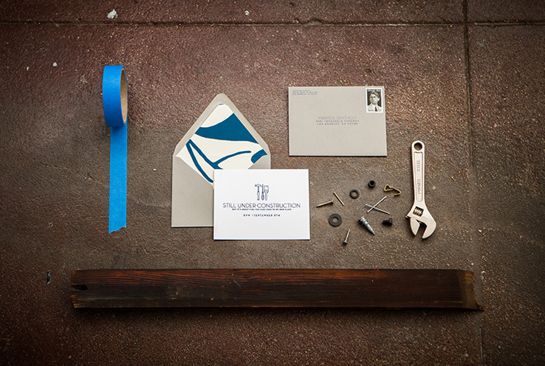
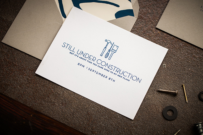
House Warming Party Invitation
Production Method
Thermography
Design
Cristina Pandol
Photography: Garrett Shannon
Custom Rubber Stamp: Hollywood Rubber Stamp Company
Printing
Cristina Pandol
You know you’re a designer when your housewarming invitation is a meticulously crafted DIY extravaganza all the way down to the choice of postage stamp.
Dimensions (Width × Height × Depth)
–
Page Count
–
Paper Stock
–
Number of Colors
1
Varnishes
–
Binding
–
Typography
Neutraface
AW Conqueror Slab
Project Description
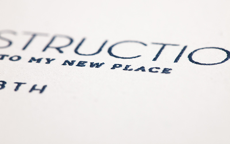
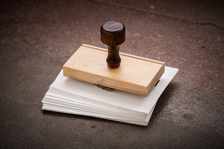
After 3 months of being at my new place, I finally was getting my act together and having a house warming party and naturally needed an invitation. Even though my place wasn't completely put together, I figured "under construction" could be the theme for the party and my downtown Los Angeles loft would serve as the inspiration for the entire project. Since I had painted, hung wall paper, and sewn throw pillows all myself, I knew that the invitation had to be completely hand done and DIY to fit that and the very industrial and urban aesthetic of my apartment.I drew the little tools and used Neutraface and AW Conqueror Slab for the type. Once the design was finalized, I sent the stamp to be made and while I was waiting for that I set off to buy a ZAP! heat gun and Adirondack powder. I stamped each invitation with clear watermark ink, then covered the wet ink with the powder, removed the extra powder by flipping the card over on a large piece of scrap paper, and then used the heat gun to melt the powder and create a thermal print. The hardest part was getting a clean stamp, but once I got the hang of it, the project just flew by. When you look at the card the thermal print looks clean and is slightly embossed, but when you look at it magnitized (through a camera lense) you can see all the grunge, almost boiled texture that the melted powder has created.
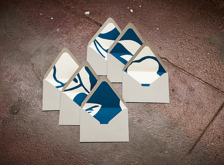
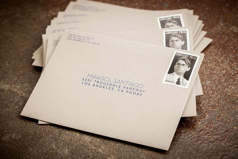
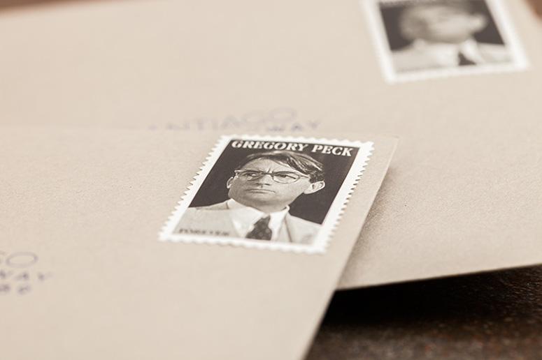
For the envelope, I decided on a light grey to match my cement floors and to use the extra wallpaper that I had hung as envelope liners so every envelope was different and someone who paid attention to detail would realize when they came to the party where that abstract paper came from. I used a standard inkjet printer to print the addresses return address on the front and use the same type style for the addresses. I picked a forever stamp of Gregory Peck since he's such a Los Angeles icon and the coloring of the stamp worked with the aesthetic and palette of the invitation.
Production Lesson(s)
It became very challenging to get a clean stamp print. The large thin lines turned out beautiful, but the small thin lines were difficult. If you applied too much pressure the slab serif letters became very muddy and hard to read. It was much better to apply a light to medium amount of pressure evenly.
Post Author

Kelly Cree
Writer for UnderConsideration LLC.
More: Online / On Twitter
Date Published
December 4, 2012
Filed Under
Invitations
Thermography
Tagged with
DIY
envelope
rubber stamp
thermography
wallpaper


About
FPO (For Print Only), is a division of UnderConsideration, celebrating the reality that print is not dead by showcasing the most compelling printed projects.
FPO uses Fonts.com to render Siseriff and Avenir Next.
FPO is run with Six Apart’s MovableType
All comments, ideas and thoughts on FPO are property of their authors; reproduction without the author’s or FPO’s permission is strictly prohibited
Twitter @ucllc
Sign-up for Mailing List
Mailing list managed by MailChimp
Thanks to our advertisers
About UnderConsideration
UnderConsideration is a graphic design firm generating its own projects, initiatives, and content while taking on limited client work. Run by Bryony Gomez-Palacio and Armin Vit in Bloomington, IN. More…
blogs we publish
Brand New / Displaying opinions and focusing solely on corporate and brand identity work.
Art of the Menu / Cataloguing the underrated creativity of menus from around the world.
Quipsologies / Chronicling the most curious, creative, and notable projects, stories, and events of the graphic design industry on a daily basis.
products we sell
Flaunt: Designing effective, compelling and memorable portfolios of creative work.
Brand New Conference videos / Individual, downloadable videos of every presentation since 2010.
Prints / A variety of posters, the majority from our AIforGA series.
Other / Various one-off products.
events we organize
Brand New Conference / A two-day event on corporate and brand identity with some of today's most active and influential practitioners from around the world.
Brand Nieuwe Conference / Ditto but in Amsterdam.
Austin Initiative for Graphic Awesomeness / A speaker series in Austin, TX, featuring some of the graphic design industry's most awesome people.
also
Favorite Things we've Made / In our capacity as graphic designers.
Projects we've Concluded / Long- and short-lived efforts.
UCllc News / Updates on what's going at the corporate level of UnderConsideration.

Related entries
“An Evening onboard the HMS Victory” Invitation
Rainforest Alliance 2017 Annual Gala Invitation
The Nelson-Atkins Museum of Art Invitation
Victoria and Sasha Wedding Invitation
“Fast & Four” Skateboard Deck Invitation