ADV @ UNDERCONSIDERATION Peek here for details
BROWSE
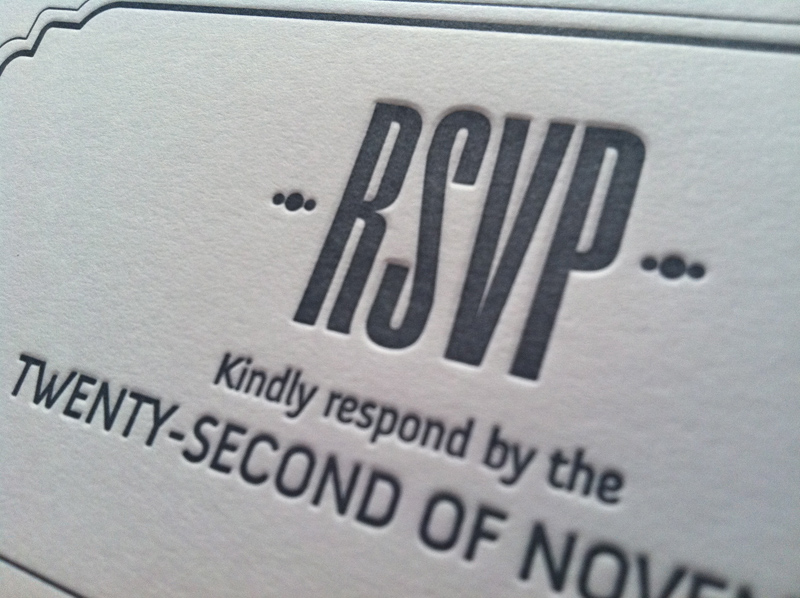
Sammarco and LaPorte Wedding Invitation
Production Method
Design
Matthew LaFleur
Printing
AccuColor Plus inc./Letterpress Chicago

A stickler for untraditional wedding materials I am drawn not only to the color choices in this wedding invitation but it’s constant verticality. Would love to see how this was carried on at the event.
Client
Julie Sammarco
Quantity Produced
180
Production Cost
–
Production Time
10 days
Dimensions (Width × Height × Depth)
3.875 × 9 × in.
Page Count
–
Paper Stock
Mohawk / Ultra White / Eggshell / 130C
Number of Colors
2
Varnishes
–
Binding
–
Typography
Droid Regular
Anivers Regular

Project Description
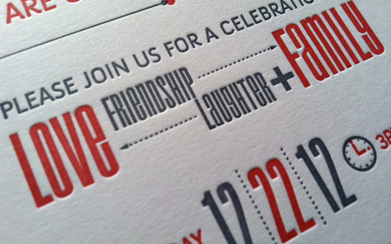
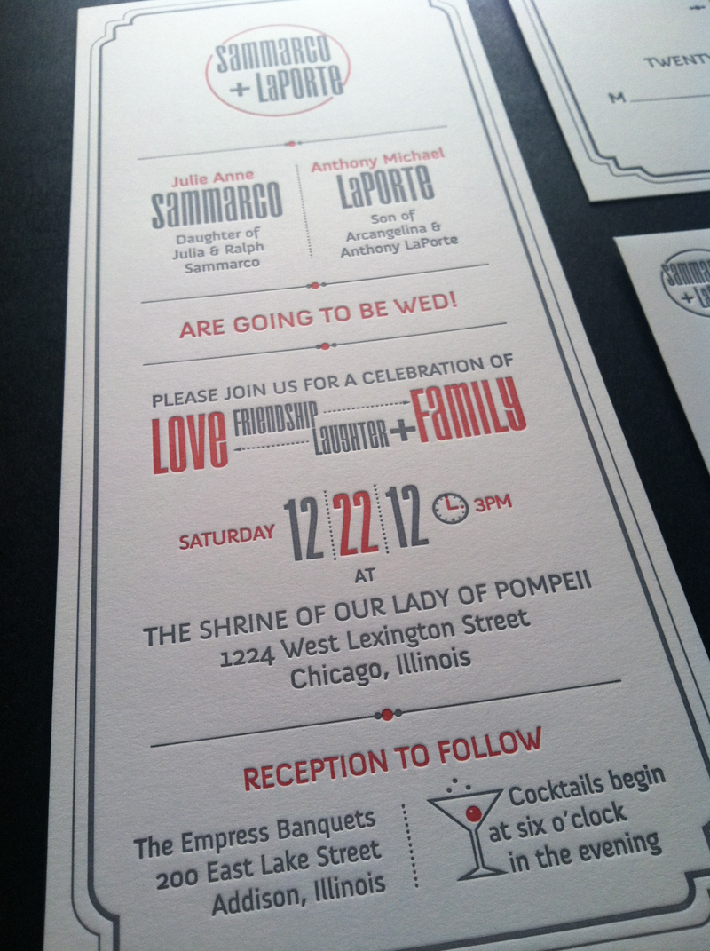
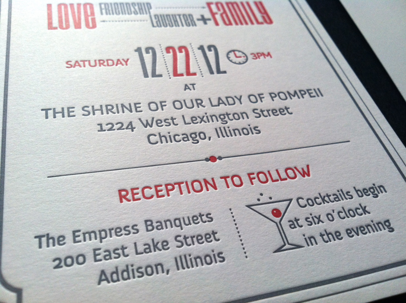
The bride, Julie, met with me and explained that she did not want a traditional wedding invitation. Coming from a large family, she had seen one too many script typefaces, centered type, thermographic printing on standard-sized stock. She wanted a modern, typographic design using gray, white and red, but nothing holiday despite the fact that the wedding date was Dec. 22. Not too feminine, but clearly still an invitation to her and her fiancé's great day. I suggested, as a tip of the hat to the traditional, that we print it letterpress. As the project evolved, the iconography presented itself as a fun way to break up the type and distinguish itself from other invitations. The final product has a nice tactile feel, a fresh look with a wonderful, old-school touch.Production Lesson(s)
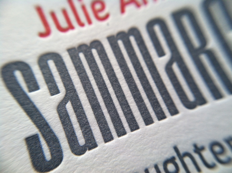
This was my first experience with letterpress. Designing digitally for a process that is about 100 years old has it's challenges. Gary Mordhorst, owner/operator of Letterpress Chicago, was fantastic in explaining the process and aspects of which to be aware. In the lowercase "e" of the Droid typeface, he suggested adding a .07 pt stroke so the space within the character would print clearly. The ink is absorbed into the uncoated paper more than offset, so the colors became slightly more subdued than I had anticipated. If you want that super-toothy surface look, you'll have to pay for it; the more texture, the more expensive the paper.
Post Author

Bryony Gomez-Palacio
Editor of FPO and co-founder of UnderConsideration LLC.
More: Online / On Twitter
Date Published
January 18, 2013
Filed Under
Letterpress
Wedding materials
Tagged with
letterpress
mohawk
PMS
wedding invitation


About
FPO (For Print Only), is a division of UnderConsideration, celebrating the reality that print is not dead by showcasing the most compelling printed projects.
FPO uses Fonts.com to render Siseriff and Avenir Next.
FPO is run with Six Apart’s MovableType
All comments, ideas and thoughts on FPO are property of their authors; reproduction without the author’s or FPO’s permission is strictly prohibited
Twitter @ucllc
Sign-up for Mailing List
Mailing list managed by MailChimp
Thanks to our advertisers
About UnderConsideration
UnderConsideration is a graphic design firm generating its own projects, initiatives, and content while taking on limited client work. Run by Bryony Gomez-Palacio and Armin Vit in Bloomington, IN. More…
blogs we publish
Brand New / Displaying opinions and focusing solely on corporate and brand identity work.
Art of the Menu / Cataloguing the underrated creativity of menus from around the world.
Quipsologies / Chronicling the most curious, creative, and notable projects, stories, and events of the graphic design industry on a daily basis.
products we sell
Flaunt: Designing effective, compelling and memorable portfolios of creative work.
Brand New Conference videos / Individual, downloadable videos of every presentation since 2010.
Prints / A variety of posters, the majority from our AIforGA series.
Other / Various one-off products.
events we organize
Brand New Conference / A two-day event on corporate and brand identity with some of today's most active and influential practitioners from around the world.
Brand Nieuwe Conference / Ditto but in Amsterdam.
Austin Initiative for Graphic Awesomeness / A speaker series in Austin, TX, featuring some of the graphic design industry's most awesome people.
also
Favorite Things we've Made / In our capacity as graphic designers.
Projects we've Concluded / Long- and short-lived efforts.
UCllc News / Updates on what's going at the corporate level of UnderConsideration.

Related entries
Herbst & Spungen Wedding Invitation Suite
Erin and Brian Wedding Invitation
Daniela & Rui Wedding Invitation
Benjamin & Catalina Wedding Announcement
Devon & Mike Wedding Invitation