ADV @ UNDERCONSIDERATION Peek here for details
BROWSE
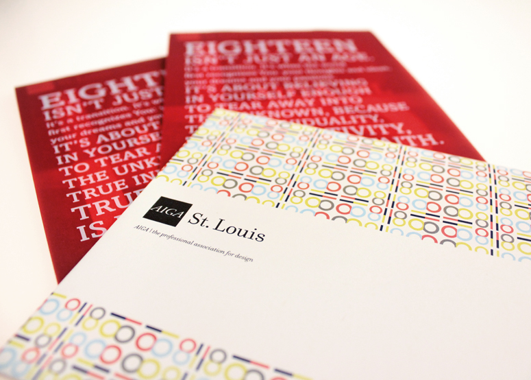
AIGA Saint Louis Design Show 18 Call-for-Entries Brochure
Production Method
Digital
Design
2e Creative
Lynda McClure, Art Director and Designer
Brandon Chuang, Copywriter
Printing
Top Graphics
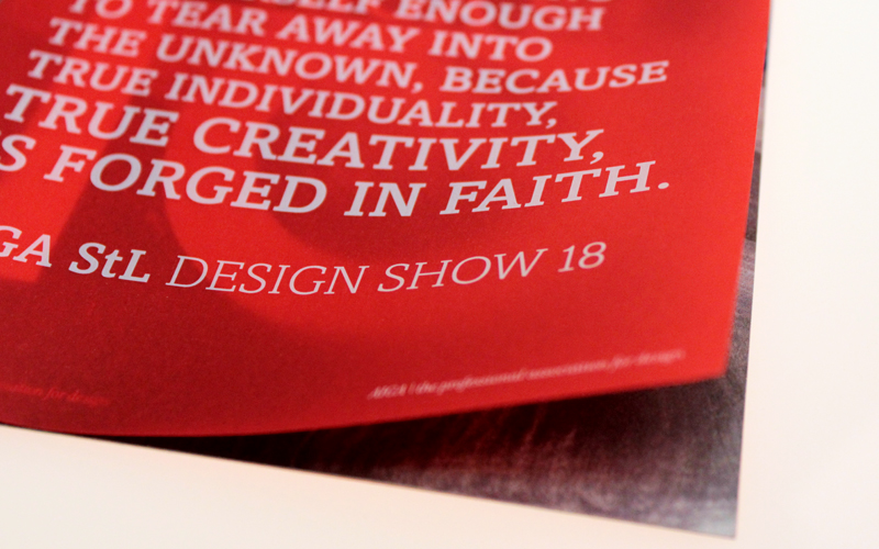
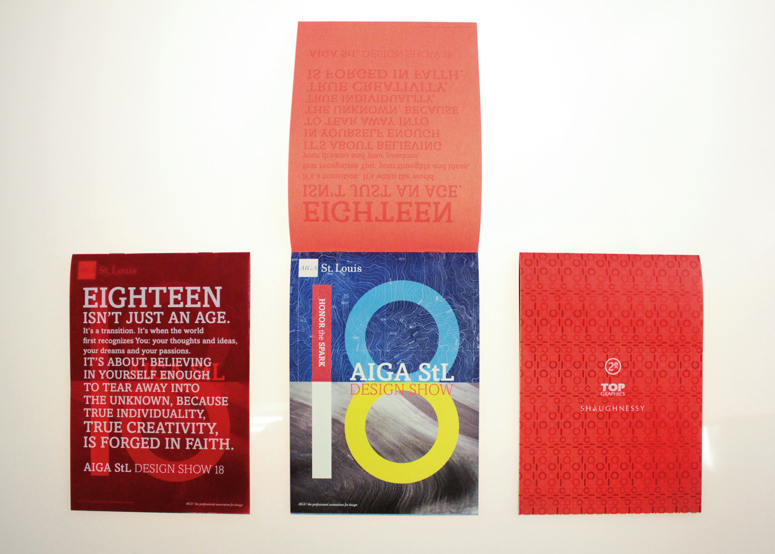
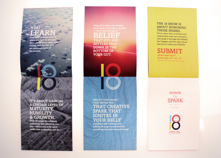
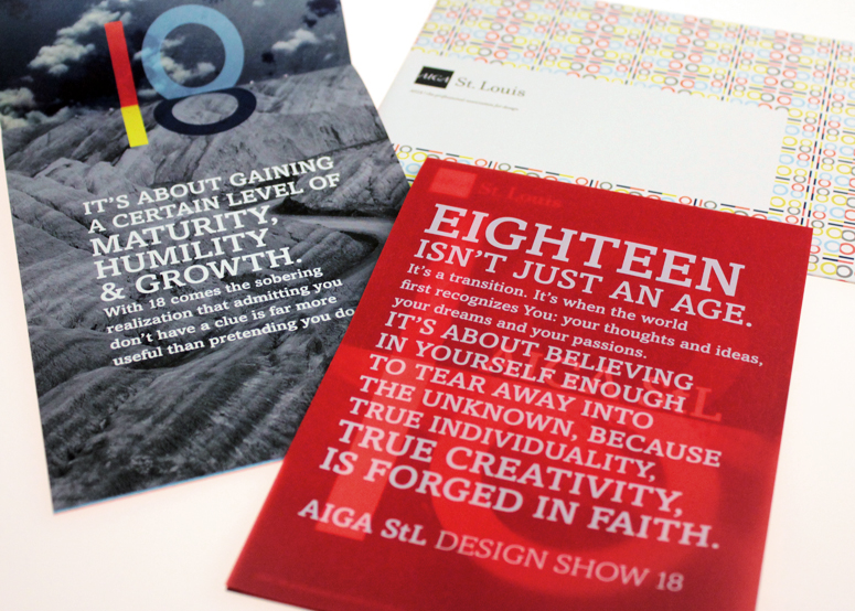
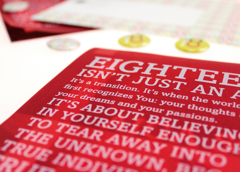
2e Creative created this clever, foldable “18” mark for AIGA St. Louis’ eighteenth annual Design Show call-for-entries brochure. The concept for the entire project muses on what 18 means and what it means to be 18, and honoring the ideas that made it through the maturing process to “adulthood.” This is also a very nice example of the ability of a digital press to print white ink on colored paper as is the case on the cover.
Dimensions (Width × Height × Depth)
5 × 7 in
Page Count
12
Paper Stock
Glama Natural / Translucent / Red / 27lb
Mohawk / Options Smooth 100% PC / Cool White / 80lb text
Number of Colors
CMYK and White
Varnishes
–
Binding
Saddle Stitch Vertical
Typography
–
Project Description
The AIGA Saint Louis Chapter needed a call-for-entries brochure for their annual local design competition. This year marked the 18th show, and the one request was to keep the tradition of using the number as the main driver of the concept.What does 18 mean? 18, or being 18, is a dichotomy. When you turn 18, you become an adult and the world is yours. But being 18 also means there are more consequences for your actions. As a creative professional, it's having the dream and ambition to create the best design for your clients, but there are still limitations and barriers that interfere with that ambition, like budgets and timelines. The mark we created is perfectly symmetrical and helps organize the layout across the pages to convey the dichotomy of being 18.
Production Lesson(s)
We were lucky enough to work with amazing printing and paper sponsors that helped us ensure the final piece came out perfect, and it did. Our long-time digital printer was able to use white ink on red translucent paper with no problem at all.
Post Author

Duncan Robertson
Former intern at UnderConsideration LLC.
More: Online / On Twitter
Date Published
October 2, 2013
Filed Under
Brochures
Digital
Tagged with
AIGA
call for entries
red
translucent


About
FPO (For Print Only), is a division of UnderConsideration, celebrating the reality that print is not dead by showcasing the most compelling printed projects.
FPO uses Fonts.com to render Siseriff and Avenir Next.
FPO is run with Six Apart’s MovableType
All comments, ideas and thoughts on FPO are property of their authors; reproduction without the author’s or FPO’s permission is strictly prohibited
Twitter @ucllc
Sign-up for Mailing List
Mailing list managed by MailChimp
Thanks to our advertisers
About UnderConsideration
UnderConsideration is a graphic design firm generating its own projects, initiatives, and content while taking on limited client work. Run by Bryony Gomez-Palacio and Armin Vit in Bloomington, IN. More…
blogs we publish
Brand New / Displaying opinions and focusing solely on corporate and brand identity work.
Art of the Menu / Cataloguing the underrated creativity of menus from around the world.
Quipsologies / Chronicling the most curious, creative, and notable projects, stories, and events of the graphic design industry on a daily basis.
products we sell
Flaunt: Designing effective, compelling and memorable portfolios of creative work.
Brand New Conference videos / Individual, downloadable videos of every presentation since 2010.
Prints / A variety of posters, the majority from our AIforGA series.
Other / Various one-off products.
events we organize
Brand New Conference / A two-day event on corporate and brand identity with some of today's most active and influential practitioners from around the world.
Brand Nieuwe Conference / Ditto but in Amsterdam.
Austin Initiative for Graphic Awesomeness / A speaker series in Austin, TX, featuring some of the graphic design industry's most awesome people.
also
Favorite Things we've Made / In our capacity as graphic designers.
Projects we've Concluded / Long- and short-lived efforts.
UCllc News / Updates on what's going at the corporate level of UnderConsideration.

Related entries
Black Sheep Studio Business Cards and Promotional Items
E.A.S.E. Stationery Set
“A to Z Letters for Sale” Promo
End of Work iPad and Notebook Cases
CNN Digital New Hire Kit