ADV @ UNDERCONSIDERATION Peek here for details
BROWSE
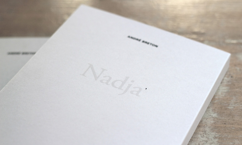
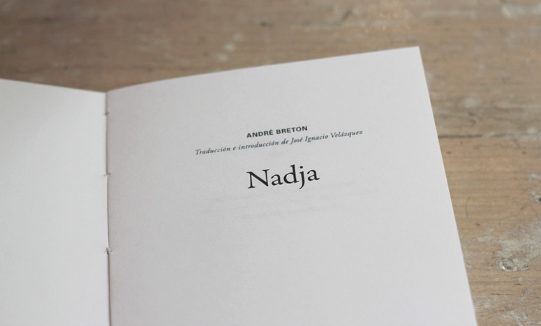
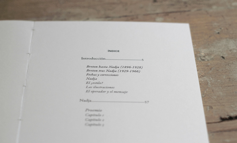
Nadja: André Breton
Production Method
Offset
Design
Carla Cascales Alimbau
Carla Cascales Alimbau, Graphic designer, Editor and Art director.
Printing
The Private Space
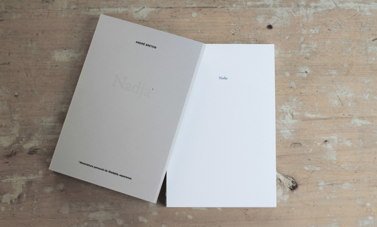
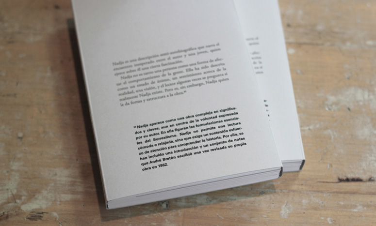
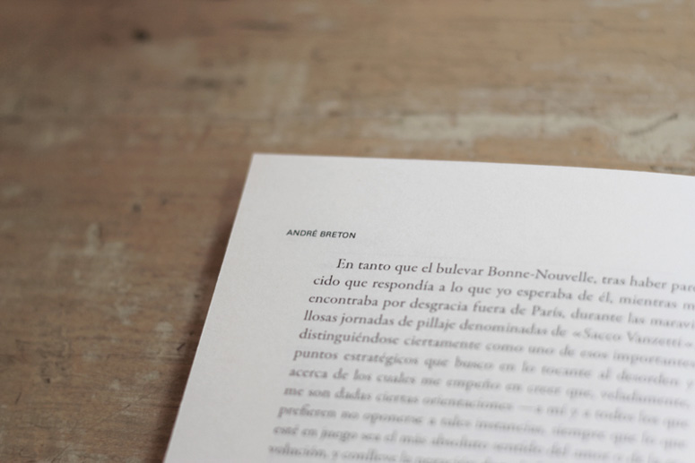
For this edition of André Breton’s “Nadja”, Carla Cascales Alimbau sought to represent themes from the iconic French surrealist novel through design decisions. The main text is printed in Garamond, while footnotes are in Univers; an insert provides supplementary illustrations; and grey paper with an organic texture works to both sets the depressed mood and reference the organic love affair between narrator and main character. Overall, the design of this edition makes a worthy effort to answer the novel’s opening question: “Who I am?”
Dimensions (Width × Height × Depth)
–
Page Count
168
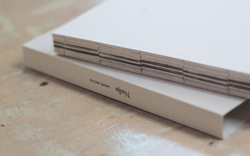
Paper Stock
100C
Number of Colors
4
Varnishes
UVI
Binding
Sewn
Typography
Baskerville
Univers
Project Description
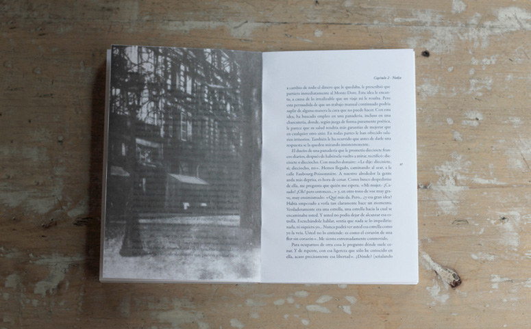
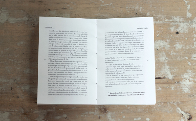
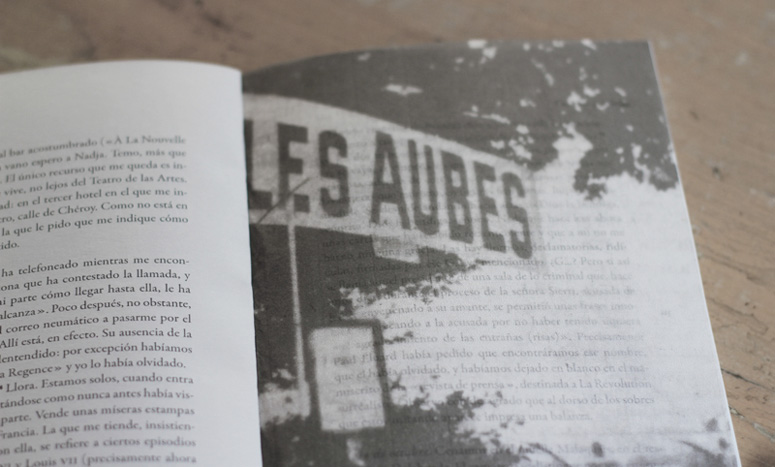
Editorial design of the book Nadja written by the surrealist André Breton. Independent Edition.The book is entirely printed on Fedrigoni paper: Sirio Pearl, and Arcoprint Milk. The design is based on the essence of the book. Nadja is an autobiographical love story between the author and a young woman in Paris in the 20s, the story is written in a surreal code, in a first reading is difficult to understand, to emphasize that the text is printed on gray (Garamond). Later, in the 60s, Breton, advised by friends and readers, included some footnotes that make the story more understandable, these notes are written in a bold typeface, the one used in the Paris subway at that time, (Univers) more modern and stronger than the text, to highlight the fact footnotes are what make the history comprehensible. The cover design follows the same concept. The city of Paris is the entire history scenario, some images of the city are printed on cotton paper and interspersed in the book, these are almost transparent and blend in the story.
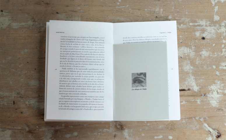
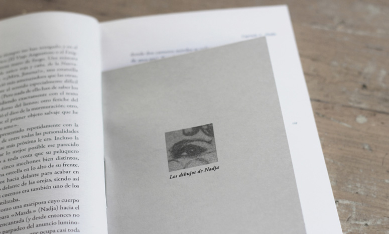
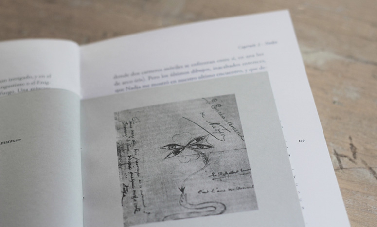
Finally, the book includes an insert in gray paper with some illustrations of Nadja, who we later discover is a patient of the Vaucluse madhouse, that's why gray is present throughout the book, to emphasize the status of sadness and depression experienced by Nadja.
Production Lesson(s)
The challenge was to choose a good paper to represent the organic love story of the book and the emphasize the status of sadness and depression experienced by the main character.


About
FPO (For Print Only), is a division of UnderConsideration, celebrating the reality that print is not dead by showcasing the most compelling printed projects.
FPO uses Fonts.com to render Siseriff and Avenir Next.
FPO is run with Six Apart’s MovableType
All comments, ideas and thoughts on FPO are property of their authors; reproduction without the author’s or FPO’s permission is strictly prohibited
Twitter @ucllc
Sign-up for Mailing List
Mailing list managed by MailChimp
Thanks to our advertisers
About UnderConsideration
UnderConsideration is a graphic design firm generating its own projects, initiatives, and content while taking on limited client work. Run by Bryony Gomez-Palacio and Armin Vit in Bloomington, IN. More…
blogs we publish
Brand New / Displaying opinions and focusing solely on corporate and brand identity work.
Art of the Menu / Cataloguing the underrated creativity of menus from around the world.
Quipsologies / Chronicling the most curious, creative, and notable projects, stories, and events of the graphic design industry on a daily basis.
products we sell
Flaunt: Designing effective, compelling and memorable portfolios of creative work.
Brand New Conference videos / Individual, downloadable videos of every presentation since 2010.
Prints / A variety of posters, the majority from our AIforGA series.
Other / Various one-off products.
events we organize
Brand New Conference / A two-day event on corporate and brand identity with some of today's most active and influential practitioners from around the world.
Brand Nieuwe Conference / Ditto but in Amsterdam.
Austin Initiative for Graphic Awesomeness / A speaker series in Austin, TX, featuring some of the graphic design industry's most awesome people.
also
Favorite Things we've Made / In our capacity as graphic designers.
Projects we've Concluded / Long- and short-lived efforts.
UCllc News / Updates on what's going at the corporate level of UnderConsideration.

Related entries
2017 Brand New Conference Program
Severe(d): A Creepy Poetry Collection by Holly Riordan
Um Caminho para Santiago CD Package and Diary
BOYCO Classpack® Book
Antes de Perder la Esperanza Book