ADV @ UNDERCONSIDERATION Peek here for details
BROWSE
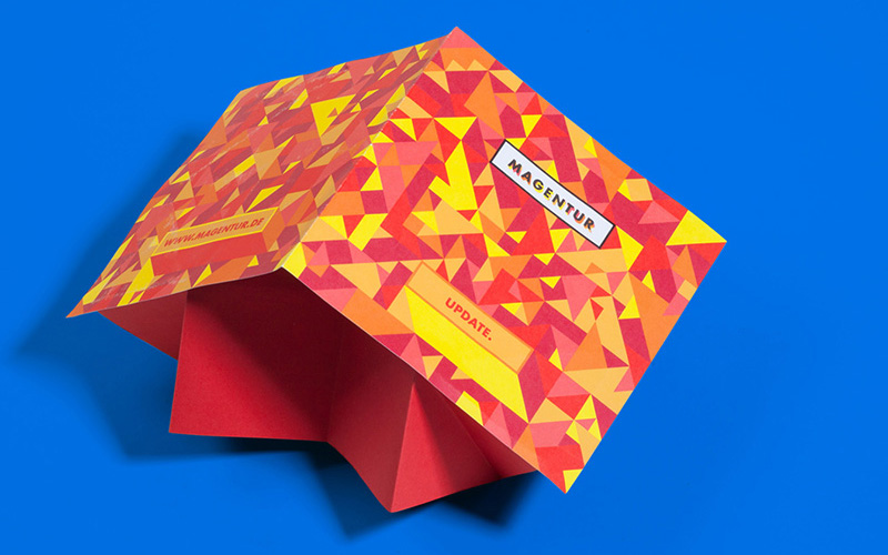
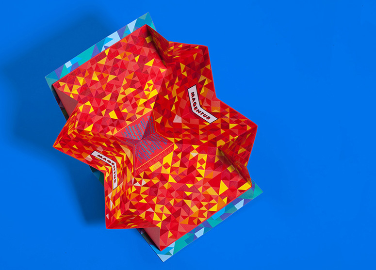
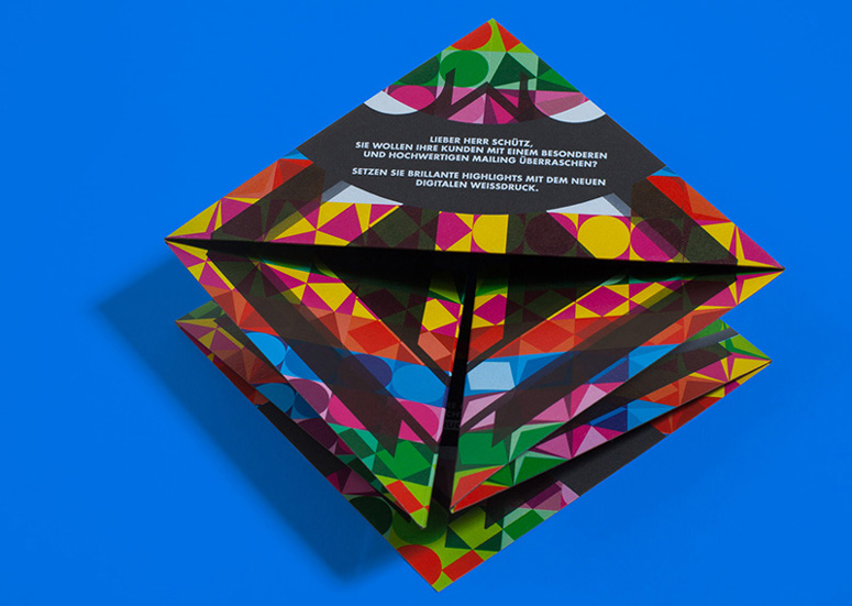
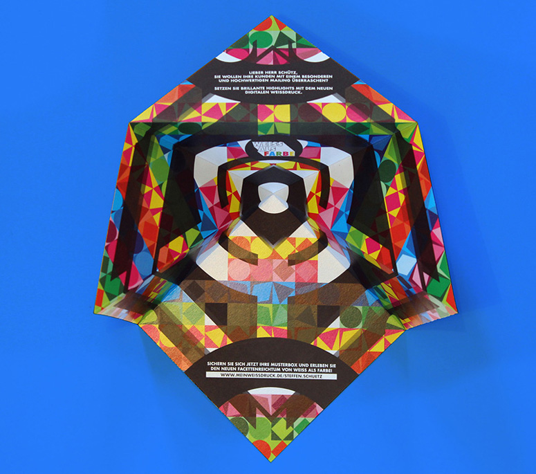
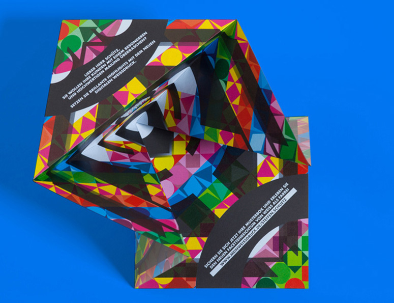
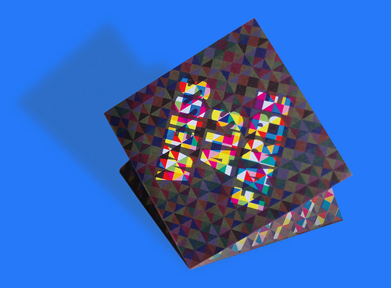
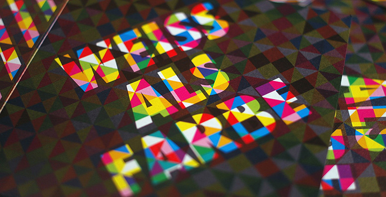
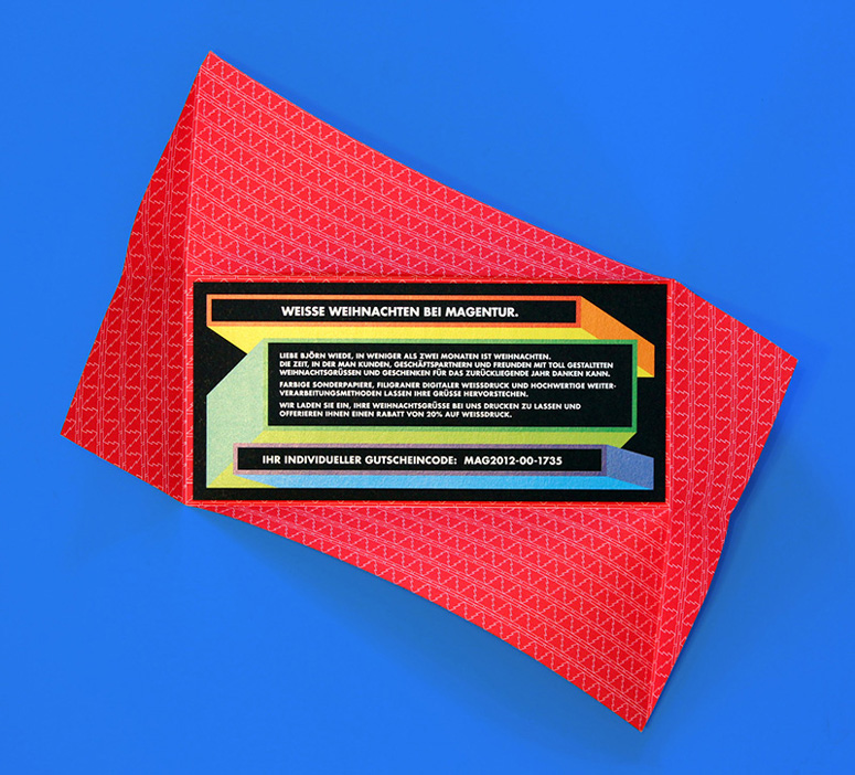
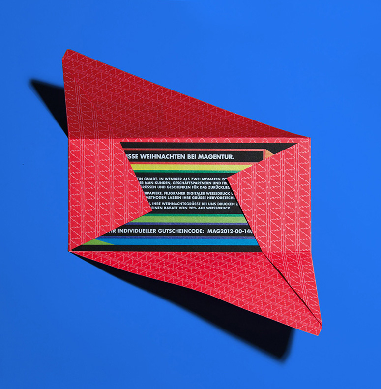
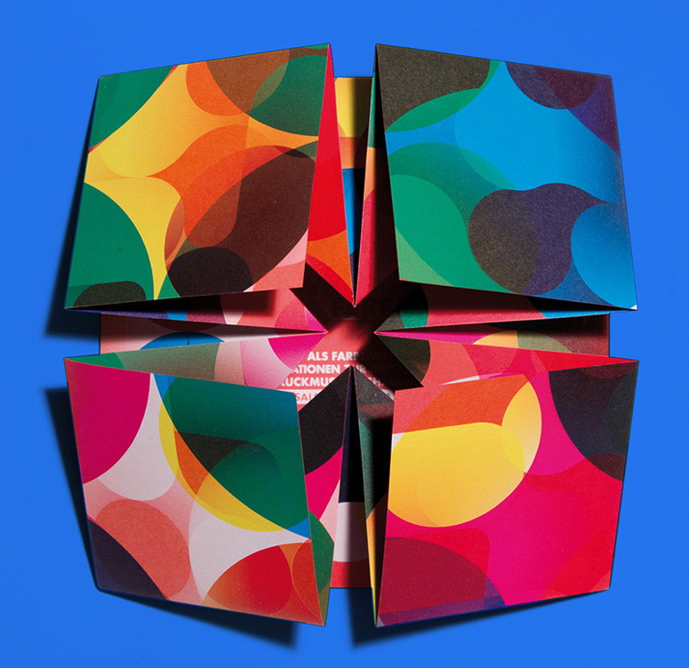
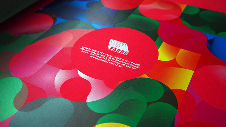
Here we have a series of promotional pieces that highlight MAGENTUR’s status as one of the first printers in Germany with the ability to digitally print white ink. There are so many interesting things about these pieces from the colorful over- and under-printed patterns to the intriguing folding to the handsomely set Futura. (Apologies for the lack of data, but the production lessons provided are good).
Dimensions (Width × Height × Depth)
–
Page Count
–
Paper Stock
–
Number of Colors
–
Varnishes
–
Binding
–
Typography
Futura (various cuts)

Project Description
The digital printing company, MAGENTUR, from Berlin was one of the first printers in Germany to be able to digitally print white ink with their HP INDIGO 5500. Several folded mailings were created to let the clients know that. The mailings did not only stand out due to their bright high quality colors, but also due to their folded finishing. They were folded in a way, so that they would open themselves to the receiving client when unpacked. The design showed different techniques of over- and underprinting of color swatches on colored papers.Production Lesson(s)
The task was to show the clients of Magentur, who received the mailings, the possibilities of digital white printing. Usually white is printed via silkscreen- or offset-printing. The possibility to print white digitally offers things like personalization and affordable print runs in very low quantities.I started to think about the graphics first; to experiment with over- and underprinting. Using several print runs of white printing, which has an effect close to a varnish colour. Printing on coloured papers offered a chance to show the effect of colours on the paper when printed without white and underprinted with white. It was the first time for me to print white digitally, so I had to guess what will come out of the printer, especially when using gradients of white under gradients of colour. It turned out quite well and received a lot of attention for Magentur and the new printing technique, which was pretty much the purpose of the whole mailing.
Furthermore I experimented with different folding techniques, that led to the idea, that it would be nice to create mailings that would open themselves to the receiving client when unpacked. The mailings were sent in see-through envelopes, so you could get a glimpse at what you are going to receive. When opened, the mailing would pop up and reveal the content and information.

Post Author

Duncan Robertson
Former intern at UnderConsideration LLC.
More: Online / On Twitter
Date Published
January 16, 2014
Filed Under
Digital
Promotional Cards
Tagged with
futura
overprint
pattern
underprint
white ink


About
FPO (For Print Only), is a division of UnderConsideration, celebrating the reality that print is not dead by showcasing the most compelling printed projects.
FPO uses Fonts.com to render Siseriff and Avenir Next.
FPO is run with Six Apart’s MovableType
All comments, ideas and thoughts on FPO are property of their authors; reproduction without the author’s or FPO’s permission is strictly prohibited
Twitter @ucllc
Sign-up for Mailing List
Mailing list managed by MailChimp
Thanks to our advertisers
About UnderConsideration
UnderConsideration is a graphic design firm generating its own projects, initiatives, and content while taking on limited client work. Run by Bryony Gomez-Palacio and Armin Vit in Bloomington, IN. More…
blogs we publish
Brand New / Displaying opinions and focusing solely on corporate and brand identity work.
Art of the Menu / Cataloguing the underrated creativity of menus from around the world.
Quipsologies / Chronicling the most curious, creative, and notable projects, stories, and events of the graphic design industry on a daily basis.
products we sell
Flaunt: Designing effective, compelling and memorable portfolios of creative work.
Brand New Conference videos / Individual, downloadable videos of every presentation since 2010.
Prints / A variety of posters, the majority from our AIforGA series.
Other / Various one-off products.
events we organize
Brand New Conference / A two-day event on corporate and brand identity with some of today's most active and influential practitioners from around the world.
Brand Nieuwe Conference / Ditto but in Amsterdam.
Austin Initiative for Graphic Awesomeness / A speaker series in Austin, TX, featuring some of the graphic design industry's most awesome people.
also
Favorite Things we've Made / In our capacity as graphic designers.
Projects we've Concluded / Long- and short-lived efforts.
UCllc News / Updates on what's going at the corporate level of UnderConsideration.

Related entries
Black Sheep Studio Business Cards and Promotional Items
E.A.S.E. Stationery Set
“A to Z Letters for Sale” Promo
End of Work iPad and Notebook Cases
CNN Digital New Hire Kit